Warning I am sorry to say that as of June 28 2023, DecaUI is no longer actively maintained.
DecaUI
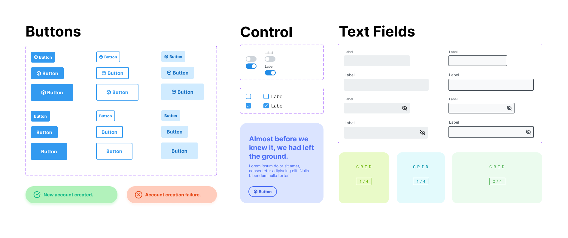
DecaUI provides a set of accessible and customizable React components that make it easy to quickly prototype and develop stunning websites.
Getting Started
npm install @deca-ui/react
Using a component
Here is a simple example of a basic app using DecaUI's Button component:
import { Button } from '@deca-ui/react';

function App() {
  return <Button variant="solid">Hello World</Button>;
}
Click here for the full documentation
What's so different about DecaUI
With DecaUI, developers can use the centralized theming system anywhere within their application with shorthand names for css properties.
Custom CSS with other UI libraries
<Box
  sx={{
    marginRight: '2rem',
    marginLeft: '2rem',
    marginTop: '2rem',
    marginBottom: '2rem',
  }}
>
  <Input placeholder="Email Address" />
  <Input placeholder="Password" />
  <Button
    sx={{
      width: '100%',
    }}
  >
    Create Account
  </Button>
</Box>
Custom CSS with DecaUI
<Box css={{ m: '$3' }}>
  <Input placeholder="Email Address" />
  <Input placeholder="Password" />
  <Button maxWidth>Create Account</Button>
</Box>
Our focus is consistency
The main problem with other UI libraries is that it's confusing to create consistent webpage layouts with them. DecaUI allows developers to utilize a root theme object which serves properties following the System UI specification.


