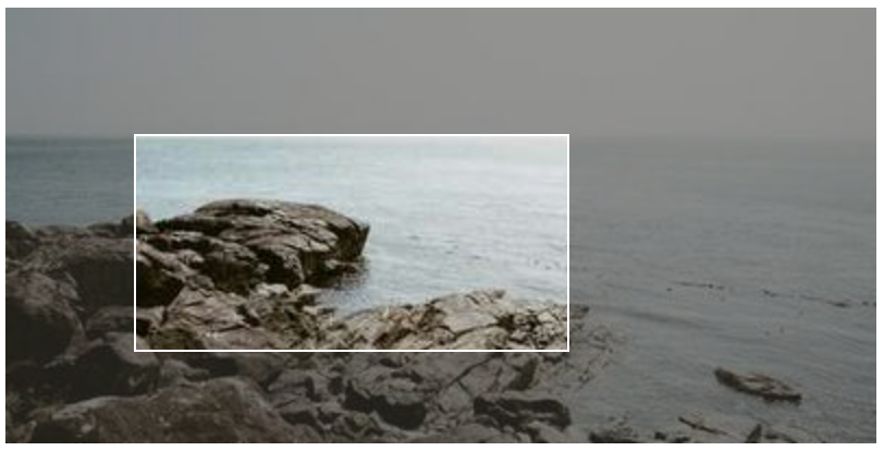
This library provides a user interface to make a visual selection of a rectangular area in an element of a Web page. The effect is shown in the following image:
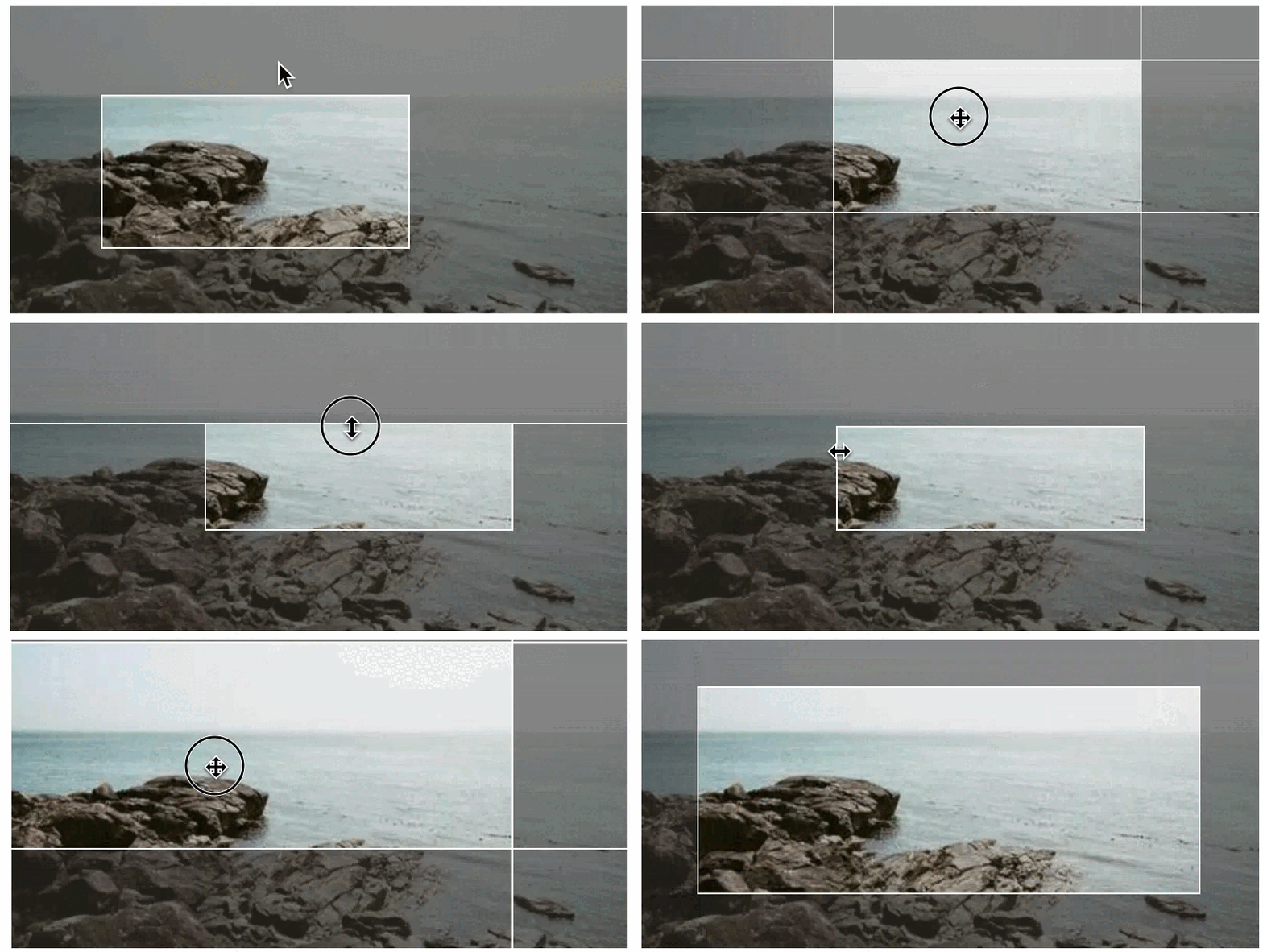
Then the user can move the selection, resize it, and get the coordinates of the selection as in the next animation:
To get this effect, you just need to add the selectbox-ui.js script and selectbox-ui.css style sheet to your Web page and add the data-selectboxui attribute to the element you want to add the effect to. For example:
<script src="selectbox-ui.js"></script>
<link href="selectbox-ui.css" rel="stylesheet"/>
...
<div data-selectboxui>
    <img src="https://picsum.photos/400/200" data-selectboxui class="mx-auto" data-selectboxui-initial-box="25%">
</div>
Alternatively, you can either use the selectBoxUI function (which will be defined in the window upon including the library) or use the jQuery call $('img').selectBoxUI() to add the effect to the element.
The library is written in JavaScript and it is compatible with jQuery (although it is not needed). It is distributed under the MIT License.
To use the library, you just need to include the selectbox-ui.js file in your Web page. You can download it from the GitHub repository or get it from the CDN:
<script src="https://cdn.jsdelivr.net/gh/dealfonso/selectbox-ui@1.0/dist/selectbox-ui.min.js"></script>
<link href="https://cdn.jsdelivr.net/gh/dealfonso/selectbox-ui@1.0/dist/selectbox-ui.min.css>" rel="stylesheet"/>The declarative version is the easiest way to use the library. You just need to add the data-selectboxui attribute to the element you want to add the effect to. For example:
<img src="https://picsum.photos/400/200" class="mx-auto" data-selectboxui>It is also possible to customize the effect by adding the data-selectboxui-* attributes to the element. For example:
<img src="https://picsum.photos/400/200" class="mx-auto" data-selectboxui data-selectboxui-initial-box="25%" data-selectboxui-no-focus>The available options are described in the Options section.
You can use the global selectBoxUI function to add the effect to an element. The function accepts two parameters:
element: Element to add the effect to. It can be a DOM element e.g. obtained usingdocument.querySelector("div").options: Object with the options to customize the effect. The available options are described in the Options section.
Once an element has the effect, it will have a selectBoxUI property which is an object that enables to control the effect. An example of usage is the following:
var element = document.querySelector("div");
element.selectBoxUI.set("10% 20% 30% 40%");
element.selectBoxUI.disable();
The available commands are:
enable: Enables the visual elements of the select box (i.e. if they are over any part of the underlying components, they will have priority over them and the user interaction will not reach to these underlying components).disable: Disables the visual elements of the select box (i.e. even if they are over any part of the underlying components, they will not have priority over them and the user interaction will reach to these underlying components)show: Shows the visual elements of the select box.hide: Hides the visual elements of the select box.set: Sets the selection box to a new position. The parameter is a string with any of the accepted formatsleft top right bottom,horizontal verticalorsize(see Selection Box format).get: Gets the selection box position. The result is an object with the propertiesleft,top,rightandbottom.
If you are using jQuery, you can use the selectBoxUI function to add the effect to an element, and to interact with the element that has the effect. E.g.:
$('div').selectBoxUI({initialBox: "10% 20% 30% 40%"});
$('div').selectBoxUI("enable");
When adding the effect to an element, the function accepts one parameter which is an object with the options to customize the effect. The available options are described in the Options section.
Once an element has the effect, the jQuery selectBoxUI plugin enables the following commands: enable, disable, show, hide, set and get. The commands are the same as in the Using in Javascript section, and are used passing the command as a string to the selectBoxUI function. E.g.:
$('div').selectBoxUI("enable");In the case of the set command, the parameter is a string with any of the accepted formats left top right bottom, horizontal vertical or size (see Selection Box format). E.g.:
$('div').selectBoxUI("set", "10% 20% 30% 40%");The selection box is the area that is selected by the user. It is defined by the top-left and bottom-right corners. The selection box is defined by the following properties:
left: Distance from the left side of the element to the left side of the selection box.top: Distance from the top side of the element to the top side of the selection box.right: Distance from the right side of the element to the right side of the selection box.bottom: Distance from the bottom side of the element to the bottom side of the selection box.width: Width of the element.height: Height of the element.
The selection box can be set using the set command or the initialBox option. The selection box can be retrieved using the get command.
You can use different formats to specify the size of the selection box:
left top right bottom: defines the box, with coordinates taken from the top-left of the element.horizontal vertical: defines the box by using the distance from the top-left and the bottom-right. e.g.10 20will be interpreted as10 20 -10 -20.size: defines the box by using the same size for all the sides. e.g.10will be interpreted as10 10 -10 -10.
Each of the coordinates can be expressed in pixels or in percentages. e.g. 10 20 30 40 or 10% 20% 30% 40%. The origin is the top-left corner of the element.
If any of the values is negative, it will be interpreted as the size from the bottom or right side. e.g. 10 20 -30 -40 will be interpreted as 10 20 <width>-30 <height>-40.
When creating a SelectBoxUI, you can pass a set of options to customize the effect. The options can be passed as an object to the selectBoxUI function or as data-selectboxuiui-* attributes to the element. The following options are available:
initialBox: Initial size of the selection box. If not specified, the initial box size will cover all the space.wrapperClass: Class to add to the wrapper of the selection box. If not specified, the default value issb-selectbox-wrapper.wrapperId: Id to add to the wrapper of the selection box. If not specified, the default value isnull(means that it will not add set id).addFocus: Whether to add an active focus section to the element when the selection box. The active focus section means that it can be moved in the selection box, and the user interaction will not reach to the underlying elements. If not specified, the default value istrue.addBorders: Whether to add active borders that enable to adjust the selection box. If not specified, the default value istrue.addCorners: Whether to add active corners that enable to adjust the selection box. If not specified, the default value istrue.addSides: Whether to add sides that adds an effect of opacity to the part which is not selected. If not specified, the default value istrue.addClasses: Whether to add classes of the element to the selection box wrapper (the idea is to get profit from css stylesheets for the wrapper to make the resulting selection box as similar to the original component as possible). If not specified, the default value istrue.borderWidth: Width of the borders of the selection box. The width means the size for the active borders, corners, etc., but that width will not have a visual effect on the result (unless tweaking the css components). If not specified, the default value is5.resizeObserver: Whether to use the ResizeObserver to detect size changes in the element. If not specified, the default value istrue.modifySizes: Whether to modify the sizes of the element to adapt it to the wrapper's size. If not specified, the default value istrue.
In the declarative version, the options can be passed as data-selectboxuiui-*::
data-selectboxuiui-initial-box: Sets the value ofinitialBox.data-selectboxuiui-wrapper-class: Sets the value ofwrapperClass.data-selectboxuiui-wrapper-id: Sets the value ofwrapperId.data-selectboxuiui-no-focus: Sets the value ofaddFocustofalse.data-selectboxuiui-no-borders: Sets the value ofaddBorderstofalse.data-selectboxuiui-no-corners: Sets the value ofaddCornerstofalse.data-selectboxuiui-no-sides: Sets the value ofaddSidestofalse.data-selectboxuiui-no-add-classes: Sets the value ofaddClassestofalse.data-selectboxuiui-border-width: Sets the value ofborderWidth.data-selectboxuiui-no-resize-observer: Sets the value ofresizeObservertofalse.data-selectboxuiui-no-modify-sizes: Sets the value ofmodifySizestofalse.
The default options can be changed by modifying the selectBoxUI.defaults object. For example, to change the default initial box to 10%, you can use the following code, which will change the default for all the elements that have the effect:
showsource.defaults.initialBox = "10%";Additionally, it is possible to set multiple default values at once, by setting showsource.defaults to an options object. For example, to disable the focus and the corners by default, you can use the following code:
showsource.defaults = {
    addFocus: false,
    addCorners: false
};The library adds a set of styles to the elements that build the selection box. The styles are added to the element itself and to the wrapper of the selection box. The following styles are added to the elements:
sb-element: Class for any object that is part from the selection box.sb-selectbox-wrapper: Class for the wrapper of the selection box.sb-border: Class of the borders of the selection box.sb-border-top,sb-border-right,sb-border-bottom,sb-border-left: Classes for each of the borders of the selection box.sb-corner: Class of the corners of the selection box.sb-corner-topleft,sb-corner-topright,sb-corner-bottomright,sb-corner-bottomleft: Classes for each of the corners of the selection box.sb-side: Class of the sides of the selection box.sb-side-top,sb-side-right,sb-side-bottom,sb-side-left: Classes for each of the sides of the selection box.sb-focus: Class of the focus section of the selection box.sb-resizing: Class of the selection box element when it is being used to resize the selection box. i.e. if the user is using the left border to resize the selection box, thesb-resizingclass will be added to the left border and only to the left border.
The library also adds some additional styles that add some effects to the selection box. The following styles are added to the elements:
sb-bounce: Is a class that makes that the borders of the selection box bounce for 2 seconds. It is designed to be used to show the user that there is a selection box. (This should be added to the wrapper element or the container of the selection box).sb-borders-fixed: Is a class that makes that the guides of the borders of the selection box are shown. If this class is not added, the guides will be hidden while they are not being used to resize the selection box. (This should be added to the wrapper element or the container of the selection box).sb-ignore-mouse: Is a class that makes that the mouse events are ignored by the element. This class is added when a selection box is disabled. This can be added to any element that you want to ignore the mouse events.sb-hidden: Is a class that makes that the element is hidden. This class is added when a selection box is hidden. This can be added to any element that you want to hide.
The default style is defined in the selectbox-ui.css file, but you can override it by defining your own style sheet. The next example will add a dark-red background to the selection box:
.sb-side-box {
    background-color: #633;
}The library triggers some events that can be used to control the effect. The events are triggered in the element that has the effect. The following events are available:
selectboxui-changed: Is triggered when the selection box is changed either by the interaction of the user or by using the API.selectboxui-resize-start: Is triggered when the box starts to be resized because of the interaction of the user (i.e. using a side, corner, etc.).selectboxui-resize: Is triggered when the box is being resized because of the interaction of the user (i.e. using a side, corner, etc.).selectboxui-resize-end: Is triggered when the box ends to be resized because of the interaction of the user (i.e. using a side, corner, etc.).selectboxui-bounce-start: Is triggered when the bounce effect starts.selectboxui-bounce-end: Is triggered when the bounce effect ends.selectboxui-show: Is triggered when the selection box is shown.selectboxui-hide: Is triggered when the selection box is hidden.selectboxui-enable: Is triggered when the selection box is enabled.selectboxui-disable: Is triggered when the selection box is disabled.selectboxui-element-resized: Is triggered when it is detected that the element that has the effect has been resized, and the selection box has been adapted to the new size.
Each of the events has a detail property which is the selectionBoxUI object.
The events can be listened using the addEventListener function. E.g.:
var element = document.querySelector("div");
element.addEventListener("selectboxui-changed", function(event) {
    console.log("Selection box changed");
});You can see some examples of usage in the examples.html web page. You can also see the examples in action in the GitHub Pages of the project.
The following example shows how to add the effect to an image:
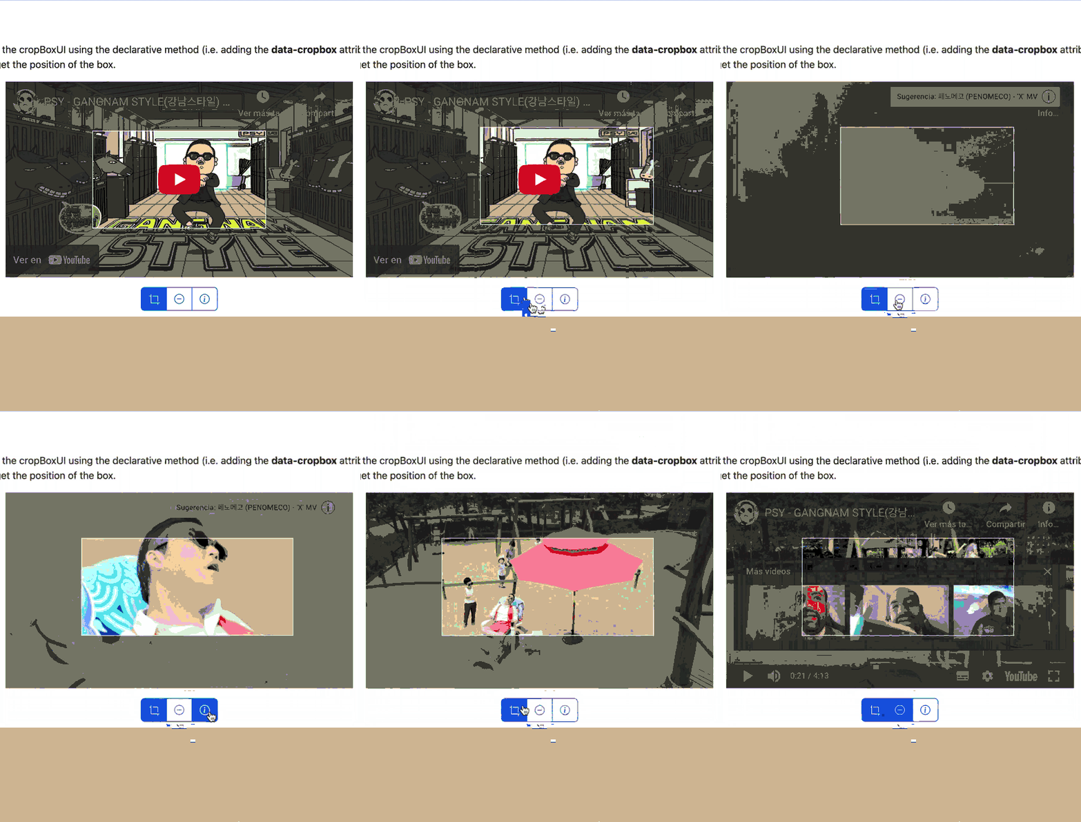
<img src="https://picsum.photos/400/200" data-selectboxui class="mx-auto" data-selectboxui-initial-box="25%">The following example shows how to add the effect to an iframe:
<iframe class="mx-auto" data-selectboxui data-selectboxui-initial-box="25%" src="https://www.youtube.com/embed/9bZkp7q19f0" width="560" height="315" frameborder="0"></iframe>In this example you can see a full example that uses the API to control the effect. The complete code is included in the examples.html file.
The SelectBoxUI is not responsive by default, but it adds helpers to respond to size changes in the element. So if you change the size of the element (e.g. by changing the style or using jQuery), the SelectBoxUI will try to adapt to the new size.
Anyway, this library tries to make its best to create the SelectBox UI, but may not get a perfect result. It is a tool to help you create a better user experience, but it is not a replacement for a good designer. So sometimes you may need to use some tweaks to get a better result:
- You can use the
resizeObserveroptions (or thedata-selectboxui-resize-observer) and set it tofalseto disable the resize observer. This will prevent the SelectBoxUI from trying to adapt to the size changes, and will avoid some issues like the SelectBoxUI not being able to adapt to the size of the element. - You can use the
modifySizesoption (or thedata-selectboxui-modify-sizes) and set it tofalseto avoid modifying the sizes of the element to adapt it to the wrapper's size. The default behavior is to set the element's size 100% to automatically adapt to the wrapper's size, but this may not be the best option in some cases and may lead to get a0pxsize and thus the object will disappear.
Any help to make the SelectBoxUI responsive by default is welcome.


