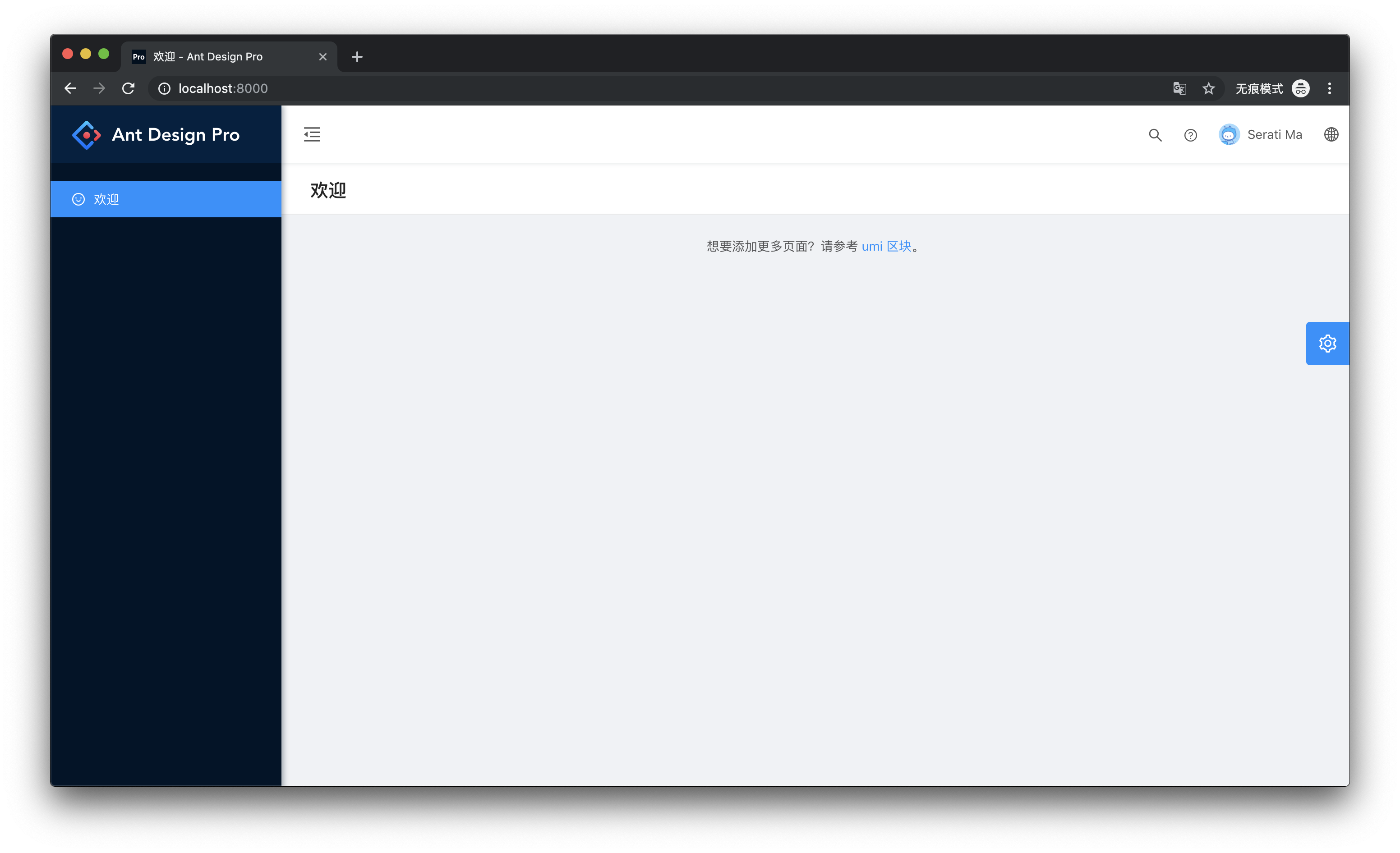
An out-of-box UI solution for enterprise applications as a React boilerplate. This repository is the layout of Ant Design Pro and was developed for quick and easy use of the layout.
npm i @ant-design/pro-layout --save
// or
yarn add @ant-design/pro-layout
import ProLayout from '@ant-design/pro-layout';
render(<ProLayout />, document.getElementById('root'));All methods at the beginning of the rendering can prevent rendering by passing in
false.
| Property | Description | Type | Default Value |
|---|---|---|---|
| title | layout in the upper left corner title | ReactNode | 'Ant Design Pro' |
| logo | layout top left logo url | ReactNode | ()=>ReactNode | - |
| layout | layout menu mode, sidemenu: right navigation, topmenu: top navigation | 'sidemenu' | 'topmenu' | 'sidemenu' |
| contentWidth | content mode of layout, Fluid: fixed width 1200px, Fixed: adaptive | 'Fluid' | 'Fixed' | 'Fluid' |
| navTheme | Navigation menu theme | 'light' | 'dark' | 'dark' |
| fixedHeader | whether to fix header to top | boolean | false |
| FixSiderbar | Whether to fix navigation menu | boolean | false |
| autoHideHeader | automatically hide the header when sliding | boolean' | false |
| menu | About the configuration of the menu, only locale, locale can turn off the globalization of the menu | { locale: boolean } | { locale: true } |
| iconfontUrl | Use IconFont icon configuration | string | - |
| locale | The language setting of the layout | 'zh-CN' | 'zh-TW' | 'en-US' | navigator.language |
| settings | layout settings | Settings |
Settings |
| siderWidth | width of sider menu | number | 256 |
| collapsed | control menu's collapse and expansion | boolean | true |
| onCollapse | folding collapse event of menu | (collapsed: boolean) => void | - |
| headerRender | custom header render method | (props: BasicLayoutProps) => ReactNode | - |
| footerRender | custom footer render method | (props: BasicLayoutProps) => ReactNode | - |
| pageTitleRender | custom page title render method | (props: BasicLayoutProps) => ReactNode | - |
| menuRender | custom menu render method | (props: HeaderViewProps) => ReactNode | - |
| menuItemRender | the render method of a custom menu item | (itemProps: MenuDataItem) => ReactNode | - |
| route | Used to assist in the generation of menu and bread crumbs. Umi will automatically bring | route | - |
import { SettingDrawer } from '@ant-design/pro-layout';SettingDrawer provides a graphical interface to set the layout configuration. Not recommended for use in a product environment.
| Property | Description | Type | Default Value |
|---|---|---|---|
| settings | layout settings | Settings |
Settings |
| onSettingChange | The setting changes event | (settings: Settings) => void | - |
For ease of viewing and use, Typescript is used here to write.
// can be done via import { Settings } from '@ant-design/pro-layout/defaultSettings' to get this type

export interface Settings {
  /**
   * theme for nav menu
   */
  navTheme: 'light' | 'dark';
  /**
   * primary color of ant design
   */
  primaryColor: string;
  /**
   * nav menu position: `sidemenu` or `topmenu`
   */
  layout: 'sidemenu' | 'topmenu';
  /**
   * layout of content: `Fluid` or `Fixed`, only works when layout is topmenu
   */
  contentWidth: 'Fluid' | 'Fixed';
  /**
   * sticky header
   */
  fixedHeader: boolean;
  /**
   * auto hide header
   */
  autoHideHeader: boolean;
  /**
   * sticky siderbar
   */
  fixSiderbar: boolean;
  menu: { locale: boolean };
  title: string;
  pwa: boolean;
  // Your custom iconfont Symbol script Url
  // eg://at.alicdn.com/t/font_1039637_btcrd5co4w.js
  // Usage: https://github.com/ant-design/ant-design-pro/pull/3517
  iconfontUrl: string;
  colorWeak: boolean;
}// can be imported { MenuDataItem } from '@ant-design/pro-layout/typings' to get this type
export interface MenuDataItem {
authority?: string[] | string;
children?: MenuDataItem[];
hideChildrenInMenu?: boolean;
hideInMenu?: boolean;
icon?: string;
locale?: string;
name?: string;
path: string;
[key: string]: any;
}// can be imported { RouterTypes } from '@ant-design/pro-layout/typings' to get this type
export interface Route {
path: string;
routes: Array<{
exact?: boolean;
icon: string;
name: string;
path: string;
// optional secondary menu
children?: Route['routes'];
}>;
}Modern browsers and IE11.
 IE / Edge |
 Firefox |
 Chrome |
 Safari |
 Opera |
|---|---|---|---|---|
| IE11, Edge | last 2 versions | last 2 versions | last 2 versions | last 2 versions |
Any type of contribution is welcome, here are some examples of how you may contribute to this project:
- Use Ant Design Pro in your daily work.
- Submit issues to report bugs or ask questions.
- Propose pull requests to improve our code.


