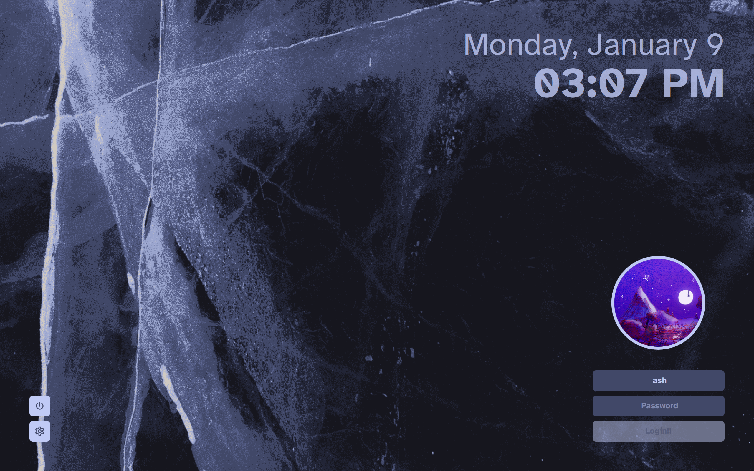
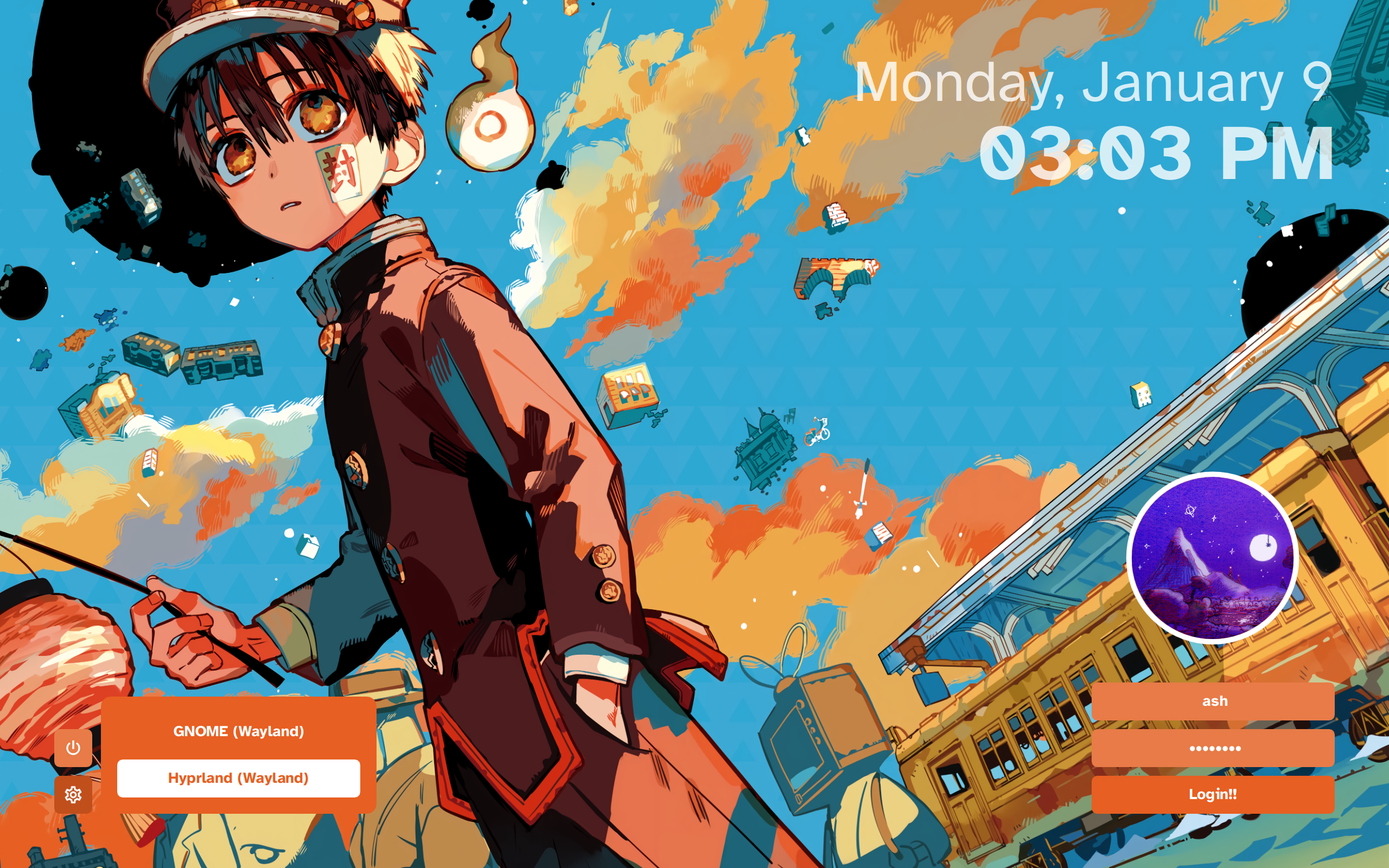
theme for SDDM that puts stuff on the corners of the screen. take a look!
wasn't really a fan of preexisting themes so I made my own. kinda inspired by sddm-chinese-painting-theme
this theme does not require KDE Plasma, so also make sure you have Qt 5 installed!
- SDDM
- Qt Graphical Effects
- Qt SVG
- Qt Quick Controls 2
on Arch, simply run pacman -Syu sddm qt5-graphicaleffects qt5-svg qt5-quickcontrols2
for Arch users, the theme is available from the AUR here. install it with your favorite AUR helper: paru sddm-theme-corners-git
on other distros, simply download/clone this repo, and copy the corners/ folder to /usr/share/sddm/themes/.
git clone https://github.com/aczw/sddm-theme-corners.git
cd sddm-theme-corners
cp -r corners/ /usr/share/sddm/themes/
if you haven't already, make sure to change the current theme that SDDM is using. on Arch, create a config file in /etc/sddm.conf.d/ with the following contents:
[Theme]
Current=corners
check the Arch Wiki for more info.
you will probably want to configure the theme before using it, as out of the box it uses Atkinson Hyperlegible as the display font, and assumes a screen DPI of 216 (basically, my setup :p).
edit the theme.conf file (located inside corners/) as you see fit. I tried to make most stuff customizable, but please lemme know if you want other options too. the following are short descriptions of what each option does.
note that colors require the leading # and that all options have to be wrapped in quotation marks. refer to this link for more info regarding colors.
Background: path to the wallpaper. you can drop files inbackgrounds/to use a relative path, or you can just use an absolute path.Font: the font to use throughout the theme. use the name of the font family.Padding: the distance that stuff should be from the screen edge.CornerRadius: specify how round corners should be, or set to 0 to disable rounded corners.GeneralFontSize: the font size used for everything excluding the date and time.LoginScale: this allows you to adjust the relative scale of UI elements. you should probably keep the value below 1.
click on the avatar to change users!
UserPictureBorderWidth: the width of the outline around the user avatar. set to 0 to disable.UserPictureBorderColor: the color of the outline around the user avatar.UserPictureColor: the color of the default, blank avatar. note that this is only visible when you don't have a custom picture set.
TextFieldColor: the color of the text field background for the user and password fields.TextFieldTextColor: the color of the text inside the user and password fields.TextFieldHighlightColor: the color of the border around the currently selected text field.TextFieldHighlightWidth: the border width of the currently selected text field. set to 0 to disable the border.UserFieldBgText: the placeholder text shown in the user field when nothing is typed.PasswordFieldBgText: the placeholder text shown in the password field when nothing is typed.
LoginButtonTextColor: the color of the login button text.LoginButtonBgColor: the color of the login button background.LoginButtonText: the text to be displayed on the login button.
PopupBgColor: the background color of the popup. this applies to the power panel, session panel, and user panel.PopupHighlightColor: the color of the currently selected entry in the popup. this applies to the power panel, session panel, and user panel.PopupHighlightedTextColor: the color of the text for the currently selected option. only applies to session and user popups.
SessionButtonColor: the color of the session button background.SessionIconColor: the color of the icon inside the session button.
PowerButtonColor: the color of the power button background.PowerIconColor: the color of the icon inside the session button.
DateColor: the text color of the date.DateSize: the font size of the date.DateIsBold: whether the date is bolded. accepts eithertrueorfalse.DateOpacity: the opacity of the date text. set to 1 to disable transparency.DateFormat: specify the formatting of the date.
TimeColor: the text color of the time.TimeSize: the font size of the time.TimeIsBold: whether the time is bolded. accepts eithertrueorfalse.TimeOpacity: the opacity of the time text. set to 1 to disable transparency.TimeFormat: specify the formatting of the time.
this project is licensed under the GPLv3 License. check it out here.
that's pretty much it. I hope you enjoy the theme. feedback is much appreciated!!

