Texture library wrapper with some additions.
- Installation
- Layout Specs
- Modifiers
- Nodes
- Containers
- Wrappers
- Animations
- Themes
- Extensions
- Previews
- Property wrappers
- Experiments
Add the following to your Podfile:
pod 'VATextureKitRx'    // includes additional wrappers.
or
pod 'VATextureKit'      // includes Texture nodes wrappers.
or
pod 'VATextureKitSpec'  // includes only Layout Spec wrappers.
In the project directory in the Terminal:
pod install
Or just try the example project:
pod try 'VATextureKit'
Minimum deployment target: iOS 11
The following LayoutSpec DSL components can be used to compose simple or very complex layouts.
| VATextureKit | Texture |
|---|---|
| Column | ASStackLayoutSpec (vertical) |
| Row | ASStackLayoutSpec (horizontal) |
| Stack | |
| SafeArea | ASInsetLayoutSpec (with safeAreaInsets) |
| .padding | ASInsetLayoutSpec |
| .wrapped | ASWrapperLayoutSpec |
| .corner | ASCornerLayoutSpec |
| .safe | ASInsetLayoutSpec (with safeAreaInsets) |
| .centered | ASCenterLayoutSpec |
| .ratio | ASRatioLayoutSpec |
| .overlay | ASOverlayLayoutSpec |
| .background | ASBackgroundLayoutSpec |
| .relatively | ASRelativeLayoutSpec |
| .absolutely | ASAbsoluteLayoutSpec |
Column
With ASStackLayoutSpec:
override func layoutSpecThatFits(_ constrainedSize: ASSizeRange) -> ASLayoutSpec {
    ASStackLayoutSpec(
        direction: .vertical,
        spacing: 8,
        justifyContent: .start,
        alignItems: .start,
        children: [
            firstRectangleNode,
            secondRectangleNode,
        ]
    )
}
With Column:
override func layoutSpecThatFits(_ constrainedSize: ASSizeRange) -> ASLayoutSpec {
    Column(spacing: 8) {
        firstRectangleNode
        secondRectangleNode
    }
}
Example:

Row
With ASStackLayoutSpec:
ASStackLayoutSpec(
    direction: .horizontal,
    spacing: 4,
    justifyContent: .spaceBetween,
    alignItems: .start,
    children: [
        firstRectangleNode,
        secondRectangleNode,
    ]
)
With Row:
Row(spacing: 4, main: .spaceBetween) {
    firstRectangleNode
    secondRectangleNode
}
Example:

Stack
Stack:
Stack {
    firstRectangleNode
    secondRectangleNode
}
Example:

SafeArea
With ASStackLayoutSpec in ASDisplayNode that automaticallyRelayoutOnSafeAreaChanges = true:
ASInsetLayoutSpec(
    insets: UIEdgeInsets(
        top: safeAreaInsets.top,
        left: safeAreaInsets.left,
        bottom: safeAreaInsets.bottom,
        right: safeAreaInsets.right
    ),
    child: ...
)
With SafeArea:
SafeArea {
    ...
}
.padding
With ASInsetLayoutSpec:
ASInsetLayoutSpec(
    insets: UIEdgeInsets(
        top: 8,
        left: 8,
        bottom: 8,
        right: 8
    ),
    child: titleTextNode
)
With .padding:
titleTextNode
    .padding(.all(8))
.wrapped
With ASWrapperLayoutSpec:
ASWrapperLayoutSpec(layoutElement: imageNode)With .wrapped:
imageNode
    .wrapped()
.corner
With ASWrapperLayoutSpec:
override func layoutSpecThatFits(_ constrainedSize: ASSizeRange) -> ASLayoutSpec {
    let spec = ASCornerLayoutSpec(
        child: imageNode,
        corner: badgeNode,
        location: .topRight
    )
    spec.offset = CGPoint(x: 4, y: 2)
    spec.wrapsCorner = false
    return spec
}
With .corner:
imageNode
    .corner(badgeNode, offset: CGPoint(x: 4, y: 2))
.safe
With ASStackLayoutSpec in ASDisplayNode that automaticallyRelayoutOnSafeAreaChanges = true:
override func layoutSpecThatFits(_ constrainedSize: ASSizeRange) -> ASLayoutSpec {
    ASInsetLayoutSpec(
        insets: UIEdgeInsets(
            top: safeAreaInsets.top,
            left: safeAreaInsets.left,
            bottom: safeAreaInsets.bottom,
            right: safeAreaInsets.right
        ),
        child: listNode
    )
}
With .safe:
listNode
    .safe(in: self)
.centered
With ASCenterLayoutSpec:
ASCenterLayoutSpec(
    centeringOptions: .XY,
    sizingOptions: .minimumXY,
    child: buttonNode
)
With .centered:
buttonNode
    .centered()
.ratio
With ASRatioLayoutSpec:
ASRatioLayoutSpec(
    ratio: 2 / 3,
    child: imageNode
)
With .ratio:
imageNode
    .ratio(2 / 3)
.overlay
With ASOverlayLayoutSpec:
ASOverlayLayoutSpec(
    child: imageNode,
    overlay: gradientNode
)
With .overlay:
imageNode
    .overlay(gradientNode)
.background
With ASOverlayLayoutSpec:
ASBackgroundLayoutSpec(
    child: gradientNode,
    background: imageNode
)
With .background:
imageNode
    .background(gradientNode)
.relatively
With ASOverlayLayoutSpec:
ASRelativeLayoutSpec(
    horizontalPosition: .start,
    verticalPosition: .end,
    sizingOption: .minimumSize,
    child: buttonNode
)
With .relatively:
buttonNode
    .relatively(horizontal: .start, vertical: .end)
.absolutely
With ASAbsoluteLayoutSpec:
buttonNode.style.preferredSize = frame.size
buttonNode.style.layoutPosition = frame.origin
return ASAbsoluteLayoutSpec(
    sizing: .sizeToFit,
    children: [buttonNode]
)
With .absolutely:
buttonNode
    .absolutely(frame: .frame, sizing: .sizeToFit)
More complex layout example
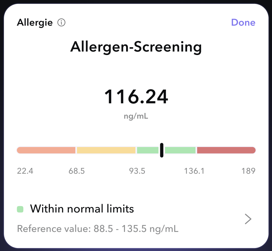
With VATextureKit:
override func layoutSpecThatFits(_ constrainedSize: ASSizeRange) -> ASLayoutSpec {
    Column(cross: .stretch) {
        Row(main: .spaceBetween) {
            Row(spacing: 8, cross: .center) {
                testNameTextNode
                testInfoButtonNode
            }
            testStatusTextNode
        }
        titleTextNode
            .padding(.top(8))
        resultTextNode
            .padding(.top(32))
            .centered(.X)
        resultUnitsTextNode
            .centered(.X)
        referenceResultBarNode
            .padding(.vertical(24))
        Row(spacing: 16, cross: .center) {
            Column(spacing: 8) {
                Row(spacing: 8) {
                    resultBadgeImageNode
                    resultDescriptionTextNode
                }
                referenceValuesTextNode
            }
            accessoryImageNode
        }
    }
    .padding(.all(16))
}
With raw Texture:
override func layoutSpecThatFits(_ constrainedSize: ASSizeRange) -> ASLayoutSpec {
    ASInsetLayoutSpec(
        insets: UIEdgeInsets(
            top: 16,
            left: 16,
            bottom: 16,
            right: 16
        ),
        child: ASStackLayoutSpec(
            direction: .vertical,
            spacing: 0,
            justifyContent: .start,
            alignItems: .stretch,
            children: [
                ASStackLayoutSpec(
                    direction: .horizontal,
                    spacing: 0,
                    justifyContent: .spaceBetween,
                    alignItems: .start,
                    children: [
                        ASStackLayoutSpec(
                            direction: .horizontal,
                            spacing: 8,
                            justifyContent: .start,
                            alignItems: .center,
                            children: [
                                testNameTextNode,
                                testInfoButtonNode,
                            ]
                        ),
                        testStatusTextNode,
                    ]
                ),
                ASInsetLayoutSpec(
                    insets: UIEdgeInsets(
                        top: 8,
                        left: 0,
                        bottom: 0,
                        right: 0
                    ),
                    child: titleTextNode
                ),
                ASCenterLayoutSpec(
                    centeringOptions: .X,
                    sizingOptions: .minimumXY,
                    child: ASInsetLayoutSpec(
                        insets: UIEdgeInsets(
                            top: 32,
                            left: 0,
                            bottom: 0,
                            right: 0
                        ),
                        child: resultTextNode
                    )
                ),
                ASCenterLayoutSpec(
                    centeringOptions: .X,
                    sizingOptions: .minimumXY,
                    child: resultUnitsTextNode
                ),
                ASInsetLayoutSpec(
                    insets: UIEdgeInsets(
                        top: 24,
                        left: 0,
                        bottom: 24,
                        right: 0
                    ),
                    child: referenceResultBarNode
                ),
                ASStackLayoutSpec(
                    direction: .horizontal,
                    spacing: 0,
                    justifyContent: .start,
                    alignItems: .center,
                    children: [
                        ASStackLayoutSpec(
                            direction: .vertical,
                            spacing: 8,
                            justifyContent: .start,
                            alignItems: .start,
                            children: [
                                ASStackLayoutSpec(
                                    direction: .horizontal,
                                    spacing: 8,
                                    justifyContent: .start,
                                    alignItems: .start,
                                    children: [
                                        resultBadgeImageNode,
                                        resultDescriptionTextNode,
                                    ]
                                ),
                                referenceValuesTextNode,
                            ]
                        ),
                        accessoryImageNode,
                    ]
                ),
            ]
        )
    )
}.sized
Set Node's size.
With style:
imageNode.style.width = ASDimension(unit: .points, value: 320)
imageNode.style.height = ASDimension(unit: .points, value: 480)
With .sized:
imageNode
    .sized(width: 320, height: 480)
.flex
Set Node's flex.
With style:
titleTextNode.style.flexShrink = 0.1
titleTextNode.style.flexGrow = 1
With .flex:
titleTextNode
    .flex(shrink: 0.1, grow: 1)
.maxConstrained
Set Node's max possible size.
With style:
titleTextNode.style.maxWidth = ASDimension(unit: .points, value: 320)
titleTextNode.style.maxHeight = ASDimension(unit: .points, value: 100)
With .maxConstrained:
titleTextNode
    .maxConstrained(width: 320, height: 480)
.minConstrained
Set Node's min possible size.
With style:
titleTextNode.style.minWidth = ASDimension(unit: .points, value: 100)
titleTextNode.style.minHeight = ASDimension(unit: .points, value: 50)
With .minConstrained:
titleTextNode
.minConstrained(width: 100, height: 50)VADisplayNode
A subclass of ASDisplayNode that automatically manages subnodes and handles theme updates.
VATextNode
A subclass of ASTextNode that handles content size and theme updates. Have default text styles.
VAButtonNode
A subclass of ASButtonNode with onTap closure.
VACellNode
A subclass of ASCellNode that automatically manages subnodes and handles theme updates.
VAImageNode
A subclass of ASImageNode with parametrized initializer.
VASpacerNode
A subclass of ASDisplayNode to fill space in Row / Column.
VASafeAreaDisplayNode
A subclass of VADisplayNode that automatically relayout on safe area changes.
VABaseGradientNode
A subclass of ASDisplayNode with CAGradientLayer root layer.
VALinearGradientNode
A subclass of VABaseGradientNode with parametrized initializer to simplify linear gradient creation.
VARadialGradientNode
A subclass of VABaseGradientNode with parametrized initializer to simplify radial gradient creation.
VAShapeNode
A subclass of ASDisplayNode with CAShapeLayer root layer.
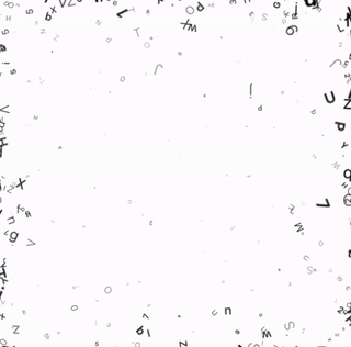
VAEmitterNode
A subclass of ASDisplayNode with CAEmitterLayer support.
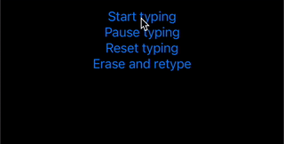
VATypingTextNode
A subclass of VATextNode with typing animation.
Example:
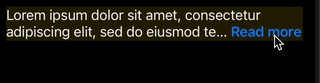
VAReadMoreTextNode
A subclass of VATextNode with "Read more" truncation in easy way.
Code:
lazy var readMoreTextNode = VAReadMoreTextNode(
    text: .loremText,
    maximumNumberOfLines: 2,
    readMore: .init(
        text: "Read more",
        fontStyle: .headline,
        colorGetter: { $0.systemBlue }
    )
)
Example:
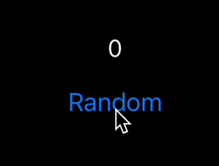
VACountingTextNode
A subclass of VATextNode with counting initation.
Code:
countingTextNode.updateCount(to: Int.random(in: 0...1000))
Example:
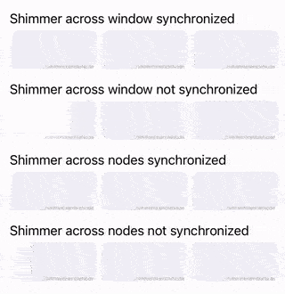
VAShimmerNode
A subclass of VADisplayNode with shimmering animation.
Example:
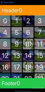
VAListNode
*Part of VATextureKitRx
A subclass of ASCollectionNode to use it in declarative way.
Example:

VATableListNode
*Part of VATextureKitRx
A subclass of ASTableNode to use it in declarative way.
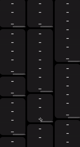
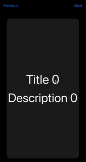
VAPagerNode
*Part of VATextureKitRx
A subclass of ASPagerNode to use it in declarative way.
Some crutches to mimic circular scrolling.
Example:
VAViewController
A subclass of ASDKViewController that handles theme updates.
VANavigationController
A subclass of ASDKNavigationController that handles theme updates and content size changes.
VATabBarController
A subclass of ASTabBarController that handles theme updates.
VAWindow
A subclass of VAWindow to handle theme updates and content size changes. Provides app context.
VAContainerCellNode
To wrap any node with Cell Node.
VASelfSizingListContainerNode
Container for wrapping an ASCollectionNode to enable self-sizing behavior in vertical or horizontal direction. Recommended not to use this class with large lists.
VAViewWrapperNode
Container to use UIView with nodes.
VANodeWrapperView
Container to use node with views.
VASizedViewWrapperNode
Container to use UIView with nodes and inheriting its size.
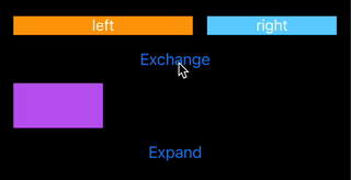
Layout transition animations
Layout transition animations in easy way. Just write:
override func animateLayoutTransition(_ context: ASContextTransitioning) {
    animateLayoutTransition(context: context)
}
Example:
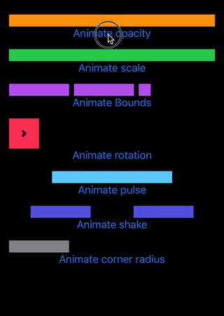
Node animations
Node animations in easy way.
Example:
pulseNode.animate(.scale(values: [1, 1.1, 0.9, 1.2, 0.8, 1.1, 0.9, 1]), duration: 1)
Result:

More examples:
Themes support in easy way. Default light / dark or custom init.
ASDimension
Init support.
With raw Texture:
style.height = ASDimension(unit: .auto, value: 0)
style.height = ASDimension(unit: .points, value: height)
style.height = ASDimension(unit: .fraction, value: 0.3)
With VATextureKit:
style.height = .auto
style.height = .points(height)
style.height = .fraction(0.3)
style.height = .fraction(percent: 30)
CGSize
Math:
CGSize(width: 2, height: 2) * 2 = CGSize(width: 4, height: 4)

CGSize(width: 2, height: 2) + 1 = CGSize(width: 3, height: 3)
Initializer:
CGSize(same: 16) == CGSize(width: 16, height: 16)
UIEdgeInsets
Variables:
/// (top, left)
origin: CGPoint

/// top + bottom
vertical: CGFloat

/// left + right
horizontal: CGFloat
Initializer:
UIEdgeInsets(all: 16) == UIEdgeInsets(top: 16, left: 16, bottom: 16, right: 16)

UIEdgeInsets(vertical: 16) == UIEdgeInsets(top: 16, left: 0, bottom: 16, right: 0)

UIEdgeInsets(horizontal: 16) == UIEdgeInsets(top: 0, left: 16, bottom: 0, right: 16)

UIEdgeInsets(vertical: 4, horizontal: 8) == UIEdgeInsets(top: 4, left: 8, bottom: 4, right: 8)
Node preview in easy way with support function:
sRepresentation(layout:)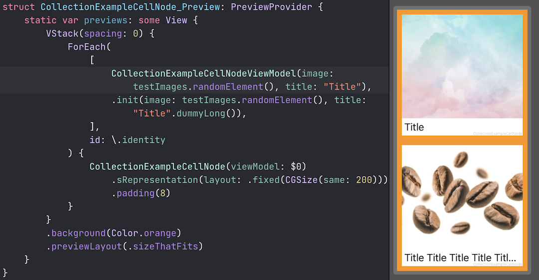
*Part of VATextureKitRx
- Obs
- Relay(value:) (BehaviorRelay)
- Relay() (PublishRelay)
With these wrappers, the code becomes more concise.
BehaviorRelay
var someObs: Observable<String> { someRelay.asObservable() }

private let someRelay = BehaviorRelay<String>(value: "value")
...
someRelay.accept("value1")
becomes
@Obs.Relay(value: "value")
var someObs: Observable<String>
...
_someObs.rx.accept("value1")
PublishRelay
var someObs: Observable<String> { someRelay.asObservable() }

private let someRelay = PublishRelay<String>()
becomes
@Obs.Relay()
var someObs: Observable<String>
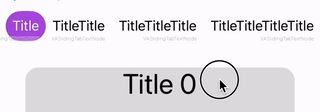
VASlidingTabBarNode
VAEmitterNode

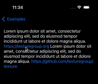
VALinkTextNode