Button Card by @RomRider


Lovelace Button card for your entities.

- Features
- Configuration
- Installation
- Examples
- Community guides
- Credits
- works with any toggleable entity
- 6 available actions on tap and/or hold and/or double click:
none,toggle,more-info,navigate,url,assistandcall-service - state display (optional)
- custom color (optional), or based on light rgb value/temperature
- custom state definition with customizable color, icon and style (optional)
- custom size of the icon, width and height (optional)
- aspect ratio support (optional)
- Support for javascript templates in some fields
- custom icon (optional)
- custom css style (optional)
- multiple layout support and custom layout support
- units for sensors can be redefined or hidden
- 2 color types
icon: apply color settings to the icon onlycard: apply color settings to the card only
- automatic font color if color_type is set to
card - blank card and label card (for organization)
- blink animation support
- rotating animation support
- confirmation popup for sensitive items (optional) or locking mecanism
- haptic support for the IOS companion App
- support for custom_updater and HACS
| Name | Type | Default | Supported options | Description |
|---|---|---|---|---|
type |
string | Required | custom:button-card |
Type of the card |
template |
string | optional | any valid template from button_card_templates |
See configuration template |
entity |
string | optional | switch.ac |
entity_id |
triggers_update |
string or array | optional | switch.ac |
entity_id list that would trigger a card update, see triggers_update |
group_expand |
boolean | false | true | false |
When true, if any of the entities triggering a card update is a group, it will auto-expand the group and the card will update on any child entity state change. This works with nested groups too. See triggers_update |
icon |
string | optional | mdi:air-conditioner |
Icon to display. Will be overridden by the icon defined in a state (if present). Defaults to the entity icon. Hide with show_icon: false. Supports templates, see templates |
color_type |
string | icon |
icon | card | blank-card | label-card |
Color either the background of the card or the icon inside the card. Setting this to card enable automatic font and icon color. This allows the text/icon to be readable even if the background color is bright/dark. Additional color-type options blank-card and label-card can be used for organisation (see examples). |
color |
string | optional | auto | auto-no-temperature | rgb(28, 128, 199) |
Color of the icon/card. auto sets the color based on the color of a light including the temperature of the light. Setting this to auto-no-temperature will behave like home-assistant's default, ignoring the temperature of the light. By default, if the entity state is off, the color will be var(--paper-item-icon-color), for on it will be var(--paper-item-icon-active-color) and for any other state it will be var(--primary-text-color). You can redefine each colors using state |
size |
string | 40% |
20px |
Size of the icon. Can be percentage or pixel |
aspect_ratio |
string | optional | 1/1, 2/1, 1/1.5, ... |
See here for an example. Aspect ratio of the card. 1/1 being a square. This will auto adapt to your screen size |
tap_action |
object | optional | See Action | Define the type of action on click, if undefined, toggle will be used. |
hold_action |
object | optional | See Action | Define the type of action on hold, if undefined, nothing happens. |
double_tap_action |
object | optional | See Action | Define the type of action on double click, if undefined, nothing happens. |
name |
string | optional | Air conditioner |
Define an optional text to show below the icon. Supports templates, see templates |
state_display |
string | optional | On |
Override the way the state is displayed. Supports templates, see templates |
label |
string | optional | Any string that you want | Display a label below the card. See Layouts for more information. Supports templates, see templates |
show_name |
boolean | true |
true | false |
Wether to show the name or not. Will pick entity_id's name by default, unless redefined in the name property or in any state name property |
show_state |
boolean | false |
true | false |
Show the state on the card. defaults to false if not set |
numeric_precision |
number | none | any number | Force the display precision of the state to be with numeric_precision decimals |
show_icon |
boolean | true |
true | false |
Wether to show the icon or not. Unless redefined in icon, uses the default entity icon from hass |
show_units |
boolean | true |
true | false |
Display or hide the units of a sensor, if any. |
show_label |
boolean | false |
true | false |
Display or hide the label |
show_last_changed |
boolean | false |
true | false |
Replace the label altogether and display the the last_changed attribute in a nice way (eg: 12 minutes ago) |
show_entity_picture |
boolean | false |
true | false |
Replace the icon by the entity picture (if any) or the custom picture (if any). Falls back to using the icon if both are undefined |
show_live_stream |
boolean | false |
true | false |
Display the camera stream (if the entity is a camera). Requires the stream: component to be enabled in home-assistant's config |
entity_picture |
string | optional | Can be any of /local/* file or a URL |
Will override the icon/the default entity_picture with your own image. Best is to use a square image. You can also define one per state. Supports templates, see templates |
units |
string | optional | Kb/s, lux, ... |
Override or define the units to display after the state of the entity. If omitted, it's using the entity's units |
styles |
object list | optional | See styles | |
extra_styles |
string | optional | See styles | |
state |
object list | optional | See State | State to use for the color, icon and style of the button. Multiple states can be defined |
confirmation |
object | optional | See confirmation | Display a confirmation popup |
lock |
object | optional | See Lock Object | Displays a lock on the button |
layout |
string | optional | See Layout | The layout of the button can be modified using this option |
custom_fields |
object | optional | See Custom Fields | |
variables |
object | optional | See Variables | |
card_size |
number | 3 | Any number | Configure the card size seen by the auto layout feature of lovelace (lovelace will multiply the value by about 50px) |
tooltip |
string | optional | Any string | (Not supported on touchscreens) You can configure the tooltip displayed after hovering the card for 1.5 seconds . Supports templates, see templates |
All the fields support templates, see templates.
| Name | Type | Default | Supported options | Description |
|---|---|---|---|---|
action |
string | toggle |
more-info, toggle, call-service, none, navigate, url, assist |
Action to perform |
entity |
string | none | Any entity id | Only valid for action: more-info to override the entity on which you want to call more-info |
target |
object | none | Only works with call-service. Follows the home-assistant syntax |
|
navigation_path |
string | none | Eg: /lovelace/0/ |
Path to navigate to (e.g. /lovelace/0/) when action defined as navigate |
url_path |
string | none | Eg: https://www.google.fr |
URL to open on click when action is url. The URL will open in a new tab |
service |
string | none | Any service | Service to call (e.g. media_player.media_play_pause) when action defined as call-service |
data or service_data |
object | none | Any service data | Service data to include (e.g. entity_id: media_player.bedroom) when action defined as call-service. If your data requires an entity_id, you can use the keywork entity, this will actually call the service on the entity defined in the main configuration of this card. Useful for configuration templates |
haptic |
string | none | success, warning, failure, light, medium, heavy, selection |
Haptic feedback for the Beta IOS App |
repeat |
number | none | eg: 500 |
For a hold_action, you can optionally configure the action to repeat while the button is being held down (for example, to repeatedly increase the volume of a media player). Define the number of milliseconds between repeat actions here. |
repeat_limit |
number | none | eg: 5 |
For Hold action and if repeat if defined, it will stop calling the action after the repeat_limit has been reached. |
confirmation |
object | none | See confirmation | Display a confirmation popup, overrides the default confirmation object |
This will popup a dialog box before running the action.
| Name | Type | Default | Supported options | Description |
|---|---|---|---|---|
text |
string | none | Any text | This text will be displayed in the popup. Supports templates, see templates |
exemptions |
array of users | none | user: USER_ID |
Any user declared in this list will not see the confirmation dialog |
Example:
confirmation:
  text: '[[[ return `Are you sure you want to toggle ${entity.attributes.friendly_name}?` ]]]'
  exemptions:
- user: befc8496799848bda1824f2a8111e30aThis will display a normal button with a lock symbol in the corner. Clicking the button will make the lock go away and enable the button to be manoeuvred for delay seconds (5 by default).
| Name | Type | Default | Supported options | Description |
|---|---|---|---|---|
enabled |
boolean | false |
true | false |
Enables or disables the lock. Supports templates, see templates |
duration |
number | 5 |
any number | Duration of the unlocked state in seconds |
exemptions |
array of user id or username | none | user: USER_ID | username: test |
Any user declared in this list will not see the confirmation dialog. It can be a user id (user) or a username (username) |
unlock |
string | tap |
tap | hold | double_tap |
The type of click which will unlock the button |
Example:
lock:
  enabled: '[[[ return entity.state === "on"; ]]]'
  duration: 10
  unlock: hold
  exemptions:
    - username: test
    - user: befc8496799848bda1824f2a8111e30a
If you want to lock the button for everyone and disable the unlocking possibility, set the exemptions object to []:
lock:
  enabled: true
  exemptions: []
By default the lock is visible in the upper-right corner. If you want to move the position of the lock to for example the bottom-right corner you can use this code:
styles:
  lock:
    - justify-content: flex-end
- align-items: flex-end| Name | Type | Default | Supported options | Description |
|---|---|---|---|---|
operator |
string | == |
See Available Operators | The operator used to compare the current state against the value |
value |
string/number | required (unless operator is default) |
If your entity is a sensor with numbers, use a number directly, else use a string | The value which will be compared against the current state of the entity |
name |
string | optional | Any string, 'Alert', 'My little switch is on', ... |
if show_name is true, the name to display for this state. If defined uses the general config name and if undefined uses the entity name. Supports templates, see templates |
icon |
string | optional | mdi:battery |
The icon to display for this state - Defaults to the entity icon. Hide with show_icon: false. Supports templates, see templates |
color |
string | var(--primary-text-color) |
Any color, eg: rgb(28, 128, 199) or blue |
The color of the icon (if color_type: icon) or the background (if color_type: card) |
styles |
string | optional | See styles | |
spin |
boolean | false |
true | false |
Should the icon spin for this state? |
entity_picture |
string | optional | Can be any of /local/* file or a URL |
Will override the icon/the default entity_picture with your own image for this state. Best is to use a square image. Supports templates, see templates |
label |
string | optional | Any string that you want | Display a label below the card. See Layouts for more information. Supports templates, see templates |
state_display |
string | optional | On |
If defined, override the way the state is displayed. Supports templates, see templates |
The order of your elements in the state object matters. The first one which is true will match. The value field for all operators except regex support templating, see templates
| Operator | value example |
Description |
|---|---|---|
< |
5 |
Current state is inferior to value |
<= |
4 |
Current state is inferior or equal to value |
== |
42 or 'on' |
This is the default if no operator is specified. Current state is equal (== javascript) to value |
>= |
32 |
Current state is superior or equal to value |
> |
12 |
Current state is superior to value |
!= |
'normal' |
Current state is not equal (!= javascript) to value |
regex |
'^norm.*$' |
value regex applied to current state does match |
template |
See templates for examples. value needs to be a javascript expression which returns a boolean. If the boolean is true, it will match this state |
|
default |
N/A | If nothing matches, this is used |
This option enables you to modify the layout of the card.
It is fully compatible with every show_* option. Make sure you set show_state: true if you want to show the state
Multiple values are possible, see the image below for examples:
vertical(default value if nothing is provided): Everything is centered vertically on top of each othericon_name_state: Everything is aligned horizontally, name and state are concatenated, label is centered belowname_state: Icon sits on top of name and state concatenated on one line, label belowicon_name: Icon and name are horizontally aligned, state and label are centered belowicon_state: Icon and state are horizontally aligned, name and label are centered belowicon_label: Icon and label are horizontally aligned, name and state are centered belowicon_name_state2nd: Icon, name and state are horizontally aligned, name is above state, label below name and stateicon_state_name2nd: Icon, name and state are horizontally aligned, state is above name, label below name and state

This field defines which entities should trigger an update of the card itself (this rule doesn't apply for nested cards in custom_fields as they are always updated with the latest state. This is expected and fast!). This was introduced in 3.3.0 to reduce the load on the frontend.
If you don't have javascript [[[ ]]] templates in your config, you don't need to do anything, else read further.
By default, the card will update itself when the main entity in the configuration is updated. In any case, the card will parse your code and look for entities that it can match (it only matches states['ENTITY_ID']) so:
return states['switch.myswitch'].state // will match switch.myswitch
 // but
 const test = switch.myswitch
 return states[test].state // will not match anything
In this second case, you have 2 options:
-
Set the value of
triggers_updatetoall(This was the behavior of button-card < 3.3.0)triggers_update: all
-
Set the value of
triggers_updateto a list of entities. When any of the entities in this list is updated, the card will be updated. The logic is the same as the internal home-assistant* templatesintegration (see here for example):type: custom:button-card entity: sensor.mysensor # No need to repeat this one in the triggers_update, it is added by default triggers_update: - switch.myswitch - light.mylight
If your entity, any entity in the triggers_update field or any entity matched from your templates are a group and you want to update the card if any of the nested entity in that group update its state, then you can set group_expand to true. It will do the work for you and you won't have to specify manually the full list of entities in triggers_update.
The template rendering uses a special format. All the fields where template is supported also support plain text. To activate the templating feature for such a field, you'll need to enclose the javascript function inside 3 square brackets: [[[ javascript function here ]]]
Don't forget to quote if it's on one line:
name: '[[[ if (entity.state > 42) return "Above 42"; else return "Below 42" ]]]'
name: >
  [[[
    if (entity.state > 42)
      return "Above 42";
    else
      return "Below 42";
  ]]]
Those are the configuration fields which support templating:
name(Supports also HTML rendering): This needs to return a string or anhtml`<elt></elt>`objectstate_display(Supports also HTML rendering): This needs to return a string or anhtml`<elt></elt>`objectlabel(Supports also HTML rendering): This needs to return a string or anhtml`<elt></elt>`objectentity_picture: This needs to return a path to a file or a url as a string.icon: This needs to return a string in the formatmdi:icon- All the styles in the style object: This needs to return a string
- All the value of the state object, apart from when the operator is
regexoperator: template: The function forvalueneeds to return a boolean- Else: The function for
valueneeds to return a string or a number
- All the
custom_fields(Support also HTML rendering): This needs to return a string or anhtml`<elt></elt>`object - All the
styles: Each entry needs to return a string (See here for some examples) - The
extra_stylesfield - Everything field in
*_action - The confirmation text (
confirmation.text) - The lock being enabled or not (
lock.enabled) - all the
cardparameters in acustom_field - all the
variables
Special fields which do support templating but are only evaluated once, when the configuration is loaded. Error in those templates will only be visible in the javascript console and the card will not display in that case:
-
entity: You can use JS templates for theentityof the card configuration. It is mainly useful when you define your entity in as an entry invariables. This is evaluated once only when the configuration is loaded.type: custom:button-card variables: my_entity: switch.skylight entity: '[[[ return variables.my_entity; ]]]'
-
triggers_update: Useful when you define multiple entities invariablesto use throughout the card. Eg:type: custom:button-card variables: my_entity: switch.skylight my_other_entity: light.bedroom entity: '[[[ return variables.my_entity; ]]]' label: '[[[ return localize(variables.my_other_entity) ]]]' show_label: true triggers_update: - '[[[ return variables.my_entity; ]]]' - '[[[ return variables.my_other_entity; ]]]'
Inside the javascript code, you'll have access to those variables:
this: The button-card element itself (advanced stuff, don't mess with it)entity: The current entity object, if the entity is defined in the cardstates: An object with all the states of all the entities (equivalent tohass.states)user: The user object (equivalent tohass.user)hass: The completehassobjectvariables: an object containing all your variables defined in the configuration. See Variables- Helper functions availble through the object
helpers:helpers.localize(entity, state?, numeric_precision?, show_units?, units?): a function which localizes a state to your language (eg.helpers.localize(entity)) and returns a string. Takes an entity object as argument (not the state of the entity as we need context) and takes optional arguments. Works with numerical states also.- If
stateis not provided, it localizes the state of theentity(Eg.helpers.localize(entity)orhelpers.localize(states['weather.your_city'])). - If
stateis provided, it localizesstatein the context of theentity(eg. :helpers.localize(entity, entity.attributes.forecast[0].condition)orhelpers.localize(states['weather.your_city'], states['weather.your_city'].attributes.forecast[0].condition)) numeric_precision(number or'card'. Default isundefined): For state which are numbers, force the precision instead of letting HA decide for you. If the value is set to'card', it will use thenumeric_precisionfrom the main config. Ifundefined, it will use the default value for the entity you're willing to display. The latter is the default.show_units(boolean. Default istrue): Will display units or not. Default is to display them.units(string): Will force the units to be the value of that parameter.- To skip one or multiple parameter while calling the function, use
undefined. Eg.helpers.localize(states['sensor.temperature'], undefined, 1, undefined, 'Celcius')
- If
- Date, Time and Date Time format helpers, all localized (takes a string or a
Dateobject as input):helpers.formatTime(time): 21:15 / 9:15helpers.formatTimeWithSeconds(time): 9:15:24 PM || 21:15:24helpers.formatTimeWeekday(time): Tuesday 7:00 PM || Tuesday 19:00helpers.formatTime24h(time): 21:15helpers.formatDateWeekdayDay(date): Tuesday, August 10helpers.formatDate(date): August 10, 2021helpers.formatDateNumeric(date): 10/08/2021helpers.formatDateShort(date): Aug 10helpers.formatDateMonthYear(date): August 2021helpers.formatDateMonth(date): Augusthelpers.formatDateYear(date): 2021helpers.formatDateWeekday(date): Mondayhelpers.formatDateWeekdayShort(date): Monhelpers.formatDateTime(datetime): August 9, 2021, 8:23 AMhelpers.formatDateTimeNumeric(datetime): Aug 9, 2021, 8:23 AMhelpers.formatDateTimeWithSeconds(datetime): Aug 9, 8:23 AMhelpers.formatShortDateTime(datetime): August 9, 2021, 8:23:15 AMhelpers.formatShortDateTimeWithYear(datetime): 9/8/2021, 8:23 AM- Example:
return helpers.formatDateTime(entity.attribute.last_changed)
helpers.relativeTime(date, capitalize? = false): Returns an lit-html template which will render a relative time and update automatically.dateshould be a string.capitalizeis an optional boolean, if set totrue, the first letter will be uppercase. Usage for eg.:return helpers.relativeTime(entity.last_changed)
See here for some examples or here for some crazy advanced stuff using templates!
All the styles entries, support Templating, see here for some examples.
For each element in the card, styles can be defined in 2 places:
- in the main part of the config
- in each state
Styles defined in each state are additive with the ones defined in the main part of the config. In the state part, just define the ones specific to your current state and keep the common ones in the main part of the config.
The style object members are:
card: styles for the card itself. Styles that are defined here will be applied to the whole card and its content, unless redefined in elements below.icon: styles for the iconentity_picture: styles for the picture (if any)name: styles for the namestate: styles for the statelabel: styles for the labellock: styles for the lock icon (see here for the default style)tooltip: styles for the tooltip overlay (see here)custom_fields: styles for each of your custom fields. See Custom Fields
- type: custom:button-card
  [...]
  styles:
    card:
      - xxxx: value
    icon:
      - xxxx: value
    entity_picture:
      - xxxx: value
    name:
      - xxxx: value
    state:
      - xxxx: value
    label:
      - xxxx: value
  state:
    - value: 'on'
      styles:
        card:
          - yyyy: value
        icon:
          - yyyy: value
        entity_picture:
          - yyyy: value
        name:
          - yyyy: value
        state:
          - yyyy: value
        label:
          - yyyy: value
This will render:
- The
cardwith the stylesxxxx: valueandyyyy: valueapplied - Same for all the others.
See styling for a complete example.
If a light entity is assigned to the button, then:
- the CSS variable
--button-card-light-colorwill contain the current light color - the CSS variable
--button-card-light-color-no-temperaturewill contain the current light without the temperature
You can use them both in other parts of the button. When off, it will be set to var(--paper-item-icon-color)

styles:
  name:
    - color: var(--button-card-light-color)
  card:
    - -webkit-box-shadow: 0px 0px 9px 3px var(--button-card-light-color)
- box-shadow: 0px 0px 9px 3px var(--button-card-light-color)For advanced styling, there are 2 other options in the styles config object:
grid: mainly layout for the gridimg_cell: mainly how you position your icon in its cell
This is how the button is constructed (HTML elements):

The grid element uses CSS grids to design the layout of the card:
img_cellelement is going to thegrid-area: iby defaultnameelement is going to thegrid-area: nby defaultstateelement is going to thegrid-area: sby defaultlabelelement is going to thegrid-area: lby default
You can see how the default layouts are constructed here and inspire yourself with it. We'll not support advanced layout questions here, please use Home Assistant's community forum for that.
To learn more, please use Google and this excellent guide about CSS Grids :)
For a quick overview on the grid-template-areas attribute, the following example should get you started:
- grid-template-areas: '"i n s" "i n s" "i n l"'If we take the value and orient it into rows and columns, you begin to see the end result.
"i n s"
"i n s"
"i n l"
The end product will results in the following grid layout

Some examples:
-
label on top:
styles:
  grid:
    - grid-template-areas: '"l" "i" "n" "s"'
    - grid-template-rows: min-content 1fr min-content min-content
    - grid-template-columns: 1fr
-
icon on the right side (by overloading an existing layout):
- type: 'custom:button-card'
  entity: sensor.sensor1
  layout: icon_state_name2nd
  show_state: true
  show_name: true
  show_label: true
  label: label
  styles:
    grid:
      - grid-template-areas: '"n i" "s i" "l i"'
      - grid-template-columns: 1fr 40%
-
Apple Homekit-like buttons:
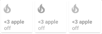
- type: custom:button-card
  entity: switch.skylight
  name: <3 Apple
  icon: mdi:fire
  show_state: true
  styles:
    card:
      - width: 100px
      - height: 100px
    grid:
      - grid-template-areas: '"i" "n" "s"'
      - grid-template-columns: 1fr
      - grid-template-rows: 1fr min-content min-content
    img_cell:
      - align-self: start
      - text-align: start
    name:
      - justify-self: start
      - padding-left: 10px
      - font-weight: bold
      - text-transform: lowercase
    state:
      - justify-self: start
      - padding-left: 10px
  state:
    - value: 'off'
      styles:
        card:
          - filter: opacity(50%)
        icon:
          - filter: grayscale(100%)

Note: extra_styles MUST NOT be used on the first button-card of the current view, else it will be applied to all the cards in all Lovelace. It is not possible to fix this behaviour.
You can inject any CSS style you want using this config option. It is useful if you want to inject CSS animations for example. This field supports templates.
An example is better than words:

- type: custom:button-card
  name: Change Background
  aspect_ratio: 2/1
  extra_styles: |
    @keyframes bgswap1 {
      0% {
        background-image: url("/local/background1.jpg");
      }
      25% {
        background-image: url("/local/background1.jpg");
      }
      50% {
        background-image: url("/local/background2.jpg");
      }
      75% {
        background-image: url("/local/background2.jpg");
      }
      100% {
        background-image: url("/local/background1.jpg");
      }
    }
  styles:
    card:
      - animation: bgswap1 10s linear infinite
      - background-size: cover
    name:
      - color: white
Custom fields support, using the custom_fields object, enables you to create your own fields on top of the pre-defined ones (name, state, label and icon). This is an advanced feature which leverages (if you require it) the CSS Grid.
Custom fields also support embeded cards, see example below.
Each custom field supports its own styling config, the name needs to match between both objects needs to match:
- type: custom:button-card
  [...]
  custom_fields:
    test_element: My test element
  styles:
    custom_fields:
      test_element:
        - color: red
        - font-size: 13px
Examples are better than a long text, so here you go:
-
Placing an element wherever you want (that means bypassing the grid). Set the grid to
position: relativeand set the element toposition: absolute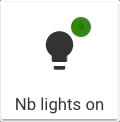
- type: custom:button-card
  icon: mdi:lightbulb
  aspect_ratio: 1/1
  name: Nb lights on
  styles:
    grid:
      - position: relative
    custom_fields:
      notification:
        - background-color: >
            [[[
              if (states['input_number.test'].state == 0)
                return "green";
              return "red";
            ]]]


        - border-radius: 50%
        - position: absolute
        - left: 60%
        - top: 10%
        - height: 20px
        - width: 20px
        - font-size: 8px
        - line-height: 20px
  custom_fields:
    notification: >
      [[[ return Math.floor(states['input_number.test'].state / 10) ]]]
-
Or you can use the grid. Each element will have it's name positioned as the
grid-area: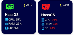
- type: custom:button-card
  entity: 'sensor.raspi_temp'
  icon: 'mdi:raspberry-pi'
  aspect_ratio: 1/1
  name: HassOS
  styles:
    card:
      - background-color: '#000044'
      - border-radius: 10%
      - padding: 10%
      - color: ivory
      - font-size: 10px
      - text-shadow: 0px 0px 5px black
      - text-transform: capitalize
    grid:
      - grid-template-areas: '"i temp" "n n" "cpu cpu" "ram ram" "sd sd"'
      - grid-template-columns: 1fr 1fr
      - grid-template-rows: 1fr min-content min-content min-content min-content
    name:
      - font-weight: bold
      - font-size: 13px
      - color: white
      - align-self: middle
      - justify-self: start
      - padding-bottom: 4px
    img_cell:
      - justify-content: start
      - align-items: start
      - margin: none
    icon:
      - color: >
          [[[
            if (entity.state < 60) return 'lime';
            if (entity.state >= 60 && entity.state < 80) return 'orange';
            else return 'red';
          ]]]


      - width: 70%
      - margin-top: -10%
    custom_fields:
      temp:
        - align-self: start
        - justify-self: end
      cpu:
        - padding-bottom: 2px
        - align-self: middle
        - justify-self: start
        - --text-color-sensor: '[[[ if (states["sensor.raspi_cpu"].state > 80) return "red"; ]]]'
      ram:
        - padding-bottom: 2px
        - align-self: middle
        - justify-self: start
        - --text-color-sensor: '[[[ if (states["sensor.raspi_ram"].state > 80) return "red"; ]]]'
      sd:
        - align-self: middle
        - justify-self: start
        - --text-color-sensor: '[[[ if (states["sensor.raspi_sd"].state > 80) return "red"; ]]]'
  custom_fields:
    temp: >
      [[[
        return `<ha-icon
          icon="mdi:thermometer"
          style="width: 12px; height: 12px; color: yellow;">
          </ha-icon><span>${entity.state}°C</span>`
      ]]]


    cpu: >
      [[[
        return `<ha-icon
          icon="mdi:server"
          style="width: 12px; height: 12px; color: deepskyblue;">
          </ha-icon><span>CPU: <span style="color: var(--text-color-sensor);">${states['sensor.raspi_cpu'].state}%</span></span>`
      ]]]


    ram: >
      [[[
        return `<ha-icon
          icon="mdi:memory"
          style="width: 12px; height: 12px; color: deepskyblue;">
          </ha-icon><span>RAM: <span style="color: var(--text-color-sensor);">${states['sensor.raspi_ram'].state}%</span></span>`
      ]]]


    sd: >
      [[[
        return `<ha-icon
          icon="mdi:harddisk"
          style="width: 12px; height: 12px; color: deepskyblue;">
          </ha-icon><span>SD: <span style="color: var(--text-color-sensor);">${states['sensor.raspi_sd'].state}%</span></span>`
      ]]]
-
Or you can embed a card (or multiple) inside the button card (note, this configuration uses card-mod to remove the
box-shadowof the sensor card. -
This is what the
styleinside the embedded card is for):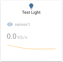
- type: custom:button-card
  aspect_ratio: 1/1
  custom_fields:
    graph:
      card:
        type: sensor
        entity: sensor.sensor1
        graph: line
        style: |
          ha-card {
            box-shadow: none;
          }
  styles:
    custom_fields:
      graph:
        - filter: opacity(50%)
        - overflow: unset
    card:
      - overflow: unset
    grid:
      - grid-template-areas: '"i" "n" "graph"'
      - grid-template-columns: 1fr
      - grid-template-rows: 1fr min-content min-content

  entity: light.test_light
  hold_action:
    action: more-info


To skip evaluating the templates in a custom_field (eg. you embed a custom:button-card inside a Custom Field), then you have to set do_not_eval to true.
type: custom:button-card
styles:
  grid:
    - grid-template-areas: "'test1' 'test2'"
variables:
  b: 42
custom_fields:
  test1:
    card:
      type: custom:button-card
      variables:
        c: 42
      ## This will return: B: 42 / C: undefined
      ## as it is evaluated in the context of the
      ## main card (which doesn't know about c)
      name: '[[[ return `B: ${variables.b} / C: ${variables.c}` ]]]'
  test2:
    ## This stops the evaluation of js templates
    ## for the card object in this custom field
    do_not_eval: true
    card:
      type: custom:button-card
      variables:
        c: 42
      ## This will return: B: undefined / C: 42
      ## as it is evaluated in the context of the local button-card
      ## inside the custom_field (which doesn't know about b)
name: '[[[ return `B: ${variables.b} / C: ${variables.c}` ]]]'-
Define your config template in the main lovelace configuration and then use it in your button-card. This will avoid a lot of repetitions! It's basically YAML anchors, but without using YAML anchors and is very useful if you split your config in multiple files 😄
-
You can overload any parameter with a new one
-
You can merge states together by
idwhen using templates. The states you want to merge have to have the sameid. Thisidparameter is new and can be anything (string, number, ...). States withoutidwill be appended to the state array. Styles embedded in a state are merged together as usual. See here for an example. -
You can also inherit another template from within a template.
-
You can inherit multiple templates at once by making it an array. In this case, the templates will be merged together with the current configuration in the order they are defined. This happens recursively.
type: custom:button-card
template:
  - template1
  - template2
The button templates will be applied in the order they are defined:
template2will be merged withtemplate1and then the local config will be merged with the result. You can still chain templates together (ie. define template in a button-card template. It will follow the path recursively).
Make sure which type of lovelace dashboard you are using before changing the main lovelace configuration:
managedchanges are managed by lovelace ui - add the template configuration to configuration in raw editor- go to your dashboard
- click three dots and
Edit dashboardbutton - click three dots again and click
Raw configuration editorbutton
yaml- add template configuration to yourui-lovelace.yaml
button_card_templates:
  header:
    styles:
      card:
        - padding: 5px 15px
        - background-color: var(--paper-item-icon-active-color)
      name:
        - text-transform: uppercase
        - color: var(--primary-background-color)
        - justify-self: start
        - font-weight: bold
      label:
        - text-transform: uppercase
        - color: var(--primary-background-color)
        - justify-self: start
        - font-weight: bold

  header_red:
    template: header
    styles:
      card:
        - background-color: '#FF0000'

  my_little_template: [...]
And then where you use button-card, you can apply this template, and/or overload it:
- type: custom:button-card
  template: header_red
name: My Test HeaderExample to merge state by id:
button_card_templates:
  sensor:
    styles:
      card:
        - font-size: 16px
        - width: 75px
    tap_action:
      action: more-info
    state:
      - color: orange
        value: 75
        id: my_id

  sensor_humidity:
    template: sensor
    icon: 'mdi:weather-rainy'
    state:
      - color: 'rgb(255,0,0)'
        operator: '>'
        value: 50
      - color: 'rgb(0,0,255)'
        operator: '<'
        value: 25

  sensor_test:
    template: sensor_humidity
    state:
      - color: pink
        id: my_id
        operator: '>'
        value: 75
        styles:
          name:
            - color: '#ff0000'
############### Used like this ##############
  - type: custom:button-card
    template: sensor_test
    entity: input_number.test
    show_entity_picture: true
Will result in this state object for your button (styles, operator and color are overridden for the id: my_id as you can see):
state:
  - color: pink
    operator: '>'
    value: 75
    styles:
      name:
        - color: '#ff0000'
  - color: 'rgb(255,0,0)'
    operator: '>'
    value: 50
  - color: 'rgb(0,0,255)'
    operator: '<'
value: 25You can add variables to your templates and overload them in the instance of your button card. This lets you easily work with templates without the need to redefine everything for a small change.
An example below:
button_card_templates:
  variable_test:
    variables:
      var_name: "var_value"
      var_name2: "var_value2"
    name: '[[[ return variables.var_name ]]]'

[...]

- type: custom:button-card
  template: variable_test
  entity: sensor.test
  # name will be "var_value"

- type: custom:button-card
  template: variable_test
  entity: sensor.test
  variables:
    var_name: "My local Value"
 # name will be "My local Value"
Variables are evaluated in their alphabetical order based on their name. That means a variable named b can depend on a variable named a, but variable named a can't depend on a variable named b.
### This works
variables:
  index: 2
  value: '[[[ return variables.index + 2; ]]]'
name: '[[[ return variable.value; ]]]' # would return 4

### This doesn't work
variables:
  z_index: 2
  value: '[[[ return variables.z_index + 2; ]]]' # This would fail because z comes after v in the alphabet.
name: '[[[ return variable.value; ]]]'-
Download the button-card
-
Place the file in your
config/wwwfolder -
Include the card code in your
ui-lovelace-card.yamltitle: Home resources: - url: /local/button-card.js type: module
-
Write configuration for the card in your
ui-lovelace.yaml
-
Make sure the HACS component is installed and working.
-
Search for
button-cardand add it through HACS -
Add the configuration to your
ui-lovelace.yamlresources: - url: /hacsfiles/button-card/button-card.js type: module
-
Refresh home-assistant.
Show a button for the air conditioner (blue when on, var(--disabled-text-color) when off):

- type: 'custom:button-card'
  entity: switch.ac
  icon: mdi:air-conditioner
  color: rgb(28, 128, 199)
Redefine the color when the state if off to red:
- type: 'custom:button-card'
  entity: switch.ac
  icon: mdi:air-conditioner
  color: rgb(28, 128, 199)
  state:
    - value: 'off'
      color: rgb(255, 0, 0)
Show an ON/OFF button for the home_lights group:
- type: 'custom:button-card'
  entity: group.home_lights
  show_icon: false
  show_state: true
Light entity with custom icon and "more info" pop-in:

- type: 'custom:button-card'
  entity: light.living_room_lights
  icon: mdi:sofa
  color: auto
  tap_action:
    action: more-info
Light card with card color type, name, and automatic color:

- type: 'custom:button-card'
  entity: light._
  icon: mdi:home
  color: auto
  color_type: card
  tap_action:
    action: more-info
  name: Home
  styles:
    card:
      - font-size: 12px
      - font-weight: bold
Horizontal stack with :
- 2x blank cards
- 1x volume up button with service call
- 1x volume down button with service call
- 2x blank cards

- type: horizontal-stack
  cards:
    - type: 'custom:button-card'
      color_type: blank-card
    - type: 'custom:button-card'
      color_type: blank-card
    - type: 'custom:button-card'
      color_type: card
      color: rgb(223, 255, 97)
      icon: mdi:volume-plus
      tap_action:
        action: call-service
        service: media_player.volume_up
        data:
          entity_id: media_player.living_room_speaker
    - type: 'custom:button-card'
      color_type: card
      color: rgb(223, 255, 97)
      icon: mdi:volume-minus
      tap_action:
        action: call-service
        service: media_player.volume_down
        data:
          entity_id: media_player.living_room_speaker
    - type: 'custom:button-card'
      color_type: blank-card
    - type: 'custom:button-card'
      color_type: blank-card
Vertical Stack with :
- 1x label card
- Horizontal Stack with :
- 1x Scene 1 Button
- 1x Scene 2 Button
- 1x Scene 3 Button
- 1x Scene 4 Button
- 1x Scene Off Button

- type: vertical-stack
  cards:
    - type: 'custom:button-card'
      color_type: label-card
      color: rgb(44, 109, 214)
      name: Kitchen
    - type: horizontal-stack
      cards:
        - type: 'custom:button-card'
          entity: switch.kitchen_scene_1
          color_type: card
          color: rgb(66, 134, 244)
          icon: mdi:numeric-1-box-outline
        - type: 'custom:button-card'
          entity: switch.kitchen_scene_2
          color_type: card
          color: rgb(66, 134, 244)
          icon: mdi:numeric-2-box-outline
        - type: 'custom:button-card'
          entity: switch.kitchen_scene_3
          color_type: card
          color: rgb(66, 134, 244)
          icon: mdi:numeric-3-box-outline
        - type: 'custom:button-card'
          entity: switch.kitchen_scene_4
          color_type: card
          color: rgb(66, 134, 244)
          icon: mdi:numeric-4-box-outline
        - type: 'custom:button-card'
          entity: switch.kitchen_off
          color_type: card
          color: rgb(66, 134, 244)
icon: mdi:eye-off-outlineInput select card with select next service and custom color and icon for states. In the example below the icon mdi:cube-outline will be used when value is sleeping and mdi:cube in other cases.

If you don't specify any operator, == will be used to match the current state against the value
- type: 'custom:button-card'
  entity: input_select.cube_mode
  icon: mdi:cube
  tap_action:
    action: call-service
    service: input_select.select_next
    data:
      entity_id: input_select.cube_mode
  show_state: true
  state:
    - value: 'sleeping'
      color: var(--disabled-text-color)
      icon: mdi:cube-outline
    - value: 'media'
      color: rgb(5, 147, 255)
    - value: 'light'
color: rgb(189, 255, 5)The definition order matters, the first item to match will be the one selected.
- type: "custom:button-card"
  entity: sensor.temperature
  show_state: true
  state:
    - value: 15
      operator: '<='
      color: blue
      icon: mdi:thermometer-minus
    - value: 25
      operator: '>='
      color: red
      icon: mdi:thermometer-plus
    - operator: 'default' # used if nothing matches
      color: yellow
      icon: mdi: thermometer
      styles:
        card:
- opacity: 0.5Buttons can link to different views using the navigate action:
- type: 'custom:button-card'
  color_type: label-card
  icon: mdi:home
  name: Go To Home
  tap_action:
    action: navigate
    navigation_path: /lovelace/0
The navigation_path also accepts any Home Assistant internal URL such as /dev-info or /hassio/dashboard for example.
You can make the whole button blink:

- type: 'custom:button-card'
  color_type: card
  entity: binary_sensor.intruder
  name: Intruder Alert
  state:
    - value: 'on'
      color: red
      icon: mdi:alert
      styles:
        card:
          - animation: blink 2s ease infinite
    - operator: default
      color: green
icon: mdi:shield-checkThrough the styles you can specify the width and height of the card, and also the icon size through the main size option. Playing with icon size will growth the card unless a height is specified.
If you specify a width for the card, it has to be in px. All the cards without a width defined will use the remaining space on the line.

- type: horizontal-stack
  cards:
    - type: 'custom:button-card'
      entity: light.test_light
      color: auto
      name: s:default h:200px
      styles:
        card:
          - height: 200px
    - type: 'custom:button-card'
      entity: light.test_light
      color_type: card
      color: auto
      name: s:100% h:200px
      size: 100%
      styles:
        card:
          - height: 200px
    - type: 'custom:button-card'
      entity: light.test_light
      color_type: card
      color: auto
      size: 10%
      name: s:10% h:200px
      styles:
        card:
          - height: 200px
- type: horizontal-stack
  cards:
    - type: 'custom:button-card'
      entity: light.test_light
      color: auto
      name: 60px
      styles:
        card:
          - height: 60px
          - width: 60px
    - type: 'custom:button-card'
      entity: light.test_light
      color_type: card
      color: auto
      name: 80px
      styles:
        card:
          - height: 80px
          - width: 30px
    - type: 'custom:button-card'
      entity: light.test_light
      color_type: card
      color: auto
      name: 300px
      styles:
        card:
          - height: 300px
- type: 'custom:button-card'
  color_type: icon
  entity: light.test_light
  label: >
    [[[
      var bri = states['light.test_light'].attributes.brightness;
      return 'Brightness: ' + (bri ? bri : '0') + '%';
    ]]]


  show_label: true
  size: 15%
  styles:
    card:
      - height: 100px
- type: 'custom:button-card'
  color_type: icon
  entity: light.test_light
  layout: icon_label
  label: >
    [[[
      return 'Other State: ' + states['switch.skylight'].state;
    ]]]


  show_label: true
  show_name: false
  styles:
    card:
- height: 100pxThe javascript code inside value needs to return true of false.
Example with template:
- type: 'custom:button-card'
  color_type: icon
  entity: switch.skylight
  show_state: true
  show_label: true
  state:
    - operator: template
      value: >
        [[[
          return states['light.test_light'].attributes
          && (states['light.test_light'].attributes.brightness <= 100)
        ]]]


      icon: mdi:alert
    - operator: default
      icon: mdi:lightbulb
- type: 'custom:button-card'
  color_type: icon
  entity: light.test_light
  show_label: true
  state:
    - operator: template
      value: >
        [[[ return states['input_select.light_mode'].state === 'night_mode' ]]]


      icon: mdi:weather-night
      label: Night Mode
    - operator: default
      icon: mdi:white-balance-sunny
      label: Day Mode
- type: 'custom:button-card'
  color_type: icon
  entity: light.test_light
  label: >
    [[[
      var bri = states['light.test_light'].attributes.brightness;
      return 'Brightness: ' + (bri ? bri : '0') + '%';
    ]]]


  show_label: true
  show_state: true
  size: 10%
  styles:
    card:
      - height: 100px
    label:
      - color: gray
      - font-size: 9px
      - justify-self: start
      - padding: 0px 5px
    name:
      - text-transform: uppercase
      - letter-spacing: 0.5em
      - font-familly: cursive
      - justify-self: start
      - padding: 0px 5px
    state:
      - justify-self: start
      - font-size: 10px
      - padding: 0px 5px
  state:
    - value: 'on'
      styles:
        state:
          - color: green
    - value: 'off'
      styles:
        state:
          - color: red
        card:
          - filter: brightness(40%)
- type: 'custom:button-card'
  color_type: icon
  entity: light.test_light
  layout: icon_label
  label: >
    [[[ return 'Other State: ' + states['switch.skylight'].state; ]]]


  show_label: true
  show_name: false
  size: 100%
  styles:
    card:
      - height: 200px
    label:
      - font-weight: bold
      - writing-mode: vertical-rl
      - text-orientation: mixed
  state:
    - value: 'on'
      styles:
        label:
          - color: red
    - value: 'off'
      styles:
        label:
          - color: green
- type: horizontal-stack
  cards:
    - type: 'custom:button-card'
      entity: switch.test
      lock:
        enabled: true
    - type: 'custom:button-card'
      color_type: card
      lock:
        enabled: true
      color: black
      entity: switch.test
- type: vertical-stack
  cards:
    - type: horizontal-stack
      cards:
        - type: custom:button-card
          name: 1/1
          icon: mdi:lightbulb
          aspect_ratio: 1/1
        - type: custom:button-card
          name: 2/1
          icon: mdi:lightbulb
          aspect_ratio: 2/1
        - type: custom:button-card
          name: 3/1
          icon: mdi:lightbulb
          aspect_ratio: 3/1
        - type: custom:button-card
          name: 4/1
          icon: mdi:lightbulb
          aspect_ratio: 4/1
    - type: horizontal-stack
      cards:
        - type: custom:button-card
          name: 1/1.2
          icon: mdi:lightbulb
          aspect_ratio: 1/1.2
        - type: custom:button-card
          name: 1/1.3
          icon: mdi:lightbulb
          aspect_ratio: 1/1.3
        - type: custom:button-card
          name: 1/1.4
          icon: mdi:lightbulb
          aspect_ratio: 1/1.4
        - type: custom:button-card
          name: 1/1.5
          icon: mdi:lightbulb
aspect_ratio: 1/1.5For dark cards, it can be usefull to change the feedback color when clicking the button. The ripple effect uses a mwc-ripple element so you can style it with the CSS variables it supports.
For example:
styles:
  card:
    - --mdc-ripple-color: blue
- --mdc-ripple-press-opacity: 0.5- robotnet.dk: Danish tutorial and how-to about using Lovelace Button card for your entities.