Welcome to Commt, a powerful chat plugin designed to seamlessly integrate secure and customizable chat functionalities into your React Native applications. Offering AES encryption as the default and end-to-end (E2E) support, Commt ensures a secure and reliable real-time communication experience for your users.
- Written in TypeScript
- Fully customizable pre-build components
- Multiple projects support with only one client configuration
- AES encryption as default and end-to-end (E2E) support
- Webhooks usage flexibility
- Customizable and easy to manage system messages
Typing,user onlineandmessage readindicators- Emoji keyboard and all emoji types support
- Hooks usage flexibility
- NPM:
npm i -S @commt/rn-sdk react-native-svg - Yarn:
yarn add @commt/rn-sdk react-native-svg cd ios && pod install- Since @commt/rn-sdk depended react-native-svg please install react-native-svg too.
-
Create
react-native.config.jsand add followingmodule.exports = { project: { ios: {}, android: {}, }, assets: ["node_modules/@commt/rn-sdk/assets/"] } -
link assets -
yarn react-native link
For detailed installation instructions and configuration options, please refer to our documentation.
Get started with Commt in just a few steps:
- Initialize Commt: Import the Provider module and set up the chat plugin in your application by wrap your app with it.
- Customize UI: Tailor the UI elements to match your app's aesthetics. Trigger the
useToggleThemehook by passing theme values and make the components custom. - Implement Secure Chat: Utilize the secure and encrypted chat functionalities.
Check out our documentation for comprehensive usage examples and API reference.
You can get client configs info from Commt Dashboard
App.tsx
import CommtProvider from "@commt/rn-sdk";
import { useInitiate } from "@commt/rn-sdk/hooks";

const ClientConfig = {
  apiKey: "123456789?",
  projectId: "0987654321?",
  secret: "123456789018A_7JzPo?23F+4y#erPL" // Must to be 16, 24 or 32 bytes
};

const App = CommtProvider(() => {
  useInitiate(ClientConfig); // Initiate a client

  return (
    {/* All your NavigationContainer, DeepLinkContainer etc. */}
  );
});
or
const Main = CommtProvider(() => {
  return (
    {/* All your NavigationContainer, DeepLinkContainer etc. */}
  );
});

const App = () => {
  useInitiate(ClientConfig); // Initiate a client

  return (
    <ThemeProvider>
      <Main />
    </ThemeProvider>
  );
};
Keep in mind that, Commt has it's own ThemeProvider and if you Wrap your whole app with CommtProvider and your ThemeProvider has different values then you won't able to set theme values for Commt as you expected!
Home.tsx
import { useSetMessages, useSetRooms, useSetUsers } from "@commt/rn-sdk/hooks";

const Home = () => {
  // ...

  useEffect(async () => {
    await useSetUsers(usersArray); // Set users for commt
    await useSetRooms(roomsArray); // Set rooms for commt
    useSetMessages(messagesArray); // Set messages for commt
  }, [usersArray, roomsArray, messagesArray]);

  // ...

  return (
    <SafeAreaView>
      <Text
        style={styles.buttonText}
        onPress={() => navigation.navigate("Messages")}>
        Go Messages
      </Text>
    </SafeAreaView>
  );
};
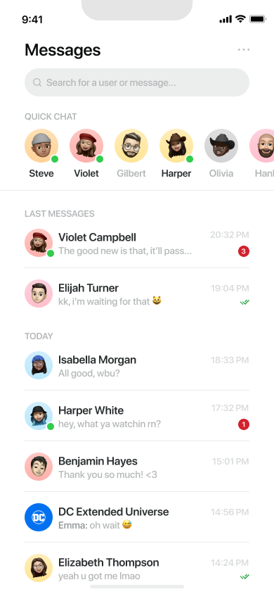
Messages-List.tsx
import {
  QuickChat,
  MessageList,
  SearchInput,
  MessagesHeader
} from "@commt/rn-sdk/components";

const Messages = () => {
  // ...

  return (
    <Container>
      <MessagesHeader />
      <SearchInput />
      <InnerContainer>
        <QuickChat onPress={navigateToChat} />
        <MessageList onPress={navigateToChat} />
      </InnerContainer>
    </Container>
  );
};
Chat.tsx
import { ChatHeader, Chat } from "@commt/rn-sdk/components";

const Chats = () => {
  const route = useRoute<RouteProp<RootStackParamList, "Chats">>();
  const roomId = route.params.roomId;
  const participants = route.params.participants;

  return (
    <Container>
      <ChatHeader
        roomId={roomId}
        participants={participants}
        leftComponent={YOUR_CUSTOM_COMPONENT} // Optional
        onUserProfileClick={YOUR_CALLBACK_FUNCTION} // Optional: Triggered on username/avatar press.
      />
      <Chat
        roomId={roomId}
        participants={participants}
        loadMoreMessages={YOUR_LOAD_MORE_MESSAGES_ACTION}
      />
    </Container>
  );
};

Customize UI Component
Utilize the useToggleTheme hook to effortlessly customize UI component colors.
Home.tsx
import { useToggleTheme} from "@commt/rn-sdk/hooks";

const toggleThemeProps = {
  passive: "#8D9293",
  bubble: "#A91A24",
  bcg: "#272C2D",
  searchText: "#FFF",
  read1: "#1B9C32",
  read2: "#E57A81",
  app1: "#F8FAFA",
  app2: "#D9DBDB",
  app3: "#41494B",
  app4: "#3FC610",
  app5: "#1A1D1E",
  app6: "#FBE9EA",
  app7: "#DC4D57",
  app8: "#E57A81",
};

const Home = () => {
  // ...
  const toggleThemeAction = useToggleTheme();

  const handleToggleTheme = () => {
    // update @commt/rn-sdk package theme colors
    toggleThemeAction(toggleThemeProps);
  };

  return (
    // ...
    <Button onPress={handleToggleTheme} title="Update Colors"/>
  );
};
Toggle Theme Props Definition
| Prop name | Required | Type | Affected UI Components Parts |
|---|---|---|---|
| passive | Yes | String | "QuickChat" title, passive username, online text under username, username in bubbles(group chat), search bar icon and placeholder, chat input placeholder and emoji icon, three dots icon, message time(RoomCard, Chat components), message text(RoomCard component) and day text between message bubbles colors |
| bubble | Yes | String | Self user bubble bcg color |
| bcg | Yes | String | App bcg color |
| searchText | Yes | String | Search bar search text color |
| read1 | Yes | String | Message read icon(RoomCard component) and typing text colors |
| read2 | Yes | String | Message had read badge icon color under bubble |
| app1 | Yes | String | "Messages" title, popUpButtons title, username and system message text colors |
| app2 | Yes | String | Chat input active text, send button passive bcg and opposite user bubble text colors |
| app3 | Yes | String | Oppsite user bubble bcg, stroke, search bar bcg, chat input bcg and chat input border colors |
| app4 | Yes | String | Online user indicator color |
| app5 | Yes | String | Chat area bcg color |
| app6 | Yes | String | Unread badge text color |
| app7 | Yes | String | Send button active bcg color |
| app8 | Yes | String | Unread badge bcg color |
| ui1 | Yes | String | Send button icon and self user bubble text color |
| ui2 | Yes | String | Chat header and footer bcg color |
Commt is compatible with:
For any questions, feedback or issues, feel free to reach out to us via contact@commt.co.
- Mesut KILINCASLAN mkilincaslan
- Sedanur Akçil sedanurakcil