Oftentimes, developers find that they have the same problems in many projects.
When it comes to CSS, a number of problems happen over and over again. For example:
- Consistency across browsers
- Making a responsive/mobile and desktop version
- Styling forms to look more modern and user friendly
Rather than each developer coding their own solution and using it over and over again, developers get together and make a code library or framework.
One popular CSS framework is called Bootstrap. It was initially developed at twitter and was made open source in 2011. As an open source project, anyone can use these code solutions for free and they can also contribute to improving the project.
While a base understanding of CSS is critical in building websites, in order to get the most out of a code library/framework is the ability to read the documentation and learn to use the built-in features.
Bootstrap's documentation is quite good. As you look through it, you will see that it has many features. The more you build with it, the more you'll learn. Today we'll focus on getting set up and looking at some basic features.
We'll be building Tree-er. The html is complete all we have to do is add the bootstrap code library and apply the appropriate classes.
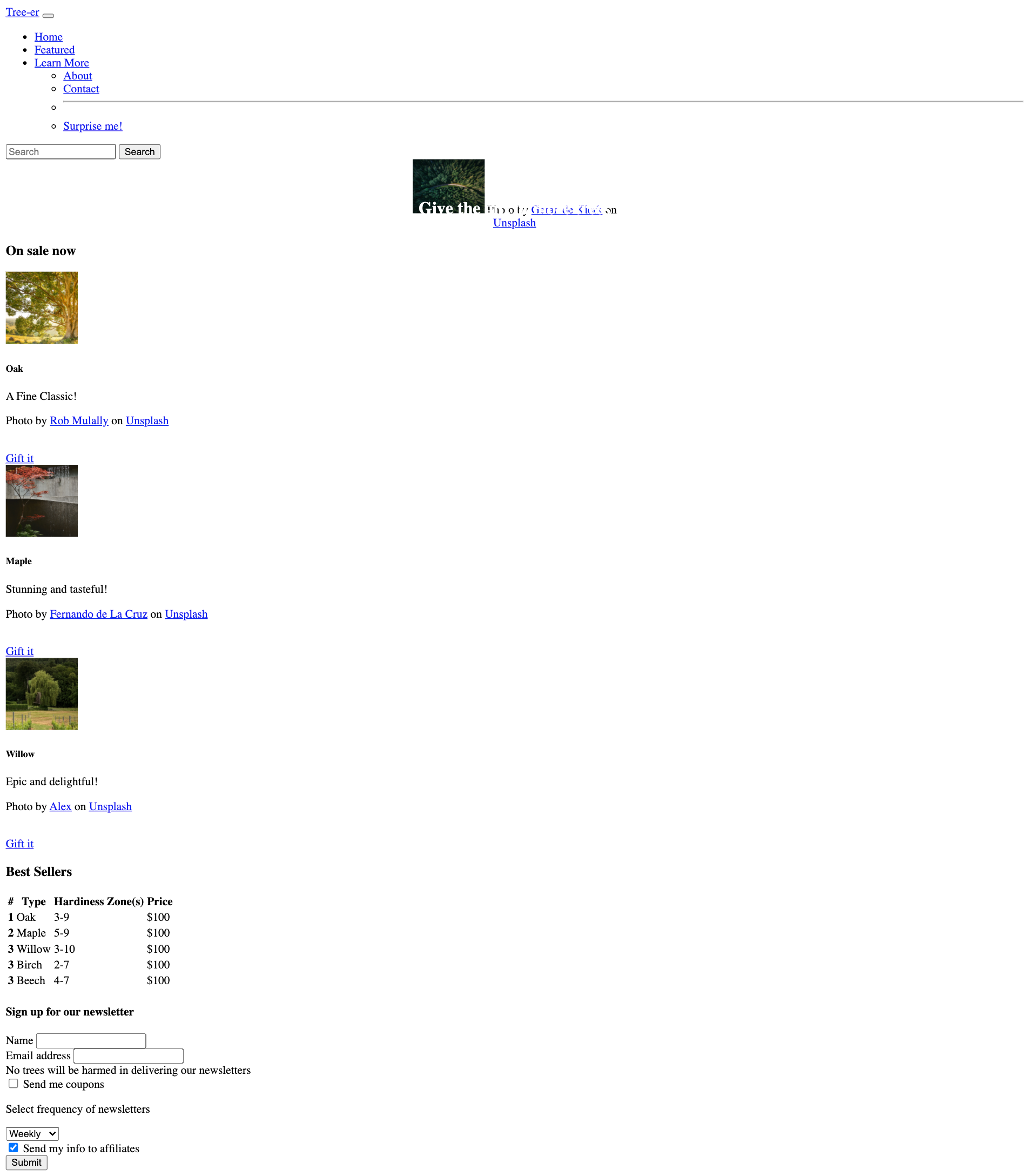
Starting appearance
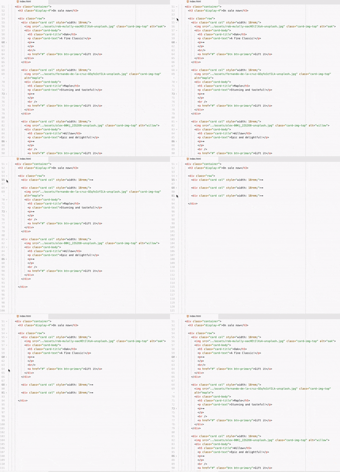
Our HTML is quite long and busy. When we work on sections we can visually fold up our code with our text editor.
 This will make it easier to stay focused on the component we need to style.
There are a few ways to get Bootstrap into your project. We'll start with just adding a link tag. This tag works just like any css you'd write yourself. It is hosted elsewhere on the internet, but it will bring in all the code.
Get the link
Looks like this:
<link href="https://cdn.jsdelivr.net/npm/bootstrap@5.0.0-beta1/dist/css/bootstrap.min.css" rel="stylesheet" integrity="sha384-giJF6kkoqNQ00vy+HMDP7azOuL0xtbfIcaT9wjKHr8RbDVddVHyTfAAsrekwKmP1" crossorigin="anonymous">
Paste it inside the head tag of the index.html
Note: when loading more than one css file, it is treated as one long file. Therefore the file that comes last 'wins' if there are the same selectors altering a particular style. Therefore, Bootstrap should come first, then your personal styles should come later. So, make sure your Bootstrap link is above the link for main.css
Further, there are more ways to customize bootstrap, but we won't cover it today.
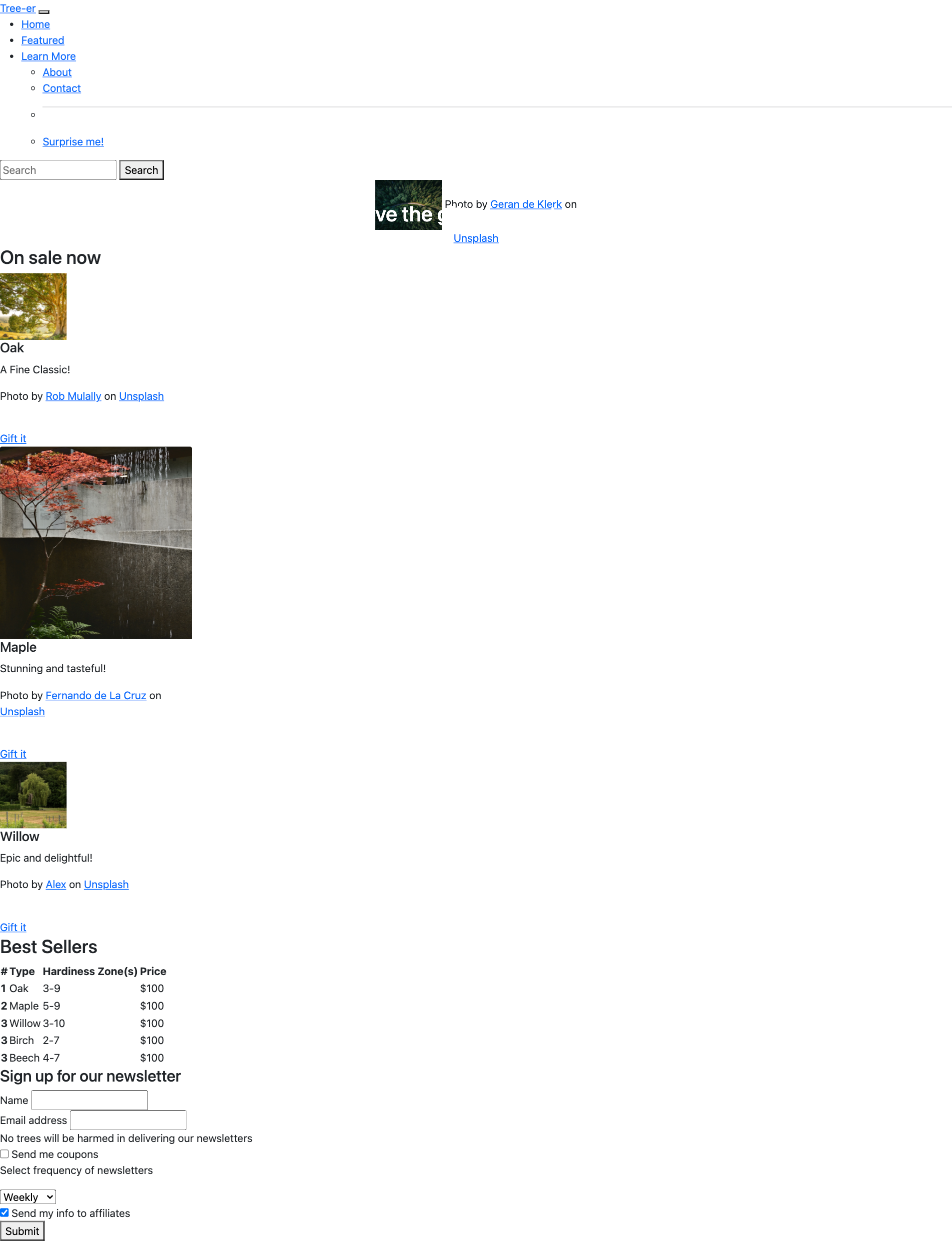
The most notable thing will be that the font has changed.
Let's style the main image. It is sometimes referred to as a hero, jumbo or jumbotronimage.
Below the nav, there is a div with an id of hero. Let's add the appropriate class: container-fluid - this will make the image stretch 100% of the page, no matter the width.
<div class="container-fluid" id="hero">Next, in the img inside of that div, add the class img-fluid - this will also keep the image at 100% width.
<img src="./assets/geran-de-klerk-qzgN45hseN0-unsplash.jpg" class="img-fluid" alt="forest view">Move down to the div that contains the h3 that reads On Sale Now and add the class container - When the width is below a certain amount of pixels, the display will be a wider percentage, when the browser is wider, there will be more space around the sides of the container.
Let's add a class to the h3 to style it more as a display. Generally, text on a web page serves two purposes - as a title/display eye-catching part of the page, or as text that is meant for easy reading. Adding the class display-4 will increase the size of the font of the h3
If we go back to our starter image we have a row of 3 cards. Let's set up the div that contains these cards as a row.
<div class="row">We then have three cards that we need to add the same styles
-
The outer div will be
card col -
The image inside
cardwill becard-img-top -
The next div will be
card-bodyinside thecard-bodyh5with a classcard-titlepwith a class ofcard-textawith two classesbtnandbtn-primary
<div class="row"> <div class="card col" style="width: 18rem;"> <img src="./assets/rob-mulally-oacHEtIlXsA-unsplash.jpg" class="card-img-top" alt="oak"> <div class="card-body"> <h5 class="card-title">Oak</h5> <p class="card-text">A Fine Classic!</p> <p> <span>Photo by <a href="https://unsplash.com/@robmulally?utm_source=unsplash&utm_medium=referral&utm_content=creditCopyText">Rob Mulally</a> on <a href="https://unsplash.com/s/photos/oak?utm_source=unsplash&utm_medium=referral&utm_content=creditCopyText">Unsplash</a></span> </p> <br/> <a href="#" class="btn btn-primary">Gift it</a> </div> </div>
The remaining two cards have had the same classes applied in the interest of time.
Scroll down to the table
For certain elements, like tables, despite already being a table element, you still have to use a class to opt in to Bootstrap's table styling. You will find this true for buttons and other elements as well.
<table class="table">Let's add another class table-striped that will allow for better differentiation between rows
<table class="table table-striped">If we want to center the text elements in our table, we could write our own css in the main.css file. But it is better to use bootstrap, whenever possible. Bootstrap has a class called text-center that will center our text. This will allow for more consistent styling and less unexpected behaviors with our styles.
<table class="table table-striped table-hover text-center">Finally, we can imagine that each row would be a link to an individual view of each tree with more information and the ability to purchase it. To assist our users in navigating the site we can add a hover effect.
<table class="table table-striped table-hover text-center table-hover">Below the table, let's add a class of container to the div
In the first two divs inside the form, add the class mb-3- this will add some bottom margins.
Add the class form-label to the two labels inside the form.
For the two text inputs, add the class form-control
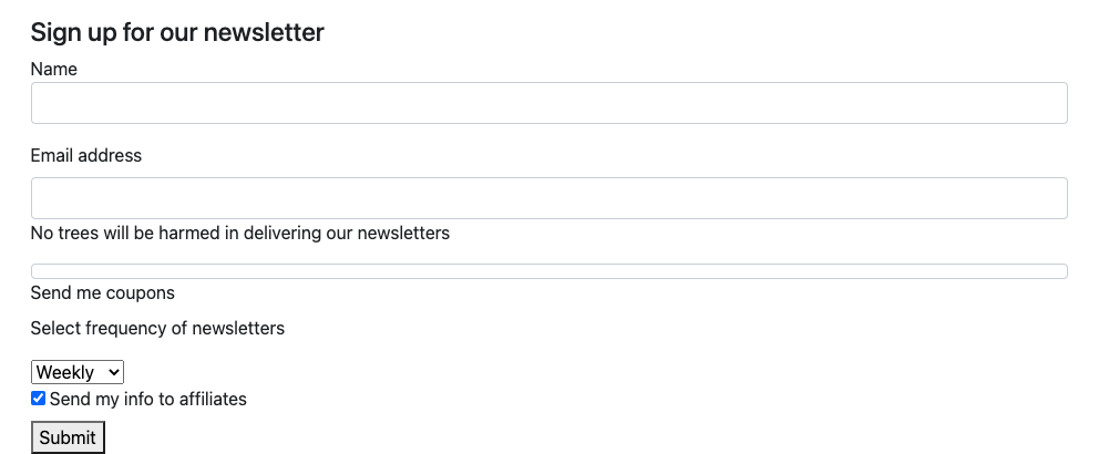
This should update our form to look like this:
Add the classes mb-3 form-check to style the div that contains the input with type checkbox.
For the input with the type checkbox add a class form-check-ionput
For the label add the class form-label
In the select element, add the class form-select
Add the classes form-check form-switch to the div that contains an input with type checkbox
For the final input with type checkbox add the classes form-check-input
Finally, let's style the submit button by adding the classes btn btn-primary
You'll see in the main.css file that the nav display is set to none. Remove that code and go back to the mockup image. Use the Bootstrap documentation to get it styled like the mockup.


