This is a data analysis writeup (as of 02/09/14) for the R Shiny application - Power to Choose (PTC), built to visualize up-to-date electricity plans and prices in the ERCOT utility market.
The project is hosted on an AWS EC2 instance and all code and implementation is open-source and made available on Github.
Power to Choose (PTC) is a consumer choice website set up by the PUC to provide customers a competitive platform to compare electricity plans and offers in Texas.
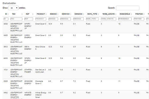
The native presentation of the data is in the form of an interactive table with search/filter widgets.
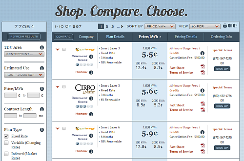
The general use of PTC is to quickly compare estimated prices at monthly usage thresholds (500kWh, 1000kWh, 2000kWh).
The various Electricity Facts Label (EFL) price values corresponds to these usage thresholds.
From the main interface shown above, a user can gather information about companies, plans and pricing details. They can use the filter widgets on the left to filter data they want to see (e.g. specifying a price range or contract length range).
The native PTC app is great for consumers to compare prices, but it is unable to display the information completely in one visualization i.e. the data is paginated and makes it difficult to ask questions on specific ranges and subsets.
The design of this application is to help empower both consumers and analysts with complete visualization of the data/market, through the use of histograms and scatterplots that are interactively updated based on user inputs.
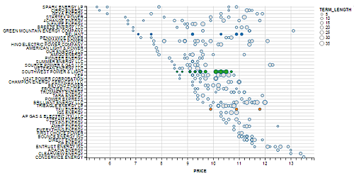
For instance, all the data on PTC can be visualized concisely as a scatterplot sorted by price and REP rank.
And with the help on the filters widgets on the left,
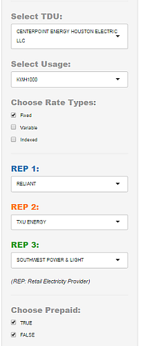
We can get real-time updates and full control of the dataset we wish to study. These widgets provide useful customization of the visualizations, some of which are listed below:
- Changing the dataset e.g. changing TDU company or usage values
- Subsetting the data e.g. selecting checkboxes
- Highlighting data records e.g. highlighting REPs
The writeup will go into detailed analysis on some of the more interesting findings in the visualization sections. An in-depth overview on data gathering, cleaning, and transformation of the original datasets will be outlined in the Data section.
At any time, feel free to experiment and draw your own conclusions with the interactive web application and refer to
the .R files found on the Github project site if you need details on code implementation.
With great marketing power and choices, comes great responsibility. Unfortunately, "cheap" prices may not always be the best deals on PTC.
Note that the existence of 3 usage-level pricing (500kWh, 1000kWh, 2000kWh) is one of the main drivers for the
diversity of products that can be designed and created in the Texas electricity market.
For instance, a retail electric provider (REP) can offer a product which incurs additional charges if usage is below 800kWh.
This causes the 500kWh price to look unfavorable but the 1000kWh and 2000kWh prices to look much more favorable, which
would help cater to customers who are shopping at higher usage price points.
However, this is also misinformation to an average customer who does not spend time using the filter/sorting widgets on the
site (since the default sorting on PTC is at 1000kWh). Many companies have, and are still abusing this fact to create
attractive but misleading prices.
My hope is that this walkthrough and application will help the general user be more informed about the choices they make.
(back to contents)
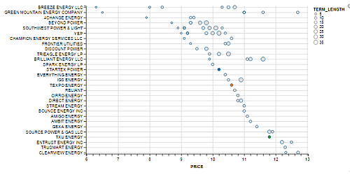
In the Rankings tab of the application, there is a scatterplot that effectively displays the price spread by REP. The
scatterplot is sorted by REP in descending price, so the cheapest provider will always be displayed on the top-left section
of the map.
By selecting a specified usage value, and highlighting a few retail electric providers (REP) of interest, we can get a quick view on the prices in the selected market.
This plot gives a quick indication on the price spread in the market and a sense on the "potential roles" of various REP in the market. We identify some interesting clusters:
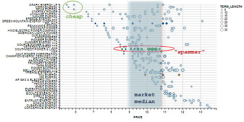
- Cheap: Only a few REPs are low-price providers.
- Market median: Most REPS are clustered around the market-consolidated median price.
- Spammer: REPs that offer many plans are what I call "PTC-spammers". This could be a viable technique to overpopulate their plans more frequently across the site for a chance of customers enrolling by accident.
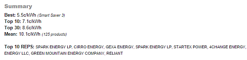
In addition to deriving information from the scatterplot, I have created a short Summary section that provides useful
statistics on the selected dataset/market (e.g. Best, Top 10, Top 30, Mean, Top 10 REPS).
Just as we mentioned earlier that REPs are able to create products that look seemingly cheap at a specified EFL usage
(usually at 1000kWh which is the default price sorting at PTC), we need to be careful on the price ranks of these
companies, and make sure that the market that we carved out using the widget selections and filtering is indeed the subset of
electricity plans we are interested in looking at.
For example, with a default PTC selection viewing all plans at 1000kWh, the cheapest providers are SPARK,
CIRRO, GEXA, STARTEX (see below).
However, selecting criteria for 100% renewable energy and a usage level of 2000kWh leads to a different ranking of
cheapest providers, which are now listed as BREEZE, GREEN MOUNTAIN, 4CHANGE (see below)
Author's note: Make sure that price is not the only criteria you are shopping with!
(back to contents)
Our previous scatterplot information can be aggregated into price buckets to get a more natural feel for the market (if we
are not concerned with details of individual companies). Here's the same results, as displayed in the Market tab of the
application, when we choose to use a histogram instead of a scatterplot.
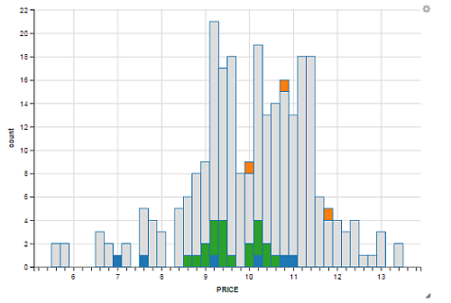
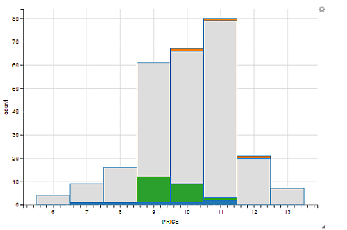
By simply adjusting the binwidth with the widget, we can reallocate the data in the histogram to a wider binwidth. The following histogram shows the same data plotted with a price binwidth of 1.0c/kWh as opposed to 0.2c/kWh used in the previous histogram.
This wraps up the data visualization sections of the web application. These interactive and dynamic visualizations are made
possible by ggvis, which is a new library being developed by Hadley Wickham. ggvis is a relatively new library, so a lot
of the methods and visualizations are limited in use, and are somewhat difficult to generate at a higher customized level.
At this point, I would recommend using ggplot2 over ggvis, but this application was an experiment in trying out the new
visualization library that Hadley is working on :)
(back to contents)
This section provides details on the data source and processes that go towards scraping and munging the initial unorganized data into a consolidated R dataframe that is used in the Shiny app. We will make references to the files on the Github project.
All data is owned by the Power to Choose made available by the PUC. I am not affiliated with the PUC, and this writeup and application is purely for practicing and sharing thoughts behind data management and visualization.
If you are not interested in the data background and processes, feel free to jump back to the visualization sections!
The PTC data is conveniently provided as a organized csv download file accessed from http://www.powertochoose.org/en-us/Plan/ExportToCsv
For the remainder of the data walkthrough, we will work with files in the Github repository.
But first, let's scrape the data!
Open the /data/data.R file and let's build a quick function for pulling the data from the URL:
# get_df helper function
get_df <- function() {
    # Get raw dataframe
    #
    # @return: raw dataframe returned by read.csv from provided url.

    url <- "http://www.powertochoose.org/en-us/Plan/ExportToCsv"
    df <- read.csv(file=url, header=TRUE, stringsAsFactors=FALSE)
    df <- clean(df)
}
We can now call and store the results of get_df into a dataframe by:
df = get_df()At this point, the data that we read in has native column headers and wrong data types (most of them are converted to
string when we used the stringsAsFactors=FALSE to avoid conversions to the "difficult-to-deal-with" factors object type
in R).
We now tidy the dataframe df using Hadley Wickham's awesome dplyr library for very clean execution of R data
manipulations written in concise and readable syntax.
The rest of the data section assumes elementary knowledge of dplyr. We assume familiarity with methods such as:
%>%,mutate,select,arrange,rename. Please check out the officialdplyrofficial guide if you need additional resources.
We will abstract most of the cleaning logic in the function clean
The implementation for clean is provided below and we'll expalin the major workflow below:
# clean helper function
clean <- function(df) {
    # Clean raw dataframe
    # Rename dataframe columns and define types.  Keep some columns
    #
    # @df: raw dataframe from raw_df()
    # @return: cleaned dataframe with some columns kept

    columns <- c("ID", "TDU", "REP", "PRODUCT",
                 "KWH500", "KWH1000", "KWH2000",
                 "FEES", "PREPAID", "TOU",
                 "FIXED", "RATE_TYPE", "RENEWABLE",
                 "TERM_LENGTH", "CANCEL_FEE", "WEdBSITE",
                 "TERMS", "TERMS_URL", "PROMOTION", "PROMOTION_DESCRIPTION",
                 "EFL_URL", "ENROLL_URL", "PREPAID_URL", "ENROLL_PHONE")
    colnames(df) <- columns  # rename columns

    df <- df %>%  # mutate df using the amazing dplyr
        select(ID, TDU, REP, PRODUCT,
               KWH500, KWH1000, KWH2000,
               RATE_TYPE, TERM_LENGTH, RENEWABLE,
               PREPAID, TOU, PROMOTION, EFL_URL) %>%
        mutate(KWH500 = KWH500 * 100,  # convert units from $/kWh to c/kWh
               KWH1000 = KWH1000 * 100,
               KWH2000 = KWH2000 * 100,
               PREPAID = as.logical(PREPAID),
               TOU = as.logical(TOU),
               PROMOTION = as.logical(PROMOTION))

    df <- na.omit(df)  # Remove NA records
    return(df)
}- Create a vector
columnsto be used to rename the native column headers indf. - Use
dplyr'sselectto project only the required columns (similar toSQL select). - Change and calculate existing columns to new calculated values using
mutate- Convert pricing units from $/kWh to c/kWh
- Convert
PREPAID,TOU,PREPAIDcolumns tologicaldatatypes
- Remove all rows with
NAvalues usingna.omit(df)
Our dataframe df is now nicely organized with well-named headers, and we can now load this into our shiny application
through global.R (calling it once). In server.R, there are a lot more dataframe manipulations used to generate unique
visualizations, but the basis for these manipulations depend on the dataframe that we have organized cleanly in this step.
For a sneak peek, our cleaned df now looks like this:
And that's all to the data lifecycle section of the guide!
(back to contents)
(back to contents)