Frontend Mentor - Interactive pricing component solution
This is a solution to the Interactive pricing component challenge on Frontend Mentor. Frontend Mentor challenges help you improve your coding skills by building realistic projects.
Table of contents
Overview
The challenge
Users should be able to:
- View the optimal layout for the app depending on their device's screen size
- See hover states for all interactive elements on the page
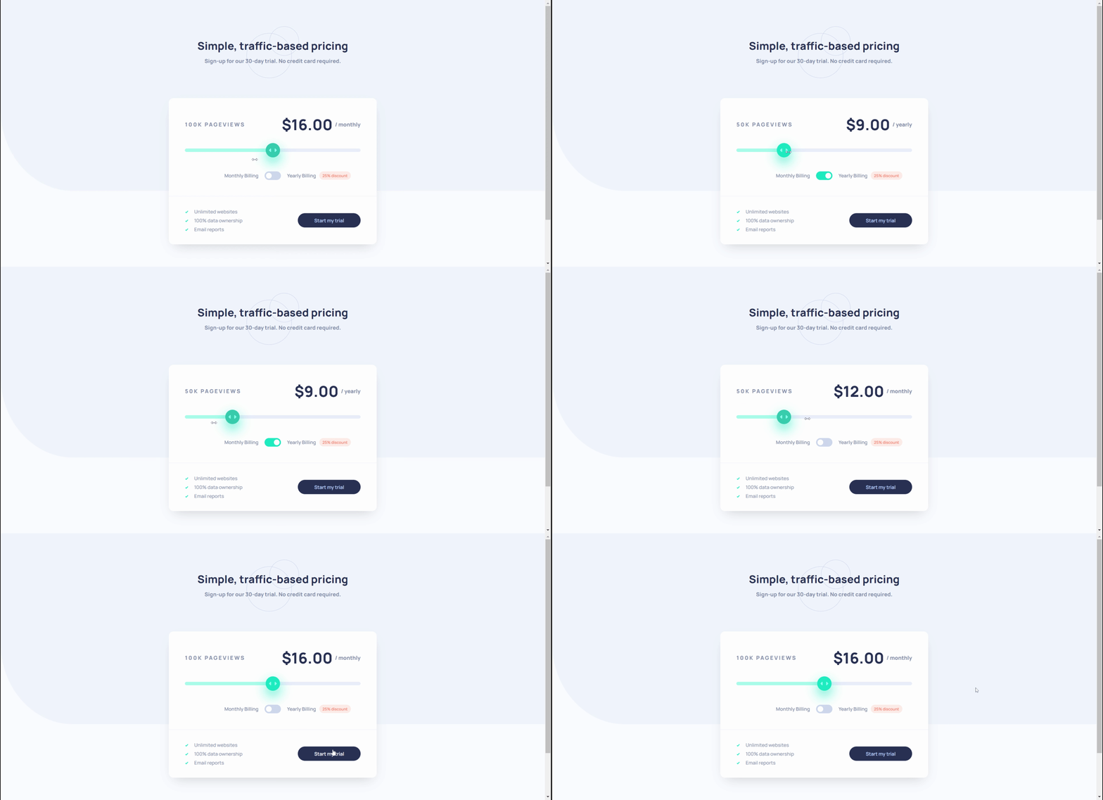
- Use the slider and toggle to see prices for different page view numbers
Screenshot
Links
- Repository URL: https://github.com/cholis04/interactive-pricing-component-main
- Live Site URL: https://interactive-pricing-fem.web.app/
My process
Built with
- Semantic HTML5 markup
- Desktop-first workflow
- CSS custom properties
- Flexbox & Grid - Layouting
- Input type 'Range' & 'Checkbox'
- Typescript - For Development JavaScript Compile
This is my first project using typescript.
- Eslint - For evaluate patterns in code
- Prettier - Formatting on Save
- Firebase Hosting - Host Static File
What I learned
List Style Image
main .card-price > .action > ul {
  list-style-image: url('../images/icon-check.svg');
}
Selection Input type Range / Slider for Styling
<input
  type="range"
  min="0"
  max="4"
  step="1"
  name="pageviews"
  id="pageviews"
  value="2"
/>input[type='range'] {
/* Styles */
}
input[type='range']::-webkit-slider-thumb {
/* Styles */
}
input[type='range']::-webkit-slider-thumb:hover {
/* Styles */
}
input[type='range']::-webkit-slider-thumb:active {
/* Styles */
}
input[type='range']::-webkit-slider-runnable-track {
/* Styles */
}
input[type='range']::-moz-range-progress {
/* Styles */
}
input[type='range']::-ms-fill-lower {
/* Styles */
}Create Toggle from Checkbox
<label for="period">
  <input type="checkbox" name="period" id="period" />
  <span class="box-check">
    <span></span>
  </span>
</label>
label > input[type='checkbox'] {
display: none;
}
label {
display: flex;
align-items: center;
justify-content: center;
cursor: pointer;
}
label > span.box-check {
position: relative;
width: 46px;
height: 24px;
border-radius: 25px;
display: flex;
align-items: center;
padding: 2px 4px;
background-color: var(--toggle-background);
transition: all 0.2s cubic-bezier(0.175, 0.885, 0.32, 1.275);
}
@media (hover: hover) {
label:hover > span.box-check {
background-color: var(--soft-cyan);
}
}
label > span.box-check > span {
position: absolute;
display: block;
width: 16px;
height: 16px;
border-radius: 50px;
background-color: var(--white);
transition: all 0.2s ease-in-out;
}
label > input[type='checkbox']:checked + span.box-check > span {
transform: translateX(22px);
}
label > input[type='checkbox']:checked + span.box-check {
background-color: var(--strong-cyan);
}Continued development
Input type range is still not supported in some older browsers. Mainly for applying styles that require a prefix to run well. A combination of JavaScript and CSS is indispensable
- https://developer.mozilla.org/en-US/docs/Web/HTML/Element/input/range - This method is very easy to apply. but unfortunately, some old browsers don't support datalist. https://caniuse.com/?search=datalist
Useful resources
-
Styling range input with CSS and JavaScript for better UX - This is an amazing article which helped me finally understand about styling range input with CSS. I'd recommend it to anyone still learning this concept.
-
Input Range progress with css gradient - This helped me for Create Range Progress with CSS Gradient. I really liked this pattern and will use it going forward.
Author
- Website - https://cholis04.github.io
- Frontend Mentor - @cholis04
- Dribbble - cholis04
- Instagram - @cholis04
- Codepen - cholis04
Acknowledgments
Many thanks to anyone who provided feedback.


