![]()
Visualize the spread of COVID-19 on a day-by-day basis
Explore the docs »
View Demo
·
Report Bug
·
Request Feature
Table of Contents
This project was submitted to Georgia Tech Hacklytics
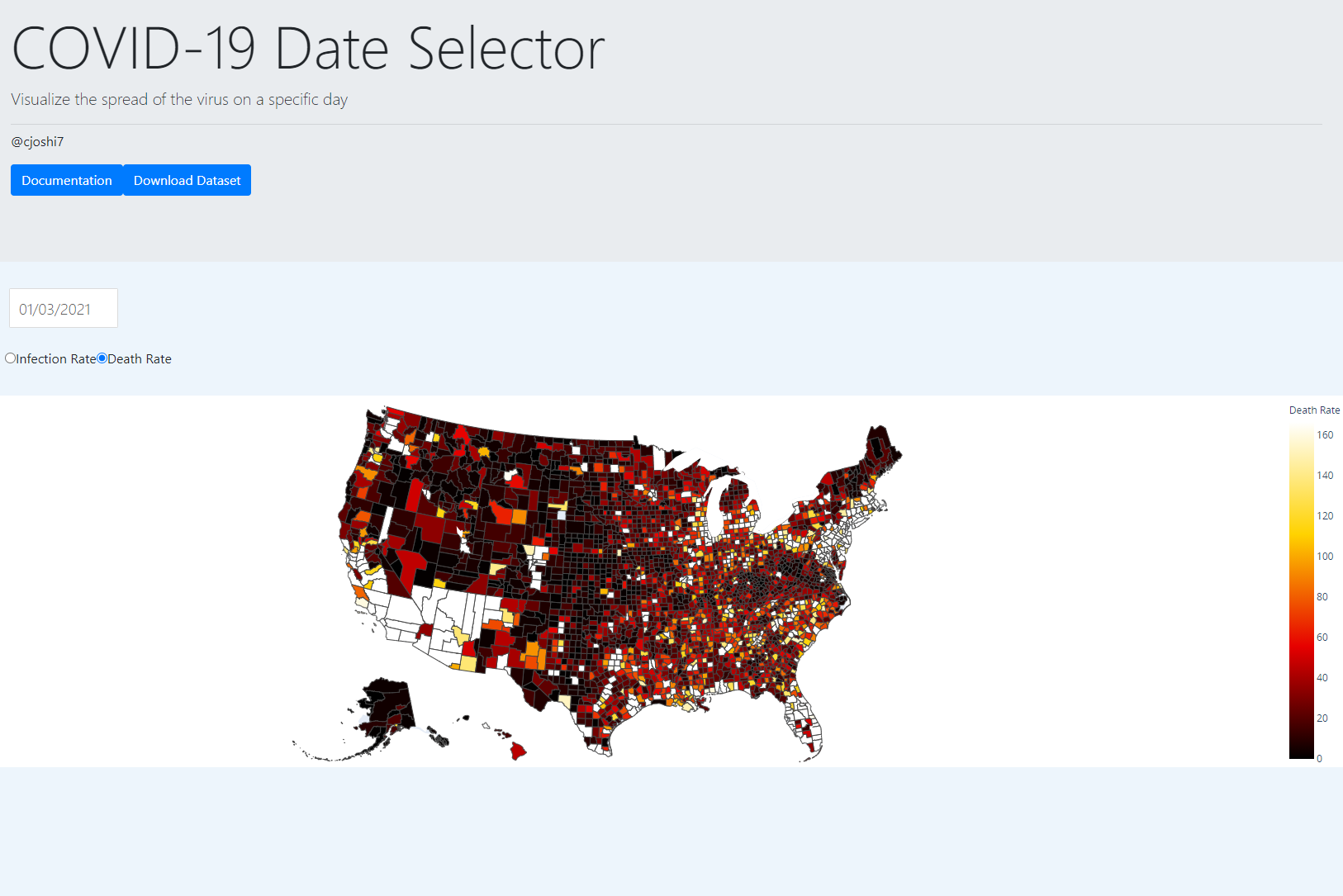
While researching for COVID-19 data, I noticed that all of the popular visualization resources either only showed the current situation, or showed a quick timeline. This is not very helpful for researching the number of cases in a specific county on any day as it provides too general of a visualization. Thus, I created a day-by-day visualization tool that allows researchers to query the data for a specific day in a user friendly and visually appealing way.
This is a web API to allow the user to visualize a snapshot of the COVID-19 situation in the USA on a specific day. The user can see exactly how many cases there were in a specific county in this snapshot of time.
This application is built using Dash with Python, the Plotly library to generate the choropleth map, and the Bootstrap framework to quickly develop the CSS. The New York Time's COVID-19 dataset was used along with a JSON map of the United States from Plotly.
It was difficult to actually find the data in a usable form online, because it was either fragmented or contained irrelevant data to my purpose. This introduced me to the pandas libraries to clean and filter the dataset. I've also never worked with visualizations of datasets before, so the hardest part was actually starting.
I created my first deployable web API and made a visually appealing application to solve a real world problem, while introducing me to data science concepts along the way.
I learned the fundamentals of data science through cleaning and filtering data and how to make useful visualizations by taking advantage of python's many data science libraries. I also learned how to use a new web application framework with Dash.
No API key is needed to access the tool, so the application may be locally run through the python file.
The prerequisite frameworks and libraries are dash, plotly, and pandas.
- pip
pip install requirements.txt
- Clone the repo
git clone https://github.com/cjoshi7/covid19-date-selector
- Install prerequisite packages
pip install requirements.txt
- Directly run the python file
python covid19-date-selector/app.py
- TODO
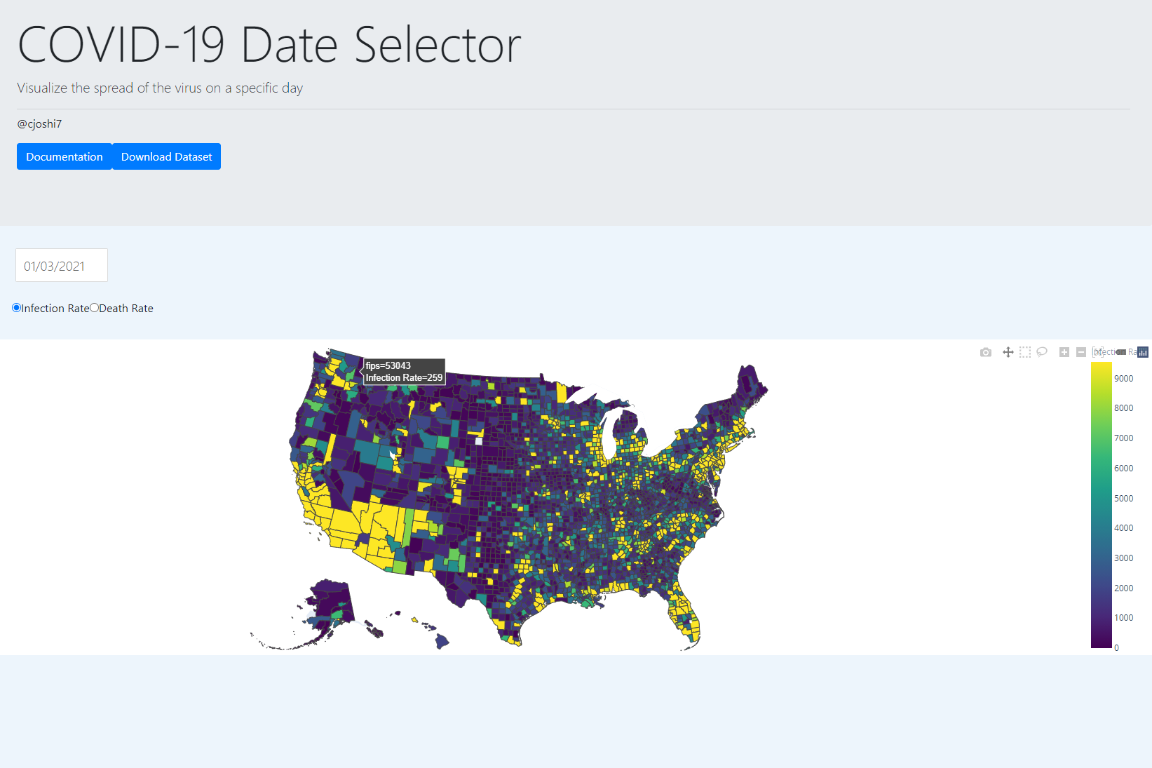
This tool can be used for research purposes to find the exact number of cases in a specific county on any day. It is useful to see the patterns of infection and death rate increases/decreases. For example, it can be seen that the number of infections skyrocketed in early January after the holiday season. The tool is useful for establishing patterns such as this.
For more examples, please refer to the Documentation
See the open issues for a list of proposed features (and known issues).
The following features will be implemented in the indefinite future:
- Expanded dataset to include:
- Mask usage
- Population Density
- Demographic breakdown
- Dark theme
- An option to use the program in the command line
Any contributions to extend features are greatly appreciated.
- Fork the Project
- Create your Feature Branch (
git checkout -b feature/newFeature) - Commit your Changes (
git commit -m 'Add NewFeature') - Push to the Branch (
git push origin feature/newFeature) - Open a Pull Request
Distributed under the MIT License. See LICENSE for more information.
Chinar Joshi - chinarjoshi7@gmail.com - Linkedin
Project Link: Github