Stylin is a build-time CSS library that offers an elegant way to style React components. It extends CSS Modules and adds some missing features like dynamic variables or auto-typing.
There is no faster way to create styled & typed React component.
import {Title} from './styles.scss'
// crazy part, importing 👆 component from styles


<Title color="tomato" size="small">
  Hello world!
</Title>/**
@tag: h1
@component: Title
size: small | medium | large
color: #38383d --color
*/
.title {
--color: #38383d;
color: var(--color);
font-size: 18px;
&.small {
font-size: 14px;
margin: 2px 0;
}
&.medium {
font-size: 18px;
margin: 4px 0;
}
&.large {
font-size: 20px;
margin: 6px 0;
}
}All the magic is behind the style annotations, which you can find in the comment section. It is like JSDoc, but for CSS. However, it is not a CSSDoc. It is more about mapping styles with component properties.
With the annotations you can:
- map styles with components
- generate TypeScript types
- generate documents or even stories for StoryBook
For all these, you will need a specific package, plugin, or webpack loader.
The core library:
npm install @stylin/style
npm install --save-dev @stylin/msa-loader
Then you should add the loader in your webpack configs files:
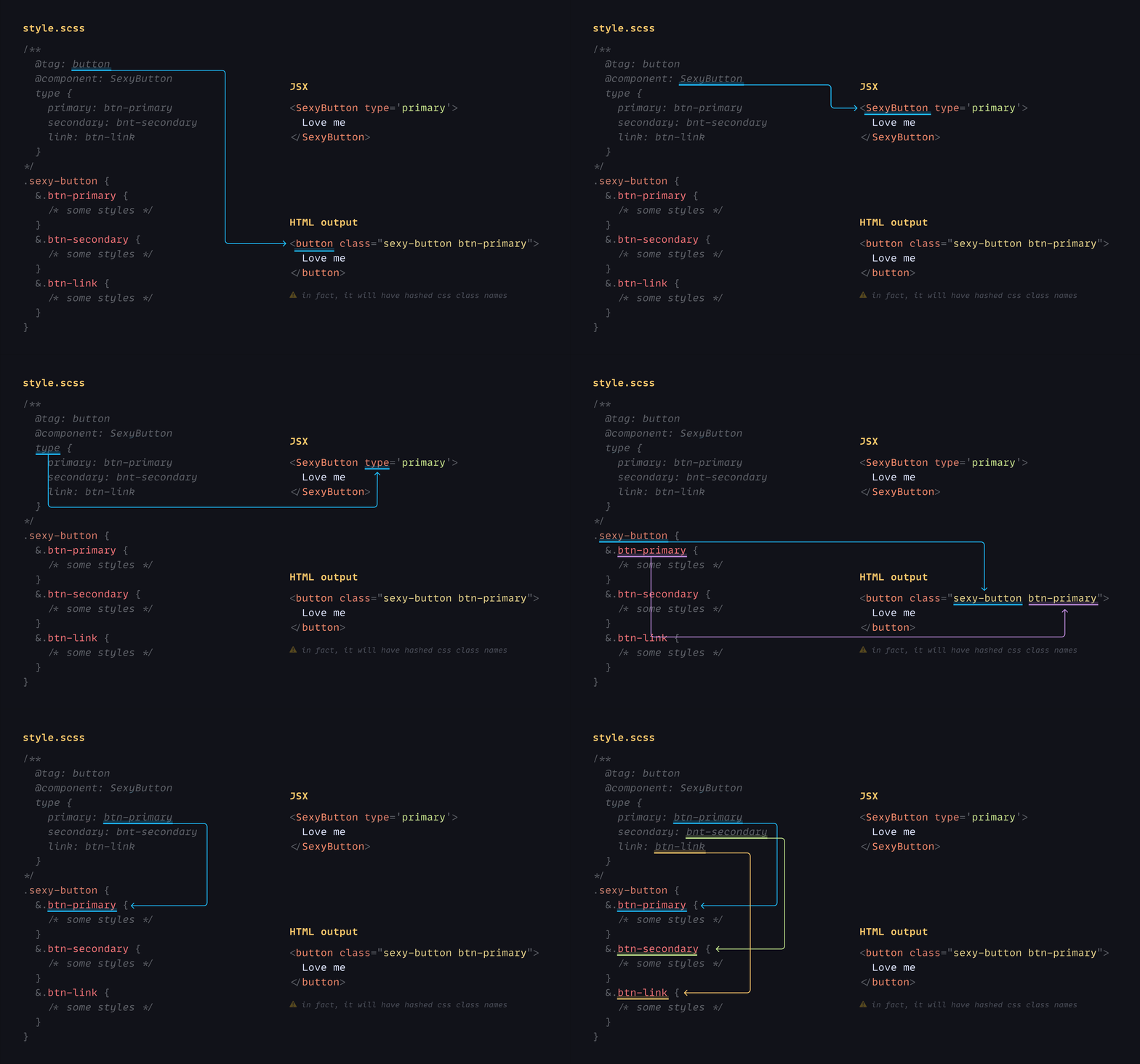
Don't be scared to learn new stuff, it is deadly simple. Only three things to remember:
- @tag: html tag
- @component: name of your component
- Mapping object:
componentPropertyName {
  propertyValue: css-class-name
  anotherPropertyValue: another-css
}
For example:
/**
  @tag: button
  @component: SexyButton
  type {
    primary: btn-primary
    secondary: bnt-secondary
    link: btn-link
  }
*/
.sexy-button {
  &.btn-primary {
    /* some styles */
  }
  &.btn-secondary {
    /* some styles */
  }
  &.btn-link {
    /* some styles
  */}
}<SexyButton type='primary'>
Love me
</SexyButton>
/* HTML output:
<button class="sexy-button btn-primary"> //in fact, it will have hashed css class names
Love me
</button>
*/Done! That is all about to know! 🎉🥳
Now you are the PRO 😎. Update your resume with a new skill!
Here are some tips to make life easier.
If your component property values are similar to CSS class names, like in the example below:
type {
  primary: primary
  secondary: secondary
  link: link
}
It can be shorten this way:
type: primary | secondary | link
Sweet! what is next? Read more about:
- Support Next.js.
- Support React-like libraries (preact etc.).
Any questions or suggestions?
You are welcome to discuss it on:


