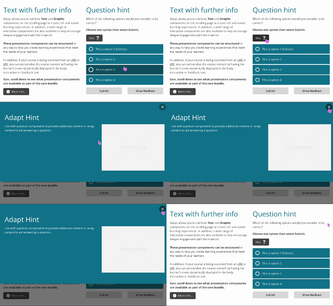
Hint is an extension for the Adapt framework.
The extension appends a button to any component. On selecting the button, additional content is displayed in a popup. The button can contain either text and/or icon and can be configured per component.
The intended use is a 'hint' for question components, providing additional content to aid answering a question. Or, to provide 'more info' for presentation components. Whether to declutter text heavy content, or, group content of a particular type/theme.
The hint button is displayed between the component display text (header) and the interaction (widget). For components without display text, the button is displayed after the interaction (widget).
Open the /src/extensions folder in a new terminal window on Mac OSX or right click the folder and select 'Git Bash Here' on Windows.
Git clone the component, making sure to delete the hidden .git folder from the adapt-hint folder.
The attributes listed below are used in components.json to configure Hint, and are properly formatted as JSON in example.json.
_isEnabled (boolean): Turns Hint on and off. Acceptable values are
trueandfalse.
title (string): The title displayed in the popup.
altTitle (string): This will be read out by screen readers as an alternative title if no visual title is included.
body (string): The body text displayed in the popup.
_imageAlignment (string): Defines the alignment of the popup image. Left: Image aligned to the left of the text area. Top: Image aligned above the text area. Right: Image aligned to the right of the text area. Bottom: Image aligned below the text area. The default alignment is
right.
_graphic (object): The image displayed in the popup. It contains the following settings:
_src (string): File name (including path) of the image. Path should be relative to the
srcfolder (e.g."course/en/images/origami-menu-two.jpg").
alt (string): The alternative text for this image. Assign alt text to images that convey course content only.
attribution (string): Optional text to be displayed as an attribution. By default it is displayed below the image. Adjust positioning by modifying CSS. Text can contain HTML tags, e.g.,
Copyright © 2015 by <b>Lukasz 'Severiaan' Grela</b>.
_button (object): The Hint button contains values for _iconClass, _alignIconRight, text and ariaLabel.
_iconClass (string): CSS class name to be applied to the
buttonicon. The class must be predefined in one of the Less files with the corresponding icon added as part of a font. See list of available vanilla icons to choose from. Default isicon-question.
_alignIconright (boolean): Defines whether the icon is aligned to the left or right of the text (if applicable). Default is
true, which aligns the icon to the right of the text.
text (string): The text that displays in the
button.
ariaLabel (string): This will be read out by screen readers as alternative text if no visual button text is included.
A global Hint button aria-label can be set within the _globals._extensions._hint.openButtonText object in course.json (or Project settings > Globals in the Adapt Authoring Tool). Default is Open hint. This will be overridden when setting either text or ariaLabel on the component's model in components.json.
No known limitations.
Author / maintainer: Kineo
Accessibility support: WAI AA
RTL support: Yes
Cross-platform coverage: Chrome, Chrome for Android, Firefox (ESR + latest version), Edge, IE11, Safari 14 for macOS/iOS/iPadOS, Opera
