The goal of this repository is to create a lot of React components.
- Fork this repo
- Clone this repo
You can find the starter code in the starter code folder of this GitHub repo.
-
Upon completion, run the following commands
git add . git commit -m "done" git push origin master -
Create Pull Request so your TAs can check up your work.
To start this project, you should:
- Fork and clone this project
- Run
npm install - Run
npm start
You can preview the solution here: https://5c6c2a0de07b084ce35373ee--determined-aryabhata-a8a833.netlify.com/
Create a IdCard component with 6 props:
lastName: A stringfirstName: A stringgender: A string,'male'or'female'height: A numberbirth: A datepicture: A string
Example
<IdCard
  lastName='Doe'
  firstName='John'
  gender='male'
  height={178}
  birth={new Date("1992-07-14")}
  picture="https://randomuser.me/api/portraits/men/44.jpg"
/>

<IdCard
  lastName='Delores '
  firstName='Obrien'
  gender='female'
  height={172}
  birth={new Date("1988-05-11")}
  picture="https://randomuser.me/api/portraits/women/44.jpg"
/>
Output
Create a Greetings component with 2 props:
lang: A string that could be ,"de","en","es","fr"children: A text
Example
<Greetings lang="de">Ludwig</Greetings>
<Greetings lang="fr">François</Greetings>
Output
Create a Random component with 2 props:
min: A numbermax: A number
Example
<Random min={1} max={6}/>
<Random min={1} max={100}/>
Output
Create a BoxColor component that displays a rectangle with a background color based on props. For this, you will need a inline style (documentation).
It takes 3 props:
r: A number between 0 and 255 representing the amount of redg: A number between 0 and 255 representing the amount of greenb: A number between 0 and 255 representing the amount of blue
Example
<BoxColor r={255} g={0} b={0} />
<BoxColor r={128} g={255} b={0} />
Output
As a bonus, you can also display the hex values of the color (ex: #ff0000 for red).
Create a CreditCard component that displays a square with a background color based on props. For this. You will need a styled component.
It takes 8 props:
type: A string that can be"Visa"or"Master Card"number: A string that is a number of the credit card. You will only display the 4 last digits for security reasons 😉expirationMonth: A number that represents the month, between 1 and 12expirationYear: A number that represents the yearbank: A string that represents the name of the bankowner: A string that represents the name of the ownerbgColor: A string for the background color of the cardcolor: A string for the text color of the card
Take your time to do as close to the output. You probably have to use flexbox.
Example
<CreditCard
  type="Visa"
  number="0123456789018845"
  expirationMonth={3}
  expirationYear={2021}
  bank="BNP"
  owner="Maxence Bouret"
  bgColor="#11aa99"
  color="white" />
<CreditCard
  type="Master Card"
  number="0123456789010995"
  expirationMonth={3}
  expirationYear={2021}
  bank="N26"
  owner="Maxence Bouret"
  bgColor="#eeeeee"
  color="#222222" />
<CreditCard
  type="Visa"
  number="0123456789016984"
  expirationMonth={12}
  expirationYear={2019}
  bank="Name of the Bank"
  owner="Firstname Lastname"
  bgColor="#ddbb55"
  color="white" />
Output
Create a Rating component that displays 5 stars, some of them must be empty (☆), some must be full (★).
It takes 1 prop:
children: A number between 0 and 5. Be careful, it can be a float number. If it's 3.9, it will display 4 stars.
Example
<Rating>0</Rating>
<Rating>1.49</Rating>
<Rating>1.5</Rating>
<Rating>3</Rating>
<Rating>4</Rating>
<Rating>5</Rating>
Output
Example
<DriverCard
  name="Travis Kalanick"
  rating={4.2}
  img="https://si.wsj.net/public/resources/images/BN-TY647_37gql_OR_20170621052140.jpg?width=620&height=428"
  car={{
    model: "Toyota Corolla Altis",
    licensePlate: "CO42DE"
  }} />
<DriverCard
  name="Dara Khosrowshahi"
  rating={4.9}
  img="https://ubernewsroomapi.10upcdn.com/wp-content/uploads/2017/09/Dara_ELT_Newsroom_1000px.jpg"
  car={{
    model: "Audi A3",
    licensePlate: "BE33ER"
  }} />
Output
Create a component LikeButton that displays a button "0 Likes" and with a number increases when the user clicks on it.
As a bonus, you can change the background color and set it to one of these: ['purple','blue','green','yellow','orange','red']
Example
<LikeButton /> <LikeButton />Output
Create a component ClickablePicture that displays a picture and toggle to the next picture on click.
Example
<ClickablePicture img='/img/persons/maxence.png' imgClicked='/img/persons/maxence-glasses.png' />Output
PS: If you want your own picture instead, you can do it yourself with this picture: http://www.stickpng.com/assets/images/584999937b7d4d76317f5ffd.png 😎
Create a Dice component that displays a random picture (example: '/img/dice3.png'). Then every time the user clicks on the component:
- An empty picture is displayed (
'/img/dice-empty.png') - 1 second later, a new random picture is displayed (example:
'/img/dice6.png').
Example
<Dice />Output before a click
Output 1 millisecond after a click
Output 1 second after a click
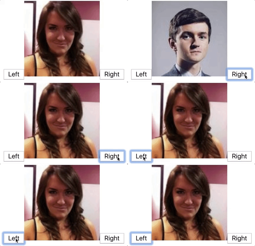
Create a Carousel component that displays an image and two buttons ('left' and 'right'), and that changes the picture every time.
Example
<Carousel
  imgs={[
    'https://randomuser.me/api/portraits/women/1.jpg',
    'https://randomuser.me/api/portraits/men/1.jpg',
    'https://randomuser.me/api/portraits/women/2.jpg',
    'https://randomuser.me/api/portraits/men/2.jpg'
  ]}
/>
Output
Create a NumbersTable component that displays a list of numbers between 1 and a limit. Even numbers must be red.
It takes 1 prop:
limit: A number.
Example
<NumbersTable limit={12} />Output
Create a FaceBook component that displays the list of all profiles from src/data/berlin.json. You will probably have to write:
import profiles from './data/berlin.json';Example
<FaceBook />Output (you should see about 28 profiles)
On your FaceBook component, add as many buttons as you have country. Then, when the user clicks on one of the buttons (example: 'USA'), add a blue background to all the profiles where their country is the one selected.
Example
<FaceBook />Output (you should see more profiles and more countries)
Example of extra iterations:
- By default, only display the picture. Then, when a user clicks on a picture, display more information
- Add sort buttons
- Add a search input
Create a SignupPage component with the following elements:
- An input "email" (bonus: make the input green/red when the email is valid/invalid)
- An input "password" (bonus: make the input green/red when the password is strong/weak)
- A select input "nationality" (possible values: "en","de","fr")
- A text "Hello", "Hallo" or "Bonjour" based on the selected nationality
- A text "Your email is john@doe.com"
For this, you will need 3 states:
emailpasswordnationality
If you want to include Bootstrap with Reactstrap, you should run
npm install reactstrap bootstrapAnd add the following line in src/index.js
import 'bootstrap/dist/css/bootstrap.min.css';Example
<SignupPage />Output
Create 2 components:
RGBColorPicker:state.rValue: A number between 0 and 255, representing the amount of redstate.gValue: A number between 0 and 255, representing the amount of greenstate.bValue: A number between 0 and 255, representing the amount of blue
SingleColorPicker: A box with an input range to select an amount of a valueprops.color: A string that is either "r", "g" or "b"props.value: A number between 0 and 255props.onChange: A method that is triggered when the input is changed
Output


