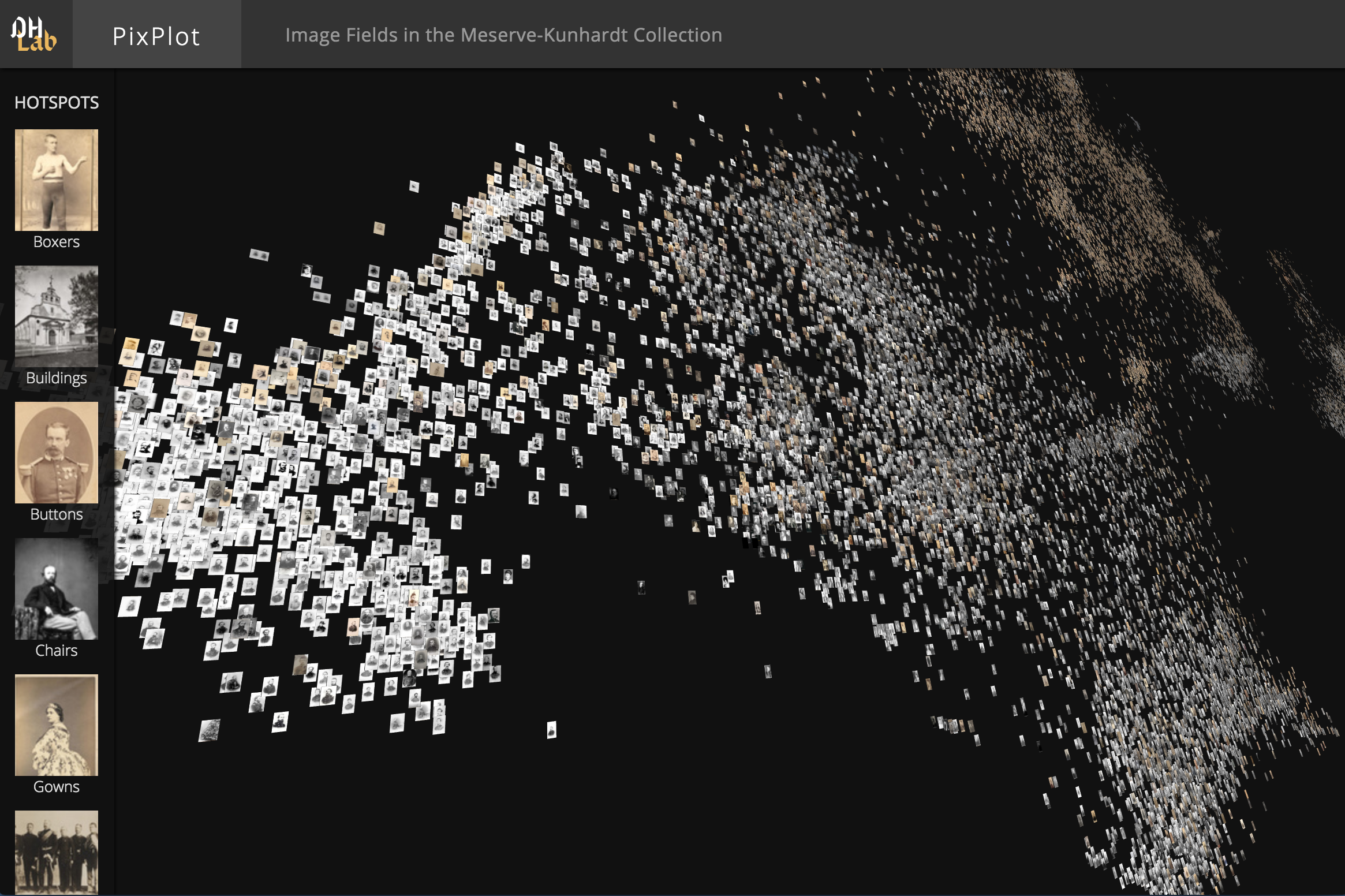
A fork of DHLab's pix plot repository for demonstrations with custom image collections
This repository contains code that can be used to visualize tens of thousands of images in a two-dimensional projection within which similar images are clustered together. The image analysis uses Tensorflow's Inception bindings, and the visualization layer uses a custom WebGL viewer.
You need to install Docker. If you are on Windows 7 or earlier, you may need to install Docker Toolbox instead.
The html viewer requires a WebGL-enabled browser.
- set a title in the index.html file
- copy jpg files into
./data/images
Download this repository by clicking the green "Clone or download" button and then "Download ZIP".
Unpack the zip file.
Start a terminal, cd into the folder that contains this README file.
Below steps each have numbered commands for later reference.
Generate the environment for your pixplot within a docker container (command 1):
# command 1:
# build the docker container
docker build --tag pixplot --file Dockerfile .
Process your collection into a pix plot (command 2).
Depending on the size of your image collection, this can take several hours. In our hackathon it took Max around 3.5 hours.
# command 2:
# process images from the VM collection
# use the `-v` flag to mount directories from outside
#   the container into the container
docker run \
  -v "$(pwd)/output:/pixplot/output" \
  -v "$(pwd)/data/images:/pixplot/images" \
  pixplot \
  bash -c "cd pixplot && python3.6 utils/process_images.py images/*"
You now have generated your pixplot. The next step will start a web server to host your plot on http://localhost:5000
# command3:
# run the web server
docker run \
  -v "$(pwd)/output:/pixplot/output" \
  -p 5000:5000 \
  pixplot \
  bash -c "cd pixplot && python3.6 -m http.server 5000"
By default, PixPlot uses k-means clustering to find twenty hotspots in the visualization. You can adjust the number of discovered hotspots by changing the n_clusters value in utils/process_images.py and re-running the script.
After processing, you can curate the discovered hotspots by editing the resulting output/plot_data.json file. (This file can be unwieldy in large datasets -- you may wish to disable syntax highlighting and automatic wordwrap in your text editor.) The hotspots will be listed at the very end of the JSON data, each containing a label (by default 'Cluster N') and the name of an image that represents the centroid of the discovered hotspot.
You can add, remove or re-order these, change the labels to make them more meaningful, and/or adjust the image that symbolizes each hotspot in the left-hand Hotspots menu. Hint: to get the name of an image that you feel better reflects the cluster, click on it in the visualization and it will appear suffixed to the URL.
- SMK 2020
- Artistic Exchange 21-24
The DHLab would like to thank Cyril Diagne, a lead developer on the spectacular Google Arts Experiments TSNE viewer, for generously sharing ideas on optimization techniques used in this viewer.
