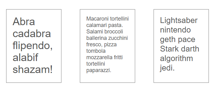
Occamy is choranaptyxic, meaning it will grow or shrink to fit available space
-- Fantastic Beasts and Where to Find Them
React component for automatically sized text that fits in its parent.
Live demo: splact.github.io/react-occamy-text
To build the examples locally, run:
npm install
npm start
Then open localhost:8000 in a browser.
The easiest way to use react-occamy-text is to install it from NPM and include it in your own React build process (using Browserify, Webpack, etc).
You can also use the standalone build by including dist/react-occamy-text.js in your page. If you use this, make sure you have already included React, and it is available as a global variable.
npm install react-occamy-text --save
Import it into your react project.
import OccamyText from 'react-occamy-text';
Render it passing text as children .
<OccamyText>Lorem ipsum dolor sit amet</OccamyText>
It should not be used inside auto-sized (eg. height: auto) elements.
- children – the text that need to be resized
- grow – true if the text can scale up its original size (default
true) - maxFontSize – maximum font size in pixels (default
96) - maxFontSizeVariation – maximum font size variation per iteration (default
8) - maxHeight – maximum height (default
undefined, parent height will be used instead) - minFontSize – minimum font size in pixels (default
4) - minFontSizeVariation – minimum font size variation per iteration (default
0.3) - shrink – true if the text can scale down its original size (default
true)
OccamyText is rendered as a div with occamy-text class and height: 100% style defined inline to make it fits in its parent.
The output text will not always perfectly fit the parent height, in some cases a subtile tollerance is accepted, giving always the larger text that doesn't exceed its parent.
NOTE: The source code for the component is in src. A transpiled CommonJS version (generated with Babel) is available in lib for use with node.js, browserify and webpack. A UMD bundle is also built to dist, which can be included without the need for any build system.
To build, watch and serve the examples (which will also watch the component source), run npm start. If you just want to watch changes to src and rebuild lib, run npm run watch (this is useful if you are working with npm link).
MIT
