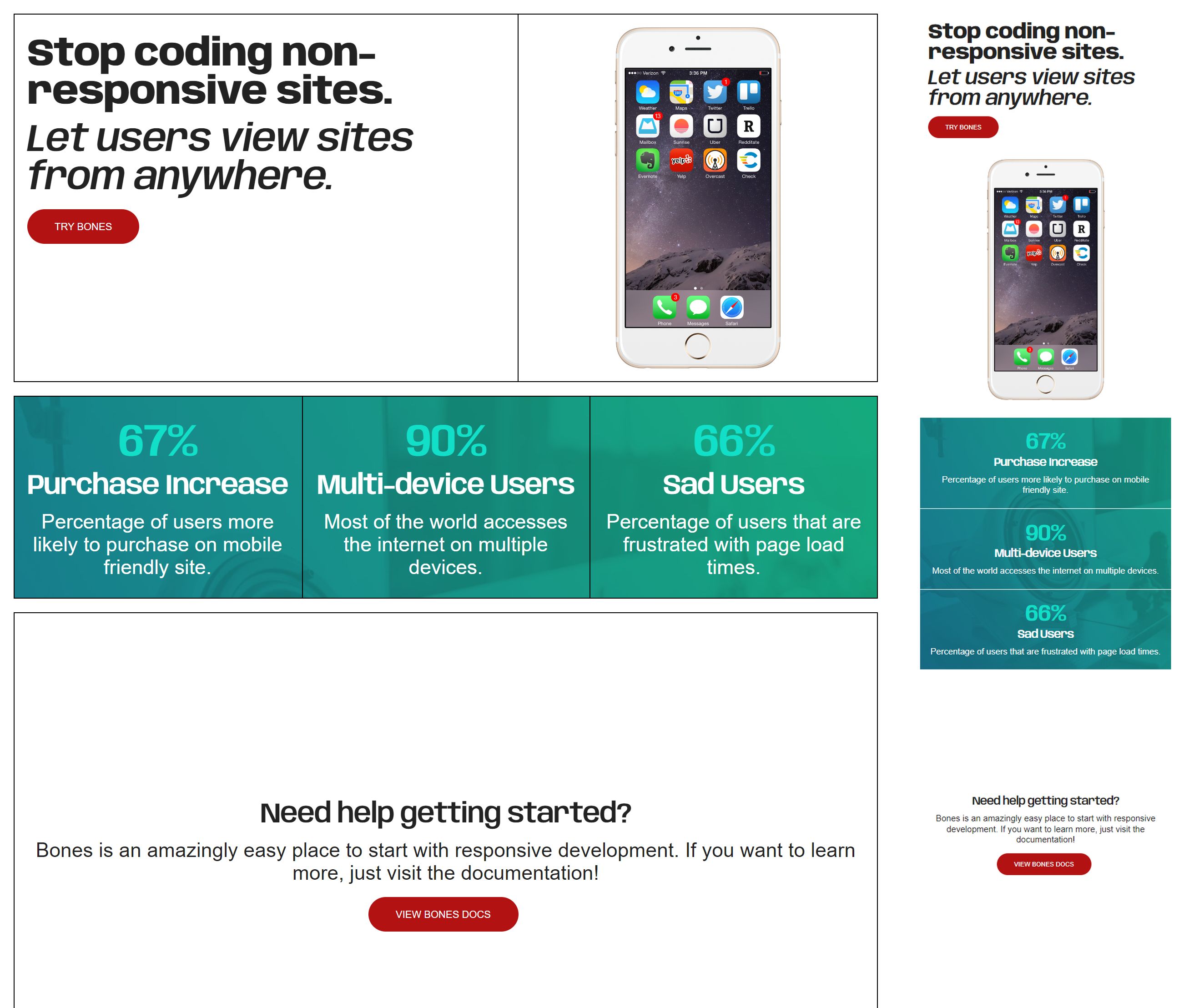
Bones.css is an easy responsive boilerplate, configurable styles with CSS variables, to kickstart any responsive project.
This was designed for simplicity. In the end, I want to eliminate having the dev make a million different decisions to design a simple site. I don't want them to think about class names or how to follow a convention. Too many boilerplates that are suppose to make responsive design easier, contain inside utility classes you need to learn, memorize and think about. My success for this project would be so you don't think about it, you style the page with simple, inline elements. I want to eliminate the hurdle to learning many different utility class names. I don't want to keep redesigning the stylesheet to continue implementing custom classes that fit certain pages.
It's still a work in progress, but my end goal would be something simple to read that is designed in HTML like this, and still looks good:
<html>
<head>
  <title>bones.css</title>
</head>

<body>
<!-- Grid is a based on the number 12. To get a complete row, you need to equal 12. With your rows. -->
<!-- E.g. Cell7 + Cell5, or Cell4, 3 times, to equal 12. -->
<!-- Consider Grid, to be your new <section> for layouts. -->
    <Grid>
        <Cell7>
          <h1>This is a heading</h1>
          <p>This is a paragraph.</p>
        </Cell7>

        <Cell5>
            <figure><img src="img.jpg"></figure>
        </Cell5>
    </Grid>

    <Grid class="center values">
      	<Cell4>
      		<h1>67%</h1>
      		<h4>Purchase Increase </h4>
      		<p>Percentage of users more likely to purchase on mobile friendly site.</p>
      	</Cell4>

      	<Cell4>
      		<h1>90%</h1>
      		<h4>Multi-device Users</h4>
      		<p>Most of the world accesses the internet on multiple devices.</p>
      	</Cell4>

      	<Cell4>
      		<h1>66%</h1>
      		<h4>Sad Users</h4>
      		<p>Percentage of users that are frustrated with page load times.</p>
        <Cell4>
    </Grid>

    <Grid class="center whitespace">
         <Cell12>
            <h4>Need help getting started?</h4>
              <p>Bones is an amazingly easy place to start with responsive development. If you want to learn more, just visit the documentation!</p>
            <button class="primary">View Bones Docs</button>
          </Cell12>
    </Grid>
</body>
</html>
There are a couple ways to download Skeleton:
- Download the zip
- Clone the repo:
git clone https://github.com/dhg/Skeleton.git(Note: this is under active development, so if you're looking for stable and safe, use the zipped download)
The download includes Skeleton's CSS, Normalize CSS as a reset, a sample favicon, and an index.html as a starting point.
Skeleton/
├── index.html
├── css/
│   ├── normalize.min.css
│   └── skeleton.css
└── images/
    └── favicon.ico
Skeleton is lightweight and simple. It styles only raw HTML elements (with a few exceptions) and provides a responsive grid. Nothing more.
- Around 400 lines of CSS unminified and with comments
- It's a starting point, not a UI framework
- No compiling or installing...just vanilla CSS
- Chrome latest
- Firefox latest
- Opera latest
- Safari latest
- IE latest
The above list is non-exhaustive. Skeleton works perfectly with almost all older versions of the browsers above, though IE certainly has large degradation prior to IE9.
All parts of Skeleton are free to use and abuse under the open-source MIT license.
The following are extensions to Skeleton built by the community. They are not officially supported, but all have been tested and are compatible with v2.0 (exact release noted):
- Skeleton on LESS: Skeleton built with LESS for easier replacement of grid, color, and media queries. (Last update was to match v2.0.1)
- Skeleton on Sass: Skeleton built with Sass for easier replacement of grid, color, and media queries. (Last update was to match v2.0.1)
Have an extension you want to see here? Just shoot an email to hi@getskeleton.com with your extension!
Skeleton was built using Sublime Text 3 and designed with Sketch. The typeface Raleway was created by Matt McInerney and Pablo Impallari. Code highlighting by Google's Prettify library. Icons in the header of the documentation are all derivative work of icons from The Noun Project. Feather by Zach VanDeHey, Pen (with cap) by Ed Harrison, Pen (with clicker) by Matthew Hall, and Watch by Julien Deveaux.
Skeleton was created by Dave Gamache for a better web.

