A minimal, configurable, neovim style tabline. Use your nvim tabs as a workspace multiplexer!
Tabby.nvim focuses on a vim-style tab instead of buffers list, so tabby only displays the buffers in tabpage(although you can use low-level API to write a bufferline). On the other hand, if you use some plugin such as "fzf" or "telescope," you will find the bufferline unnecessary. In that case, you may want to use the tab as its original feature: a windows layout multiplexer. That might be the reason why you choose tabby.nvim.
With tabby.nvim, you can config your own tabline from scratch. And don't worry about the complexity, you can start from presets and examples. tabby.nvim has complete type annotations (powered by EmmyLua), so you can write config with the help of lua-language-server.
Use command TabRename <tabname> to rename tab. At all preset configs, it will work automatically.
In your customize config, you can use require('tabby.util').get_tab_name(tabid, fallback) to get tabname.
If no name is specified, it will display the focus window's Unique name.
Use your plugin manager to installing:
"nanozuki/tabby.nvim",
The presets config use nerdfont, should use nerdfonts-patched font to display correctly. If you don't want to use nerdfont, here is a config example: example for no nerdfont
And setup tabby in your config file:
require"tabby".setup()If you use packer:
use {
    "nanozuki/tabby.nvim",
    config = function() require("tabby").setup() end,
}Built-in presets only use the highlight group Tabline, TablineSel,
TablineFill and Normal, to support most colorschemes. To use presets:
require("tabby").setup({
    tabline = require("tabby.presets").tab_with_top_win,
})
There are five presets for now:
- active_wins_at_tail [default]
Put all windows' labels in active tabpage at end of whold tabline.
- active_wins_at_end
Put all windows' labels in active tabpage after all tags label. In-active tabpage's window won't display.

- tab_with_top_win
Each tab lab with a top window label followed. The top window is the focus
window when you enter a tabpage.
- active_tab_with_wins
Active tabpage's windows' labels is displayed after the active tabpage's label.
- tab_only
No windows label, only tab. and use focus window to name tab

These are some awesome exmaples shared by tabby.nvim users! Also welcome to share your own!
Tabby uses native nvim tab, so you can directly use nvim tab operation. Maybe you want to map some operation. For example:
vim.api.nvim_set_keymap("n", "<leader>ta", ":$tabnew<CR>", { noremap = true })
vim.api.nvim_set_keymap("n", "<leader>tc", ":tabclose<CR>", { noremap = true })
vim.api.nvim_set_keymap("n", "<leader>to", ":tabonly<CR>", { noremap = true })
vim.api.nvim_set_keymap("n", "<leader>tn", ":tabn<CR>", { noremap = true })
vim.api.nvim_set_keymap("n", "<leader>tp", ":tabp<CR>", { noremap = true })
-- move current tab to previous position
vim.api.nvim_set_keymap("n", "<leader>tmp", ":-tabmove<CR>", { noremap = true })
-- move current tab to next position
vim.api.nvim_set_keymap("n", "<leader>tmn", ":+tabmove<CR>", { noremap = true })
And in fact, vim has some built-in keymapping, it's better to read :help tabline. Here are some useful mappings:
gt					*i_CTRL-<PageDown>* *i_<C-PageDown>*
		Go to the next tab page.  Wraps around from the last to the
		first one.
{count}gt	Go to tab page {count}.  The first tab page has number one.
g<Tab>		Go to previous (last accessed) tab page.
gT		Go to the previous tab page.  Wraps around from the first one
		to the last one.
The {count} is the number displyed in presets.
Customize tabby with tabby.setup(config), the opt definition is:
---@class TabbyConfig
---@field tabline?    TabbyTablineOpt           high-level api
---@field components? fun():TabbyComponent[]    low-level api
---@field opt? TabbyOption option for tabby---@class TabbyOption
---@field show_at_least number show tabline when there are at least n tabs.- show_at_least
Only show tabline when there are at least n tabs.
The basic config unit in tabby is TabbyText. It's a set of text content,
highlight group and layout setting. You may use it in many places. The type
definition is:
---@class TabbyText
---@field [1] string|fun():string text content or a function to return context
---@field hl nil|string|TabbyHighlight
---@field lo nil|TabbyLayout
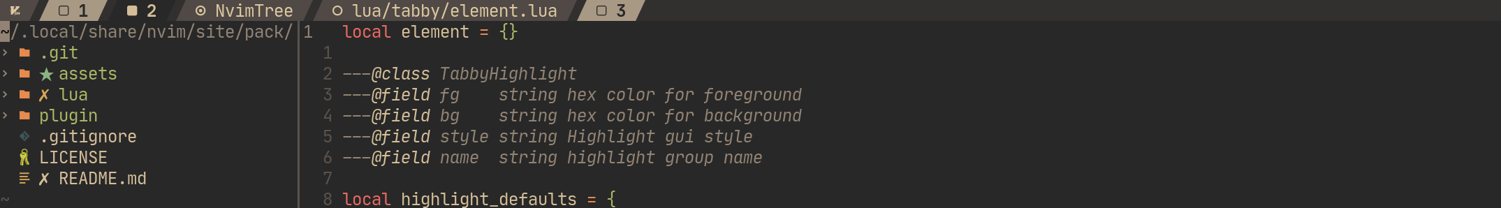
---@class TabbyHighlight
---@field fg string hex color for foreground
---@field bg string hex color for background
---@field style string Highlight gui style
---@field name string highlight group name
---@class TabbyLayout
---@field max_width number
---@field min_width number
---@field justify "left"|"right" default is leftFor example:
local text1 = { "Tab 1" }
local text2 = {
    "Tab 2",
    hl = "TablineSel",
}
local text3 = {
    "Tab 3",
    hl = { fg = my_hl.fg, bg = my_hl.bg, style = "bold" },
    lo = { min_width = 20, justify = "right" },
}
local cwd = {
    function()
	return " " .. vim.fn.fnamemodify(vim.fn.getcwd(), ":t") .. " "
    end
    hl = "TablineSel",
}
There is a util for extract values from highlight:
local hl_normal = util.extract_nvim_hl("Normal")
local labal = {
" " .. tabid .. " ",
hl = { fg = hl_normal.fg, bg = hl_normal.bg, style = "bold" },
}Through setting the TabbyOption.tabline to use the high-level api to customize
tabby. You can edit one of the three built-in layouts. (Corresponding to the
three preset values)
---@class TabbyTablineOpt
---@field layout TabbyTablineLayout
---@field hl TabbyHighlight background highlight
---@field head? TabbyText[] display at start of tabline
---@field active_tab TabbyTabLabelOpt
---@field inactive_tab TabbyTabLabelOpt
---@field win TabbyWinLabelOpt
---@field active_win? WinLabelOpt need by "tab_with_top_win", fallback to win if this is nil
---@field top_win? TabbyWinLabelOpt need by "active_tab_with_wins" and "active_wins_at_end", fallback to win if this is nil
---@field tail? TabbyText[] display at end of tabline

---@alias TabbyTablineLayout
---| "active_tab_with_wins" # windows label follow active tab
---| "active_wins_at_end" # windows in active tab will be display at end of all tab labels
---| "tab_with_top_win"  # the top window display after each tab.

---@class TabbyTabLabelOpt
---@field label string|TabbyText|fun(tabid:number):TabbyText
---@field left_sep string|TabbyText
---@field right_sep string|TabbyText

---@class TabbyWinLabelOpt
---@field label string|TabbyText|fun(winid:number):TabbyText
---@field left_sep string|TabbyText
---@field inner_sep string|TabbyText won't works in "tab_with_top_win" layout
---@field right_sep string|TabbyText
You can find three presets config for example.
If built-in layouts do not satisfy you, you can also use the low-level API to
define the tabline from scratch by setting TabbyOption.components.
TabbyOption.components is a function which return an array of
TabbyComponent. The TabbyComponent is object like:
{
    "type": "<component type>",
    -- "... config ..."
}
These are all TabbyComponents:
- TabbyComTab
TabbyComTab can receive a tabid to render a tab label.
---@class TabbyComTab
---@field type "tab"
---@field tabid number
---@field label string|TabbyText
---@field left_sep TabbyText
---@field right_sep TabbyText- TabbyComWin
TabbyComWin can receive a winid to render a window label.
---@class TabbyComWin
---@field type "win"
---@field winid number
---@field label TabbyText
---@field left_sep TabbyText
---@field right_sep TabbyText- TabbyComText
TabbyComText for rendering static text.
---@class TabbyComText
---@field type "text"
---@field text TabbyText- TabbyComSpring
TabbyComSpring mark a separation point. Each separation point will be print as equal number of spaces.
---@class TabbyComSpring
---@field type "spring"
Example
For example, we can use low-level api to define the presets
active_wins_at_end:
- Rename tab
- Unique short name for window label
- Button for close tab and add tab
- Custom click handler
- Telescope support
- Nvim doc
- Utils library