#grid-kiss: Keep CSS Grids simple, stupid
This is a PostCSS plugin aiming to replace the 24 new properties brought by CSS Grids with a single one that you immediately understand when you see it.
- Example
- Try it online
- Responsive layouts
- Alternative styles
- Installation
- Usage
- [Options] (#options)
- Properties supported
- Documentation
##Example
body {
	grid-kiss:
		"+-------------------------------+      "
		"|           header ↑            | 120px"
		"+-------------------------------+      "
		"                                       "
		"+-- 30% ---+  +--- auto --------+      "
		"| .sidebar |  |       main      | auto "
		"+----------+  +-----------------+      "
		"                                       "
		"+-------------------------------+      "
		"|              ↓                | 60px "
		"|         → footer ←            |      "
		"+-------------------------------+      "
}
is converted to:
body > header {
	grid-area: header;
	align-self: start
}

body > .sidebar {
	grid-area: sidebar
}

body > main {
	grid-area: main
}

body > footer {
	grid-area: footer;
	justify-self: center;
	align-self: end
}

body {
	display: grid;
	align-content: space-between;
	grid-template-rows: 120px 1fr 60px;
	grid-template-columns: 30% 1fr;
	grid-template-areas:
	"header  header"
	"sidebar main  "
	"footer  footer"
}
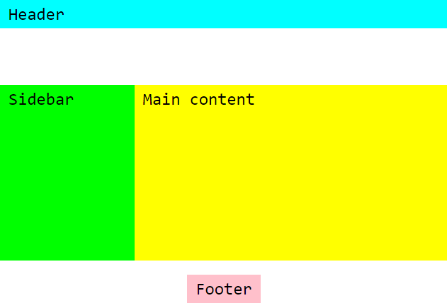
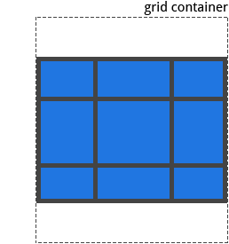
which displays this kind of grid layout:
You can play with the plugin on the playground. Edit the CSS and HTML on the left and the grid will be updated instantly.
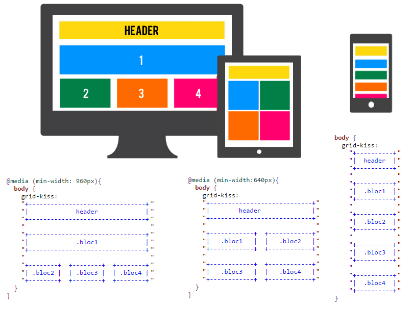
Use different grid-kiss declarations in media queries to easily get responsive layouts. It is recommended to start by the grid on small screens, then use media queries to progressively enhance your layouts on wider screens.
┌ ┐ └ ┘for corners and│ ─for segments
div {
	grid-kiss:
	"┌──────┐  ┌──────┐         "
	"│      │  │  ↑   │         "
	"│      │  │ bar →│  200px  "
	"│  ↓   │  └──────┘         "
	"│ baz  │              -    "
	"│  ↑   │  ┌──────┐         "
	"│      │  │  ↑   │  200px  "
	"└──────┘  │      │         "
	"          │ foo  │    -    "
	"┌──────┐  │      │         "
	"│ qux  │  │  ↓   │  200px  "
	"│  ↓   │  │      │         "
	"└─20em─┘  └──────┘         "
}
╔ ╗ ╚ ╝for corners and║ ═for segments
main {
	grid-kiss:
	"╔═══════╗  ╔════════════════╗      "
	"║       ║  ║    .article    ║ auto "
	"║   ↑   ║  ╚════════════════╝      "
	"║  nav  ║  ╔════╗  ╔════════╗      "
	"║       ║  ║    ║  ║ aside →║ 240px"
	"╚═ 25% ═╝  ╚════╝  ╚═ 80em ═╝      "
}- with yarn
yarn add postcss-grid-kiss --dev- with npm
npm install postcss-grid-kiss --save-devIf you never used PostCSS before, read PostCSS usage documentation first.
- with command line interface :
postcss src/your.css --output dist/compiled.css --use postcss-grid-kiss- with Node:
const postcss  = require('postcss'),
      gridkiss = require('postcss-grid-kiss');

postcss([ gridkiss ])
    .process(css, { from: 'src/your.css', to: 'compiled.css' })
    .then(function (result) {
        fs.writeFileSync('compiled.css', result.css);
        if( result.map ) fs.writeFileSync('compiled.css.map', result.map);
    });
Read PostCSS documentation for usage with Gulp, Webpack, Grunt or other build systems.
Grid-kiss comes with a few options you can pass to PostCSS:
postcss([ gridkiss({ ...options }) ])As of December 2016, CSS Grid Layout specification is a Candidate Recommandation and is not widely supported. It is available in Firefox 52 and Chrome Nightly (and probably in Chrome 57). Maybe March 2017 for Safari (maybe). See Can I Use for more information on browser support. Microsoft Edge implements an older and unusable version of this specification. All the major browser editors are currently working on it and we can hope a decent browser support at mid-2017.
In the meantime, Grid-kiss proposes a fallback option that tries to simulate CSS Grid Layout with absolute positionning and calc() operator. This is a CSS-only fallback that applies only on browsers not supporting CSS Grid Layout, thanks to a @supports query.
To add the fallback styles to the output, use the fallback option:
postcss([ gridkiss({ fallback: true }) ])With this option, grid layouts are supported on any browser supporting calc(), which is like 90% of browsers.
Note that a fallback based on absolute positionning is very far from the awesomeness of CSS Grid Layout. It comes with a few caveats that you have to be aware:
- Zones with
position: absoluteare out of the flow. This implies that the container will no longer resize based on the zones content. Grid-kiss tries to calculate the total size of the grid when possible. If one of the rows/columns dimensions isautoor a fraction of the remaining space (fr), the height/width is set to100%. - Zones require the property
box-sizing: border-box; otherwise they may overlap because of their padding or border size. Grid-kiss takes care of it, but it may change a bit the dimensions of your zones compared to the grid layout version. - It is only a fallback for
grid-kissdeclarations. Other Grid Layout properties such asgrid-gapare not covered by this fallback - New dimensions properties defined in the Grid layout specification such as
min-content,max-content,minmax(),fit-contentalso are not supported - The CSS output is significally bigger, almost 3x in size
This option is only used when fallback option is set to true.
Internet Explorer does not support @supports 🙄 , so Grid-kiss needs to add another media query hack that is known to run only on IE: @media screen and (min-width:\0). This extends support from IE9 to IE11.
If you don't care about Internet Explorer support and want to reduce the output size, you can add the screwIE option to skip the IE hack:
postcss([ gridkiss({ fallback: true, screwIE: true }) ])This option is only used when fallback option is set to true.
Set this option to false if you want to debug how Grid-kiss is computing some fallback dimensions.
display: grid✅grid-template-columns✅grid-template-rows✅grid-template-areas✅grid-column-gap❌ [1]grid-row-gap❌ [1]grid-gap❌ [1]justify-items❌ [2]align-items❌ [2]justify-content✅align-content✅grid-auto-columns❌ [3]grid-auto-rows❌ [3]grid-auto-flow❌ [3]grid❌ [4]
[1]: gaps are actually faked as empty zones, so you can define the gap dimension specifically by row/column. See Gaps Dimensions
[2]: justify-items and align-items are not used on the container level, instead use alignment helpers for each zone
[3]: grid-auto-columns, grid-auto-rows and grid-auto-flow are not used, instead define explicitely all the zones
[4]: grid-kiss aims to replace the grid property
grid-column-start❌ [5]grid-column-end❌ [5]grid-row-start❌ [5]grid-row-end❌ [5]grid-column❌ [5]grid-row❌ [5]grid-area✅justify-self✅align-self✅
[5] named areas are used instead of indexes
- Draw the different zones of your grid as shown in the example. You can use some tools like AsciiFlow.
- Inside every zone, write a CSS selector that matches the corresponding element. It can be a
tagname, a.class, an#id, orany.other[valid]#selector - The elements matched have to be direct descendants of the grid element
- Separate each row by a newline (
\n) and give the same indentation level to every row - Make sure each row starts and end by a double quote
" - Make sure the zone corners (
+) are correctly aligned. Every index in the rows where a corner character is found creates a new column. - Do not hesitate to make large zones with unused space, it may be useful for future modifications
- Use Insert. key and Multi-cursor if supported by your editor to draw and edit your grids easily
Declare the size of a row by writing the dimension just after the last column of the grid
+------+  +------+ ---
|  ^   |  | .bar | 40em
|      |  +------+ ---
| .baz |
|      |  +------+ ---
|  v   |  |  ^   | 38em
+------+  |      | ---
          | .foo |
+------+  |      | ---
| .qux |  |  v   | 40em
+------+  +------+ ---
The - separators between dimensions are not mandatory, they are only here to make the grid more readable.
Declare the size of a column by writing the dimension inside the top or bottom border of a zone:
+-- 640px --+      +----------+
|  selector |  or  | selector |
+-----------+      +---30%----+
You cannot set the width of a zone occupying more than one column. This would imply some calculations that may or may not have a solution. As an alternative, you can declare the size of a column just after the last row of the grid:
+-------------+ +-----+        +-------------+ +-20%-+
|  .bigzone   | |     |        |  .bigzone   | |     |
+-------------+ +-----+        +-------------+ +-----+
+-----+ +-------------+   or   +-----+ +-------------+
|     | |  .bigzone2  |        |     | |  .bigzone2  |
+-----+ +-------------+        +-20%-+ +-------------+
| 20% | | 60% | | 20% |                | 60% |
The | separators between dimensions are not mandatory, they are only here to make the grid more readable.
You can also declare the dimension of spacing between zones the same way you do with rows and columns. These spaces are called gaps and act like empty zones. The example below defines gaps of 50px.
+-----+      +-----+      +-----+  ----
| .nw |      | .n  |      | .ne | 100px
+-----+      +-----+      +-----+  ----
                                   50px
+-----+      +-----+      +-----+  ----
| .w  |      |     |      | .e  | 100px
+-----+      +-----+      +-----+  ----
                                   50px
+-----+      +-----+      +-----+  ----
| .sw |      | .s  |      | .se | 100px
+-----+      +-----+      +-----+  ----
|100px| 50px |100px| 50px |100px|
Dimensions can be any of the specified values:
-
a non-negative length.
15px4rem
-
a non-negative percentage value, optionally with a context keyword
20%25% free=>25fr30% grid=>30%5% view=>5vwor5vh
-
a non-negative number representing a fraction of the free space in the grid container.
5=>5fr
-
maxormax-content: a keyword representing the largest maximal content contribution of the grid items occupying the grid track -
minormin-content: a keyword representing the largest minimal content contribution of the grid items occupying the grid track -
a range between a minimum and a maximum or
minmax(min, max)100px - 200px=>minmax(100px, 200px)
-
> *length*or< *length*: a minimum or maximum value> 100px=>minmax(100px, auto)< 50%=>minmax(auto, 50%)
-
fit *length*orfit-content(*length*): a keyword representing the formula min(max-content, max(auto, length)), which is calculated similar to auto (i.e. minmax(auto, max-content)), except that the track size is clamped at argument length if it is greater than the auto minimum.fit 100px=>fit-content(100px)
-
auto: a keyword representing one part of the remaining free space, i.e.1fr. When used as a maximum value, it is equal tomax-content. When used as a minimum value, it it is equal tomin-content.
When no value is specified, row and column sizes are set as auto
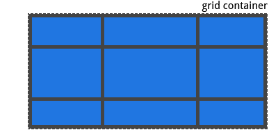
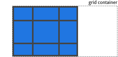
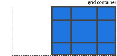
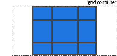
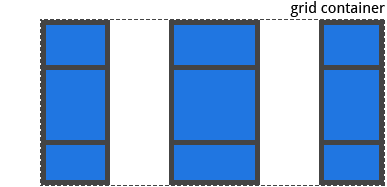
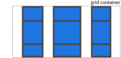
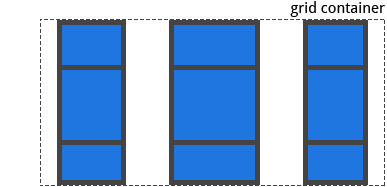
Specifies how all the zones are aligned horizontally inside the grid container. Irrelevant if one of the zones fits all the remaining free space.
justify-content: stretchwhen there are no two consecutive spaces at the beginning or the end of the rows
"+---+ +---+ +---+"
"| a | | b | | c |"
"+---+ +---+ +---+"
"+---+ +---+ +---+"
"| d | | e | | f |"
"+---+ +---+ +---+"
"+---+ +---+ +---+"
"| g | | h | | i |"
"+---+ +---+ +---+"
justify-content: startwhen there are two consecutive spaces or more at the end of the rows
"+---+ +---+ +---+    "
"| a | | b | | c |    "
"+---+ +---+ +---+    "
"+---+ +---+ +---+    "
"| d | | e | | f |    "
"+---+ +---+ +---+    "
"+---+ +---+ +---+    "
"| g | | h | | i |    "
"+---+ +---+ +---+    "
justify-content: end
when there are two consecutive spaces or more at the beginning of the rows
"    +---+ +---+ +---+"
"    | a | | b | | c |"
"    +---+ +---+ +---+"
"    +---+ +---+ +---+"
"    | d | | e | | f |"
"    +---+ +---+ +---+"
"    +---+ +---+ +---+"
"    | g | | h | | i |"
"    +---+ +---+ +---+"
justify-content: centerwhen there are two consecutive spaces or more at the beginning and the end of the rows
"    +---+ +---+ +---+    "
"    | a | | b | | c |    "
"    +---+ +---+ +---+    "
"    +---+ +---+ +---+    "
"    | d | | e | | f |    "
"    +---+ +---+ +---+    "
"    +---+ +---+ +---+    "
"    | g | | h | | i |    "
"    +---+ +---+ +---+    "
justify-content: space-betweenwhen there are two consecutive spaces or more between zones
"+---+    +---+    +---+"
"| a |    | b |    | c |"
"+---+    +---+    +---+"
"+---+    +---+    +---+"
"| d |    | e |    | f |"
"+---+    +---+    +---+"
"+---+    +---+    +---+"
"| g |    | h |    | i |"
"+---+    +---+    +---+"
justify-content: space-evenlywhen there are two consecutive spaces or more at the beginning and the end of the rows, and exactly two consecutive spaces between zones
"    +---+  +---+  +---+    "
"    | a |  | b |  | c |    "
"    +---+  +---+  +---+    "
"    +---+  +---+  +---+    "
"    | d |  | e |  | f |    "
"    +---+  +---+  +---+    "
"    +---+  +---+  +---+    "
"    | g |  | h |  | i |    "
"    +---+  +---+  +---+    "
justify-content: space-aroundwhen there are two consecutive spaces or more at the beginning and the end of the rows, and four consecutive spaces or more between zones
"  +---+    +---+    +---+  "
"  | a |    | b |    | c |  "
"  +---+    +---+    +---+  "
"  +---+    +---+    +---+  "
"  | d |    | e |    | f |  "
"  +---+    +---+    +---+  "
"  +---+    +---+    +---+  "
"  | g |    | h |    | i |  "
"  +---+    +---+    +---+  "
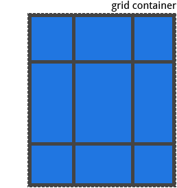
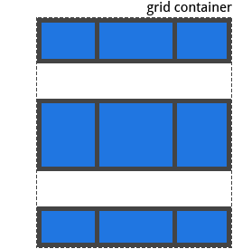
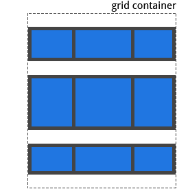
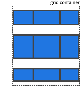
Specifies how all the zones are aligned vertically inside the grid container. Irrelevant if one of the zones fits all the remaining free space.
align content: stretchwhen no space rows
"+---+ +---+ +---+"
"| a | | b | | c |"
"+---+ +---+ +---+"
"+---+ +---+ +---+"
"| d | | e | | f |"
"+---+ +---+ +---+"
"+---+ +---+ +---+"
"| g | | h | | i |"
"+---+ +---+ +---+"
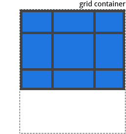
align-content: startwhen at least one space row at the end
"+---+ +---+ +---+"
"| a | | b | | c |"
"+---+ +---+ +---+"
"+---+ +---+ +---+"
"| d | | e | | f |"
"+---+ +---+ +---+"
"+---+ +---+ +---+"
"| g | | h | | i |"
"+---+ +---+ +---+"
"                 "
"                 "
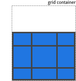
align-content: endwhen at least one space row at the beginning
"                 "
"                 "
"+---+ +---+ +---+"
"| a | | b | | c |"
"+---+ +---+ +---+"
"+---+ +---+ +---+"
"| d | | e | | f |"
"+---+ +---+ +---+"
"+---+ +---+ +---+"
"| g | | h | | i |"
"+---+ +---+ +---+"
align-content: centerwhen at least one space row at the beginning and one space row at the end
"                 "
"+---+ +---+ +---+"
"| a | | b | | c |"
"+---+ +---+ +---+"
"+---+ +---+ +---+"
"| d | | e | | f |"
"+---+ +---+ +---+"
"+---+ +---+ +---+"
"| g | | h | | i |"
"+---+ +---+ +---+"
"                 "
align-content: space-betweenwhen there is one space row between zones
"+---+ +---+ +---+"
"| a | | b | | c |"
"+---+ +---+ +---+"
"                 "
"+---+ +---+ +---+"
"| d | | e | | f |"
"+---+ +---+ +---+"
"                 "
"+---+ +---+ +---+"
"| g | | h | | i |"
"+---+ +---+ +---+"
align-content: space-evenlywhen there is one space row at the beginning, at the end and between zones
"                 "
"+---+ +---+ +---+"
"| a | | b | | c |"
"+---+ +---+ +---+"
"                 "
"+---+ +---+ +---+"
"| d | | e | | f |"
"+---+ +---+ +---+"
"                 "
"+---+ +---+ +---+"
"| g | | h | | i |"
"+---+ +---+ +---+"
"                 "
align-content: space-aroundwhen there is one space row at the beginning and at the end, and two space rows between zones
"                 "
"+---+ +---+ +---+"
"| a | | b | | c |"
"+---+ +---+ +---+"
"                 "
"                 "
"+---+ +---+ +---+"
"| d | | e | | f |"
"+---+ +---+ +---+"
"                 "
"                 "
"+---+ +---+ +---+"
"| g | | h | | i |"
"+---+ +---+ +---+"
"                 "
Each zone can specify an alignment indicator. When no indicators are specified, defaults are stretch horizontally and vertically.
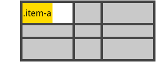
justify-self: startwith<or←
+-------------+    +-------------+
| .item-a  <  | or | .item-a  ←  |
+-------------+    +-------------+
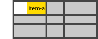
justify-self: endwith>or→
+-------------+    +-------------+
|  >  .item-a | or |  →  .item-a |
+-------------+    +-------------+
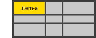
justify-self: stretchwith<and>or←and→in this order
+--------------+    +--------------+
| < .item-a  > | or | ← .item-a  → |
+--------------+    +--------------+
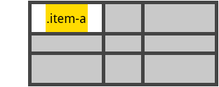
justify-self: centerwith>and<or→and←in this order
+--------------+    +--------------+
| > .item-a  < | or | → .item-a  ← |
+--------------+    +--------------+
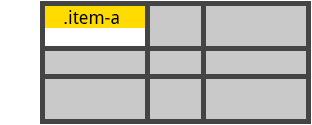
align-self: startwith^or↑
+-------------+    +-------------+
|   .item-a   | or |   .item-a   |
|      ^      |    |      ↑      |
+-------------+    +-------------+
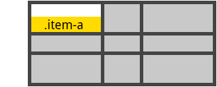
align-self: endwithvor↓
+-------------+    +-------------+
|      v      | or |      ↓      |
|   .item-a   |    |   .item-a   |
+-------------+    +-------------+
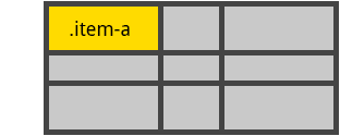
align-self: stretchwith^andvor↑and↓in this order
+-------------+    +-------------+
|      ^      |    |      ↑      |
|   .item-a   | or |   .item-a   |
|      v      |    |      ↓      |
+-------------+    +-------------+
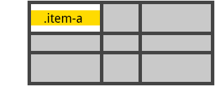
align-self: centerwithvand^or↓and↑in this order
+-------------+    +-------------+
|      v      |    |      ↓      |
|   .item-a   | or |   .item-a   |
|      ^      |    |      ↑      |
+-------------+    +-------------+
New lines and position of alignement characters do not matter. Just make it visually understandable.
Credits for images : CSS Tricks - https://css-tricks.com/snippets/css/complete-guide-grid/


