Short tutorial on displaying an astronomical FITS datacubes
 Below is a short tutorial for making a movie of an astronomical data cube. It can be expanded upon with a number of useful Python modules (some are listed below). Jeff Mangum and I have been experimenting with various ways of doing this while minimizing the amount of code needed. In addition to walking through this short tutorial and providing the script, a number of useful links are provided at the end. The following video is a slightly more complex example with a number of features available in APLpy: Video display

Data used: Infrared | Very Large Array | Digital Sky Survey
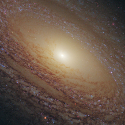
Matplotlib, numpy, pylab/Scipy, astropy, and APLpy are needed for this example. The example used below is a naturally weighted, VLA HI data cube of galaxy NGC 2841, and can be obtained from this link (Walter et al. 2008).
import os, sys, string, matplotlib, aplpy

import matplotlib.pyplot as plt
import numpy as np
import pylab as py
from astropy.io import fits
from matplotlib import colors, cm
I really like this custom colormap, so we define it here.
#Colormap I like to use
cdict_bkcmap={
    'red'  :  ((0., 0., 0.), (0.25,0.,0.), (0.5,1.,1.), (0.75,1.0,1.0),  (1., 1., 1.)),
    'green':  ((0., 0., 0.), (0.25,0.,0.), (0.5,0.,0.), (0.75,1.0,1.0),  (1., 1., 1.)),
    'blue' :  ((0., 0., 0.), (0.25,1.,1.), (0.5,0.,0.), (0.75,0.0,0.0),  (1., 1., 1.))
    }

bkcmap = matplotlib.colors.LinearSegmentedColormap('bkcmap', cdict_bkcmap,1024)
These parameters can be hardwired into a script, used as function kwargs, or prompted for at the terminal depending on how one wishes to interact with the data.
filename='NGC_2841_NA_CUBE_THINGS.FITS'
nchan=128
img=fits.getdata(filename)
hdulist = fits.open(filename)        # open a FITS file
prihdr = hdulist[0].header           # the primary HDU header

# FITS coordinate pixels
raminbox = 462-11
ramaxbox = 462+11
decminbox = 575-11
decmaxbox = 575+11

# Select a spectrum out of the data cube
# Units of mJy/beam and km/s
# Creating the abscissa array will vary depending on the datacube
spectrum = [np.mean(img[i,decminbox:decmaxbox,raminbox:ramaxbox])*1000.0 for i in range(0,nchan)]
velocity = [(prihdr['CRVAL3'] + prihdr['CDELT3']*(i+prihdr['CRPIX3']))/1000.0 for i in range(0,nchan)]
We now utilize APLpy and matplotlib to slice data cube channel. Note that a "recenter" class method can be used to crop the field as desired. A commented out "beam" method can be used to display the beam if the appropriate keywords are in the FITS header. Create a 'pngs' subdirectory before starting. We would recommend clearing out the pngs directory between successive runs, or wherever you choose to save your frames - be careful what you delete!
for i in range(0,nchan):
        plt.clf()

        ax1 = aplpy.FITSFigure(filename, dimensions=[0,1], slices=[i,0], figure=fig, subplot=[0.25,0.5,0.60,0.45])
        ax1.recenter(140.50924, 50.975394, width=0.125, height=0.125)  # degrees
        ax1.show_colorscale(cmap=bkcmap, vmin=-.0001, vmax=0.00387265)
        ax1.add_grid()
        ax1.axis_labels.set_xtext(u'$\\mathrm{Right}$'+' '+u'$\\mathrm{Ascension}$' + ' ' +u'$\\mathrm{(J2000)}$')
        ax1.axis_labels.set_ytext(u'$\\mathrm{Declination}$'+' '+u'$\\mathrm{(J2000)}$')
        ax1.set_tick_labels_format(xformat='hh:mm:ss', yformat='dd:mm')
        ax1.set_tick_color('white')
        ax1.set_tick_labels_style('latex')
        ax1.set_labels_latex(True)
        ax1.show_rectangles(140.54131,51.002304,0.009504002,0.009504002, edgecolor='green', facecolor='none', lw=1)
        #ax1.show_beam(edgecolor='white', facecolor='none', lw=1)
        ax1.show_colorbar()
        ax1.colorbar.set_axis_label_text(u'$\\mathrm{Jy/beam}$')


        ax2 = fig.add_axes([0.2,0.1,0.74,0.3])
        ax2.plot(velocity, spectrum)
        ax2.axvline(x=velocity[i],linewidth=2, color='green')
        ax2.axhline(y=0,color='grey')
        ax2.set_xlabel(u'$\\mathrm{Velocity (km/s)}$')
        ax2.set_ylabel(u'$\\mathrm{Flux}$'+u' '+u'$\\mathrm{Density (mJy/beam)}$')
        ax2.axis([max(velocity),min(velocity),-0.5,3.5])


	fig.canvas.draw()
	plt.savefig('pngs/'+str(i).zfill(3)+'.png', pad_inches=0)
Rather than use the "show_rectangles" class method, one can utilize DS9 region files, formatted in ASCII text as:
# Region file format: DS9 version 4.1
# Filename: NGC_2841_NA_CUBE_THINGS.FITS
global color=green dashlist=8 3 width=1 font="helvetica 10 normal roman" select=1
fk5
box(9:22:19.126,+50:57:34.27,34.2144",34.2144",0) # color=red
box(9:22:01.676,+50:57:15.68,27.9936",34.2144",0) # color=magenta
box(9:22:09.914,+51:00:08.30,34.2144",37.3248",0) # color=green
box(9:21:55.743,+51:01:29.18,34.2144",34.2144",0) # color=cyan
Note that pyregion is needed to read these kinds of files. These can be then read in with:
ax1.show_regions('myregions.reg')
Finally, you can use ImageMagick to assemble everything into an animated GIF, which will run in PowerPoint, Keynote, or a web browser. Delay units are in milliseconds (larger number means a slower framerate. Loop determines how many times for the GIF to loop. From the ternimal prompt in your pngs directory:
convert -delay 10 -loop 10 *.png animate.gif
Alternatively, one can use Blender or the matplotlib animation moviewriter example to create an MP4 file.
- Final animation: Animated GIF
- Example script: Python script