


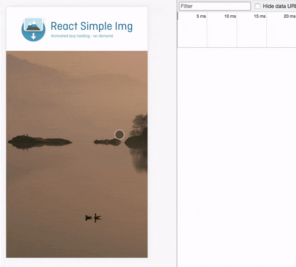
Smart react image with IntersectionObserver API and animations 👏
🤔 Why this package?
- Speed up initial page loads by loading only images above the fold
- Responsive with placeholders and animations
- Smart download logic using IntersectionObserver
- Simple usage and tiny size
yarn add react-simple-img || npm install react-simple-img
Navigate into example folder and install
yarn && yarn start || npm install && npm run start
Tip for the above effect
To generate svg placeholder, please install SQIP to generate placeholders.
import { SimpleImg, initSimpleImg } from 'react-simple-img';

initSimpleImg(); // run once at your root component or at file which calls `ReactDOM.render`

export default () => <SimpleImg height={500} src="your image path" />;
This function will set up global intersection observer and watch all <SimpleImg /> appear in the viewport through your
entire app
Arguments
-
config: (Object) this argument is optional
-
[root]: The element that is used as the viewport for checking visiblity of the target. Must be the ancestor of the target. Defaults to the browser viewport if not specified or if null.
-
[rootMargin]: Margin around the root. Can have values similar to the CSS margin property, e.g. "10px 20px 30px 40px" (top, right, bottom, left). If the root element is specified, the values can be percentages. This set of values serves to grow or shrink each side of the root element's bounding box before computing intersections. Defaults to all zeros.
-
[threshold]: Either a single number or an array of numbers which indicate at what percentage of the target's visibility the observer's callback should be executed. If you only want to detect when visibility passes the 50% mark, you can use a value of 0.5. If you want the callback run every time visibility passes another 25%, you would specify the array [0, 0.25, 0.5, 0.75, 1]. The default is 0 (meaning as soon as even one pixel is visible, the callback will be run). A value of 1.0 means that the threshold isn't considered passed until every pixel is visible.
-
This high order component will connect all your SimpleImg to be observed per section, and overwrite global config by
initSimpleImg().
Arguments
-
Component: (Component) react component
-
config: (Object) this argument is optional (same as
initSimpleImgconfig argument)
Image component working similar with standard img tag and with the following props.
| Prop | Type | Required | Description |
|---|---|---|---|
src |
string | ✓ | The large image source |
srcSet |
string | eg: large.jpg 2x, small.jpg Reference for examples |
|
sizes |
string | eg: (max-width: 320px) 280px, (max-width: 480px) 440px Reference for examples |
|
placeholder |
string | Placeholder image source (svg, jpg, png...) or css color value (white, linear-gradient(blue, pink)) |
|
imgClassName |
string | class for the image itself, which also applied to the placeholder | |
width |
number | image width apply to original image and placeholder | |
height |
number | image height apply to original image and placeholder | |
alt |
string | alt attribute for img tag | |
wrapperClassName |
string | className for element wrapping img tag | |
animationDuration |
number | animation duration in seconds passed as durationSeconds to react-simple-animate |
|
animationEndStyle |
object string |
style to transition to passed as endStyle to react-simple-animate |
Set up React Simple Img per page, you can use the following example without initSimpleImg()😘
import { SimpleImg, SimpleImgProvider } from 'react-simple-img';

export default () =>  (
   <SimpleImgProvider
     config={{
       threshold: [0.5], // load image when 50 percentage of image in the view port
     }}
   >
     // placeholder background color example
     <SimpleImg
       height={500}
       placeholder="linear-gradient(rgb(30, 87, 153) 0%, rgb(125, 185, 232) 100%)"
       src="your image path"
     />
     // placeholder background image example
     <SimpleImg height={500} placeholder="your placeholder svg or image path" src="your image path" />
   </SimpleImgProvider>
 );
https://medium.com/jsdownunder/optimising-web-page-a-simple-step-66f7f4ba417c