dash_table_highlight
This is just to show a simple alternative to row selection in Dash DataTable which it visually more pleasant (at least to me).
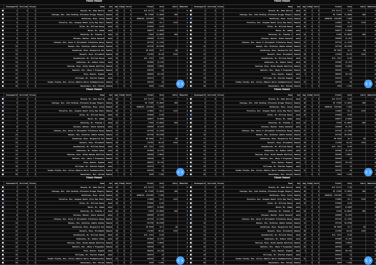
The table is built using the training set of the famous Kaggle Titanic Challeng, we basically move from the default raw selection in Dash, with Radio Buttons

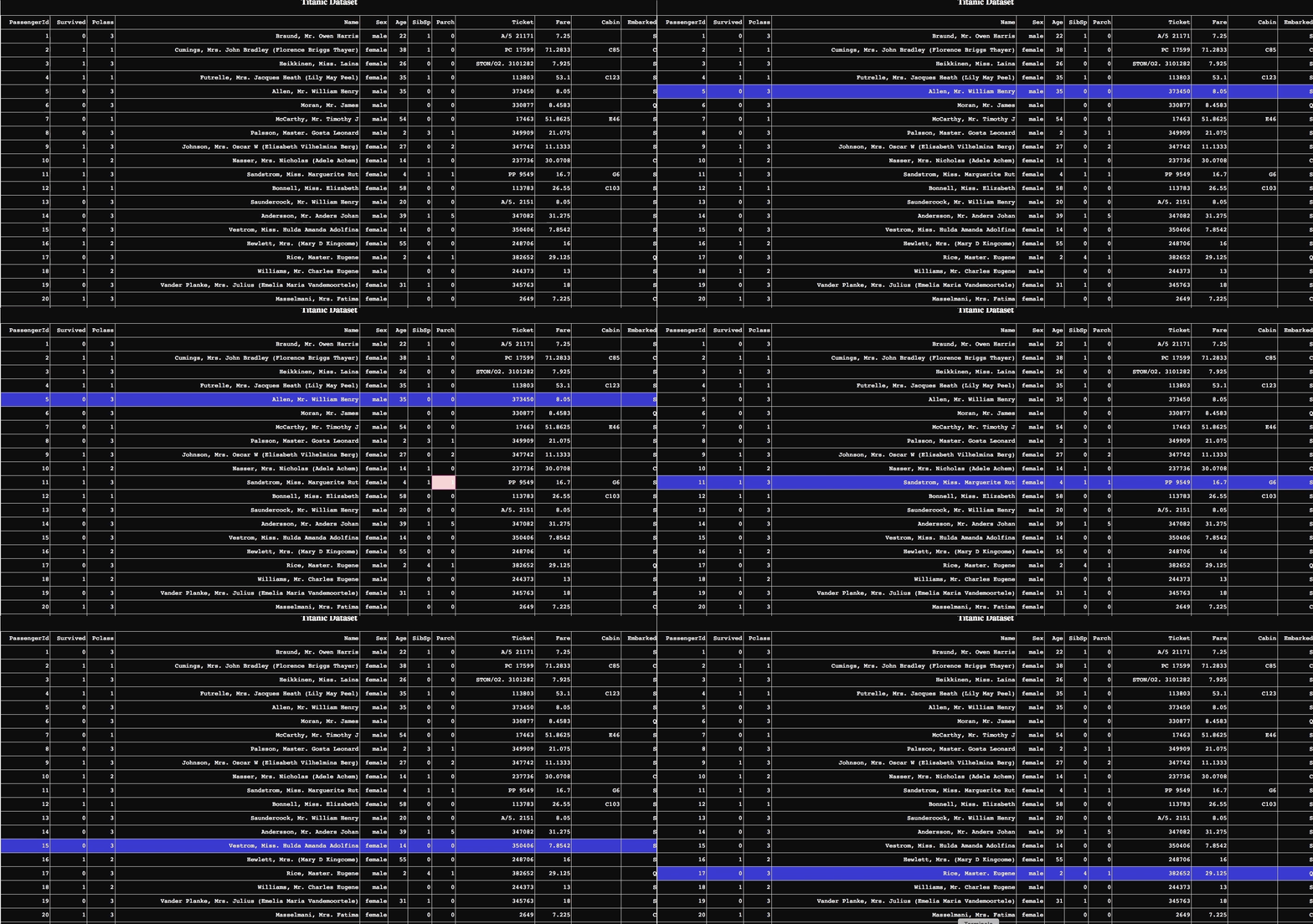
To this one below in which the whole row gets highlighted, hence it's easier to focus on relevant features when moving from one observation to the other.
Dash basic Layout (an example in table_select_raw.py) works fine as long as you are not too demanding terms of colors and customization.
I built as an example a whole black table (table_select_black.py) but it works perfectly with any other color your dashboard/GUI might need.
For this setting Dash lets you select rows with an item similar to the Radio Items component (table_select_black_select.py), and to be honest it works way better in their latest version, since it previously kept the whole column with the buttons in grey, regardless the color of the rest of the table.
Nonetheless I find it way more intuitive with something that highlight the row selected.
This is possible by storing the selected row in a memory component (dcc.Store) and use it to return a different table each time. The drawback is that these method does not work that well the heavier your DataTable gets, for a dataset the size of the Titanic's it works smooth enough but I was not able to implement it on some larger dataframes
