A Zeplin extension that generates Styled Component snippets from colors, text styles and layers. 💅
Download the extension from the Zeplin extensions website: Zeplin Styled Components, and open a Zeplin project to see it work its magic.
For colors and textstyles output go to the styleguide tab.
Click the download icon ![]() to export your styles into your project directly.
to export your styles into your project directly.
// colors

export default {
  alert1: '#e00202',
  alert2: '#8fbe49',
  global1: '#0d62a5',
  global2: '#a7a9ac',
  global3: '#009ad9',
  neutral1: '#ffffff',
  neutral2: '#000000',
  neutral3: '#333333',
  neutral4: '#848484',
  neutral5: '#dee4ea',
  neutral6: '#e6e6e6'
}// textStyles
import { css } from 'styled-components';
export default {
alertNeutral4: css`
font-size: 14px;
color: ${({ theme }) => theme.palette.neutral4};
letter-spacing: 0.4px;
line-height: 1.57;
font-family: TheSansLF;
font-weight: 300;
`,
heading12neutral3: css`
color: ${({ theme }) => theme.palette.neutral3};
line-height: 1.1;
font-size: 40px;
font-family: TheSansLF;
font-weight: 700;
`,
};For the layers output click on any layer within a project.
export const Tooltip = styled.div`
  ${({ theme }) => theme.textStyles.paragraph1Neutral3};
  height: 347px;
  width: 351px;
  background-color: ${({ theme }) => theme.palette.neutral1};
  border-radius: 2px;
  box-shadow: 0 1px 5px 1px rgba(51, 51, 51, 0.1);
  border: 1px solid rgb(230, 230, 230);
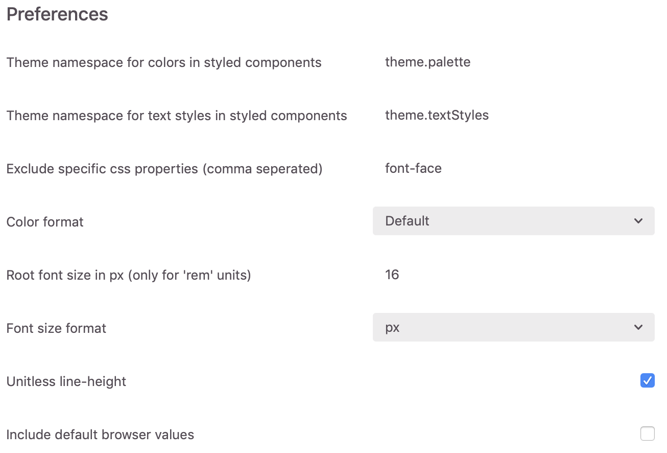
`;There are several options to modify this plugin to your own preferences, with even more updates available in the future. Check out the roadmap for further details.
- Theme namespace for colors in styled components: Use this option if you have a different namespace for theme colors in your project than the provided default. Namespaces will automatically be destructured in the output.
- Theme namespace for text styles in styled components: Similar to the color namespace option but for text styles.
- Exclude specific css properties (comma seperated) : If you don't want specific CSS properties to be generated/exported you can comma seperate them here.
- Color format: Set the generated color format, available in:
- Default (HEX)
- HEX
- RGB
- HSL
- Root font size: Set the font-size on which the rem-values will be calculated.
- Font size format: Choose between px and rem for the font-size. note: em not supported because it relies on the parent font-size which we can't know within Zeplin...
- Unitless line-height: Line-height in px or unitless.
If you have any ideas or requests for additional options, check out our contributing guidelines.
This project is developed by novemberfive.co, and maintained by Nick Verstocken.
Got any questions or ideas? We'd love to hear from you. Check out our contributing guidelines for ways to offer feedback and contribute.
Copyright (c) November Five BVBA. All rights reserved.
Licensed under the MIT License.


