by Adam Willats
- yeah yeah yeah, skip the lists & resources, just tell me which plotting library to use
- just show me cool-looking plots!
- Comparing plotting libraries
- Advice for data visualization
I'm interested in using python and javascript to interactively explore problems in computational neuroscience and neuroengineering. I'm also interested in using interactive visualizations to teach concepts to others. here's some of my work:
- dynamics visualizer code :fa-github:, demo
- cross-correlation visualizer code :fa-github: demo (🚧 work in progress 🚧)
my priorities are:
- must allow rich interactivity (zooming, filtering, linking plots)
- robust handling of multiple 10k sample timeseries
- expressive, functional-style flexible mapping of (nested) indices to plots
- I want to be able to explore relationships between variables in high(er) dimensional parameter sweeps
- bonus points if it can render 3D plots
- easy to embed / host results, especially in static webpages
- easy to share, and for others to access, preferrably without complex tools
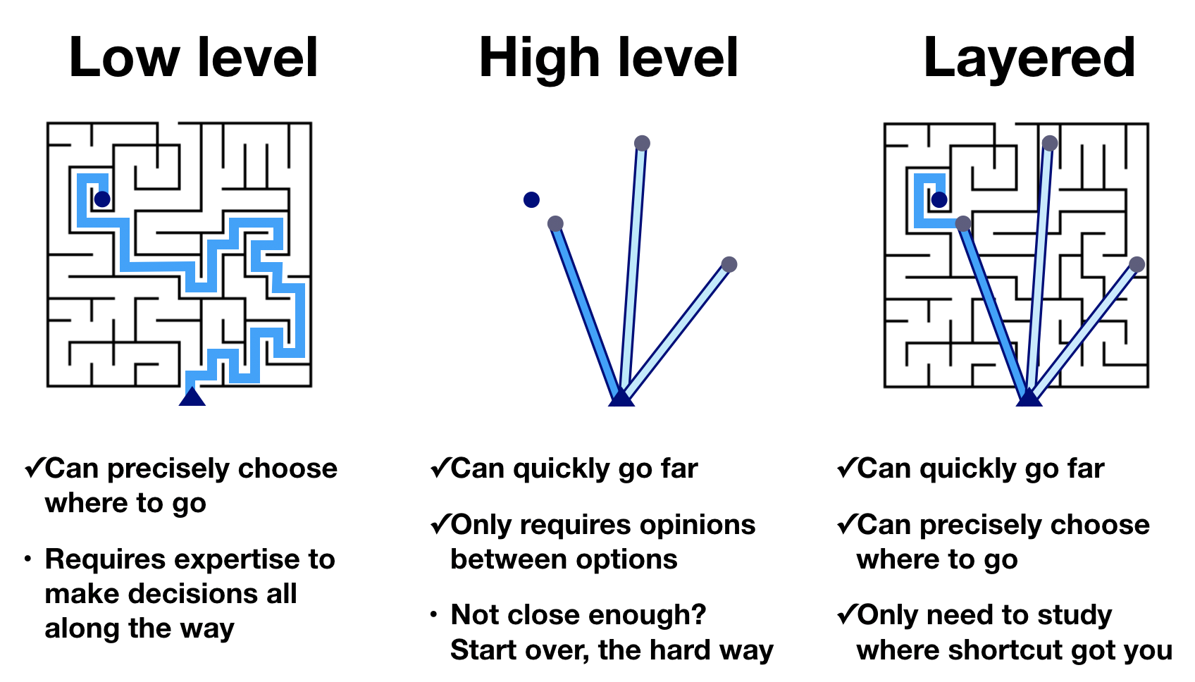
Here I focus on a subset of solutions which I think are most promising for the interactive use-case. see also pyviz.org or "Dynamic science viz.."1 for a more comprehensive evaluation.
| library | language for computation | lots of data | custom js | easy to embed | interactivity | 3D plots |
|---|---|---|---|---|---|---|
| Plotly /Dash | python2 | yes, webgl + datashader | sort of - via Dash 3 | yes, dash is more flexible, but more complicated | high | yes |
| Bokeh | python (+ js) | yes, column-data & server solutions | yes | yes | high | yes-ish |
| Altair | python | no 4️ | difficult | yes, through vega-lite | medium | no |
| HoloViz | python | via datashader | yes | yes | high | yes, through plotly |
| Observable | javascript5 | yes6, stream from server | yes 7 | yes, can also embed single cells | high | yes, through js libraries |
-
matplotlib - the de facto standard for (non-interactive, 2D) plotting in Python
-
plotnine - like Altair, this is a Python library which implements a grammar of graphics approach to plotting
-
Streamlit - python dashboarding library becoming increasingly popular
-
weights and biases - visualization & logging for machine learning
- has great table view page, live demo
- incremental logging of diverse data-types
- flexible enough to be used outside ML
- could fit with use-case of having to stop mid-simulation to offload data
- wrapper functions for managing hyperparameter sweeps
- tools for visualizing results in progress
-
see also:
- The Python Visualization Landscape (2017) video of talk by Jake VanderPlas
- lots more comparisons of python viz tools at pyviz.org
Adaptation of Jake VanderPlas graphic about the Python visualization landscape, by Nicolas P. Rougier, via PyViz.org
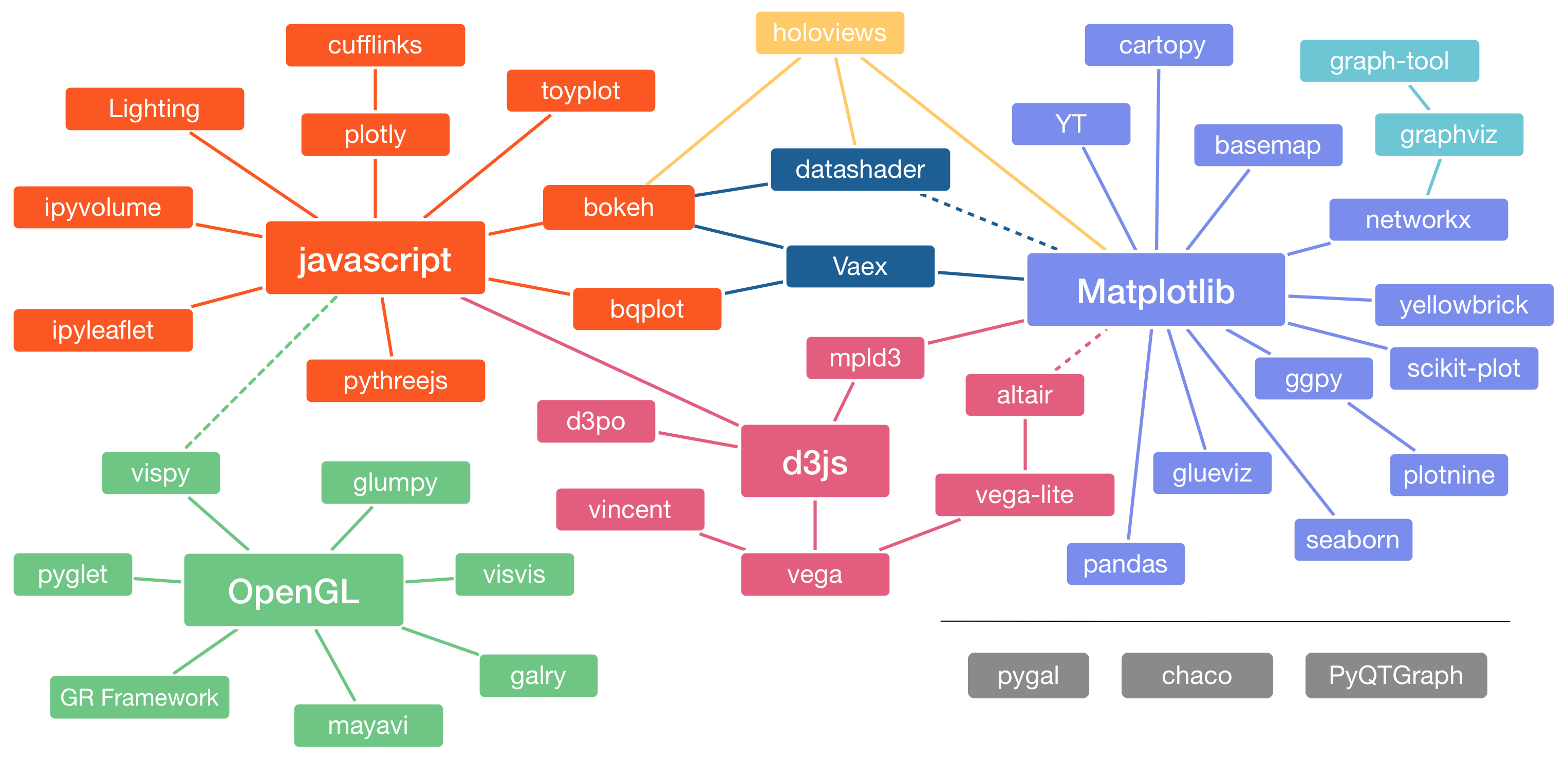
breakdown of where libraries came from / were inspired by
-
- best as remapping data to visual features
- comparatively "low-level" specification of plots
- many libraries built from, or inspired by D3
-
- provides a higher-level, more concise interface to plots
- Vega -> Vega-lite
- making Vega simpler, provides an even higher-level interface
- Vega-lite -> Altair
- bringing vega-lite's declarative visualization to python
- Altair discussion group
- see "Exploratory Data Visualization with Vega, Vega-Lite, and Altair" - PyCon 2018 video of talk by Jake VanderPlas for examples and context
-
-
Bokeh is inspired by, but not built on D3.js
-
HoloViz is a very high-level tool
- which allows combinations of many of the above libaries
- matplotlib, Seaborn
- Bokeh
- Plotly
- Altair / Vega
- ggplot2
- which allows combinations of many of the above libaries
-
Grammar of Graphics (see sources for more info)
- explicit framework for:
- Vega -> Vega-lite -> Altair
- ggplot / ggplot2 -> plotnine
- Observable:Plot
- influenced
- Plotly
- Seaborn
- Bokeh
- explicit framework for:
-
Pandas DataFrames
- several of the above plotting libraries depend on (or work best with) data being in pandas dataframes
- they also work most smoothly if the data is organized in "tidy" form (see resources here)
- 10 minutes to pandas
- Python for Financial Data Analysis with pandas by Wes McKinney
-
Design philosophy
- Clean axis indexing design to support fast data alignment, loops, hierarchical indexing and more - Think outside the matrix: stop thinking about shape and start thinking about indices - Fault tolerance: save you from common blunders caused by coding errors (misaligned data) - Hierarchical indexing + `group_by` database operations
-
It depends on your goals and use case. Select the goals that line up most closely with what you want and I'll recommend a library to you.
-
🛠️ I just want to publish a paper (or other non-interactive publication), and I want to be able to tweak the details of the figure
matplotlib
-
⚔️ I'm not interested in learning the intricacies of how to draw ellipses on a computer, just give me nice looking plots with minimal code
Seaborn
- you can always fine-tune details with matplotlib later if needed.
-
🎻 I love the elegance of the grammar of graphics approach, and work mostly with small to medium-sized datasets. Easily specified interactivity would be a a bonus
Altair
-
🧙 I want interactivity, to be able to switch between python and javascript, and from small to large datasets (even if it takes more code)
Bokeh
-
🏹 I want the maximum amount of plotting features (3D plots, interactivity, dashboards) without having to write too much code
Plotly
-
🧰 I have no loyalties to a particular plotting library, let me mix-and-match the best tools for the job
HoloViz
Ploty 🚧 One double-edged feature of Plotly is the gradient of multiple approaches to achieve the same plot:
- Good-looking plots can be put together very quickly with Plotly express
- If you need more customization, you often end up switching to Plotly's graph objects. This has a similar level of customization to matplotlib
- If you want to compose multiple plots together, you use Plotly's figure factory
While this flexible allows you to pick the right tool for the job, it makes looking through the documentation much more confusing.
Altair 🚧 The biggest part of the Altair learning curve for me was getting my data into the correct form. It was also disheartening to fall in love with the grammar of graphics approach, only to run into a wall when trying to plot many timeseries4.
Bokeh technical vision
- attempts to address "How do we look at all the data?" and "How can scientists and data analysts be empowered to use visualization fluidly, not merely as an output facility or one stage of a pipeline, but as an entire mode of engagement with data and models?"
HoloViz 🚧
- HoloViz Goals: talk
- Full functionality in browsers (not desktop)
- Full interactivity (inside and out of plots)
- Focus on Python users, not web programmers
- Start with data, not coding
- Work with data of any size
- Exploit general-purpose SciPy/PyData tools
- Focus on 2D primarily, with some 3D
- Avoid entangling your data, code, and viz:
- Same viz/analysis code in Jupyter, Python, HPC, ...
- Widgets/apps in Jupyter, standalone servers, web pages
- Jupyter as a tool, not part of the results
Observable 🚧
- created by designer of D3.js Mike Bostock
- reactive javascript notebooks
- often compared to excel, in that cells of code automatically rerun when their predecessors change value (unlike jupyter notebooks)
- Reactive Dataflow in Observable
- big data analytics with pandas and sqlite
- Options for nesting data: take a look at Dask
- Arguably, Bokeh has the best suite of tools for visualizing large datasets
- Bokeh's
ColumnDataSource[docs] allows more flexible partial loading of data leading to better performance with large datasets- slices of data can be extracted with
CDSView[docs]
- slices of data can be extracted with
- Running a Bokeh server
- Accelerating with WebGL
- Proper way to plot large datasets
- WebGL vs SVG in Python
- millions of points!
- restricted to scatter plots only?
- datashader for aggregation / density estimation Mapping over 1 Million points with Plotly Datashader
-
Interactive chart slow with large number of data points
- fastdom = big performance improvements
-
scaleable-vega for lots of data-points
-
- see also observable section
-
just adding data to a database seems to dramatically slow down altair, even if the data isn't actively being rendered
- some confirmation of that here:
-
[++] Streaming Data
-
also discussion here: altair discussion
-
for local exploration, can use altair-data-server
This notebook shows an example of using the Altair data server, a lightweight plugin for Altair that lets you efficiently and transparently work with larger datasets.
- Getting Data into a Notebook video, notebook
- Connecting to databases (for private notebooks only) notebook
- "Vega-Lite with Streaming Data Updates" notebook
Should you be saving data from Python with pickle, numpy binary, writing to csv, or something else?
- plain-text “human-readable” formats v.s. binary
- "human-readable" formats like
.csvgive the ability to visually inspect the integrity of the data which is very useful - This choice also impact git’s ability to diff files.
- Binary files seem very slow to add to git because of this.
- The standard solution to this seems to be simple to avoid version-controlling binary data.
- but generally binary data storage is going to be faster and more memory-efficient
- "human-readable" formats like
- ability to load partial chunks of data
- one of the primary selling points of hdf5
- also seems to be one of the use cases for
ColumnDataSourceas in Bokeh, although I haven't tried this yet
- ease of integration with summary visualization tools
- integration with data-analysis tools like numpy / pandas
- tight connection between metadata / summary data and primary timeseries
features which are good to have, but don’t strongly impact my user experience at the moment
- memory efficiency of storage
-
- "best way to preserve numpy arrays on disk" - stack overflow discussion with benchmarks
-
- speed of saving/loading to/from files
- portability across platforms (i.e. python versions)
Being able to share results and code with others, especially without them having to install a complex ecosystem of tools is useful, and good for open, reproducible science.
-
Observable
- Observable: Sharing, Publishing & Embedding video
- Introduction to Embedding by Toph Tucker
- Advanced Embedding and Downloading by Jeremy Ashkenas
-
Plotly
- interactive HTML export
- see also
get_embed()docs , an example
- see also
- Dash provides a way to build and embed more complex "dashboards" built from plotly components
- can be deployed with Heroku
- interactive HTML export
-
Altair
- convert to JSON, then embed with vegaEmbed
- to save altair to html: altair-viz/altair#1511
shell_html = io.StringIO()
chart.save(shell_html,'html')
return shell_html
-
Bokeh
-
Embedding Bokeh content docs
Standalone documents These documents don’t require a Bokeh server to work. They may have many tools and interactions such as custom JavaScript callbacks but are otherwise nothing but HTML, CSS, and JavaScript. These documents can be embedded into other HTML pages as one large document or as a set of sub-components with individual templating.
- can use
file_html()orjson_item()to get standalone components
Bokeh applications These applications require a Bokeh server to work. Having a Bokeh server lets you connect events and tools to real-time Python callbacks that execute on the server. For more information about creating and running Bokeh apps, see Running a Bokeh server.
- can use
-
Code for embedding using various servers - examples repo
- includes standalone embed
- How to embed a bokeh server in a standalone - stack overflow discussion
-
- Seattle weather interactive - demo ⭐
- Using facets to identify patterns - Correlation over Time - observable
-
Filtering (aka brushing) - dynamic queries
- Altair
- very useful in parallel coordinates
- Plotly - parallel coordinates with brushing
- Observable
- intro to brushing, as well as several rich examples
-
Linking / cross-filtering - connecting behavior across subplots
-
faceting / small multiples - prerequisite for cross-filtering
- Altair
- scatter plot with marginal distributions - histogram demo, dot-dash plot demo
- Plotly - several facet plot examples
- Observable
- Multi-View Composition tutorial by UW Data Lab
- Altair
-
Linked filtering - Plotly R demo
-
Altair
- subselecting distribution by category - demo
- visualizing the correlation structure of weather data - linked histogram example
- subselecting timeseries - demo
-
Bokeh
- linking - docs
- Bokeh via HoloViz - crossfiltering demo
-
-
Highlights / tooltips - responsive annotation ties different representations together
- Altair: multi-line highlight
- Altair: simple scatter plot with tooltips (limited customization)
- Bokeh hover tool docs
- Plotly:
- hover text and formatting in python
- car exploration with hover events in Python/v3
- uses Figure Widgets
-
Plotly / Dash
-
Bokeh
- Color slider example demo
- includes custom JavaScript callbacks
- Making Interactions - docs
- Linking - docs
- Color slider example demo
-
Altair
- Interactive plot gallery
- Bindings, Selections, Conditions: Making Charts Interactive
One of the unique features of Altair, inherited from Vega-Lite, is a declarative grammar of not just visualization, but interaction.
In order to implement rich interactivity beyond preconstructed templates, it is useful to have control over the callbacks or functions which execute after another event.
-
Dash has it's own pseudo-javascript interface to callbacks:
-
Bokeh has very straightforward integration with custom JS callbacks!
- js callbacks docs
-
Altair / vega-lite
Altair does not offer any way to register event handlers, beyond what's available in the Vega-Lite spec. That would have to be done in Javascript via the Vega view API
- export to json, write callbacks as js: github
- run js on click discussion
-
ObservableHQ:
- Since the entire notebook is reactive, and built on javascript, callbacks should be straightforward
- but specifically from vega-lite:
- custom callback example in observable vega-lite, custom events
- more info: Observing Vega Signals
-
HoloViz
- Linking using custom JS code
Linking objects in Python is often very convenient, because it allows writing code entirely in Python. However, it also requires a live Python kernel. If instead we want a static example (e.g. on a simple website or in an email) to have custom interactivity, or we simply want to avoid the overhead of having to call back into Python, we can define links in JavaScript.
- Linking using custom JS code
for Altair-specific implementation notes see building blocks of interactivity
(see the New Python Data Visualization Tools repo :fa-github: by Stephanie Kirmer to compare plot-type implementations across Altair, Plotly, Bokeh) 🚧 to-do: embed examples for each of these 🚧
-
think about explanatory versus exploratory data-viz
- exploratory vs explanatory analysis blogpost by Cole Nussbaumer Knaflic
- see also "Analyzing Time Series Data" video via Observable for a practical discussion of balancing these goals
- As scientists we often need to start with exploration, but transition to explanation by time of publication. Interactive, executable articles allow for doing both well
- see "Neuronal timescales are functionally dynamic and shaped by cortical microarchitecture" by Richard Gao et al. as an example
- see resources by Daisy Chung for excellent explanatory data-viz
-
faceting / small multiples:
-
scatter-plot matrix (aka SPLOM) - 💡this is always my starting point for visualizing complex data
-
observable article by Mike Bostock
🌟 interactive demo 🌟
<iframe width="100%" height="600" frameborder="0" src="https://observablehq.com/embed/@d3/brushable-scatterplot-matrix?cells=viewof+selection"></iframe>
implementations
- [comparisons :fa-github:](https://github.com/skirmer/new-py-dataviz/blob/main/facets.ipynb) by Stephanie Kirmer - [seaborn](https://seaborn.pydata.org/tutorial/axis_grids.html) - I think the added value of marginal distributions visualized with [kernel-density estimates](https://seaborn.pydata.org/examples/joint_kde.html) is great. - Seaborn's [PairGrid implementation](https://seaborn.pydata.org/tutorial/axis_grids.html) is the best one I've seen for this in Python - although [R's `pairs.panels`](http://www.sthda.com/english/wiki/scatter-plot-matrices-r-base-graphs) seems to do something similar - [altair implementation](https://altair-viz.github.io/gallery/scatter_matrix.html) with linked behavior between panels - [plotly](https://plotly.com/python/splom/) [w/ customization using figure factory](https://plotly.com/python/v3/legacy/scatterplot-matrix/) -
-
case study: correlation over time , article by Mike Freeman
🌟 live, embedded demo 🌟
<iframe width="100%" height="600" frameborder="0" src="https://observablehq.com/embed/@observablehq/correlation-over-time?cells=facet_wrap"></iframe>
-
-
add tooltips on hover with useful detail
-
use interactive heatmaps
- can nest / hierarchically organize a lot of dimensions
- Clustergrammer demo, talk video
- highly interactive heatmap for clustering genes associated with phenotypes
- Plotly examples, docs
-
parallel coordinates -
⚠️ primarily for exploratory data-viz⚠️ -
🌟 live observable demo by @sophigri 🌟
<iframe width="100%" height="584" frameborder="0" src="https://observablehq.com/embed/@sophiegri/exercise-3-parallel-coordinates?cells=paracoords"></iframe>
-
5 minute intro by Amit Kapoor
-
longer showcase of parallel coordinates by Kai Chang
- associated project page syntagmatic - parllel coordinates - d3.js implementation
-
practical, implementation tips:
- plotly implementation
- while there are parallel coordinates implementations in many python plotting packages, this is the only one I've found with the very useful feature of filtering each dimension into ranges as well as being able to reorder axes
- order of dimensions matters a lot! use a tool where you can rearrange order
- scaling / normalization matters a lot!
- coloring by a key attribute can help dissect structure
- interactivity is crucial to sort through the "hairball"
- high bandwidth, but hard to parse
- can be used to pick out clusters in high-dimensional parameter space
- plotly implementation
-
-
replacing legends with direct text-annotation
- "Six Decades of Carbon Dioxide Concentration in the Atmosphere" example
- Text annotation with Observable plot
-
"banking to 45 degrees" i.e. choosing aspect ratios for plots that maximize discriminability
- original paper: Cleveland, W. S., M. E. McGill, and R. McGill. The Shape Parameter of a Two-Variable Graph. Journal of the American Statistical Association, 83:289-300, 1988
- Eager Eyes blog examples
- my old, messy screenshot examples
example here
image
-
meaningful color-scales
- example: red-yellow-green for "bad to good"
- example from @vlandham
- provides an empathetic shortcut to visual digestion
- Consider "perceptually uniform" colormaps
- A colour scheme for the display of astronomical intensity images - Dave Green
- see also Cubehelix, or How I Learned to Love Black & White Printers - JamesDavenport repo
- ColorBrewer: Color Advice for Maps
- Color Map Advice for Scientific Visualization - Kenneth Moreland
- Turbo, An Improved Rainbow Colormap for Visualization
- How Bad Is Your Colormap?
- Good Colour Maps: How to Design Them - Peter Kovesi
- A colour scheme for the display of astronomical intensity images - Dave Green
- example: red-yellow-green for "bad to good"
-
many of these ideas I've fumbled my way to by trying to plot my own work
-
but many of these ideas I picked up from the work of Edward Tufte
-
I've found learning about "the Grammar of Graphics" quite compelling
- both as a philsophical standpoint for how to think about data-visualization
- and as an attractive framework for prototyping and implementing visualizations
- this idea underlies several plotting frameworks including ggplot, vega (vega-lite, altair)
- but may help put together creative solutions for libraries which aren't explicitly built around the grammar of graphics
- The Grammar of Graphics - Leland Wilkinson
- A Layered Grammar of Graphics - Hadley Wickham
- A Comprehensive Guide to the Grammar of Graphics for the effective visualization of multi-dimensional data - by Dipanjan Sarkar
-
Broad data-viz advice
- Daisy Chung has a great list of resources for visual storytelling with data
- [data visualization workshop slides] great practical advice from Sam Way & Dan Larremore:
- "Analyzing Time Series Data" video, by Zan Armstrong, Ian Johnson, and Mike Freeman
- also does a great job of walking through several practical case-studies
- video via Observable
- code workshop materials
- I enjoyed Amit Kapoor's taxonomy of different strategies for plotting high-dimensional data video
- discusses the tradeoffs between simplicity and need for interactivity
-
Other great overviews of python, science, data-viz
- Dynamic scientific visualizations in the browser for Python users by Patrick Mineault
- covers much more of the pipeline from scientific computing to web-based notebooks
- Nicolas Rougier is currently working on Scientific Visualization – Python & Matplotlib
- Going Beyond Matplotlib and Seaborn (2021) video, and repo :fa-github: by Stephanie Kirmer
- has implementations for several common plot types across Bokeh, plotnine, Altair and Plotly
- Dynamic scientific visualizations in the browser for Python users by Patrick Mineault
-
Learning JavaScript-based visualization tools
- UW Data has an excellent series of tutorial notebooks
- the Interaction notebook and Introduction to Vega-Lite are especially good
- see also Observable: Vega-Lite: A Crash Course - video by Visnu Pitiyanuvath
- Introduction to D3 - video by Curran Kelleher
- pracitcal step-by-step guide to building up useful plots in D3.js from scratch
- React + D3 video by Shirley Wu
- excellent breakdown of how D3 can interface with other javascript libraries to get the best use out of each
- use D3 for remapping and drawing axes
- use something like React / Vue to handle rendering to DOM, user input
- excellent breakdown of how D3 can interface with other javascript libraries to get the best use out of each
- UW Data has an excellent series of tutorial notebooks
-
Monotonic cubic splines - often useful for drawing model-agnostic trends through points
- unlike other cubic spline methods, interpolated values must lie between the two points being interpolated, so you don’t get distracting overshoots for high-derivative segments.
- Monotone Cubic Interpolation - observable notebook - by Dan Burzo
- JavaScript - D3 implementation
- Python - SciPy implementation
The following are my personal opinions and not necessarily general recommendations:
-
successful faceting might be even more useful than interactivity
- with interactivity like sweeping through parameter space, we need something like a faded version of previous parameters to show context for where we explored from
- this tradeoff changes based on the density, continuity and monotonicity of
-
fully flattened tidy csv for everything means loading far too much information (especially in Altair/Vega-lite)
- but the tidy data paper helped me understand a lot of the philosophy of both Pandas DataFrames and vega-lite / altair
- need some virtual-link / lazy-loading solution to continue this paradigm to large datasets
-
straying too far outside python limits iteration
- there's value to communicating to scientists the python you're using to compute things
- oftentimes the
numpysyntax is much nicer than the equivalent javascript for matrix stuff - this is why jupyter is the current horse to bet on
- this is also a factor making me hesitant to jump to Observable, despite all its nice features
- this also means I'm very interested in watching the Pyodide project
-
aesthetically I don't like jupyter notebooks
- I want plain-text notebooks
- no excessive meta-data in file
- easy to inspect, version-control the important stuff
- easy to convert between script and notebook
- I want to be able to use my multi-purpose editor (VSCode / Atom) for research as well
- see Hydrogen for Atom or docs on Jupyter in VSCode
- see also JupyText for plain-text markdown-like notebooks
- I want embedding not to require binder. (ideally "just go to a link!")
- they also look very clunky (compared to observablehq for instance)
- I want plain-text notebooks
-
being able to host via github pages is a big advantage
- but is this always doable via services like heroku / netlify ?
- even if the library itself doesn't natively support it?
- ( beyond my current expertise )
- but is this always doable via services like heroku / netlify ?
Structuring data for visualization tools
-
short version: keep one instance to one row
-
Tidy Data by Wickham, python version
- well worth reading
- practical examples
- ellucidated the philosophy behind R, grammar of graphics, pandas
- discusses value of alternative "wide-format" representations also
- idea has ties to dimensional stacking for viz
-
data wrangling in observable
Footnotes
-
Dynamic scientific visualizations in the browser for Python users by Patrick Mineault ↩
-
Plotly also has interfaces in R, MATLAB, Julia, JavaScript ↩
-
Dash tries to provide a pure-Python interface to mimic the roles of HTML, JS, CSS in traditional websites. > "Dash abstracts away all of the technologies and protocols that are required to build a full-stack web app with interactive data visualization." dash callbacks ↩
-
there are some workarounds in progress for Altair w/ large datasets ↩ ↩2
-
While Observable notebooks can't currently execute Python, I've included it here because I do think it's a promising solution for interactive data-science notebooks. At the moment my workflow would look something like performing the primary analysis in Python, exporting the results to
.csvthen importing that to Observable for visualization. ↩ -
data capacity / capabilities differ between public and private notebooks ↩