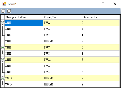
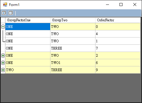
This is an Expandable/Collapsable grid view which extends DataGridView.
GroupByEnabled: default true
Determines if grouping behaviour is enabled. If set to false, it will be a normal gridview.
GroupByColumns: default first column
Add each column index which is required to match in order to form a group. The GroupBy Columns attribute grouping gridview that have the same values into groups of rows.
GroupByColumnsOnlyBeforeUnderlineEnable: default false
Determine if the grouping gridview only compares the content before the underline.
GroupByNonsequenceEnabled: default true
Determine if nonsequence row grouping is enabled.
GroupByNullValueEnabled: default false
Determine if grouping for null value of columns is enabled.
BaseRowSingleGroupEnabled: default false
Determines if single group for 'Base' Rows is enabled.
BaseRowGroupOrderColumn: default -1
Determines which column is used to order groups. This is necessary to identify the 'Base' row for each group. A value of -1 means that it relies on existing order.
BaseRowGroupOrder: default Ascending (Only effective when BaseRowGroupOrderColumn is set)
Determines if Ascending or Descending order groups. Grouping order is based on the order column.
BaseRowColorEnabled: default true
Determines if defines a Color for 'Base' Rows is enabled.
BaseRowColor: default White (Only effective when BaseRowColorEnabled is true)
Defines a Color for 'Base' Rows in groups.
BaseRowColorInterleaved: default false
Determines if to make the group list color interleaved.
RowHeadersCollapse: default built-in collapse image
Defines a Collapse image of 'Base' Rows in groups.
RowHeadersExpand: default built-in expand image
Defines a Expand image of 'Base' Rows in groups.
RowHeadersSeparaterWireEnabled: default true
Determines if separater wire for row headers of each group is enabled.
RowHeadersSeparater: default built-in separater image
Defines a Separater image for RowHeaders in groups.
RowHeadersSeparaterEnd: default built-in separaterEnd image
Defines a SeparaterEnd image for RowHeaders in groups.
TopLeftHeaderButtonEnabled: default true
Determines if CollapseExpandAll button for TopLeft Header is enabled.
TopLeftHeaderCollapseAll: default built-in collapseA image
Defines a CollapseAll image for TopLeft Header.
TopLeftHeaderExpandAll: default built-in expandAll image
Defines a ExpandAll image for TopLeft Header.

