#

- I got tired of seeing the same generic bootstrap portfolio that everyone uses (no hate on bootstrap, you guys are great. )
- People should have responsive mobile sites in 2016.
This framework accomplishes both. It allows the creator to change any color they want & add their portfolio relatively quickly. The CSS was built with SaSS which allows you to quickly change any of the colors to whatever you like.
## Examples 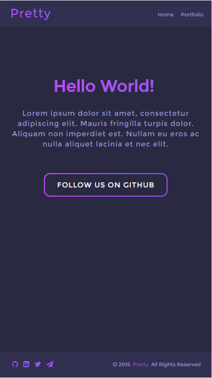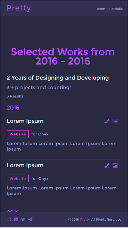 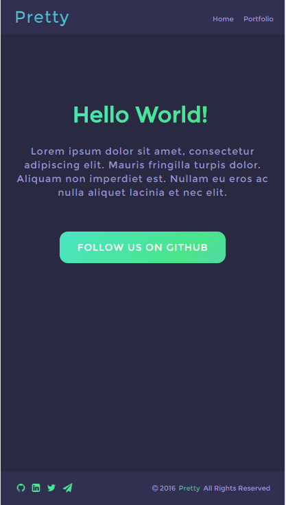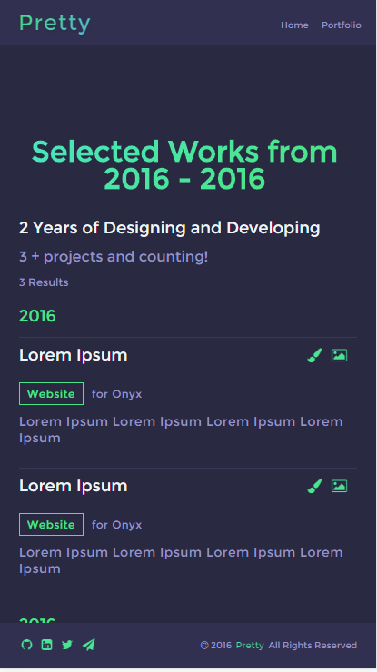** You can view the live version here Gleb.io/Pretty
## Getting Started ### Installation The first step is to install the framework. You can either download the whole zip or you can just go into the dist folder and choose the version you want. Each version comes with a landing page and example portfolio page. The "Example Project" comes with all the styles combined into 1 style sheet.- This guide assumes you know how to setup SaSS. You can change everything without SaSS but it's harderOnce your fine with the theme you chose, install it where you typically have your projects. Mine is here (Yours is problably different)
D:\wamp64\www\Once we drag it in there feel free to check it out in your browser!
Ok so chances are the majority of you will want to change the colors of something. Thanks to SaSS, this is easy. Go to
../assets/css/theme.scssand at the top of the file you should see a bunch of variables. Below is the list of variables used in the framework with a description.
$background // Simply the background of the page
$primary // The second color used in contrast to the background. I suggest you use a darker color then the background so people can see the layout clearer
$secondary // Similar to primary except you should use a lighter tone / darker tone depending on where you are planning on using it. By default this is used on the nav, footer, and background text
$alt // Text color for buttons and titles for the portfolio section. Should use something that pops.
$hOne    ---\
$hTwo    --- | // All these variables are used to create the gradient hover on the text/button/icon
$hThree  --- | // I will explain this in the CSS section.
$hFour   ---/
...I based the layout on the best way I feel is to display a portfolio. The navigation is fixed in the top position incase the viewer wants to go to another page. The footer is also in a fixed position but it has the copyright info for your website and the "social" section. By default I integrated Font Awesome into it but you are free to add your own. Any icon set should work based on the code (Don't blame me if I'm wrong)
The navigation is broken down pretty straightforward. The navigation-container holds the nav in place on the top of the webpage. You can change this in theme.scss / theme.css by changing position:fixed to position:relative. The navigation class has all the width, height, padding, etc of the elements inside. logo-container holds the logo itself. By default it supports images and text of course.
To add / remove navigation links just add a <li><a href="#">Example</a></li> after the previous li or remove it.
Example
  <div class="navigation-container">
   <div class="navigation">
    <div class="logo-container">
     <a href="index.php" class="logo pulse">Pretty</a>
    </div>
    <ul>
     <li><a href="index.php">Home</a></li>
     <li><a href="portfolio.php">Portfolio</a></li>
    </ul>
   </div>
</div>The content is where this framework shines. It's so simple but it makes everything look pretty. It is built in the same fashion as the navigation and the footer. The content-container holds it but it doesn't have any fixed position, just padding to the top. The content just holds the content.
title is used at the top of the page. In the examples its the big text on the middle of the webpage. subtitle is exactly the same as title except it's smaller.
<div class="content-container">
 <div class="content">
  <h1 class="title">Hello World</h1>
  <h2 class="subtitle">Lorem ipsum dolor sit amet, consectetur adipiscing elit.</h2>
 </div>
</div> btn-g holds the button on the middle of the page. This can be viewed as the container for btn-p, btn-h, btn-s, btn-n. An alternative version is available for the button class by just adding the alt class.
<div class="content-container">
 <div class="content">
  <div class="btn-g">
   <a href="#" class="btn-p">Example button</a>
   <a href="#" class="btn-s alt">Alternative button</a>
  </div>
 </div>
</div>The filter is used as a filter for the table. The table will hold all your portfolio items. This is pretty straight forward so there isn't much to explain. This supports universal classes
<div class="content-container">
 <div class="content">
  <div class="filter">
   <p class="pu">Table Filter</p>
   <div class="form-p">
    <a href="#">Lorem Ipsum <span class="badge">21</span></a>
    <a href="#">Lorem Ipsum <span class="badge">488</span></a>
    <a href="#">Lorem Ipsum <span class="badge">76</span></a>
    <a href="#">Lorem Ipsum <span class="badge">9</span></a>
    <a href="#">Lorem Ipsum <span class="badge">7</span></a>
    <a href="#">Lorem Ipsum <span class="badge">82</span></a>
   </div>
  </div>
 </div>
</div>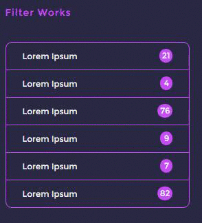
The table class holds everything together. You can think of this as your container.
The h3, h2, h1 elements are titles in a way. They scale down in size ranging from h3 to h1. All three of these elements support the universal classes.
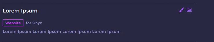
The data class is the container for the portfolio items.
The dTitle class is the 'data title' which will be the year in our example.
The pRef is the icons for each item. The way this works is by using the data-tooltip="Lorem Ipsum" to display the text below the icon you hover over. It supports the universal classes but it has a different variable name. data-placement="bottom" is required because that's where it creates the text. It wouldn't be to hard to display it somewhere else like left, right, and top. If enough people want it, I can add support to it. It supports sRef, hRef, pRef, and nRef. An example of this is below.
The iTitle is the item title. It's the white text that can be seen under the border.
The iSub is similar to the iTitle class except it's smaller and has a different color. It supports the pTag & other univeral classes.
The pTag is the tag for the portfolio items. This should be the same as the list items in the filter. It gives the viewer a good idea on what the item is and allows them to filter it. It supports sTag, pTag, hTag, and nTag.
- Currently you will have to add the javascript filter code yourself but I'm planning on releasing one soon.The desc class is just the description of the project. It's just a simple p tag with some styles.
<div class="table">
<h3>2 Years of Designing and Developing</h3>
<h2>3 + projects and counting!</h2>
<h1>3 Results</h1>
<div class="data">
 <h1 class="dTitle p">2016</h1>
 <div class="item">
  <h1 class="iTitle">Lorem Ipsum</h1>
  <div class="pRef">
   <a href="#" data-tooltip="View Concept" data-placement="bottom"><i class="fa fa-paint-brush pulse"></i></a>
   <a href="#" data-tooltip="View Website" data-placement="bottom"><i class="fa fa-picture-o pulse"></i></a>
  </div>
  <p class="iSub"><span class="pTag">Website</span> for Onyx</p>
  <p class="desc">Lorem Ipsum Lorem Ipsum Lorem Ipsum Lorem Ipsum </p>
  </div>
 </div>
</div>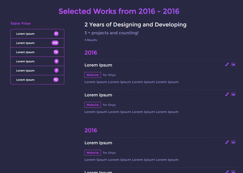
The footer is actually the same thing as the navigation except that it supports icons and that it's on the bottom of the page. To add / remove a icon just add it to the social class. Pretty straight forward right?
Example
  <div class="footer-container">
   <div class="footer">
    <div class="social">
     <a href="#"><i class="fa fa-github pulse" aria-hidden="true"></i></a>
     <a href="#"><i class="fa fa-linkedin-square pulse" aria-hidden="true"></i></a>
     <a href="#"><i class="fa fa-twitter pulse" aria-hidden="true"></i></a>
     <a href="#"><i class="fa fa-paper-plane pulse" aria-hidden="true"></i></a>
    </div>
    <div class="copy">
     <p><i class="fa fa-copyright" aria-hidden="true"></i> <?php echo date("Y"); ?> <a href="#" class="pulse">Pretty</a> All Rights Reserved</p>
    </div>
   </div>
  </div>
<h1 class="title pulse">Pulse</h1>
<h1 class="title shift">Shift</h1>
<h1 class="title nova">Nova</h1>
<h1 class="title hyper">Hyper</h1>The gradients used in Pretty distinguishes the framework from others. By default, I included four different "themes" or gradients. "Pulse" which is the purple theme shown in the Examples is being used as the example. The general idea behind the gradients is to create a background behind the text/icon/whatever and transform it when you hover over it. We achieve this effect by making the text-fill-color transparent for all browsers.
Now back to the variables. You might be wondering why I named the variables $hOne, $hTwo, etc. This was because they originate from $hOne all the way to $hFour. $hOne originates from the left side all the way to the right where $hFour stands. I included a example of how this effect looks below. It's best to leave the animation alone. You can find that on the bottom of the example. All it does it return to the origin.

SaSS Example
.pulse {
  text-decoration: none;
  color: white;
  padding: 0.2em;
  line-height: 0.8em;
  display: inline-block;
  background-size: 250% 100%;
  -webkit-background-clip: text;
  -webkit-text-fill-color: transparent;
  -moz-background-clip: text;
  -moz-text-fill-color: transparent;
  -ms-background-clip: text;
  -ms-text-fill-color: transparent;
  background-clip: text;
  text-fill-color: transparent;
  background-image: -webkit-linear-gradient(315deg, $pOne, $pTwo, $pThree, $pFour);
  background-image: linear-gradient(-45deg, $pOne, $pTwo, $pThree, $pFour);
  -webkit-transition: all 0.5s linear;
  -moz-transition: all 0.5s linear;
  transition: all 0.5s linear;

  &:hover {
    background-position: 100% 0;
    text-shadow: 0 2px 4px rgba(0, 0, 0, 0.1);
    -webkit-animation: 1s return infinite alternate;
    -moz-animation: 1s return infinite alternate;
    animation: 1s return infinite alternate;
    -webkit-transition: all 0.5s linear;
    -moz-transition: all 0.5s linear;
    transition: all 0.5s linear;
  }
}

@-webkit-keyframes return {
  from {
    background-position: 0 0;
  }

  to {
    background-position: 100% 0;
  }
}

@-moz-keyframes return {
  from {
    background-position: 0 0;
  }

  to {
    background-position: 100% 0;
  }
}

@keyframes return {
  from {
    background-position: 0 0;
  }

  to {
    background-position: 100% 0;
  }
}
CSS Example
.pulse {
    text-decoration: none;
    color: white;
    padding: 0.2em;
    line-height: 0.8em;
    display: inline-block;
    background-size: 250% 100%;
    -webkit-background-clip: text;
    -webkit-text-fill-color: transparent;
    -moz-background-clip: text;
    -moz-text-fill-color: transparent;
    -ms-background-clip: text;
    -ms-text-fill-color: transparent;
    background-clip: text;
    text-fill-color: transparent;
    background-image: -webkit-linear-gradient(315deg, #5d5ad1, #725ade, #9e54f4, #c84bf7);
    background-image: linear-gradient(-45deg, #5d5ad1, #725ade, #9e54f4, #c84bf7);
    -webkit-transition: all 0.5s linear;
    -moz-transition: all 0.5s linear;
    transition: all 0.5s linear;
}
.pulse:hover {
    background-position: 100% 0;
    text-shadow: 0 2px 4px rgba(0, 0, 0, 0.1);
    -webkit-animation: 1s return infinite alternate;
    -moz-animation: 1s return infinite alternate;
    animation: 1s return infinite alternate;
    -webkit-transition: all 0.5s linear;
    -moz-transition: all 0.5s linear;
    transition: all 0.5s linear;
}
@-webkit-keyframes return {
    from {
        background-position: 0 0;
    }
    to {
        background-position: 100% 0;
    }
}
@-moz-keyframes return {
    from {
        background-position: 0 0;
    }
    to {
        background-position: 100% 0;
    }
}
@keyframes return {
    from {
        background-position: 0 0;
    }
    to {
        background-position: 100% 0;
    }
}Normalize.css - for making my life easier
SaSS - Best CSS preprocessor ever
HTML5Shiv.js - Made making crossbrowser stuff easy :)
SkullCrusher - For all the feedback he gave me during the making of the framework :)
## License The MIT LicenseCopyright (c) 2016 Michael Golebiewski. http://gleb.io
Permission is hereby granted, free of charge, to any person obtaining a copy of this software and associated documentation files (the "Software"), to deal in the Software without restriction, including without limitation the rights to use, copy, modify, merge, publish, distribute, sublicense, and/or sell copies of the Software, and to permit persons to whom the Software is furnished to do so, subject to the following conditions:
The above copyright notice and this permission notice shall be included in all copies or substantial portions of the Software.
THE SOFTWARE IS PROVIDED "AS IS", WITHOUT WARRANTY OF ANY KIND, EXPRESS OR IMPLIED, INCLUDING BUT NOT LIMITED TO THE WARRANTIES OF MERCHANTABILITY, FITNESS FOR A PARTICULAR PURPOSE AND NONINFRINGEMENT. IN NO EVENT SHALL THE AUTHORS OR COPYRIGHT HOLDERS BE LIABLE FOR ANY CLAIM, DAMAGES OR OTHER LIABILITY, WHETHER IN AN ACTION OF CONTRACT, TORT OR OTHERWISE, ARISING FROM, OUT OF OR IN CONNECTION WITH THE SOFTWARE OR THE USE OR OTHER DEALINGS IN THE SOFTWARE.