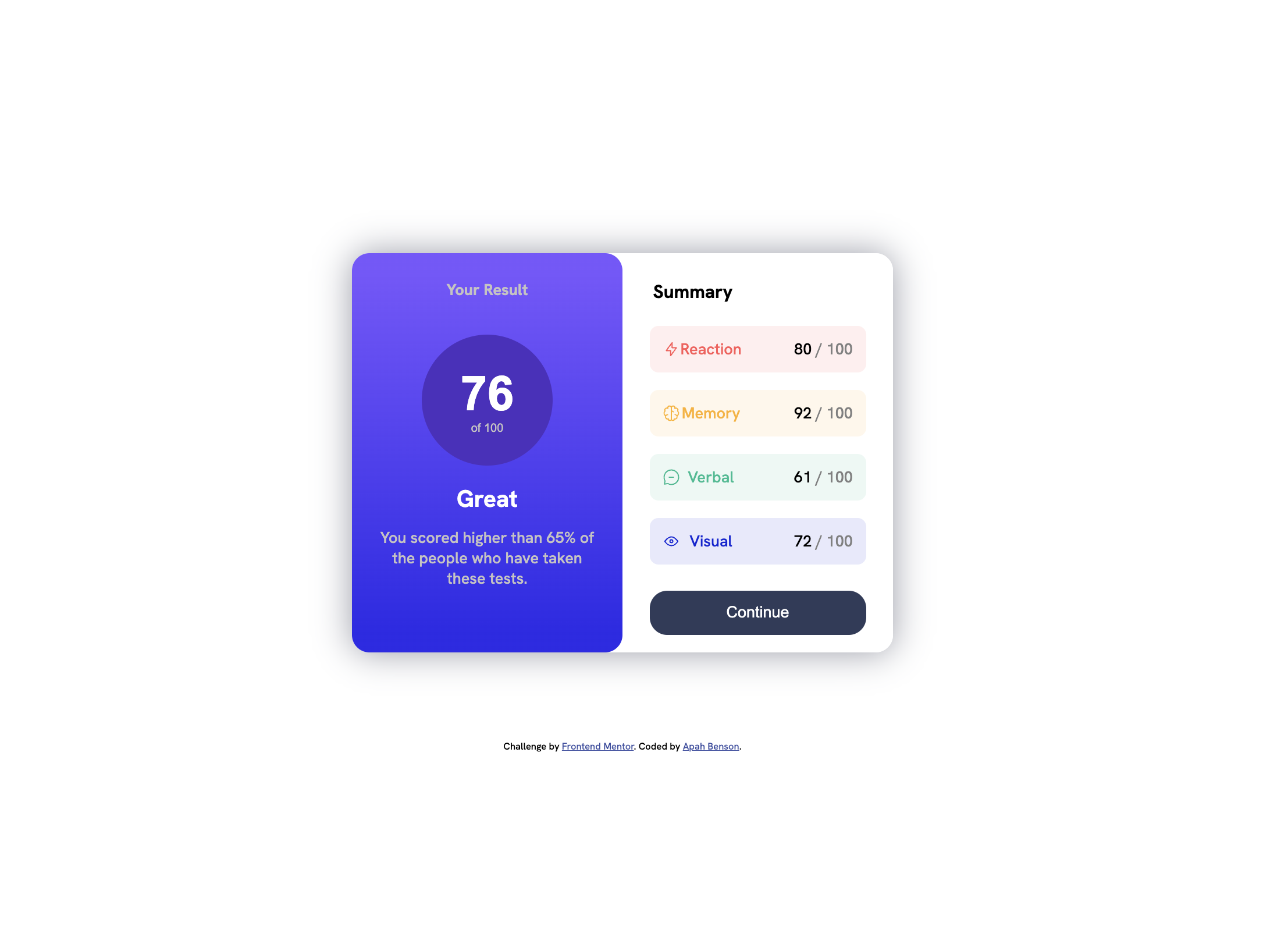
This is a solution to the Results summary component challenge on Frontend Mentor. Frontend Mentor challenges help you improve your coding skills by building realistic projects.
Users should be able to:
- View the optimal layout for the interface depending on their device's screen size
- See hover and focus states for all interactive elements on the page
- Solution URL: Add solution URL here
- Live Site URL: Add live site URL here
- Semantic HTML5 markup
- CSS custom properties
- Flexbox
- Media Query
Used spans to target specific areas of paragraphs and headings Used Media Query to properly specify the dimension/view for mobile for a more responsive layout
<div class="visual">
  <img src="./assets/images/icon-visual.svg" alt="alt" />Visual
  <span id="percentage"> 72 <span id="hundred"> / 100 </span></span>
</div>
@media (max-width: 600px) {
main {
flex-direction: column;
padding: 0;
margin: 0;
width: 100%;
margin-top: -20px;
}I intend to further understand when to use flexbox for the body or the main content and also to be able to fully take control of the background-image to great gradients
- Frontend Mentor - @apah-dev
- Twitter - @benson_apah
