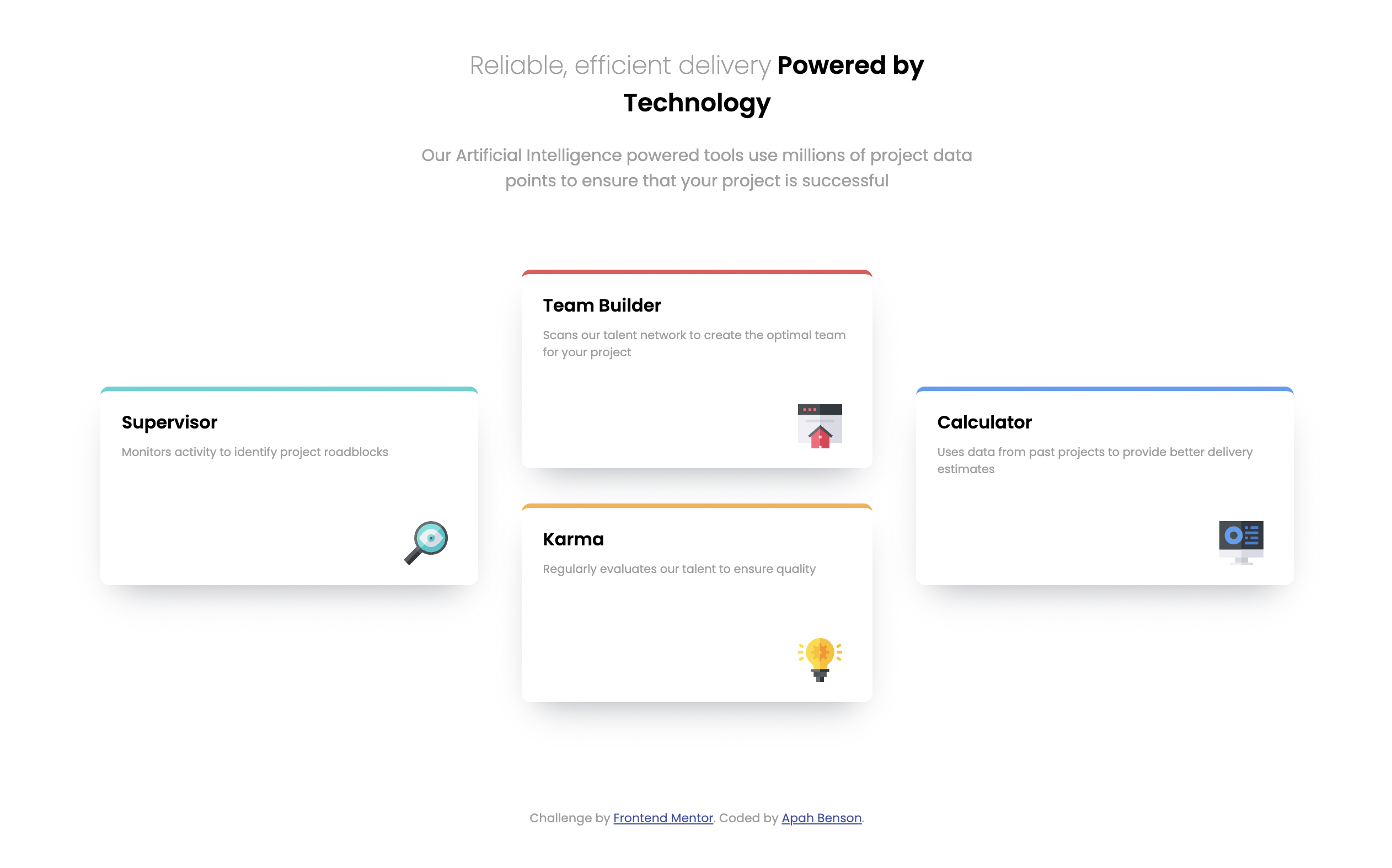
This is a solution to the Four card feature section challenge on Frontend Mentor. Frontend Mentor challenges help you improve your coding skills by building realistic projects.
Users should be able to:
- View the optimal layout for the site depending on their device's screen size
- Solution URL: Add solution URL here
- Live Site URL: Add live site URL here
- Semantic HTML5 markup
- CSS custom properties
- Flexbox
- Mobile-first workflow
Learn how to properly use the align-self property and how to use it for self-aligning contents withing a flexbox div.
To see how you can add code snippets, see below:
.middle-set {
  justify-content: center;
  align-items: center;
}

.tools {
  width: 80%;
}

.tools:nth-of-type(1) {
  align-self: flex-center;
}

.tools:nth-of-type(4) {
  align-self: center;
}- HTML & CSS Udemy Course - This helped with properly understanding the align-self property and how to use it for self-aligning contents withing a flexbox div.
- Frontend Mentor - @apah-dev
- Twitter - @benson_apah
Thanks to Colt for the udemy course https://www.udemy.com/course/the-web-developer-bootcamp/learn/lecture/22380972#notes
