This repository has been archived as it is no longer being maintained. No future development of SACPlot.jl will take place. Please instead use Seis.jl.
A Julia package for plotting seismic data in the SAC format, designed to work with the SAC.jl module.
SACPlot.jl is compatitble with Julia v0.7+.
First install the unregistered package SAC.jl:
julia> import Pkg

julia> Pkg.add("https://github.com/anowacki/SAC.jl")
Then you can install the package itself:
julia> Pkg.add("https://github.com/anowacki/SACPlot.jl")You then need only do
using SACPlotand if that works, you're ready to go.
(Older versions of SACPlot compatible with Julia v0.6 can be installed like so:
Pkg.clone("https://github.com/anowacki/SAC.jl"); Pkg.clone("https://github.com/anowacki/SACPlot.jl").)
SACPlot.jl relies on the SAC.jl and Plots.jl packages, so make sure to install these first (and their respective dependencies).
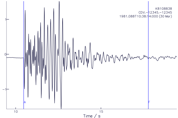
As an example, let's plot the sample data that comes with SAC.jl:
julia> using SAC, SACPlot

julia> t = SAC.sample();

julia> plot1(t)
Assuming your Plots.jl installation works, and you are in the REPL or another interactive environment, you should see a plot:
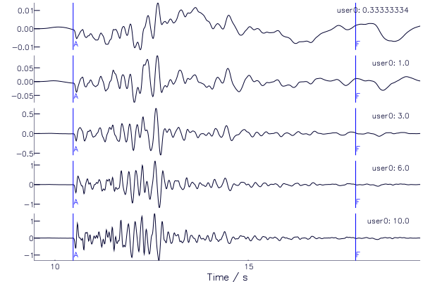
Simply pass an array of traces in to plot1 (also called p1). The following
example creates a set of traces showing the effect of changing the limit of a
lowpass filter, ranging from 0.33 Hz to 10 Hz. We put the corner
frequency in header variable user0, and pass the name of this variable as a
symbol to the plot1 method (label=:user0), which then shows this on the
right of each plot.
julia> using SAC, SACPlot

julia> A = [SAC.sample() for i in 1:5]  |> rtrend! |> taper!
5-element Array{SAC.SACtr,1}:
 SAC.SACtr(delta=0.01, b=9.459999, npts=1000, kstnm=CDV, gcarc=3.357463, az=88.14708, baz=271.8529)
 SAC.SACtr(delta=0.01, b=9.459999, npts=1000, kstnm=CDV, gcarc=3.357463, az=88.14708, baz=271.8529)
 SAC.SACtr(delta=0.01, b=9.459999, npts=1000, kstnm=CDV, gcarc=3.357463, az=88.14708, baz=271.8529)
 SAC.SACtr(delta=0.01, b=9.459999, npts=1000, kstnm=CDV, gcarc=3.357463, az=88.14708, baz=271.8529)
 SAC.SACtr(delta=0.01, b=9.459999, npts=1000, kstnm=CDV, gcarc=3.357463, az=88.14708, baz=271.8529)

julia> freqs = [1/3, 1, 3, 6, 10];

julia> A[:user0] = freqs;

julia> lowpass!.(A, freqs);

julia> p1(A)
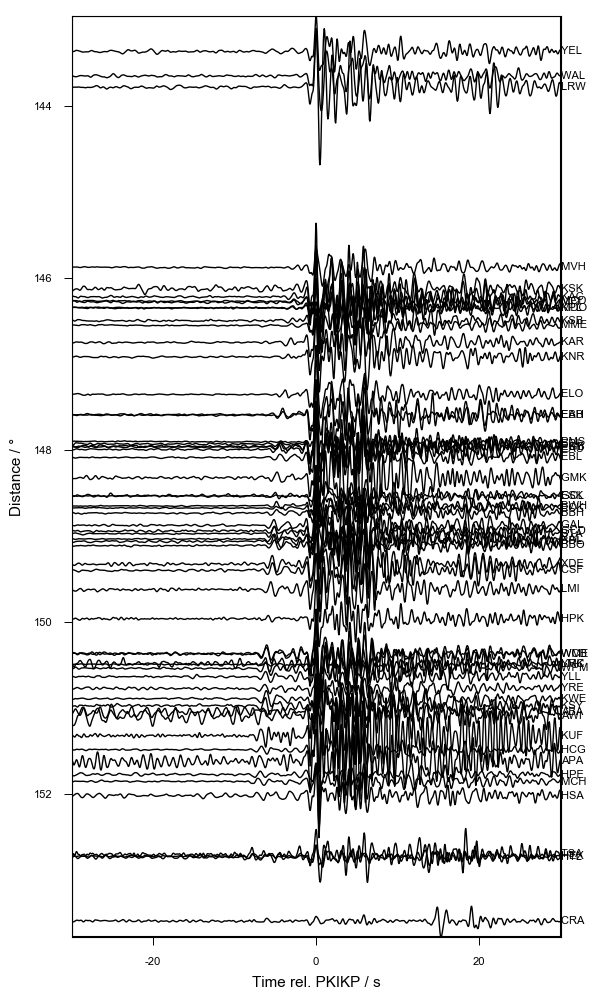
Record sections are plotted with plotrs:
Note that the y-axis variable is set using the keyword argument y=<value>,
and defaults to :gcarc, the epicentral distance, as is usual for record
sections.
Aligning traces on a certain arrival, say, is as simple as passing a second
argument to prs. It can be a header Symbol (e.g., :a) or an array of
numbers (e.g., prs(A, :a) or prs(A, rand(length(A)))). Let's plot some
data for the UK network from an event beneath Fiji, which has picks for the
PKIKP phase in header :a:
julia> B = SAC.sample(:array); # Load sample data

julia> B = cut(B, :a, -30, :a, 30); # Cut traces

julia> import Pkg; Pkg.add("Plots"); # This allows us to call Plots directly below

julia> import Plots; Plots.default(size=(600,1000), margin=4Plots.mm) # Change the default figure size and margin

julia> plotrs(B, :a, qdp=false, label=:kstnm, xlabel="Time rel. PKIKP / s", ylabel="Distance / °")
In this case we used the label keyword argument to label the traces by the
station name (header :kstnm) and add labels to the axes. We also turned off
‘quick-and-dirty-plotting’ with the qdp=false option.
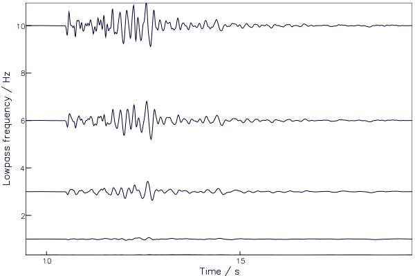
plotrs can show traces against any header value or array passed in. Here we
plot the earlier example traces against frequency:
julia> plotrs(A, y=:user0, xlabel="Time / s", ylabel="Lowpass frequency / Hz")Functions are documented, so at the REPL type ? to get a help?> prompt,
and type the name of the function:
help?> plot1
search: plot1 plot2 plotsp plotpm SACPlot PyPlot prevfloat parsefloat PartialQuickSort

  plot1(s::Array{SACtr}; xlim=[NaN, NaN], ylim=[NaN, NaN], label=:default, title="")

  Create a plot of the SAC trace(s) s.

  Define limits in time with xlim

  Define dependent variable axis limits with ylim, which can be a 2-array of values, or
  "all" to set all axes to have the same automatic limits.

  Define the text labels with an array of sumbols, which correspond to the names of SAC
  headers.


