RSCSS
Reasonable System for CSS Stylesheet Structure.
See the changelog for summaries of revisions.
Introduction
Any CSS greater than 1000 lines will get unwieldy. You'll eventually run into these common pitfalls:
- "What does this class mean?"
- "Is this class still being used?"
- "If I make a new class
green, will there be a clash?"
rscss is an attempt to make sense of all these. It is not a framework. It's simply a set of ideas to guide your process of building maintainable CSS for any modern website or application.
Components
Think in components. Consider of each piece of your UI as an individual "component."
Naming components
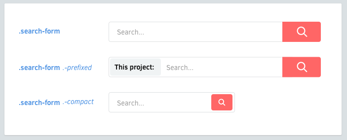
Components will be named with at least two words, separated by a dash. Examples of a component:
- A like button (
.like-button) - A search form (
.search-form) - A news article card (
.article-card)
Elements
Elements are things inside your component.
Naming elements
Each component may have elements. They should have classes that are only one word.
.search-form {
  > .field { /* ... */ }
  > .action { /* ... */ }
}
Element selectors
Prefer to use the > child selector whenever possible. This prevents bleeding through nested components, and performs better than descendant selectors.
.article-card {
  .title     { /* okay */ }
  > .author  { /* ✓ better */ }
}
On multiple words
For those that need two or more words, concatenate them without dashes or underscores.
.profile-box {
  > .firstname { /* ... */ }
  > .lastname { /* ... */ }
  > .avatar { /* ... */ }
}
Avoid tag selectors
Use classnames whenever possible. Tag selectors are fine, but they may come at a small performance penalty and may not be as descriptive.
.article-card {
  > h3    { /* ✗ avoid */ }
  > .name { /* ✓ better */ }
}
Variants
Components may have variants. Elements may have variants, too.
Naming variants
Classnames for variants will be prefixed by a dash (-).
.like-button {
  &.-wide { /* ... */ }
  &.-short { /* ... */ }
  &.-disabled { /* ... */ }
}
Element variants
Elements may also have variants.
.shopping-card {
  > .title { /* ... */ }
  > .title.-small { /* ... */ }
}
Dash prefixes
Dashes are the preferred prefix for variants.
- It prevents ambiguity with elements.
- a CSS class can only start with a letter,
_or-. - dashes are easier to type than underscores.
- it kind of resembles switches in UNIX commands (
gcc -O2 -Wall -emit-last)
Nested components
<div class='article-link'>
  <div class='vote-box'>
    ...
  </div>
  <h3 class='title'>...</h3>
  <p class='meta'>...</p>
</div>
Sometimes it's necessary to nest components. Here are some guidelines for doing that.
Variants of nested components
A component may need to appear a certain way when nested in another component. Avoid modifying the nested component by reaching into it from the containing component.
.article-header {
  > .vote-box > .up { /* ✗ avoid this */ }
}
Instead, prefer to add a variant to the nested component and apply it from the containing component.
<div class='article-header'>
  <div class='vote-box -highlight'>
    ...
  </div>
  ...
</div>
.vote-box {
&.-highlight {
> .up { /* ... */ }
}
}Simplifying nested components
Sometimes, when nesting components, your markup can get dirty:
<div class='search-form'>
  <input class='input' type='text'>
  <button class='search-button -red -large'></button>
</div>
You can simplify this by using your CSS preprocessor's @extend mechanism:
<div class='search-form'>
  <input class='input' type='text'>
  <button class='submit'></button>
</div>
.search-form {
> .submit {
@extend .search-button;
@extend .search-button.-red;
@extend .search-button.-large;
}
}Layout
Avoid positioning properties
Components should be made in a way that they're reusable in different contexts. Avoid putting these properties in components:
- Positioning (
position,top,left,right,bottom) - Floats (
float,clear) - Margins (
margin) - Dimensions (
width,height) *
Fixed dimensions
Exception to these would be elements that have fixed width/heights, such as avatars and logos.
Define positioning in parents
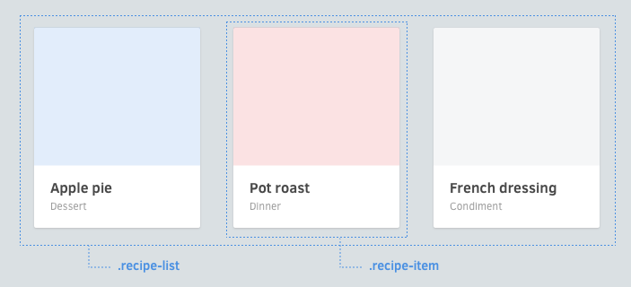
If you need to define these, try to define them in whatever context whey will be in. In this example below, notice that the widths and floats are applied on the list component, not the component itself.
.article-list {
  & {
    @include clearfix;
  }

  > .article-card {
    width: 33.3%;
    float: left;
  }
}

.article-card {
  & { /* ... */ }
  > .image { /* ... */ }
  > .title { /* ... */ }
  > .category { /* ... */ }
}
Helpers
._unmargin { margin: 0 !important; }
._center { text-align: center !important; }
._pull-left { float: left !important; }
._pull-right { float: right !important; }
For general-purpose classes meant to override values, put them in a separate file and name them beginning with an underscore. They are typically things that are tagged with !important. Use them very sparingly.
Naming helpers
Prefix classnames with an underscore. This will make it easy to differentiate them from modifiers defined in the component. Underscores also look a bit ugly which is an intentional side effect: using too many helpers should be discouraged.
<div class='order-graphs -slim _unmargin'>
</div>
Organizing helpers
Place all helpers in one file called helpers. While you can separate them into multiple files, it's very preferrable to keep your number of helpers to a minimum.
CSS structure
One component per file
For each component, place them in their own file.
/* css/components/search-form.scss */
.search-form {
  > .button { /* ... */ }
  > .field { /* ... */ }
  > .label { /* ... */ }

  // variants
  &.-small { /* ... */ }
  &.-wide { /* ... */ }
}
Use glob matching
In sass-rails and stylus, this makes including all of them easy:
@import 'components/*';Avoid over-nesting
Use no more than 1 level of nesting. It's easy to get lost with too much nesting.
/* ✗ Avoid: 3 levels of nesting */
.image-frame {
  > .description {
    /* ... */

    > .icon {
      /* ... */
    }
  }
}

/* ✓ Better: 2 levels */
.image-frame {
  > .description { /* ... */ }
  > .description > .icon { /* ... */ }
}
Pitfalls
Bleeding through nested components
Be careful about nested components where the nested component has an element of the same name.
<article class='article-link'>
 <div class='vote-box'>
    <button class='up'></button>
    <button class='down'></button>
    <span class='count'>4</span>
  </div>

  <h3 class='title'>Article title</h3>
  <p class='count'>3 votes</p>
</article>
.article-link {
> .title { /* ... */ }
> .count { /* ... (!!!) */ }
}
.vote-button {
> .up { /* ... */ }
> .down { /* ... */ }
> .count { /* ... */ }
}In this case, if .article-link > .count did not have the > (child) selector, it will also apply to the .vote-button .count element. This is one of the reasons why child selectors are preferred.
Apprehensions
Some people may have apprehensions to these convention, such as:
-
But dashes suck: You're free to omit it and just use regular words, but keep the rest of the ideas in place (components, elements, variants).
-
But I can't think of 2 words: Some components will only need one word to express their purpose, such as
alert. In these cases, consider that using some suffixes will make it clearer that it's a block-level element:.alert-box.alert-card.alert-block
Or for inlines:
.link-button.link-span
Other resources
- ITCSS ("Inverted Triangle CSS") is a nice complement to any rscss structure.
Other solutions
BEM
BEM in nice, but some may be irked at its unconventional syntax. RSCSS pretty much follows BEM conventions, only with a different syntax.
<!-- BEM -->
<form class='site-search site-search--full'>
  <input  class='site-search__field' type='text'>
  <button class='site-search__button'></button>
</form>
<!-- rscss -->
<form class='site-search -full'>
<input class='field' type='text'>
<button class='button'></button>
</form>Terminologies
The same concepts exist in similar ways in other CSS structuring ideologies.
| RSCSS | BEM | SMACSS |
|---|---|---|
| Component | Block | Module |
| Element | Element | ? |
| Layout | ? | Layout |
| Variant | Modifier | Theme & State |
Summary
- Think in components, named with 2 words (
.screenshot-image) - Components have elements, named with 1 word (
.blog-post .title) - Name variants with a dash prefix (
.shop-banner.-with-icon) - Components can nest
- Remember you can extend to make things simple


