sfMooToolsFormExtraPlugin
Introduction
This symfony plugin contains several widgets (and a validator) for use with the MooTools javascript framework.
All default configuration is controlled in plugins/sfMooToolsFormExtraPlugin/config/app.yml.
See Setup for publishing assets.
Credits:
- MooEditable - Lim Chee Aun
- Datepicker - Arian Stolwijk
- mooRainbow - Djamil Legato and Christopher Beloch
- Autocompleter - Harald Kirschner
Dependencies
PHP
- PHP 5.2.4 or later
- symfony 1.3/1.4
Javascript
- MooTools Core 1.4.5
- Custom version of MooTools.More on a project level (http://mootools.net/more/db85d287cff2f9dcf4e970a2f6e688b0)
- Datepicker requires MooTools.More:
- More/Date
- More/Date.Extras
- More/Locale
- More/Locale.en-GB.Date
- MooEditable requires MooTools.More:
- More/Class.Refactor
- More/Locale
- mooRainbow requires MooTools.More:
- More/Slider
- More/Drag
- More/Color
- Slider requires
- More/Slider
- Datepicker requires MooTools.More:
- MooEditable, Datepicker, mooRainbow and Autocompleter in lib/vendor - see Setup
Setup
NOTE: Using custom forks of Mooditable and mooRainbow for easy to fix bugs with new versions of MooTools.
NOTE: Using custom fork of Datepicker as file structure changed, also added 'datepicker_light' theme (default) with calendar icon - meshes better with symfony (and as above).
NOTE: Using own repo for Autocompleter as currently doesn't exist in Github
Note for SVN
If using SVN you will need to add these dependancies (custom forks) as svn:externals in the project's lib/vendor folder
(they cannot be added in the plugin, as the SVN bridge converts the existing submodules in Git to folders and svn:externals cannot override existing files)
Datepicker           https://github.com/angelsk/mootools-datepicker.git/trunk
MooEditable          https://github.com/angelsk/mooeditable.git/trunk
mooRainbow           https://github.com/angelsk/mooRainbow.git/trunk
Autocompleter        https://github.com/angelsk/mootools-autocompleter.git/trunk
Note for Git
The plugin's lib/vendor folder contains submodules for the javascript libraries, if the repository is exported then these will also need to be exported in the appropriate place.
git submodule add git://github.com/angelsk/mooeditable.git lib/vendor/MooEditable
git submodule add git://github.com/angelsk/mootools-datepicker.git lib/vendor/Datepicker
git submodule add git://github.com/angelsk/mooRainbow.git lib/vendor/mooRainbow
git submodule add git://github.com/angelsk/mootools-autocompleter.git lib/vendor/Autocompleter
Publish assets
Run ./symfony mootools:publish-assets after installation to ensure all the JavaScript and Stylesheet files are in place (and can be run subsequent times if need to upgrade to new widgets).
This plugin has a custom task due to symlinks in web being required from lib/vendor in the plugin or in the project, rather than just creating a symlink to the web/ folder as normal.
Slots or not?
By default, the accompanying JavaScript to configure the widgets are placed inline with the inputs themselves, which may cause problems if your JavaScript files (especially MooTools Core/More) are included in the footer.
As such, each of the widgets accepts a use_slots option, which defaults to the boolean value set in the appropriate config option (false by default). When this is set to true (either in app.yml or in the forms' options), the accompanying JavaScript added to a slot, which you should include in your template after JavaScript libraries are included, e.g.:
<?php
include_javascripts();
include_slot('date_picker_js');
include_slot('mooeditable_js');
include_slot('colour_picker_js');
include_slot('autocomplete_js');
include_slot('slider_js');
?>
All of the widget initialisation JavaScript is fired on domready, so the slot is also safe to include in the head.
If you have multiple date picker widgets, then the javascript is concatenated safely.
Validators
- Enhanced String Validator
- String Array Validator
Tests
There are unit tests for the validators - connect them in the ProjectConfiguration
  /**
   * Connect tests for plugins
   */
  public function setupPlugins()
  {
    $this->pluginConfigurations['sfMooToolsFormExtraPlugin']->connectTests();
  }


  ./symfony test:unit sfValidatorStringArray
  ./symfony test:unit sfEnhancedValidatorString
Enhanced String Validator
An enhanced string validator which allows HTML strings to have a max length which doesn't include the tags (especially useful if the character limit is for display purposes). Adds an extra dynamic option to the validator message to tell the user how many characters they have actually used, to make it easier to reduce. Can be used in conjunction with other validators.
Changes:
- Extends
sfValidatorStringso all options and messages for that are used - Adds
%current_length%to the options for the validator messages - Strips HTML tags before calculating length, but returns the string with HTML
Example usage:

Default implementation:
  $this->validatorSchema['text'] = new sfEnhancedValidatorString(array('max_length'=>200),
                                                                 array('max_length'=>'Content is too long (%current_length% characters), please limit to %max_length% characters'));
String Array Validator
A validator for use with arrays of strings, which is useful to use with the Doctrine field type of array. There are a couple of widgets included in the plugin which make use of it.
Changes:
- Extends
sfValidatorStringso all options and messages for that are used - Adds
num_requiredto the validator settings - which extends the functionality of required to allow you specify the number of items required to be validated.
Example usage:

Default implementation:
$this->validatorSchema['benefits'] = new sfValidatorStringArray(array('required' => true, 'max_length' => 60, 'min_length' => 10, 'num_required' => 2));
Widgets
- MooEditable text area
- Datepicker - input (with and without time)
- Datepicker - drop down (with and without time)
- mooRainbow colour picker
- Autocomplete - predictive input
- Slider
Widget configuration options:
use_slots: All widgets have this option (detailed above) which allows the Javascript to be set into a slot rather than included in the flow of the page.
MooEditable text area
A configurable rich text editor widget, which includes (turned on by default) a clean paste from Word
Default configuration:
- Controls all default configuration options
- Controls base CSS for the editable area
- Controls whether CleanPaste included (by default)
- Controls base toolbar options, and allows extra CSS and JS to be added if the default toolbar for all widgets is changed
Widget configuration options:
config: Additional MooEditable configurationwidth: The width of the editable areaheight: The height of the editable areaextratoolbar: Any additional toolbar options - include | to separate
Example usage:

Default implementation:
$this->widgetSchema['text'] = new sfWidgetFormTextareaMooEditable();
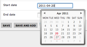
Datepicker - input
A date picker with the calendar control appearing when the user clicks on the input box to enter the date
Default configuration:
- Controls locale (defaults to
en-GB), and location of locale files - must include all locales if local files - Controls the theme and location of the theme CSS files and images
Widget configuration options:
-
locale: if this is changed from the default, will require additional JS locale files -
date_format: The JavaScript format of the date in the input box (defaults to%Y-%m-%d- see below) - see MooTools Date Format.
If this is changed should be paired with appropriatesfValidatorDateand regex - see Example usage.
Ensure includes time if below option is 'true' -
php_date_format: If the date_format for display is changed to a more user friendly format than%Y-%m-%d- the value needs to be converted from the database format.
This field should contain the corresponding PHPdate_formatfor use withdate()- see PHP Date Format -
with_time: defaults to '
false', include time in the date picker (date format defaults to%Y-%m-%d %H:%iinstead of%Y-%m-%d) -
year_picker: defaults to '
true', click on the month name twice to select year - if date range restricted within one year then set to 'false' -
min_date: default is none, set to restrict date range (format: see above)
-
max_date: default is none, set to restrict date range (format: see above)
Examples:
Just date:
$this->widgetSchema['date'] = new sfWidgetFormInputDateTimeMooPicker();
Date with min and max:
  $minDate = '2006-01-01';
  $maxDate = (date('Y') + 1) . '-12-31';
  $this->widgetSchema['date'] = new sfWidgetFormInputDateTimeMooPicker(array('min_date'=>$minDate, 'max_date'=>$maxDate));
With time:
$this->widgetSchema['date'] = new sfWidgetFormInputDateTimeMooPicker(array('with_time'=>'true'));
With a different date format:
  $regex = '~(?P<day>\d{2})/(?P<month>\d{2})/(?P<year>\d{4})~';
  $date_format = '%d/%m/%Y';
  $php_date_format = 'd/m/Y';

  $this->widgetSchema['date']     = new sfWidgetFormInputDateTimeMooPicker(array('date_format'=>$date_format, 'php_date_format'=>$php_date_format));
  $this->validatorSchema['date']  = new sfValidatorDate(array('date_format'=>$regex));
Datepicker - dropdown
A date picker with the calendar control appearing when the user clicks on the calendar image.
Default configuration:
- Controls locale (defaults to
en-GB), and location of locale files - must include all locales if moved - Controls the theme and location of the theme CSS files and images
- Controls the default display date and time formats for the symfony drop down widgets
Widget configuration options:
(date):
locale: if this is changed from the default, will require additional JS locale filesyear_picker: defaults to 'true', click on the month name twice to select year - if date range restricted within one year then set to 'false'min_date: default is none, set to restrict date range (format:Y-m-d)max_date: default is none, set to restrict date range (format:Y-m-d)date_widget: The date widget to render with the calendar
(datetime):
locale: if this is changed from the default, will require additional JS locale filesyear_picker: defaults to 'true', click on the month name twice to select year - if date range restricted within one year then set to 'false'min_date: default is none, set to restrict date range (format:Y-m-d)max_date: default is none, set to restrict date range (format:Y-m-d)date_time_widget: The datetime widget to render with the calendar
Example usage:

Just date:
$this->widgetSchema['date'] = new sfWidgetFormDateMooPicker();
Date with min and max and customised date widget:
  $years = range(2006, (date('Y') + 1));
  $minDate = '2006-01-01';
  $maxDate = (date('Y') + 1) . '-12-31';
  $this->widgetSchema['date'] = new sfWidgetFormDateMooPicker(array('min_date'=>$minDate, 'max_date'=>$maxDate,
                                                                    'date_widget'=>new sfWidgetFormDate(array('years'=>array_combine($years, $years),
                                                                                                              'format'=>'%day% %month% %year%'))));
With time:
$this->widgetSchema['date'] = new sfWidgetFormDateTimeMooPicker();

Customised datetime widget:
  $years = range(2006, (date('Y') + 1));
  $minDate = '2006-01-01';
  $maxDate = (date('Y') + 1) . '-12-31';
  $this->widgetSchema['date'] = new sfWidgetFormDateTimeMooPicker(array('min_date'=>$minDate, 'max_date'=>$maxDate,
                                                                        'date_time_widget'=>new sfWidgetFormDateTime(array('date' => array('years'=>array_combine($years, $years),
                                                                                                                                           'format'=>'%day% %month% %year%'),
                                                                                                                           'time'=> array('format'=>'%hour% %minute%')))));
mooRainbow colour picker
A plain input with a colour picker appearing when the user clicks on the associated icon. Value returned is a hex code with the # - so a fixed string of length 7 should be used to store it.
Default configuration
- Controls the colours used - the default starting colour, and the default background colour (as the widget changes the body background as you are picking to make it easier to see).
- Controls the location of the images, and the picker icon
Example usage
$this->widgetSchema['colour'] = new sfWidgetFormColourPicker();

Autocomplete - predictive input
A plain input with a predictive autocomplete script attached. Requires a separate JSON feed for each implementation.
Default configuration:
- Control default configuration for the widget - see app.yml for more information
Widget configuration options:
url: The url to create the auto complete with, this will return a JSON array (this will need to be created separately)multiple: Can multiple tags be selected? Or just one (default: see app.yml)
Example usage
  <?php
  if (!function_exists('url_for')) sfApplicationConfiguration::getActive()->loadHelpers(array('Url'));

  $this->widgetSchema['tag']     = new sfWidgetFormInputAutocomplete(array('url' => url_for('@tags')));
If multiple is true multiple entries are separated by a comma then a space. For all implementation continue typing to add an new entry that's not in the list.

Your URL should accept the query string searched for - request parameter called value (you may need to create a custom query / process query results)
  <?php
  public function executeTags(sfWebRequest $request)
  {
    $result = TagTable::getInstance()->getTagsLike($request->getParameter('value'), Doctrine_Core::HYDRATE_SINGLE_SCALAR);
    if (!is_array($result)) $result = array($result);

    sfConfig::set('sf_web_debug', false);
    return $this->renderText(json_encode($result));
  }
and return a JSON encoded array
["games","facebook game","gardening","gamification"]
Slider
A slider with a hidden input - give it a start and end value, and it will populate the input with the position on the slider
Default configuration
- Controls the basic style of the slider and knob - see app.yml for more information
Widget configuration options:
start_value: Start value for the sliderend_value: End value for the slider
Example usage
  <?php
  $this->widgetSchema['value'] = new sfWidgetFormSlider(array('start_value' => 0, 'end_value' => 300));
