px-path-guide

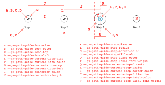
px-path-guide is a Polymer web component that is a visual representation of any sequence of steps and progress made on those steps. It can show which steps have been completed, the current step, and remaining steps, for example. Its visual details (nodes, connecting lines, icons, fonts, etc.) can be styled using custom CSS properties (shown in red in the above diagram).
Overview
Use the px-path-guide to represent any sequence of steps in a process. An example of a process is user account creation, which can consist of this sequence of steps: 1. Sign Up, 2. Email Confirmation, 3. Account Activation and 4. Account Configuration. px-path-guide can represent this process with a sequence of nodes (circles by default) corresponding to the steps. Each step is labeled accordingly. px-path-guide can place connector lines between adjacent steps. Each step's completion state can be symbolized by a font-awesome icon, like a checkmark ('fa-check') for a completed step.
Usage
Prerequisites
- node.js
- npm
- bower
- Install the webcomponents-lite.js polyfill to add support for web components and custom elements to your application.
Getting Started
First, install the component via bower on the command line.
bower install px-path-guide --save
Second, import the component to your application with the following tag in your head.
<link rel="import" href="/bower_components/px-path-guide/px-path-guide.html"/>
Finally, use the component in your application:
<px-path-guide></px-path-guide>
Documentation
Read the full API and view the demo here.
Using Events
Events follow the Polymer data-binding standards.
You can can attach the following listener(s) to these parts of the component:
- Mouseclick event on a step.
Local Development
From the component's directory, to setup the component and its dependencies:
$ npm install
$ bower install
$ gulp sass
From the component's directory, to start a local server and automatically bring up web page of the component demo:
$ gulp serve
(A web page with URL http://localhost:8080/ will be opened in your default browser.)
LiveReload
By default gulp serve is configured to enable LiveReload and will be watching for modifications in your root directory as well as /css.
GE Coding Style Guide
Known Issues
Please use Github Issues to submit any bugs you might find.