Processing the data from "TASS" (Russian News Agency). The links: https://tass.ru/ and https://tass.com/.
This repo contains extracted public data, supplemented by processing of article texts (from the beginning of October 2019 to mid-April 2020). This project shows how to extract, load, transform, analyze and visualize information from the "TASS".
What are the parts of this repo?
What is the reason for this research?
Visualizations are presented as images and gifs of Python data processing alongside with PowerBI demos.
By the beginning of May (2020) many countries were under a lockdown so, one way or another, mostly everyone was aware of COVID-19 and a lot of areas(categories) of everyday life were affected. So, I chose a half-year interval that ends by May.
The timeline: there is a selection of days from the beginning of October 2019 to mid-April 2020. Each and every day consists of a different number of articles. Articles have different feature columns (e.g. title; article_text; category; etc.)
There are about 11.5k COVID-19 related articles out of all (68k) articles.
I have placed the results at the beginning to make it more interesting
There are colorful Power BI results
The very first article (related to COVID-19) is:
https://tass.ru/obschestvo/7008288 (16th of October, 2019)
The next two articles (9th of January, 2020) start the wave
https://tass.ru/obschestvo/7484619
https://tass.ru/obschestvo/7487139
It seems like different categories were affected differently but there was a universal peak (16th of March, 2020)
Feel free to download this repository and check the files by Yourself for more information
These visual results can be opened right in a browser:
! [NOTICE]

Feel free to download these html files for a smooth experience

Unfortunately, it may take some time to load these heavy (35Mb) pages right in a browser.

These files contain brief info about each article (about 70.000 articles),

So, it may take a while to react to Your actions (e.g. to zoom in, to show info about an article; etc.)
Colorization by number of articles per day: https://alexlx7.github.io/Tass-Data-Processing/output_images/full_info.html
COVID-19 related articles visualization: https://alexlx7.github.io/Tass-Data-Processing/output_images/final_info.html
https://alexlx7.github.io/Tass-Data-Processing/output_images/full_info.html
Each day has its own color, depending on number of articles per day. Each cell contains a piece of information about one article. As You can see from 'full_info.html': the days highlighted in blue are weekends and holidays, on such days there is much less news.
There is the same selection of days. But the colors correspond to the field called 'covid_related'. If the cell is indeed covid_related, the cell is highlighted in red:
https://alexlx7.github.io/Tass-Data-Processing/output_images/final_info.html
The 'final_info.html' file shows that COVID-19 has only been gaining attention in Russia since mid-January 2020:
By mid-March, COVID-19 related news exceeded half of all articles per day:
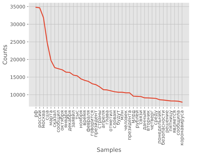
The most common words from articles:
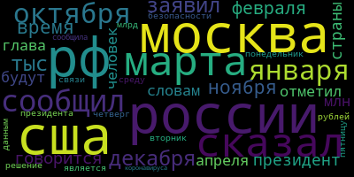
It is possible to make a Wordcloud by these common words. The size of each word corresponds to its frequency:
For more info check out 'analyzing.ipynb'.
Extracting.py contains ways to get info from the 'https://tass.ru/' (e.g. 'article_text', 'title', 'category', 'href') by the start date and the end date (e.g. ['2020-04-21 00:00:00', '2020-04-20 00:00:00']). That parsed information is stored in '/data/' folder as .pickle file (per each month).
Feel free to download 'data/data_of_seven_months_without_article_texts.csv' to check the data by Yourself.
Cleaning.py contains ways to extract, transform and load important pieces of data to the dataframe.
Analyzing.ipynb contains ways to show some basic info about the dataframe. Visualizations are stored in '/output_images/' folder.
https://alexlx7.github.io/Tass-Data-Processing/output_images
A file called 'tass_covid_related_report.pbix' contains insights which can be easilty opened by PowerBI Desktop Application.
https://alexlx7.github.io/Tass-Data-Processing/tass_covid_related_report.pbix
Initially, I was curious: when and how did the idea about this virus spread by different areas(categories) of our everyday life? Apart from that, I wanted to try a new at that time (April 2020) Jupyter Notebook in VS Code. So, I created this public repository and decided: 1) to check out old text articles to see how it all started; 2) to analyze articles about mentioning COVID-19; 3) to keep it structured (here, at github) so everyone could see the stages of processing and the results.


