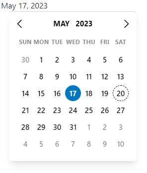
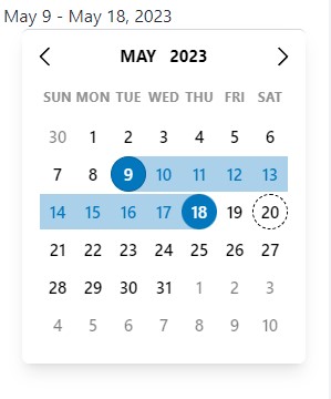
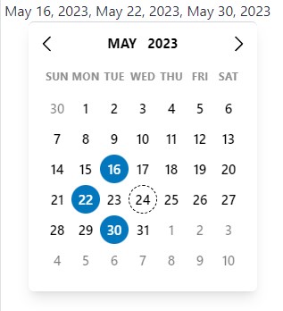
A simple and reusable Datepicker component for SolidJS (Demo)
npm i @rnwonder/solid-date-pickeryarn add @rnwonder/solid-date-pickerpnpm add @rnwonder/solid-date-pickerThis package depends on solid-js so you need to have it installed
import DatePicker, { PickerValue } from "@rnwonder/solid-date-picker";

const App = () => {
  const [value, setValue] = createSignal<PickerValue>({
    value: {},
    label: "",
  });

  return (
    <DatePicker
      value={value}
      setValue={setValue}
      onChange={(data) => {
        if (data.type === "range") {
          console.log(data.startDate, data.endDate);
        }
        if (data.type === "single") {
          console.log(data.selectedDate);
        }
        if (data.type === "multiple") {
          console.log(data.multipleDates);
        }
      }}
    />
  );
};
For Solid Start, you want to use the DatePicker component as a client-side component. You can do this by using the unstable_clientOnly from solid-start.
import { unstable_clientOnly } from "solid-start";
import { PickerValue } from "@rnwonder/solid-date-picker";
const DatePicker = unstable_clientOnly(
    () => import("@rnwonder/solid-date-picker")
);
After importing the DatePicker component, you can use it the same way as above.
- You can style the datepicker using class props, color props, default css class names or data attributes.
- Check out the documentation for more details
- We have a growing list of themes you can use. Please check them out here
- We have some other props that can be useful when working with the datepicker. Please check them out here
- Formatting the datepicker input label is done with the
formatInputLabel,formatInputLabelRangeStart,formatInputLabelRangeEnd,localOptionsandlocaleprops - Check out the documentation for more details
- We have some utility functions that can be useful when working with the datepicker. Please check them out here
- We have some other components that can be useful when working with the datepicker. Please check them out here
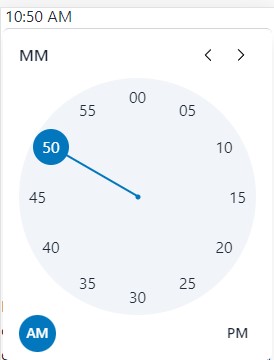
- This is in beta and can be used like this
import { TimeValue, TimePicker } from "@rnwonder/solid-date-picker";

const App = () => {
  const [value, setValue] = createSignal<TimeValue>({
    value: {},
    label: "",
  });

  return (
    <TimePicker
      value={value}
      setValue={setValue}
    />
  );
};- Send a message to the author on twitter if you have any questions or suggestions. Don't forget to follow me on twitter.
- Feel free to open an issue here if you run into any problem while using this library.
- You can also contribute to this project here.
