- Add native feeling to your web app and PWA by replicating Android/IOS native drawer.
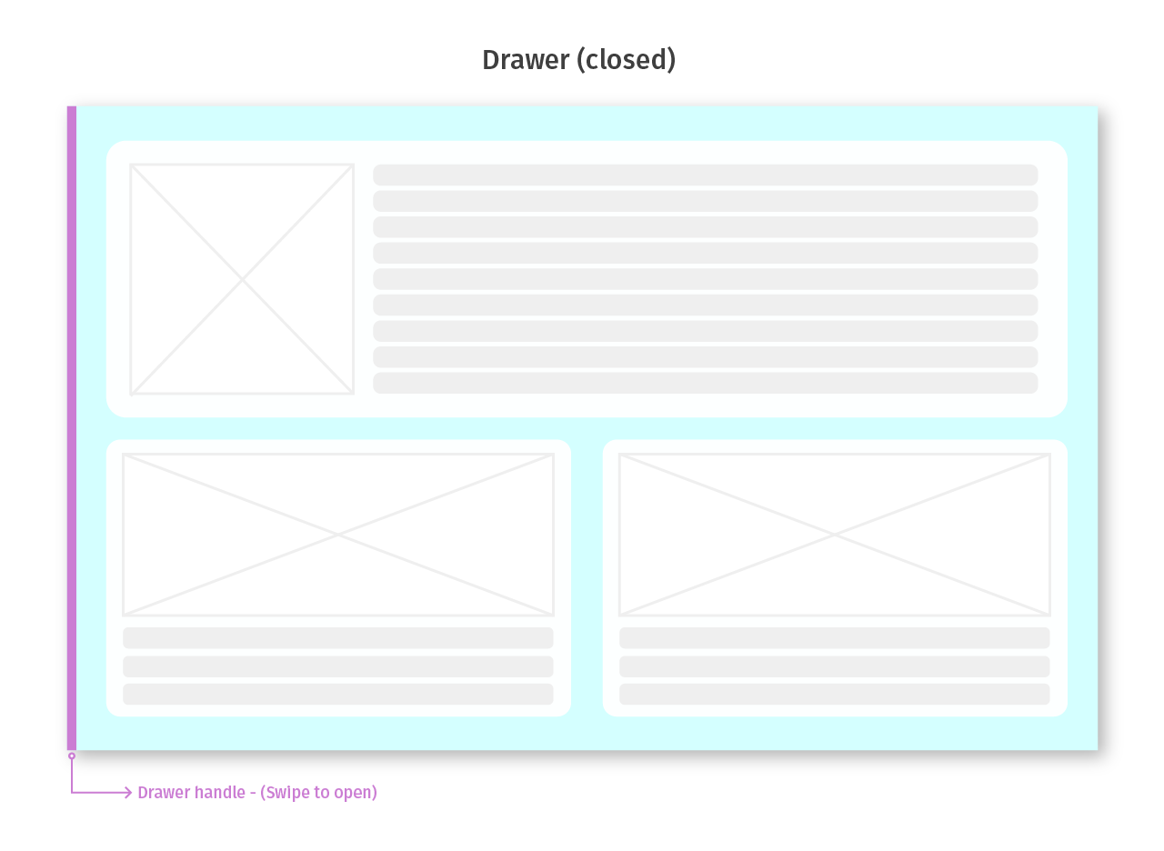
- Swipe from the screen edge to open the drawer.
- Detect swipe momentum to open/close the drawer.
- Swipe gestures are available for touch and mouse input.
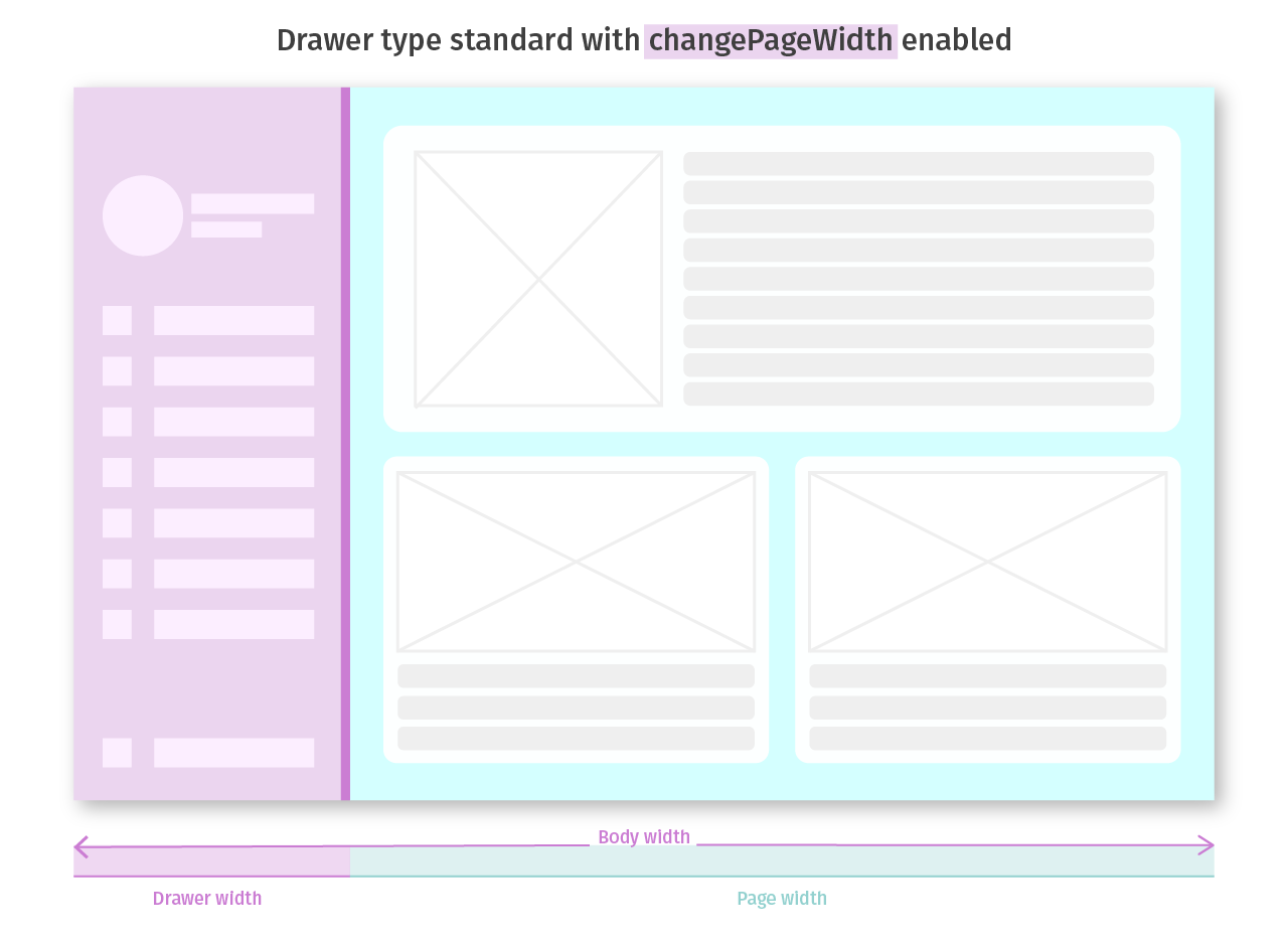
- Drawer type standard appears beside the page (co-planar with page content).
- Effects the page layout.
- When
changePageWidthis enabled the drawer shares the body width with the page (the page shrinks when drawer opens).
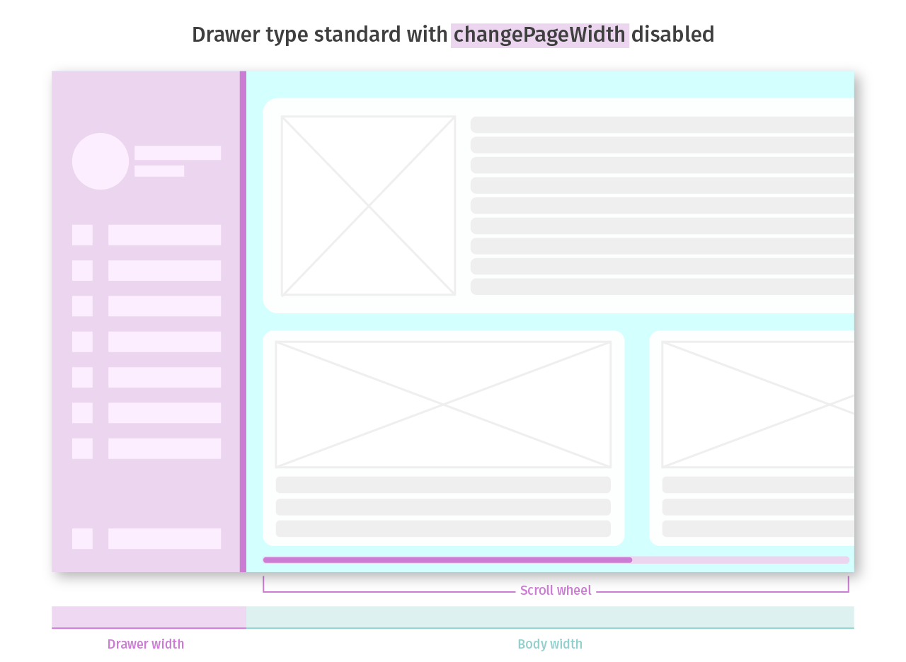
- When
changePageWidthis disabled the drawer will push page content and add it's width to the body causing scrollbar to appear.
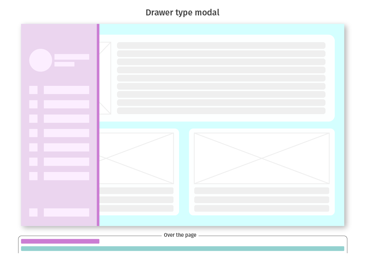
- Drawer type
modalappears on the top off the page. - deosn't effect the page layout.
npm install react-js-drawer
- Make sure to put the drawer on the top of your main page.
- The drawer should have one sibling element (the page) for stability reasons.
// ...
import Drawer from 'react-js-drawer';

export default function App() {
  let drawerMethods = null;

  const openDrawerHandle = () => {
    drawerMethods.open();
  };

  return (
    <>
      <Drawer ref={node => (drawerMethods = node)}>{/* ... drawer content */}</Drawer>
      // wrap the page contents with container
      <div>
        // ... page contents
        <button onClick={openDrawerHandle}>Open Drawer</button>
      </div>
    </>
  );
}modal: the drawer appears on top of the page (deosn't effect the page layout).standard: the drawer appears beside the page (effects the page layout).- Default Value
modal
- Options for drawer type
standard.
| Option | Description | Default |
|---|---|---|
changePageWidth |
chrink the page width to fit the drawer when it's open (co-planar with page content). | false |
preventPageScrolling |
Prevent the page from scrolling when the drawer is open. | false |
- Options for drawer type
modal.
| Option | Description | Default |
|---|---|---|
preventPageScrolling |
Prevent the page from scrolling when the drawer is open. | false |
- Position the drawer on the left or on the right side of the Html page.
- Default Value
left
- The initial status of the drawer.
- Default Value
closed
- The drawer width when it's open.
- Default Value
300
- The drawer handle width, the handle is unvisible element that receive swipe gesture input.
- Default Value
20
- The drawer handle background color, use only for debuging.
- Default Value
initial
- Drawer open and close animation duration.
- Default Value
200
- Drawer open and close animation transition timing function.
- Check easings.net to learn more.
- Default Value
easeOutQuart - If you want to provide your own timing-function make sure that the function takes one parameter and returns one value.
function easeInQuad(x) {
  return x * x;
}- Enable open and close drawer with mouse swipe gestures.
- Default Value
false
- Enable open and close drawer with touch swipe gestures.
- Default Value
true
- The background color of drawer shading layer.
- Default Value
rgba(0,0,0,0.5)
- The drawer container style (React inline style object).
- You can also use
idorclassNameattributes to add style from CSS StyleSheet.
- A callback fired when the drawer opens.
- A callback fired when the drawer closes.
- A callback fired everytime the drawer moves.
- Takes the
percentargument(0-1)that indicates the open percentage of the drawer.
- Drawer wrapper element z-index css value.
- Default Value
100
-
open() -
close() -
toggle()