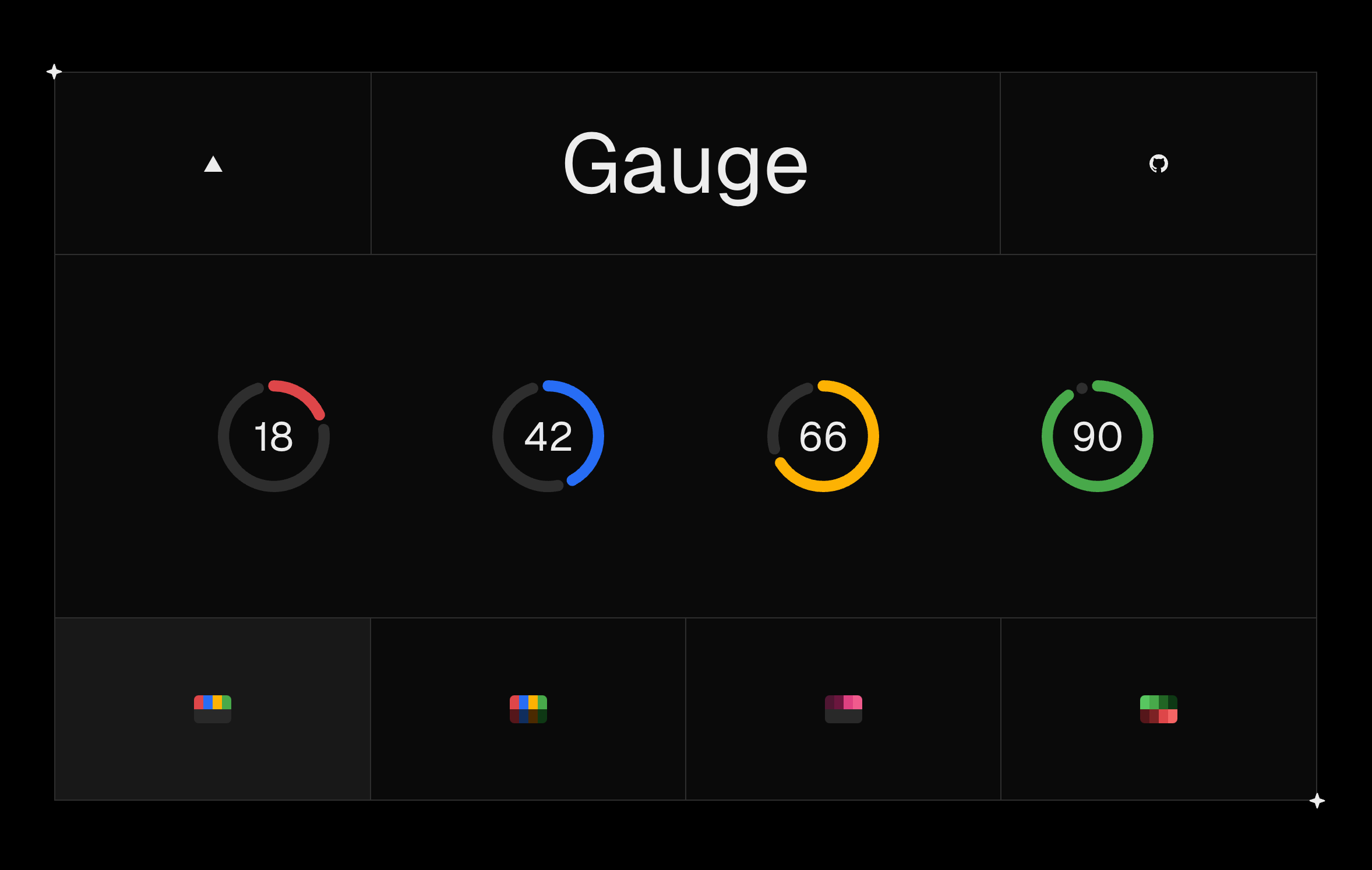
This is a replication of Vercel's Gauge component from their Geist Design System. It can be used as a circular visual for conveying a percentage. You can view the demo here: https://gauge-demo.vercel.app.
- Will work in any React application.
- Tailwind is NOT a requirement, but can be used to adjust the styling of this component through the className prop.
- This is a standalone component that you need to copy/paste to your codebase. I might make it an NPM package in the future.
-
Copy the
gaugecomponent from here: gauge.tsx -
Copy the required colors from global.css. At minimum, you will need gray, red, amber, blue, and green.
-
Import into your page
import { Gauge } from "@/components/gauge";

export default function Home() {
  return (
   <>
     // ...
     <Gauge value={75} className='size-24' />
     // ...
   </>
  )
}
The Gauge component requires a value prop and supports many others to customize it according to your needs.
value: a number from0to100representing the current value of the gauge, expressed as a percentage.size: a number to represent pixels or a string like 100% to take up the parent containers dimensions, which is useful when you want to for example, dynamically size the gauge based on screen width using tailwind's breakpoint prefix classNames. Defaults to"100%".gapPercent: a number to set the gap percent between primary and secondary arcs. Defaults to5%.strokeWidth: a number to set the arc thickness. Defaults to10px.equal: a boolean to determine whether the gauge should have equal primary and secondary arc lengths. Defaults tofalse.showValue: a boolean to determine whether the % value should be shown inside the gauge. Defaults totrue.primary- a string color value for the primary arc. You can also pass an array with threshold values and the respective colors to make it dynamic. Defaults to a dynamic range with 25% steps goingred, amber, blue, green.secondary- a string color value for the secondary arc. You can also pass an array with threshold values and the respective colors to make it dynamic. Defaults to a hue ofgray.transition- an array of transition settings for the gauge's animation, specifying the length, step, and delay of transitions represented in ms. Defaults to1000, 200, 0respectively.className- a string to represent the className of the svg. You can also pass an object with svgClassName, primaryClassName, secondaryClassName, and textClassName for more customization.props- any other prop accepted by a React SVG element.
