A package to visualize ERPs in R
You have exported your preprocessed ERP data and loaded them into R in order to run your statistics? Why not plot your data in the same environment and take advantage of R high plotting capabilities?
The package is still under development to make it more flexible and compatible with more data formats.
Some new options will be available by the end of May 2021. To support these new options, some arguments will have a new names and new arguments have been created
- Option to have negative or positive up : argument polarity_up ('negative' or 'positive')
- Split plotname into output_file_name (for the file) and plot_title (for the title in the graph)
- The former baseline argument is not mandatory anymore and its name has been changed to prepro_bsl with many options (display it or not, define its time-window,the fill color, the label, its font size and font color, the height of the label)
- The adjusted_baseline argument has been changed to simul_bsl
- Option to automatically put labels below ERPs and not only above
- Define custom scale limits for Voltage in ERP plots
- Offer multiple CI computation options/ standard error option
- Define different colors for labels
- Option to adjust font sizes of various elements x and y axis labels, legend, title and subtitle
We are also working on an interactive version of ERPscope for a release during the summer!
- Installation
- Update ERPscope
- Data specifications
- Function plot_erp
- Function plot_difference
- Function plot_difference_maps
- Function generate_ERP_stats_table
- Function plot_cor_with_erp_effect
- Future developments
- Other R EEG packages
- Acknowledgments
To install ERPscope, install the devtools package if you don't already have it (https://www.rdocumentation.org/packages/devtools)
install.packages("devtools")Run the following command to install from the github repository
devtools::install_github("aherbay/erpscope")- 2020-07-21 Sometimes the package rlang cannot update properly and needs to be removed from the R library folder. ( to know where are you packages folders stored, just run
.libPaths())
  detach("package:erpscope", unload=TRUE) #if ERPscope is loaded in your session
  devtools::install_github("aherbay/erpscope") # update
library(erpscope) # loading againYour dataframe should have:
- one column named Voltage (numeric)
- one column named Subject (factor)
- one column named Time (integer)
- one column named Electrode (factor)
- one column for the conditionToPlot argument with the variable and levels to plot (factor)
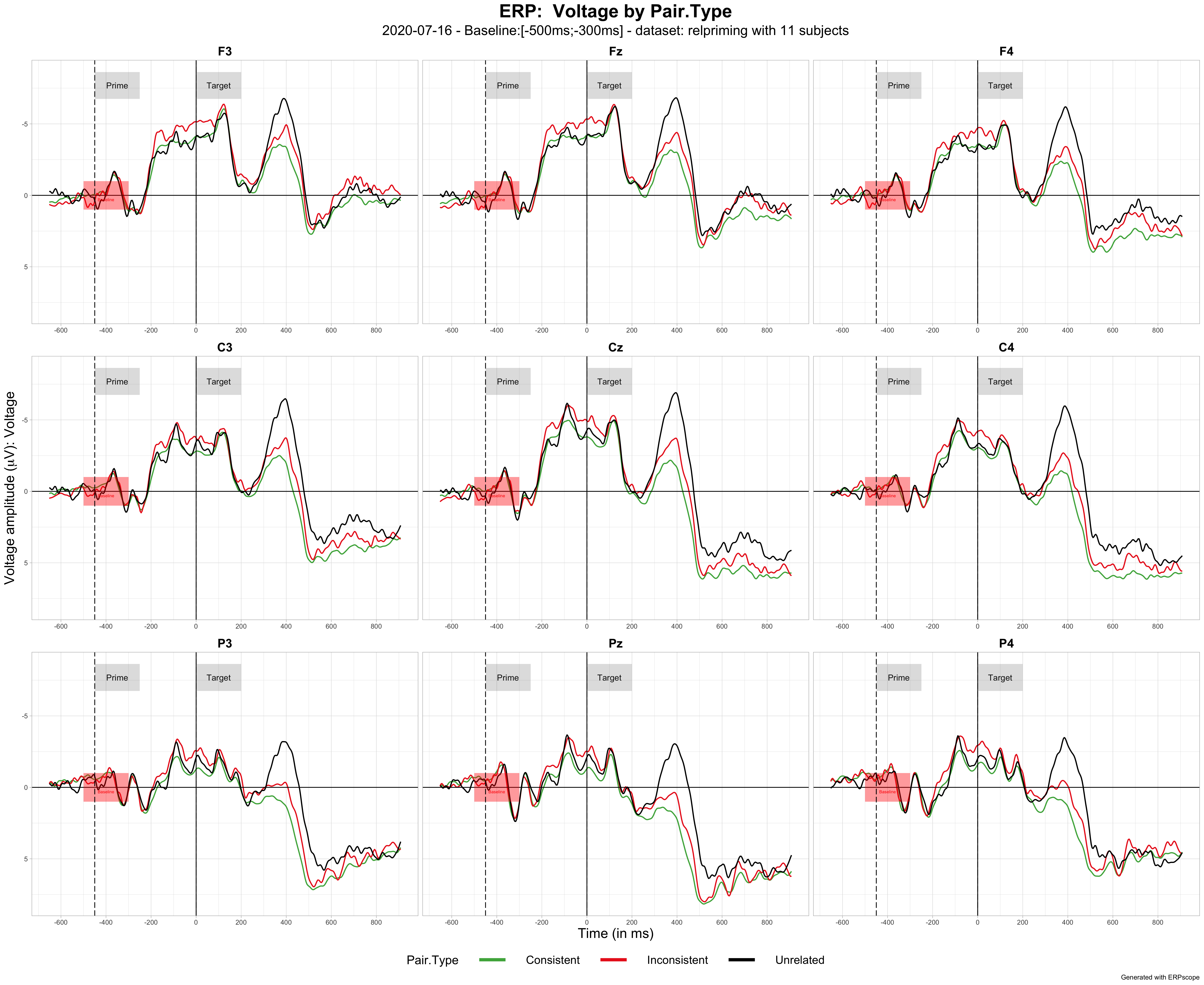
- function plot_erp with all arguments
plot_erp( data = relpriming,
          conditionToPlot = Pair.Type,
          electrodes_list =  c("F3", "Fz", "F4","C3", "Cz","C4", "P3", "Pz", "P4"),
          output_type = "pdf",
          color_palette =  c("#4DAF4A","#EA2721","#000000")  ,
          custom_labels = list(list(-450,-250,"Prime"),list(0,200,"Target")),
          show_conf_interval = FALSE,
          baseline = c(-500,-300),
          adjusted_baseline = FALSE,
          time_labels_interval = 200,
          plotname = 'auto',
          show_check_message = FALSE,
          labels_vertical_position = 'auto',
          labels_height = 'auto',
          vary ="Voltage"
) - function plot_erp with only mandatory arguments
plot_erp( data = relpriming,
          conditionToPlot = Pair.Type,
          electrodes_list =  c("F3", "Fz", "F4","C3", "Cz","C4", "P3", "Pz", "P4"),
          color_palette =  c("#4DAF4A","#EA2721","#000000")  ,
          custom_labels = list(list(-450,-250,"Prime"),list(0,200,"Target")),
          baseline = c(-500,-300),
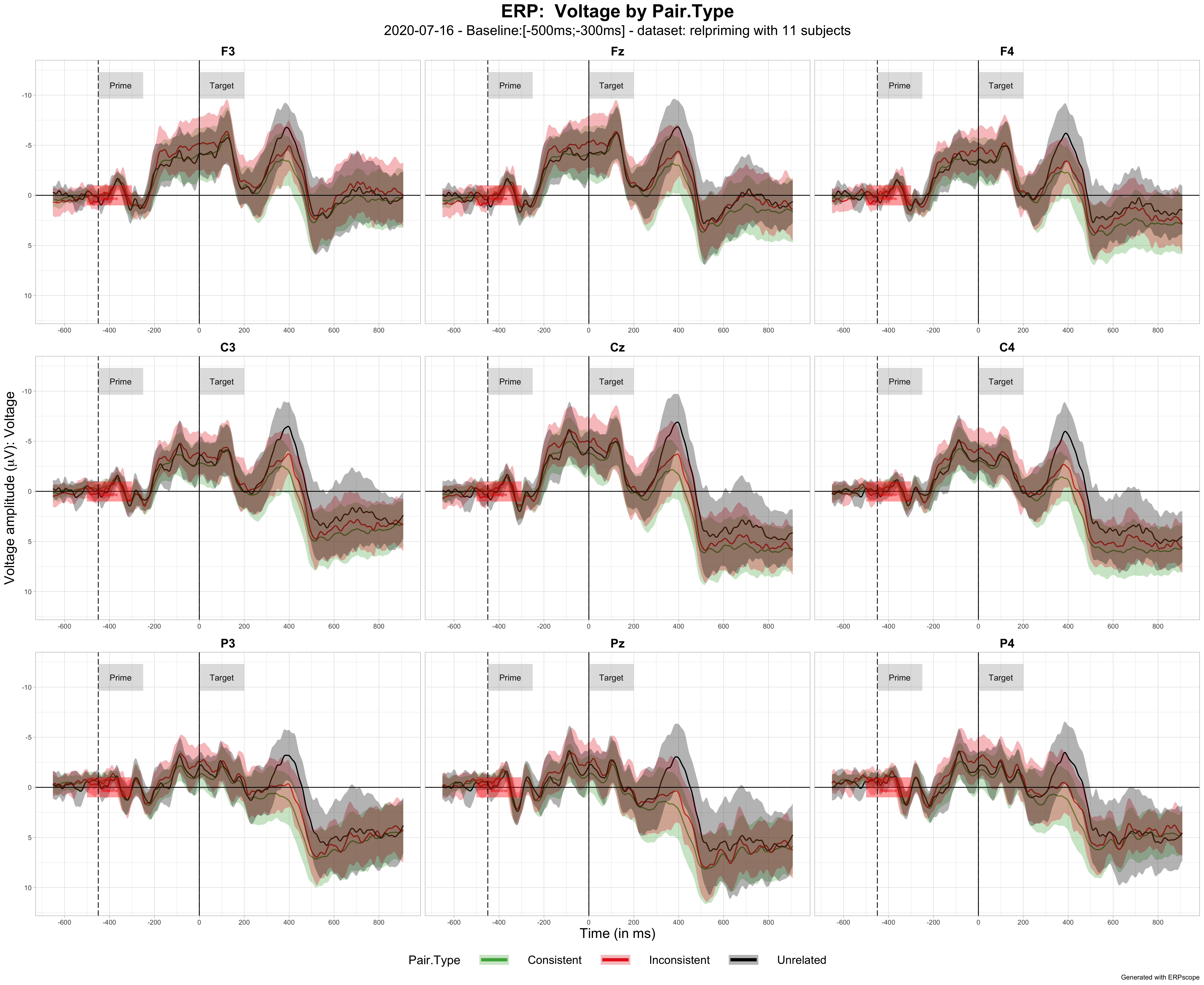
) - plot_erp with 95% bootstrapped confidence interval ribbons for each condition
To show confidence interval ribbons, just set the argument show_conf_interval to TRUE as below:
plot_erp( data = relpriming,
          conditionToPlot = Pair.Type,
          electrodes_list =  c("F3", "Fz", "F4","C3", "Cz","C4", "P3", "Pz", "P4"),
          color_palette =  c("#4DAF4A","#EA2721","#000000")  ,
          custom_labels = list(list(-450,-250,"Prime"),list(0,200,"Target")),
          baseline = c(-500,-300),
          show_conf_interval = FALSE

) - display ERP baseline
For now it is a mandatory argument. Display a red rectangle from the beginning to the end of the baseline time window.
- change ERP baseline
You can adjust the ERPs to the baseline provided in the argument baseline by setting the argument adjusted_baseline to TRUE
- add custom labels
You can add custom labels for stimuli appearing, or specific time window. It appears a vertical dotted line at start time with a grey rectangle with the label on the top of the plot.
To add a label you need to add a list to the custom_labels argument (which is a list of lists, by default an empty list).
The list defining a label has the structure : list(start_time, end_time, label). For example, to add a label displaying the word Prime between -450 ms and -250 ms, you would have : custom_labels = list( list(-450,-250,"Prime") )
The position of label is automatic by default but it can be adjusted to your need by changing the argument labels_vertical_position to the voltage you want the label to be centered on and the argument labels_height if you also want to change it's height (again in mV)
- output file form
By default, the file is exported to a PDF file. It is aslo possible to export it to png, jpeg, pdf, png, svg by changing the argument output_type to "png" for example.
- plot name
By default, the plot name is automatic. But it can be customized by changing the argument plotname
- show 95% confidence intervals
By default, only the ERPs are displayed. But it is possible to add the 95% confidence intervals for each condition by setting the argument show_conf_interval to FALSE.
- changing the colors of ERP lines
By default there are 9 colors used to display ERPs : "#4DAF4A" (green), "#EA2721" (red), "#377EB8" (blue), "#FF7F00" (orange), "#984EA3" (purple), "#000000" (black), "#5c5c5c" (grey), "#945D25" (brown),"#FF748C" (pink), "#2E692C" (dark green).
To change the order of colors or to change them entirely, you can change the argument color_palette. For example, to put the colors red, blue, purple for 3 ERP lines color_palette = c("#EA2721","#377EB8","#984EA3"). You can also use default values from R for example: c("blue","red","black").
- changing line thickness
line_thickness = 0.75 by default
- changing background format
background = "grid" , "white" , "dark"
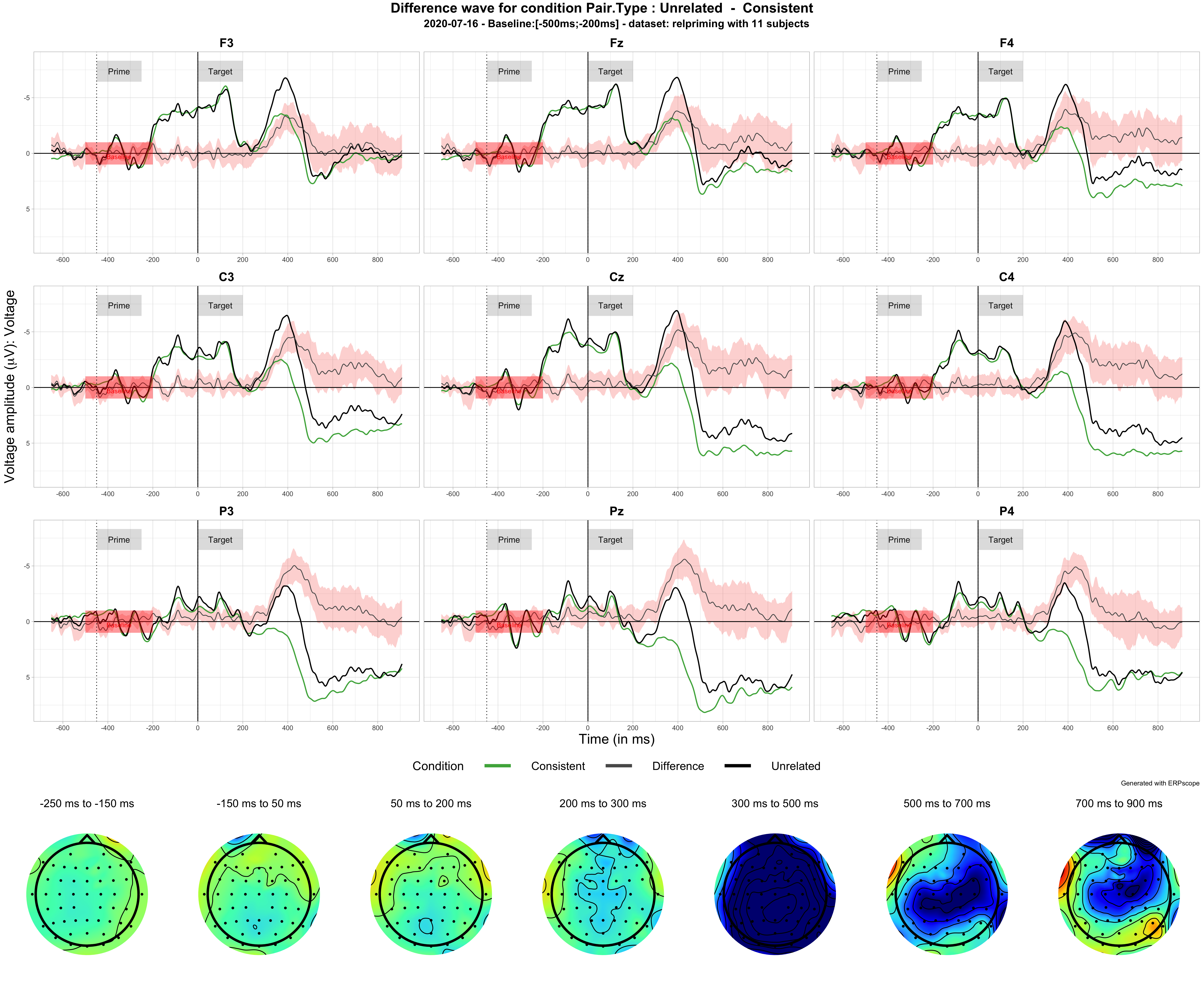
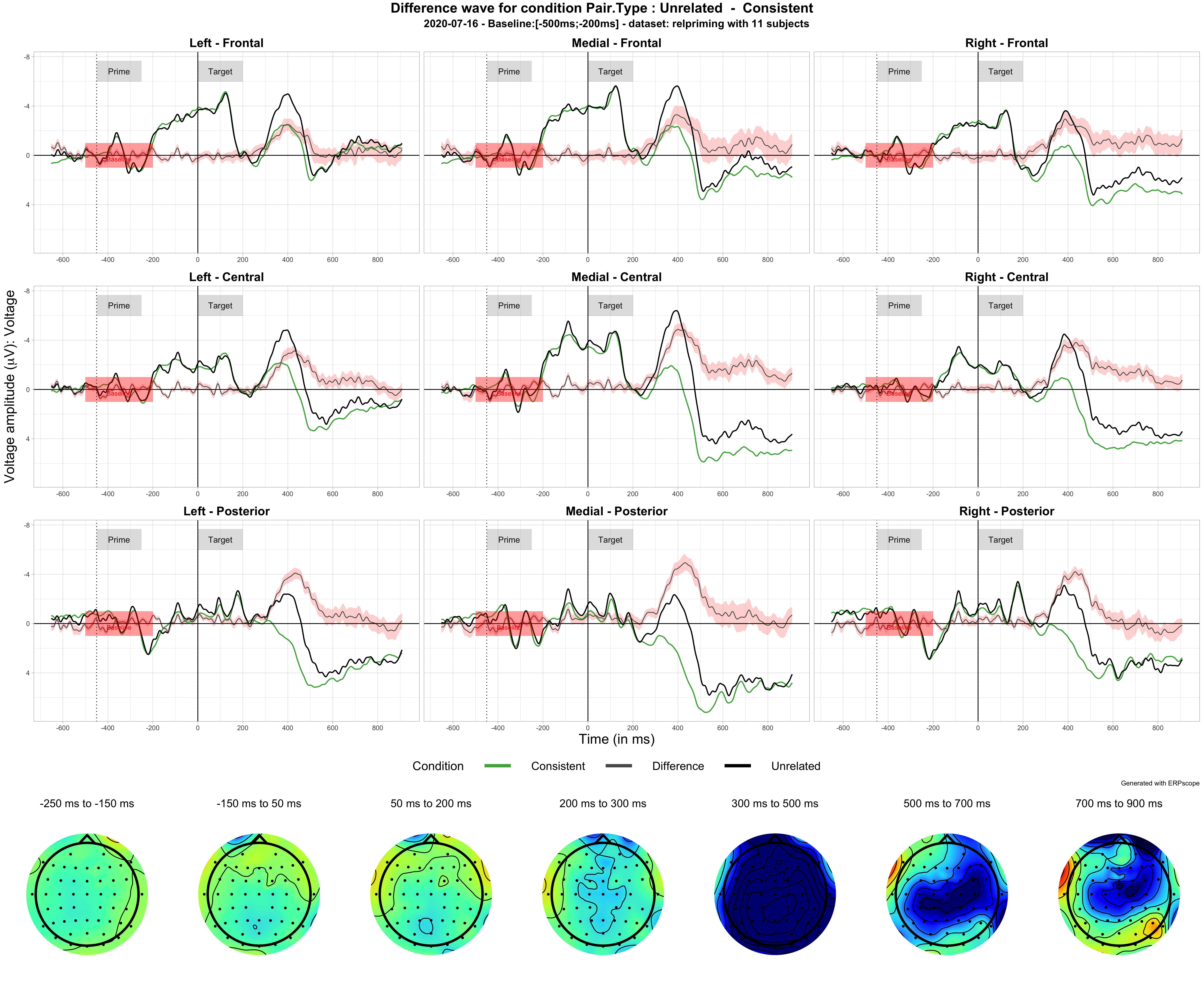
- function plot_difference with minimal arguments displaying 9 electrodes and voltages maps
plot_difference( data = relpriming,
                 conditionToPlot = Pair.Type,
                 levelA = Unrelated ,
                 levelB = Consistent,
                 electrodes_to_display = c("F3", "Fz", "F4","C3", "Cz","C4", "P3", "Pz", "P4"),
                 topoplots_time_windows = list(c(-250,-150),c(-150,50),c(50,200),c(200,300),c(300,500),c(500,700),c(700,900)),
baseline= c(-500,-200))- function plot_difference with all arguments displaying 9 electrodes and voltages maps
plot_difference( data = relpriming,
                 conditionToPlot = Pair.Type,
                 levelA = Unrelated ,
                 levelB = Consistent,
                 output_type ='pdf',
                 ant_levels= Anteriority.Levels,
                 med_levels= Mediality.Levels,
                 vary= Voltage,
                 group_var = Subject,
                 show_group_obs = TRUE ,
                 labels_vertical_position = 'auto',
                 labels_height = 'auto',
                 baseline= c(-500,-200),
                 topoplots_time_windows = list(c(-250,-150),c(-150,50),c(50,200),c(200,300),c(300,500),c(500,700),c(700,900)),
                 topoplots_scale = c(-2,2),
                 time_labels_interval = 200,
                 custom_labels = list(list(-450,-250,"Prime"),list(0,200,"Target")),
                 electrodes_to_display = c("F3", "Fz", "F4","C3", "Cz","C4", "P3", "Pz", "P4"),
                 plotname = 'auto'
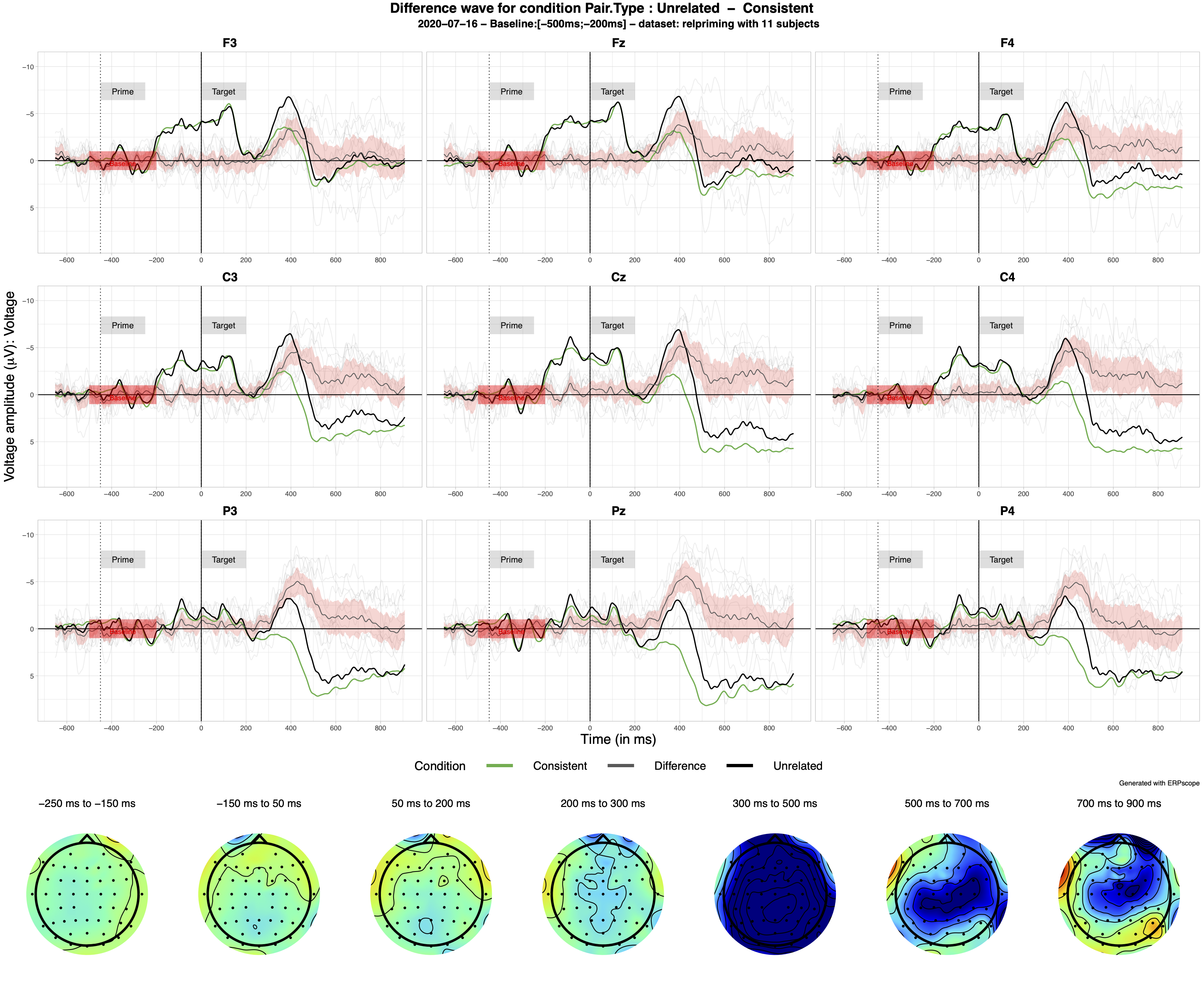
) - function plot_difference to display Subject individual data
You can display Subject data in light grey with show_group_obs = TRUE
plot_difference(  data = relpriming,
                  conditionToPlot = Pair.Type,
                  levelA = Unrelated ,
                  levelB = Consistent,
                  output_type ='pdf',
                  ant_levels= Anteriority.Levels,
                  med_levels= Mediality.Levels,
                  vary= Voltage,
                  group_var = Subject,
                  show_group_obs = TRUE ,
                  labels_vertical_position = 'auto',
                  labels_height = 'auto',
                  baseline= c(-500,-200),
                  topoplots_time_windows = list(c(-250,-150),c(-150,50),c(50,200),c(200,300),c(300,500),c(500,700),c(700,900)),
                  topoplots_scale = c(-2,2),
                  time_labels_interval = 200,
                  custom_labels = list(list(-450,-250,"Prime"),list(0,200,"Target")),
                  plotname = 'auto'
) - function plot_difference with all arguments displaying 9 ROI and voltages maps
Instead of displaying difference on 9 specific electrodes you can display it on 9 Regions of Interest To do so, just remove the line, electrodes_to_display or put it electrodes_to_display = c()
plot_difference(  data = relpriming,
                  conditionToPlot = Pair.Type,
                  levelA = Unrelated ,
                  levelB = Consistent,
                  output_type ='pdf',
                  ant_levels= Anteriority.Levels,
                  med_levels= Mediality.Levels,
                  vary= Voltage,
                  group_var = Subject,
                  show_group_obs = FALSE ,
                  labels_vertical_position = 'auto',
                  labels_height = 'auto',
                  baseline= c(-500,-200),
                  topoplots_time_windows = list(c(-250,-150),c(-150,50),c(50,200),c(200,300),c(300,500),c(500,700),c(700,900)),
                  topoplots_scale = c(-2,2),
                  time_labels_interval = 200,
                  custom_labels = list(list(-450,-250,"Prime"),list(0,200,"Target")),
                  plotname = 'auto'
) - function plot_difference_maps with custom time windows
  plot_difference_maps(  data = relpriming,
                         conditionToPlot = Pair.Type,
                         levelA = Unrelated ,
                         levelB = Consistent,
                         output_type ='pdf',
                         topoplots_time_windows = list(c(-250,-150),c(-150,50),c(50,200),c(200,300),c(300,500),c(500,700)),
                         topoplots_scale = c(-2,2),
                         plotname = 'auto'
)- function plot_difference_maps with fixed time windows
Precise in the fixed argument the start_time, end_time and time duration of your windows
  plot_difference_maps(  data = relpriming,
                         conditionToPlot = Pair.Type,
                         levelA = Unrelated ,
                         levelB = Consistent,
                         output_type ='pdf',
                         fixed= c(-300,900,100), # init_time, end_time, step
                         topoplots_scale = c(-2,2),
                         plotname = 'auto'
)-
dataset
-
lmer model structure between quotes
-
timeWindowMode : "custom" or "byStep"
-
output name between quotes for the HTML file
-
if timeWindowMode == "custom", you need to define your custom time windows on which you will perform analyses.
- custom_TW = list of vectors defining your time windows c(start_time, last_time)
-
if timeWindowMode == "byStep", you need to define when to start, stop, and the time step (all in ms):
- time_step=100, min_time=-300, max_time=900,
 generate_ERP_stats_table(
      data = relpriming,
      model_structure = "Voltage ~   Pair.Type + (1+ Pair.Type|Subject)",
      timeWindowMode="custom",
      custom_TW =  list(c(-300,-150),c(-150,50),c(50,200),c(200,300),c(300,500),c(500,700)),
      output_name="2020_07_02_PairTypeModels.html"
) generate_ERP_stats_table(
data = relpriming,
model_structure = "Voltage ~ Pair.Type + (1+ Pair.Type|Subject)",
timeWindowMode="byStep",
time_step=100, min_time=-300, max_time=900,
output_name="2020_07_02_PairTypeModels.html"
) Function to compute the correlation between an ERP effect (between two conditions) between two specific times and another variable (e.g. behavioral, demographic) that exists for each subject
-
erpDataset
-
erp_var: ERP condition variable
-
erp_levelA: level A in A - B
-
erp_levelB: levelB in A - B
-
erp_start_time:
-
erp_end_time:
-
behavDataset : dataset with the behavioral/demographic variable
-
behav_var : behavioral/demographic variable
plot_cor_with_erp_effect ( erpDataset = relpriming2,
                     erp_var = Pair.Type ,
                     erp_levelA = Unrelated ,
                     erp_levelB =  Consistent,
                     erp_start_time = 700 ,
                     erp_end_time = 900,
                     behavDataset = relpriming_RT,
                     behav_var = Related_RTs,
                     subject_var = "Subject_short"
) Among various improvements and bug fixes, here are some other planned development
- Move beyond 9 or 12 electrodes and display preselected layouts of electrodes - evaluation of one possible solution
- Repeat Voltage scale on all facets
- Allow to define ROIs in a better way
- Allow to make multiple comparisons defined in a pairwise manner
- Offer various color scale for voltage maps and change the default one
- Input custom electrodes layouts for voltage maps
- Input specific custom ROI
- Replace regression line by correlation line
- Improve the table output: more details on dataset
- The table should report that some models do not converge properly
- Fix the warning regarding the nonempty <title> element in the HTML file
- Allow to output the table into an editable word document
- Allow to run linear models (not mixed-models)
I would like want to thank my supervisors Karsten Steinhauer and Shari Baum and my labmates Anastasia Glushko and Max Wolpert for their support and feedback, as well as people who visited my poster at the LiveMEEG 2020 conference and gave me very useful feedback to improve the package. Finally special thanks to Matt Craddock, his blog and work served as an inspiration and basis for ERPscope.
