DR T'ANA: (to Mariner) "You wanna goof around, go work on Starbase 80!"
JET: "Damn, Starbase 80?!"
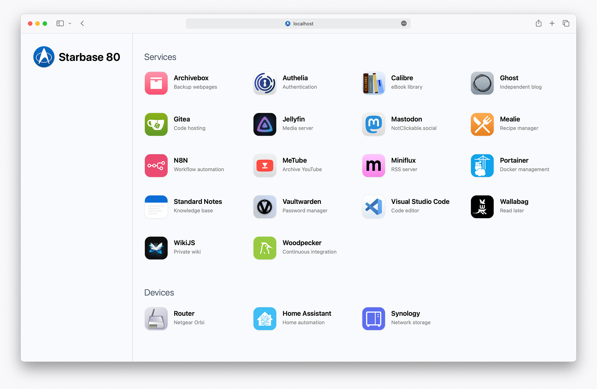
A nice looking homepage for Docker containers or any services and links.
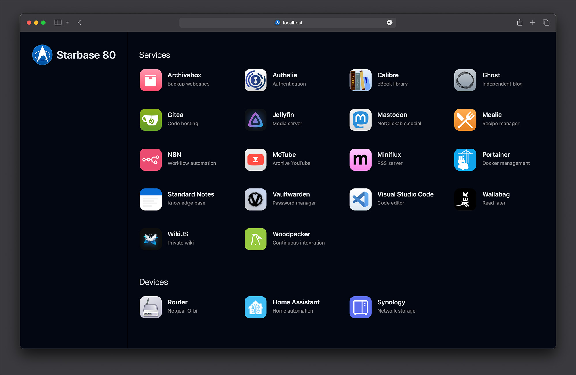
No actual integration with Docker. Loads instantly. Dark mode follows your OS.
If you make a change to the config JSON, restart this container and refresh.
Inspired by Ben Phelps' Homepage and Umbrel.
Create a volume or bind mount to a subfolder of /app/public and specify a relative path.
# Your folder
compose.yml
- icons
  - jellyfin.jpg
  - ghost.jpg
  - etc

# Bind mount
./icons:/app/public/icons

# Specify an icon in config.json
"icon": "/icons/jellyfin.jpg"Use Dashboard icons by specifying a name without any prefix.
# Specify an icon in config.json
"icon": "jellyfin"Use any Material Design icon by prefixing the name with mdi-.
Fill the icon by providing an "iconColor."
Use "black" or "white" for those colors.
# Specify an icon in config.json
"icon": "mdi-cloud",
"iconColor": "black"# Specify an icon in config.json
"icon": "/icons/jellyfin.jpg", # mostly required, but if set to "" it removes the icon
"iconColor": "blue-500", # optional, defaults to a contrasting color
"iconBG": "gray-200", # optional, defaults to a complementary color
"iconBubble": false, # optional, defaults to true, turns off bubble and shadow when false
"iconAspect": "width", # optional, defaults to "square", can set to "width" or "height" to constrain the icon to the width or height of the icon, respectivelyFor iconColor and iconBG, use a hexadecimal color or a Tailwind color. Turn off background color with a value of "transparent". Do not prefix with "bg-".
version: "3"

services:
    homepage:
        image: jordanroher/starbase-80
        ports:
            - 4173:4173
        environment:
            - TITLE=Starbase 80 # defaults to "My Website", set to TITLE= to hide the title
            - LOGO=/starbase80.jpg # defaults to /logo.png, set to LOGO= to hide the logo
            - HEADER=true # defaults to true, set to false to hide the title and logo
            - HEADERLINE=true # defaults to true, set to false to turn off the header border line
            - HEADERTOP=true # defaults to false, set to true to force the header to always stay on top
            - CATEGORIES=small # defaults to normal, set to small for smaller, uppercase category labels
            - BGCOLOR=#fff # defaults to theme(colors.slate.50), set to any hex color or Tailwind color using the theme syntax
            - BGCOLORDARK=#000 # defaults to theme(colors.gray.950), set to any hex color or Tailwind color using the theme syntax
            - NEWWINDOW=true # defaults to true, set to false to not have links open in a new window
        volumes:
            - ./config.json:/app/src/config.json # required
            - ./public/favicon.ico:/app/public/favicon.ico # optional
            - ./public/logo.png:/app/public/logo.png # optional, or you can reference something in /icons
- ./public/icons:/app/public/icons # or wherever, JSON icon paths are relative to /app/publicCan have as many categories as you like.
- category: Title, optional, displays above services
- bubble: boolean, optional, defaults to false, shows a bubble around category
- services: Array of services
- name: Name, required
- uri: Hyperlink, required
- description: 2-3 words, optional
- icon: optional, relative URI, absolute URI, service name (Dashboard icon) or
mdi-service name (Material Design icon) - iconBG: optional, hex code or Tailwind color (do not prefix with
bg-). Background color for icons. - iconColor: optional, hex code or Tailwind color (do not prefix with
bg-). Only used as the fill color for Material Design icons. - iconBubble: optional, defaults to
true, whenfalsethe bubble and shadow are removed from the icon - iconAspect: optional, defaults to
"square", can set to"width"or"height"to constrain the icon to the width or height of the icon, respectively
[
	{
		"category": "Category name",
		"bubble": false,
		"services": [
			{
				"name": "My Cloud App",
				"uri": "https://website.com",
				"description": "Fun site",
				"icon": "mdi-cloud",
				"iconBG": "#fff",
				"iconColor": "#000",
				"iconBubble": false,
				"iconAspect": "width"
			}
		]
	}
][
{
"category": "Services",
"services": [
{
"name": "Archivebox",
"uri": "https://archivebox.mywebsite.com",
"description": "Backup webpages",
"icon": "/icons/archivebox.jpg"
},
{
"name": "Authelia",
"uri": "https://auth.mywebsite.com",
"description": "Authentication",
"icon": "/icons/authelia.png"
},
{
"name": "Calibre",
"uri": "https://calibre.mywebsite.com",
"description": "eBook library",
"icon": "/icons/calibre.png"
}
]
},
{
"category": "Devices",
"bubble": true,
"services": [
{
"name": "Router",
"uri": "http://192.168.1.1/",
"description": "Netgear Orbi",
"icon": "/icons/router.png"
},
{
"name": "Home Assistant",
"uri": "http://homeassistant.local:8123/",
"description": "Home automation",
"icon": "home-assistant",
"iconBubble": false
},
{
"name": "Synology",
"uri": "http://synology:5000",
"description": "Network storage",
"icon": "/icons/synology.png"
}
]
}
]
