This repo contains the first assignment for the course Information Visualization. Students need to create one visualization using html/js/d3 and one visualization using the python package Bokeh.
- 12161381: Gongze Cao
- 11057246: Samir Zamarialai
- 13526588: Ahmed Abdelghany
- 12863815: Daniel den Heijer
- 11872888: Bob Leijnse
- Install docker via: https://docs.docker.com/engine/install/
- Move the docker-compose.yml up 1 directory (so from the InfoVis-Framework-2021 directory it is in now to the directory that contains the InfoVis-Framework-2021 directory)
- Run "docker-compose build" in your terminal from the directory that is 1 up from the InfoVis-Framework-2021 directory
- Run "docker-compose up" to start the docker container you just build
- Navigate to localhost:5000 to access the app
Note: in order to get any new changes you make in the app to display in your browser, you will need to stop the app (ctrl+c), rebuild it (step 3) and rerun it (step 4). After some time as you rebuild the app multiple times, it's advisable to clean up some of the old docker containers by running the command "docker system prune".
See the requirements.txt file You can automatically install all the requirements by running: pip install -r requirements.txt
You can get the app to run in your local browser by following the steps below.
- The app can be started by running: bash start_app.sh
- The app can then be accessed by navigating to http://127.0.0.1:5000/
- Type the following in your terminal when using windows CMD: set FLASK_ENV=development OR when using windows powershell: $env:FLASK_ENV=development OR conda env config vars set FLASK_ENV=development (when using anaconda powershell)
- Followed by: python run.py
- The app can then be accessed by navigating to http://127.0.0.1:5000/
- The following marked the non-nan instance count for each attribute available:
id                           1946273
artwork_name                 1946264
artist_full_name             1946199
artist_first_name            1946151
artist_last_name             1946267
creation_year                1614116
century                      1614116
source_url                   1946273
image_url                    1946273
collection_origins           1946273
artwork_type                 1946220
school                       1938918
original_id_in_collection    1946273
created_at                   1946273
last_modified                1946273
omni_id                      1946273
created_by_id                1946273
general_type                 1946273
geocoded                     1946273
color_pallete                1946262
dominant_color               1946262
palette_count                1945629
dtype: int64
- Examples and unique counts of several attributes:
For
artist_name:
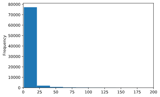
Unique artists: 81316

942873
arkyves arkyves        316969
Unknown Unknown        116751
andrea alciato           3898
Allen &                  3815
                        ...
claude paradin            474
odilon redon              460
james tissot              457
augustine augustine       455
m.c. escher               452
The histogram of the artwork counts each artist create is shown below:

For school:
Unique geoid:  4428

Some examples:
['modern' 'Italia'
 'Great Britain, Richmondshire, North Yorkshire, Yorkshire and the Humber, England, UK'
 'France métropolitaine, France' 'unknown' 'Nederland' 'flemish'
 'Deutschland, Europe' 'netherlandish' 'italian' 'french' 'english'
 'german' 'dutch' 'spanish' 'austrian' 'hungarian' 'danish' 'american' nan
 'japanese' 'catalan' 'chinese' 'london' 'british' 'roman' 'greek' 'irish'
 'philadelphia' 'printed for j. tonson; and m. tonson' 'turkey,' 'balkan,'
 'colonial' 'persian' 'hindi' 'india' 'tibet' 'philippines' 'burma'
 'america' 'leipzig' 'new york' 'korean' 'chicago' 'lubeck' 'european'
 'russian' 'portuguese' 'south american' 'swiss' 'breslau' 'roma'
 'cypriot' 'indonesia' 'etruscan' 'minoan' 'cretan' 'calcutta'
 'stockport; champante & whitrow' 'bombay' 'tlatilco' 'veracruz' 'colima'
 'wari' 'moche' 'vicús' 'chimú' 'valdivia' 'maya' 'el' 'akan' 'nayarit'
 'tairona' 'glasgow' 'parthian' 'achaemenid' 'iran' 'assyrian' 'sumerian'
 'phrygian' 'sasanian' 'babylonian' 'westminster' 'boulogne' 'xxu'
 'madrid' 'bruxelles' 'amsterdam' 'scottish' 'paris' 'colombia'
 'frankfurt am main' 'orvieto' 'paris, poissy [printed]'
 'burlington [vt.]' 'cheltenham' 'newcastle'
 'philadelphia, [printed] new york' 'stockholm' 'reims']

 Sorted from high freq to low(top100):
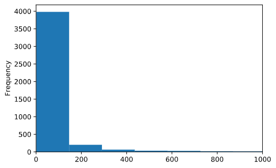
 Unique geoid:  4428
unknown      662228
london       380279
modern       184170
paris         79474
new york      37413
              ...
v praze         972
hamburg         972
haarlem         970
liverpool       926
exeter          883
Name: school, Length: 100, dtype: int64
The histogram of the artwork counts each school(geographic location) create is shown below:

Almost a third of artworks are with a known label `school` (although among those a third is marked as `london` and `modern`). But according to the histogram, the number of school with over 1000 artworks is almost 100, a considerably large number to fill up the map. A plausible idea will hence be:

**On the front-end**:

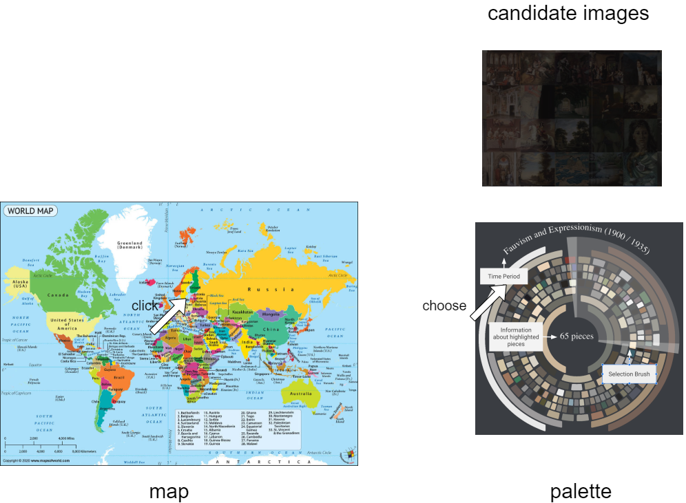
* Create a global map using some library marked in the [course website](http://selection.datavisualization.ch/).
* Create a hidden interactive component to control attribute other than `school`, say, we could use a radial chart to control palette. This is meant for a finer search/explore for each of district present in the dataset.
* When a mouse clicks on a certain district on the map, request the right data from back-end, show the hidden interactive component(now we use palette as instance), and some candidate image set of the default palette.
-
User then could choose/rotate/drag the palette to change the candidate image set, front-end retrieve the right data on the fly.
On the back-end: * Initialize the
school-pallette-candidatesmap before everything. * Response when a certain request is emitted by front-end, say, what info the user-clicked school/district contains? For a certain palette, what is the image that has closest palette among this school/district set?Obstacles/caveat:
-
Have to use an extra map lib.
- Have to map the
schoollabel to a location, because based on the freq counter above, some of school don't really have a location. So data cleaning and even hand-label is needed.
Pros:
- Think it won't leave us a bad score.
- Have to map the
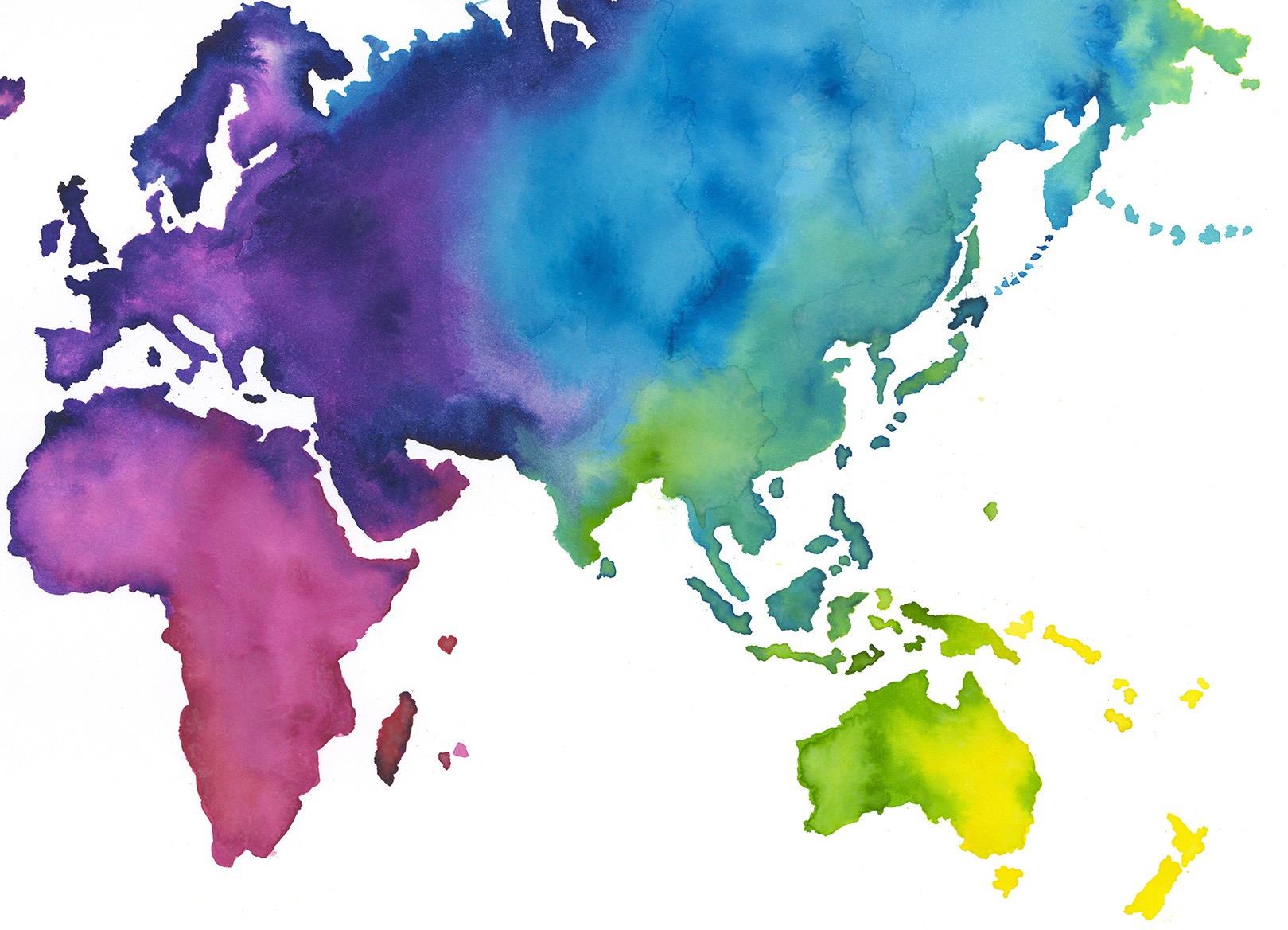
The idea is to visualize the changes in the most used colour pallet per geographic label location over time. First of all, this will look eye-catching colourful. Secondly, this enables visualization visitors to develop an intuition about differences between countries/continents. At lasts, this allows visitors to see colour trends changing over time.

