A data visualizer for Last.fm
https://github.com/XT3RM1N8R/lastfm-visualizer/raw/master/Project_1_Demo_Video.mkv
https://xt3rm1n8r.github.io/lastfm-visualizer/
Data is taken from the Last.fm service using their REST API to access their databases. Last.fm is an online music service and platform that tracks what users listen to in order to build a listening profile and compare it to other users, as well as make reccomendations and provide more information on listening patterns. The listening data is recorded through scrobbles, which are essentially pieces of data that contain information on what was listened to, such as the track name, artist, and time listened. These scrobbles are sent by applications that run on whatever devices someone is listening or through integrations with music streaming services.
This data has to be requested dynamically while the application runs, which means that the data can be different each time. I used their API to get information on listening data per-user, then I had to filter the JSON result that was returned. The information in the result can vary over time, but it follows an established schema, so I used the schema to select the information that I needed, such as track scrobble times, names, and artist names, which are essential to the scrobble data and always present.
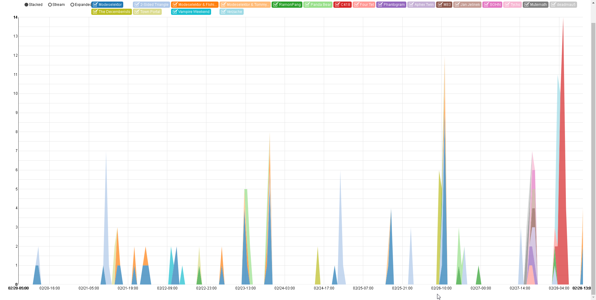
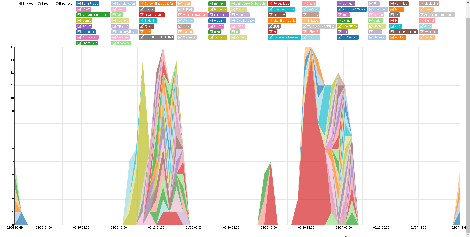
In order to use the filtered information, I had to aggregate it into useful categories and format it into something that could be used in a visualization. This took more time than I had anticipated, as I had expected most of the data to be usable straight from the API. For the artist listening stacked graph, I had to categorize the scrobbles by artist, sort them by time, establish a standard time-step and quantize the times based on this time-step, then populate the missing data across each category in order to have a full dataset.
Additionally, I had to select the most significant information from this data due to crowding on the graph and I had to have it preformatted before processing it with the visualization libraries due to some issues I later discovered with data formatting compatibility.
I had initially aimed to establish a way to visualize how a certain user would listen to different artists over time, but I an unintended result was that the visualization could also be used to observe the music listening patterns over shorter intervals of time, such as hourly listening patterns.
At first, I started by displaying all of the artist data. Unfortunately, some people can listen to a large number of artists, which resulted in a crowded graph and poor performance, as well as a lack of sufficient color-coding. This is how I ended up selecting the most significant categories. I will continue to consider improvements to this issue, such as further clustering the smaller artist categories into larger groups of data.
In addition to the D3.js library, my project uses the NVD3 library to help build a chart from the data. This library is an extension of the D3.js library.

