R plotting functions to plot gene expression data of single-cell data.
You can install the package via devtools::install_github() function in R
if (!requireNamespace("devtools", quietly = TRUE))
    install.packages("devtools")
if (!requireNamespace("BiocManager", quietly = TRUE))
    install.packages("BiocManager")
devtools::install_github('zktuong/ktplots', dependencies = TRUE)library(ktplots)There is a test dataset in Seurat format to test the functions.
# note, you need to load Seurat to interact with it
# so maybe install Seurat if you haven't already
# if (!requireNamespace("Seurat", quietly = TRUE))
    # install.packages("Seurat")
library(Seurat)
data(kidneyimmune)
The data is downsampled from the kidney cell atlas.
For more info, please see Stewart et al. kidney single cell data set published in Science 2019.
Plotting gene expression dot plots heatmaps.
# Note, this conflicts with tidyr devel version
geneDotPlot(scdata = kidneyimmune, # object
	genes = c("CD68", "CD80", "CD86", "CD74", "CD2", "CD5"), # genes to plot
	idents = "celltype", # column name in meta data that holds the cell-cluster ID/assignment
	split.by = 'Project', # column name in the meta data that you want to split the plotting by. If not provided, it will just plot according to idents
	standard_scale = TRUE) + # whether to scale expression values from 0 to 1. See ?geneDotPlot for other options
theme(strip.text.x = element_text(angle=0, hjust = 0, size =7)) + small_guide() + small_legend()
Hopefully you end up with something like this:

Generates a dot plot after CellPhoneDB analysis via specifying the query celltypes and genes.
The plotting is largely determined by the format of the meta file provided to CellPhoneDB analysis.
For the split.by option to work, the annotation in the meta file must be defined in the following format:
{split.by}_{idents}so to set up an example vector, it would be something like:
annotation <- paste0(kidneyimmune$Experiment, '_', kidneyimmune$celltype)To run, you will need to load in the means.txt and pvals.txt from the analysis.
# pvals <- read.delim("pvalues.txt", check.names = FALSE)
# means <- read.delim("means.txt", check.names = FALSE)

# I've provided an example dataset
data(cpdb_output)
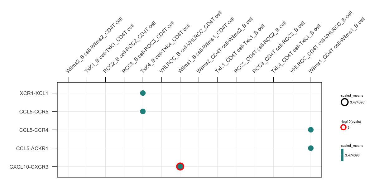
plot_cpdb(cell_type1 = 'B cell', cell_type2 = 'CD4T cell', scdata = kidneyimmune,
	idents = 'celltype', # column name where the cell ids are located in the metadata
	split.by = 'Experiment', # column name where the grouping column is. Optional.
	means = means, pvals = pvals,
	genes = c("XCR1", "CXCL10", "CCL5")) +
small_axis(fontsize = 3) + small_grid() + small_guide() + small_legend(fontsize = 2) # some helper functions included in ktplots to help with the plotting
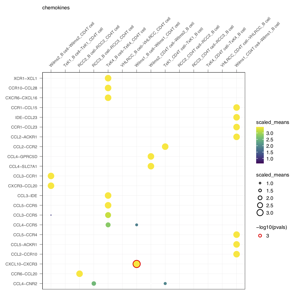
You can also try specifying gene.family option which will grep some pre-determined genes.
plot_cpdb(cell_type1 = 'B cell', cell_type2 = 'CD4T cell', scdata = kidneyimmune,
	idents = 'celltype', means = means, pvals = pvals, split.by = 'Experiment',
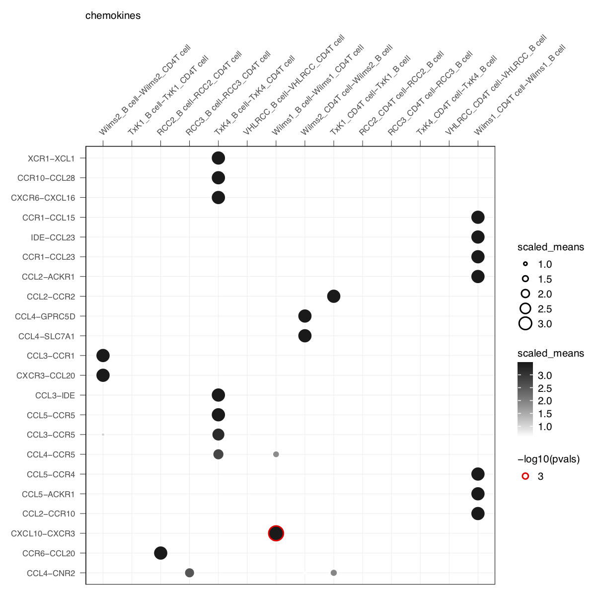
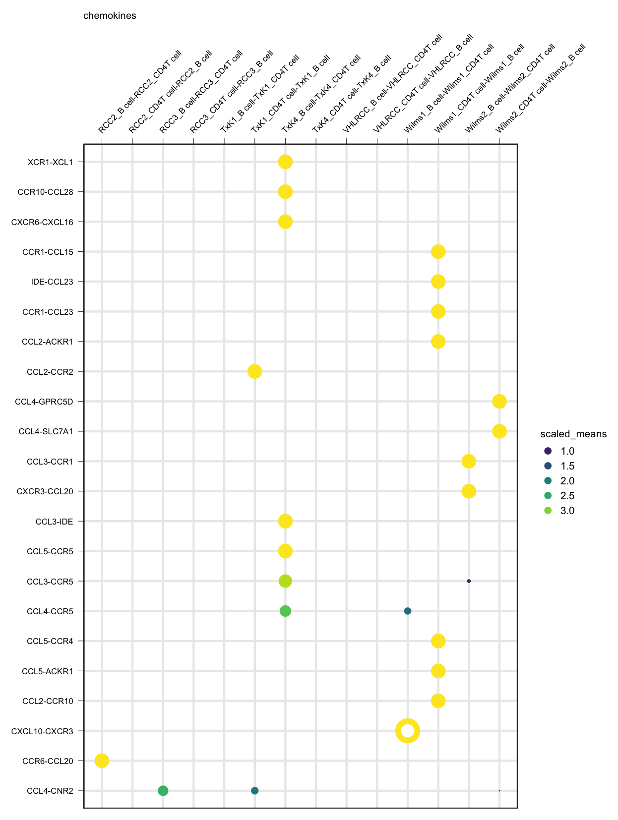
gene.family = 'chemokines') + small_guide() + small_axis() + small_legend(keysize=.5)plot_cpdb(cell_type1 = 'B cell', cell_type2 = 'CD4T cell', scdata = kidneyimmune,
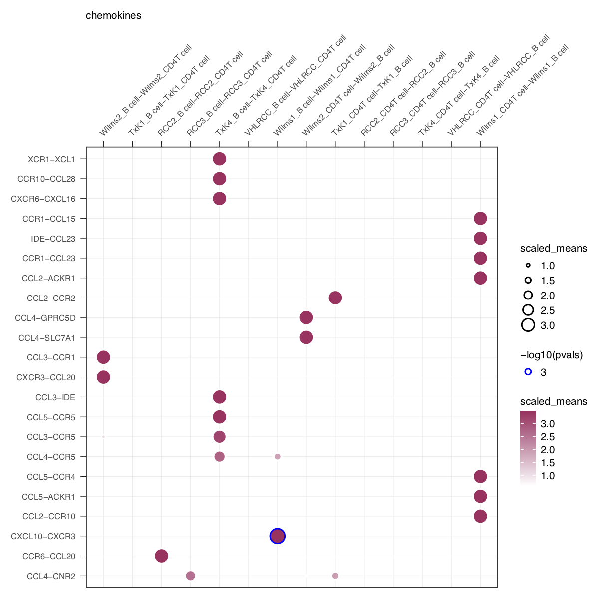
idents = 'celltype', means = means, pvals = pvals, split.by = 'Experiment',
gene.family = 'chemokines', col_option = "maroon", highlight = "blue") + small_guide() + small_axis() + small_legend(keysize=.5)plot_cpdb(cell_type1 = 'B cell', cell_type2 = 'CD4T cell', scdata = kidneyimmune,
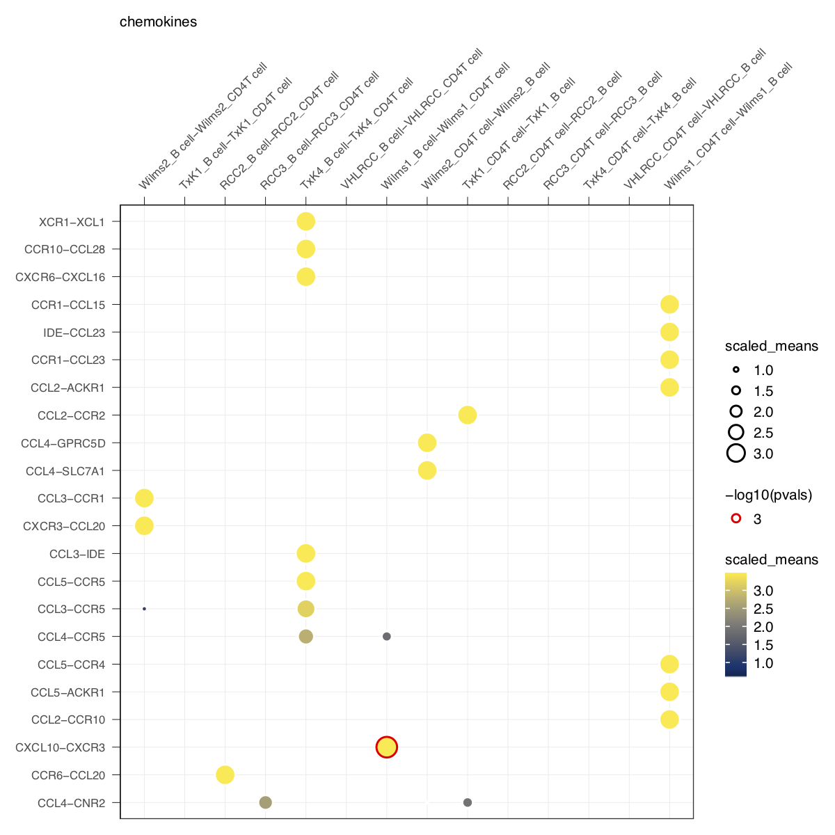
idents = 'celltype', means = means, pvals = pvals, split.by = 'Experiment',
gene.family = 'chemokines', col_option = viridis::cividis(50)) + small_guide() + small_axis() + small_legend(keysize=.5)plot_cpdb(cell_type1 = 'B cell', cell_type2 = 'CD4T cell', scdata = kidneyimmune,
idents = 'celltype', means = means, pvals = pvals, split.by = 'Experiment',
gene.family = 'chemokines', noir = TRUE) + small_guide() + small_axis() + small_legend(keysize=.5)A new style to plot inspired from squidpy.pl.ligrec where significant interactions are shown as outline instead.
plot_cpdb(cell_type1 = 'B cell', cell_type2 = 'CD4T cell', scdata = kidneyimmune,
	idents = 'celltype', means = means, pvals = pvals, split.by = 'Experiment',
	gene.family = 'chemokines', default_style = FALSE) + small_guide() + small_axis() + small_legend(keysize=.5)
if genes and gene.family are both not specified, the function will try to plot everything.
Specifying keep_significant_only will only keep those that are p<0.05 (which you can try to adjust with p.adjust.method).
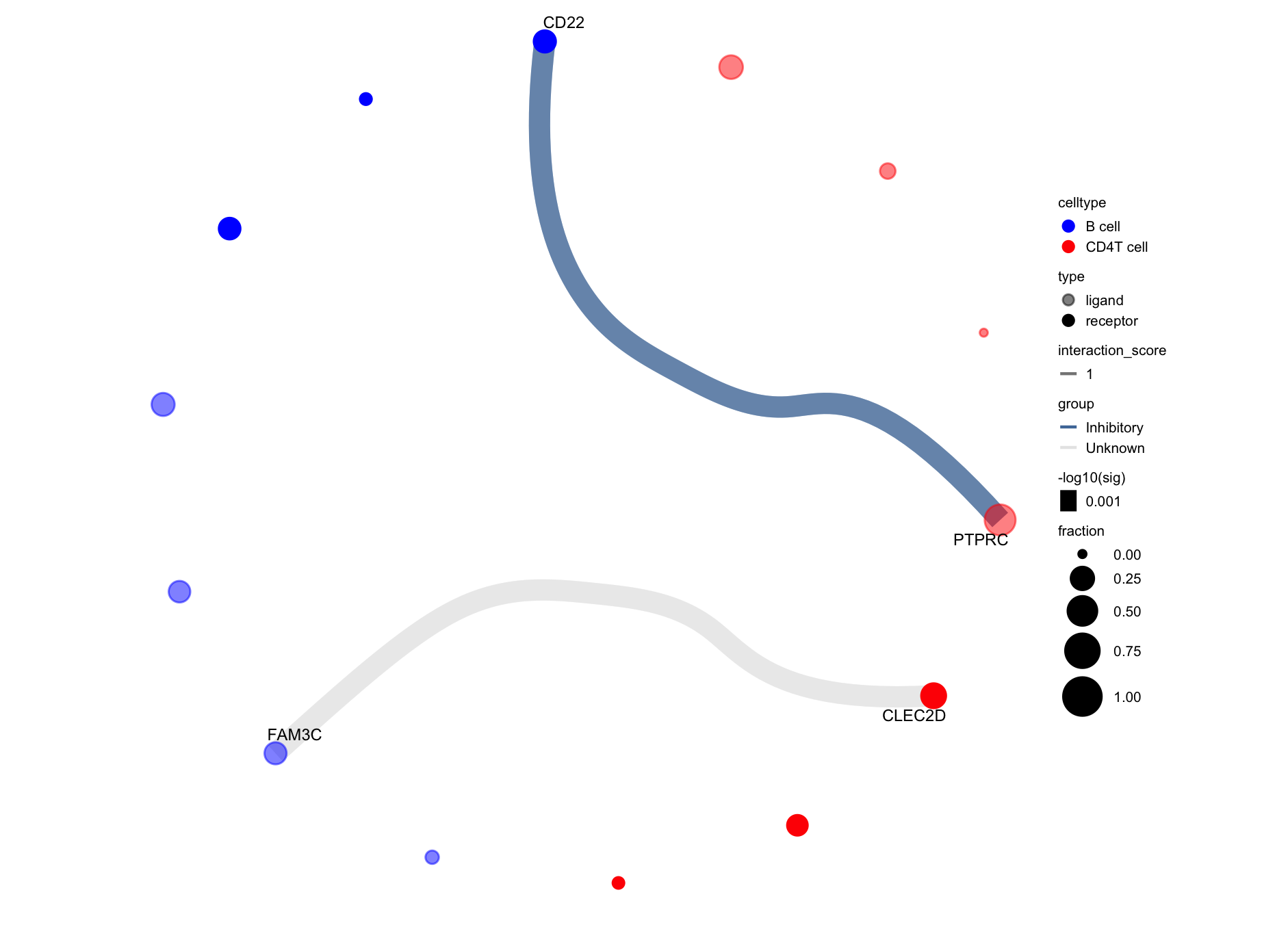
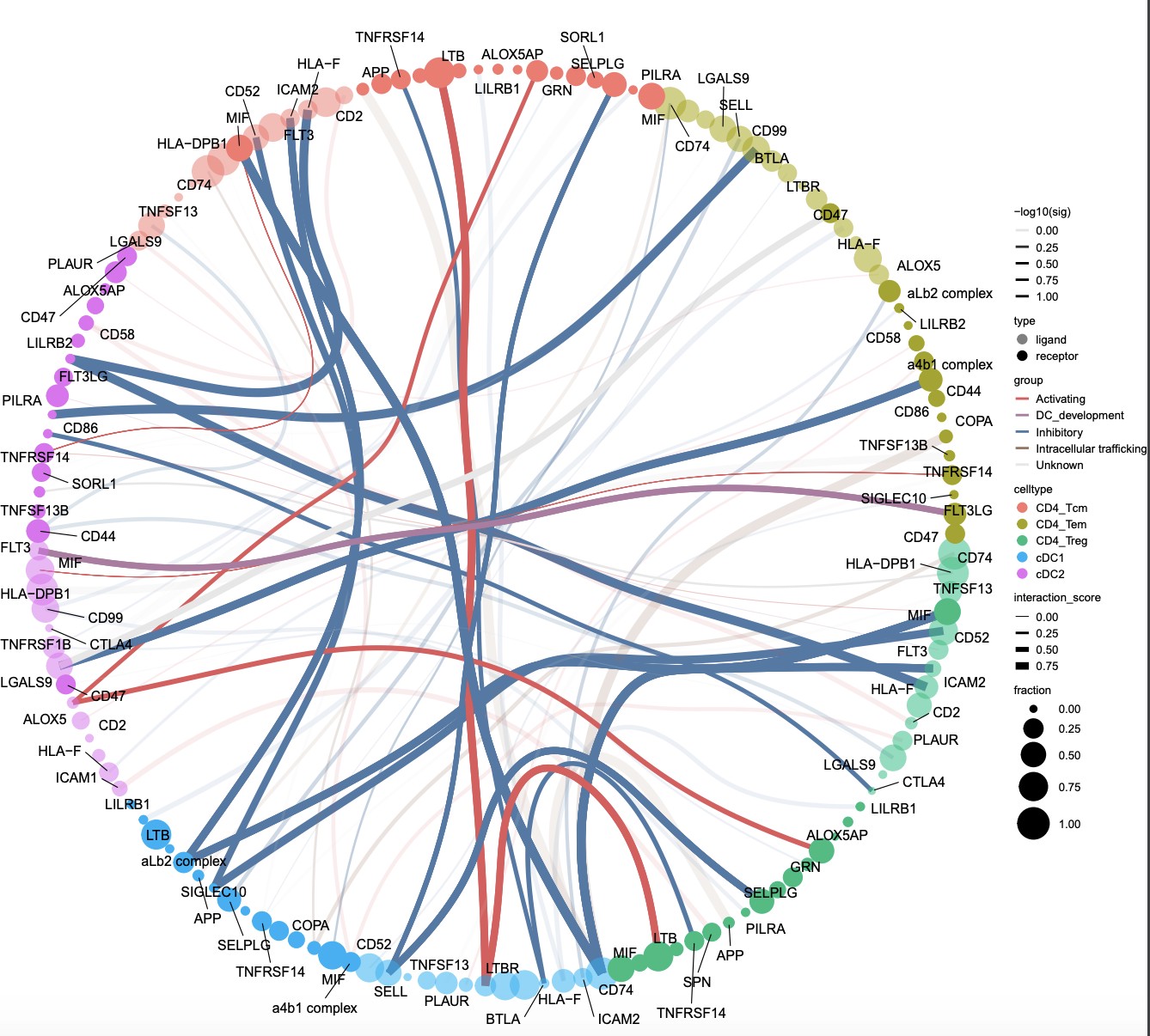
Generates a circos-style wire/arc/chord plot for cellphonedb results.
This functions piggy-backs on the original plot_cpdb function and generates the results like this:
Please help contribute to the interaction grouping list here!
Credits to Ben Stewart for coming up with the base code!
library(ktplots)
data(kidneyimmune)
data(cpdb_output2)

sce <- Seurat::as.SingleCellExperiment(kidneyimmune)
p <- plot_cpdb2(cell_type1 = 'B cell', cell_type2 = 'CD4T cell',
    scdata = sce,
    idents = 'celltype', # column name where the cell ids are located in the metadata
    means = means2,
    pvals = pvals2,
    deconvoluted = decon2, # new options from here on specific to plot_cpdb2
    desiredInteractions = list(
        c('CD4T cell', 'B cell'),
        c('B cell', 'CD4T cell')),
    interaction_grouping = interaction_annotation,
    edge_group_colors = c(
        "Activating" = "#e15759",
        "Chemotaxis" = "#59a14f",
        "Inhibitory" = "#4e79a7",
        "Intracellular trafficking" = "#9c755f",
        "DC_development" = "#B07aa1",
        "Unknown" = "#e7e7e7"
        ),
    node_group_colors = c(
        "CD4T cell" = "red",
        "B cell" = "blue"),
    keep_significant_only = TRUE,
    standard_scale = TRUE,
    remove_self = TRUE
    )
p# code example but not using the example datasets
library(SingleCellExperiment)
library(reticulate)
library(ktplots)
ad=import('anndata')
adata = ad$read_h5ad('rna.h5ad')
counts <- Matrix::t(adata$X)
row.names(counts) <- row.names(adata$var)
colnames(counts) <- row.names(adata$obs)
sce <- SingleCellExperiment(list(counts = counts), colData = adata$obs, rowData = adata$var)
means <- read.delim('out/means.txt', check.names = FALSE)
pvalues <- read.delim('out/pvalues.txt', check.names = FALSE)
deconvoluted <- read.delim('out/deconvoluted.txt', check.names = FALSE)
interaction_grouping <- read.delim('interactions_groups.txt')
# > head(interaction_grouping)
# interaction role
# 1 ALOX5_ALOX5AP Activating
# 2 ANXA1_FPR1 Inhibitory
# 3 BTLA_TNFRSF14 Inhibitory
# 4 CCL5_CCR5 Chemotaxis
# 5 CD2_CD58 Activating
# 6 CD28_CD86 Activating
test <- plot_cpdb2(cell_type1 = "CD4_Tem|CD4_Tcm|CD4_Treg", # same usage style as plot_cpdb
cell_type2 = "cDC",
idents = 'fine_clustering',
split.by = 'treatment_group_1',
scdata = sce,
means = means,
pvals = pvalues,
deconvoluted = deconvoluted, # new options from here on specific to plot_cpdb2
gene_symbol_mapping = 'index', # column name in rowData holding the actual gene symbols if the row names is ENSG Ids. Might be a bit buggy
desiredInteractions = list(c('CD4_Tcm', 'cDC1'), c('CD4_Tcm', 'cDC2'), c('CD4_Tem', 'cDC1'), c('CD4_Tem', 'cDC2 '), c('CD4_Treg', 'cDC1'), c('CD4_Treg', 'cDC2')),
interaction_grouping = interaction_grouping,
edge_group_colors = c("Activating" = "#e15759", "Chemotaxis" = "#59a14f", "Inhibitory" = "#4e79a7", " Intracellular trafficking" = "#9c755f", "DC_development" = "#B07aa1"),
node_group_colors = c("CD4_Tcm" = "#86bc86", "CD4_Tem" = "#79706e", "CD4_Treg" = "#ff7f0e", "cDC1" = "#bcbd22" ,"cDC2" = "#17becf"),
keep_significant_only = TRUE,
standard_scale = TRUE,
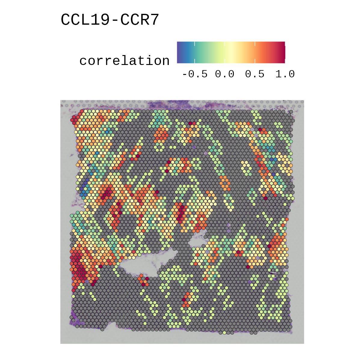
remove_self = TRUE)Ever wanted to ask if your gene(s) and/or prediction(s) of interests correlate spatially in vissium data? Now you can! disclaimer It might be buggy.
library(ggplot2)
scRNAseq <- Seurat::SCTransform(scRNAseq, verbose = FALSE) %>% Seurat::RunPCA(., verbose = FALSE) %>% Seurat::RunUMAP(., dims = 1:30, verbose = FALSE)
anchors <- Seurat::FindTransferAnchors(reference = scRNAseq, query = spatial, normalization.method = "SCT")
predictions.assay <- Seurat::TransferData(anchorset = anchors, refdata = scRNAseq$label, dims = 1:30, prediction.assay = TRUE, weight.reduction = spatial[["pca"]])
spatial[["predictions"]] <- predictions.assay
Seurat::DefaultAssay(spatial) <- "predictions"
Seurat::DefaultAssay(spatial) <- 'SCT'
pa <- Seurat::SpatialFeaturePlot(spatial, features = c('Tnfsf13b', 'Cd79a'), pt.size.factor = 1.6, ncol = 2, crop = TRUE) + viridis::scale_fill_viridis()
Seurat::DefaultAssay(spatial) <- 'predictions'
pb <- Seurat::SpatialFeaturePlot(spatial, features = 'Group1-3', pt.size.factor = 1.6, ncol = 2, crop = TRUE) + viridis::scale_fill_viridis()

p1 <- correlationSpot(spatial, genes = c('Tnfsf13b', 'Cd79a'), celltypes = 'Group1-3', pt.size.factor = 1.6, ncol = 2, crop = TRUE) + scale_fill_gradientn( colors = rev(RColorBrewer::brewer.pal(12, 'Spectral')),limits = c(-1, 1))
p2 <- correlationSpot(spatial, genes = c('Tnfsf13b', 'Cd79a'), celltypes = 'Group1-3', pt.size.factor = 1.6, ncol = 2, crop = TRUE, average_by_cluster = TRUE) + scale_fill_gradientn(colors = rev(RColorBrewer::brewer.pal(12, 'Spectral')),limits = c(-1, 1)) + ggtitle('correlation averaged across clusters')

cowplot::plot_grid(pa, pb, p1, p2, ncol = 2)Generates a stacked violinplot like in scanpy's sc.pl.stacked_violin.
Credits to @tangming2005.
features <- c("CD79A", "MS4A1", "CD8A", "CD8B", "LYZ", "LGALS3", "S100A8", "GNLY", "NKG7", "KLRB1", "FCGR3A", "FCER1A", "CST3")
StackedVlnPlot(kidneyimmune, features = features) + theme(axis.text.x = element_text(angle = 90, hjust = 1, size = 8))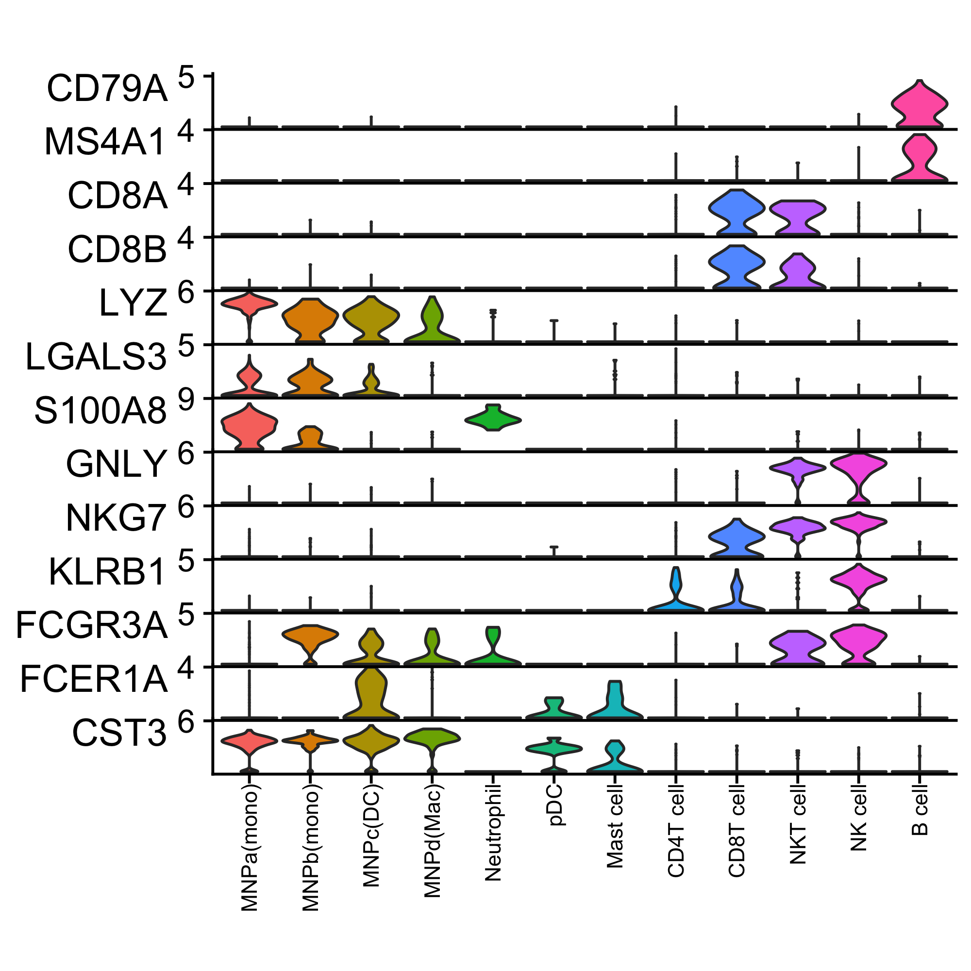 Seems like standard ggplot
 theme functions only work on the x-axis. Need to work out how to adjust that.
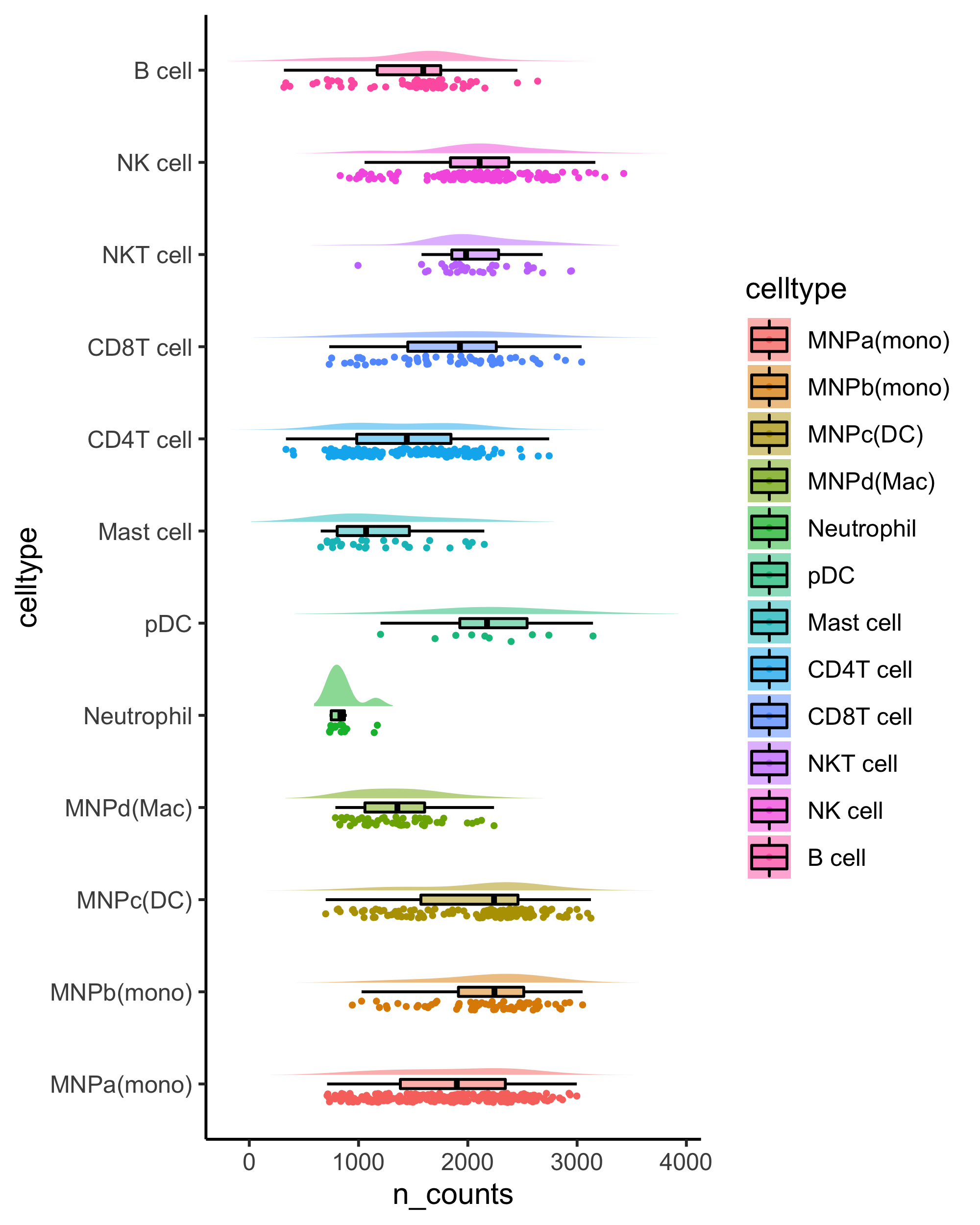
Generates a raincloudplot to use boxplot, scatterplot and violin all at once!
Adopted from https://wellcomeopenresearch.org/articles/4-63
rainCloudPlot(data = kidneyimmune@meta.data, groupby = "celltype", parameter = "n_counts") + coord_flip()small_legend/small_guide/small_axis/small_grid/topright_legend/topleft_legend/bottomleft_legend/bottomright_legend
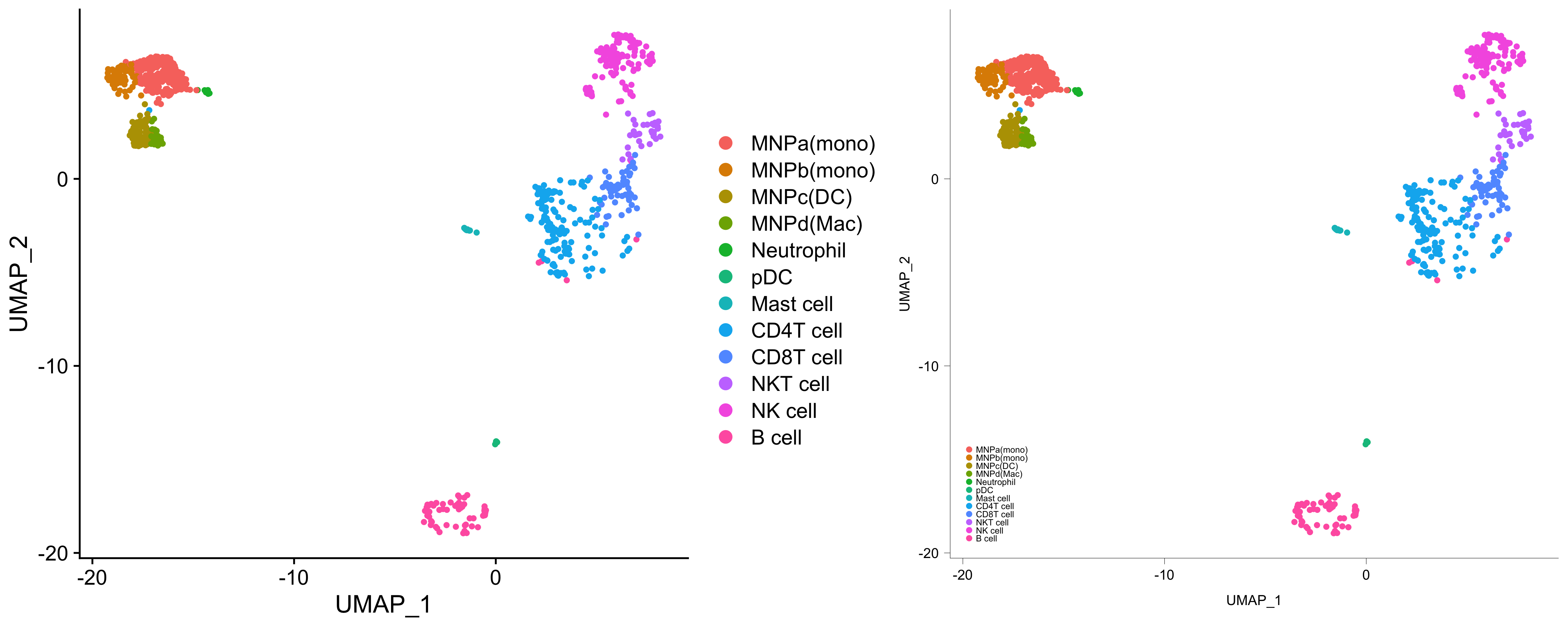
As shown in the examples above, these are some functions to quickly adjust the size and position of ggplots.
# for example
g <- Seurat::DimPlot(kidneyimmune, group.by = "celltype")
g1 <- g + small_legend() + small_guide() + small_axis() + bottomleft_legend()
library(patchwork)
g + g1If you find these functions useful, please consider leaving a star, citing this repository, and/or citing the following DOI:
Zewen Kelvin Tuong. (2021). zktuong/ktplots: 1.1.16 (v1.1.16). Zenodo. https://doi.org/10.5281/zenodo.5717923
Thank you!

