- Using NPM
npm install volkeno-react-native-drag-drop - or:
- Using Yarn
yarn add volkeno-react-native-drag-drop
import React from "react";
import { StyleSheet, Text, View } from "react-native";
import DragAndDrop from "volkeno-react-native-drag-drop";
export default function App() {
const [items, setItems] = React.useState([
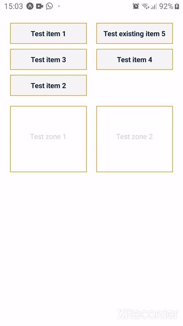
{ id: 1, text: "Test item 1" },
{ id: 2, text: "Test item 2" },
{ id: 3, text: "Test item 3" },
{ id: 4, text: "Test item 4" },
]);
const [zones, setZones] = React.useState([
{
id: 1,
text: "Test zone 1",
items: [{ id: 5, text: "Test existing item 5" }],
},
{
id: 2,
text: "Test zone 2",
},
]);
return (
<DragAndDrop
style={styles.container}
contentContainerStyle={styles.contentContainerStyle}
itemKeyExtractor={(item) => item.id}
zoneKeyExtractor={(zone) => zone.id}
zones={zones}
items={items}
itemsContainerStyle={styles.itemsContainerStyle}
zonesContainerStyle={styles.zonesContainerStyle}
onMaj={(zones, items) => {
setItems(items);
setZones(zones);
}}
itemsInZoneStyle={styles.itemsInZoneStyle}
renderItem={(item) => {
return (
<View style={styles.dragItemStyle}>
<Text style={styles.dragItemTextStyle}>{item.text}</Text>
</View>
);
}}
renderZone={(zone, children, hover) => {
return (
<View
style={{
...styles.dragZoneStyle,
backgroundColor: hover ? "#E2E2E2" : "#FFF",
}}
>
<Text stylae={styles.dragZoneTextStyle}>{zone.text}</Text>
{children}
</View>
);
}}
/>
);
}
const styles = StyleSheet.create({
container: {
flex: 1,
},
itemsInZoneStyle: {
width: "100%",
},
contentContainerStyle: {
padding: 20,
paddingTop: 40,
},
itemsContainerStyle: {
flexDirection: "row",
flexWrap: "wrap",
justifyContent: "space-between",
alignItems: "center",
},
zonesContainerStyle: {
flexDirection: "row",
flexWrap: "wrap",
justifyContent: "space-between",
},
dragItemStyle: {
borderColor: "#F39200",
borderWidth: 1,
width: "47%",
alignItems: "center",
justifyContent: "center",
marginVertical: 5,
backgroundColor: "#F5F5F5",
padding: 10,
},
dragItemTextStyle: {
color: "#011F3B",
fontWeight: "700",
textAlign: "center",
},
dragZoneStyle: {
borderColor: "#F39200",
borderWidth: 1,
width: "47%",
padding: 15,
minHeight: 130,
marginVertical: 15,
},
dragZoneTextStyle: {
position: "absolute",
opacity: 0.2,
zIndex: 0,
alignSelf: "center",
top: "50%",
},
});| Property name | Type | Description |
|---|---|---|
| style | Object | Custom style for ScrollView component |
| draggedElementStyle | Object | Custom style for the dragged item |
| maxItemsPerZone | Number | max items inside a drop area default to null (no limit) |
| itemsInZoneDisplay | row or collumn | the flex direction for the container of items inside a zone |
| itemsDisplay | row or collumn | the flex direction for the container of items |
| itemsNumCollumns | Number | the number of collumns for items |
| itemsInZoneNumCollumns | Number | the number of collumns for items inside a zone |
| headerComponent | ReactElement | render a header |
| footerComponent | ReactElement | render a footer |
| contentContainerStyle | Object | Custom style for ScrollView contentContainerStyle |
| itemKeyExtractor | Function | function that take an item as a parameter then return the id of the item |
| zoneKeyExtractor | Function | function that take a zone as a parameter then return the id of the item |
| zones | Array | array contains the drops area |
| items | Array | array contains draggable items |
| itemsContainerStyle | Object | Custom style for the container of the draggable items |
| zonesContainerStyle | Object | Custom style for the container of the drop zones |
| itemsInZoneStyle | Object | Custom style for the item in the drop area |
| onMaj | Function | The callback function trigger when there are changes on the items or the zones |
| renderItem | Function | Function to render an item |
| renderZone | Function | Function to render a drop zone important the chidren parameter is the draggable items in the drop area |
import React from "react";
import { StyleSheet, Text, View } from "react-native";
import DragAndDrop from "volkeno-react-native-drag-drop";
export function DragDropModule() {
const [items, setItems] = React.useState([
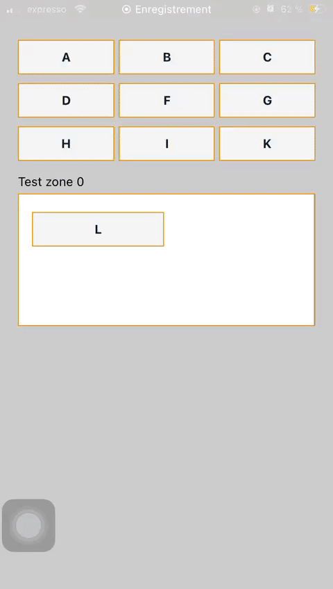
{ id: 1, text: "A" },
{ id: 2, text: "B" },
{ id: 3, text: "C" },
{ id: 4, text: "D" },
{ id: 5, text: "F" },
{ id: 6, text: "G" },
{ id: 7, text: "H" },
{ id: 8, text: "I" },
{ id: 9, text: "K" },
]);
const [zones, setZones] = React.useState([
{
id: 1,
text: "Test zone 0",
items: [{ id: 10, text: "L" }],
},
]);
return (
<DragAndDrop
style={styles.container}
contentContainerStyle={styles.contentContainerStyle}
itemKeyExtractor={(item) => item.id}
zoneKeyExtractor={(zone) => zone.id}
zones={zones}
items={items}
onMaj={(zones, items) => {
setItems(items);
setZones(zones);
}}
itemsInZoneDisplay="row"
itemsDisplay="row"
itemsNumCollumns={3}
itemsInZoneNumCollumns={2}
renderItem={(item) => {
return (
<View style={styles.dragItemStyle}>
<Text style={styles.dragItemTextStyle}>{item.text}</Text>
</View>
);
}}
renderZone={(zone, children, hover) => {
return (
<View style={{ marginVertical: 10 }}>
<Text style={{ marginBottom: 5 }}>{zone.text}</Text>
<View
style={{
...styles.dragZoneStyle,
minHeight: 150,
backgroundColor: hover ? "#E2E2E2" : "#FFF",
}}
>
{children}
</View>
</View>
);
}}
/>
);
}
const styles = StyleSheet.create({
container: {
flex: 1,
},
contentContainerStyle: {
padding: 20,
paddingTop: 40,
},
dragItemStyle: {
borderColor: "#F39200",
borderWidth: 1,
alignItems: "center",
justifyContent: "center",
marginVertical: 5,
backgroundColor: "#F5F5F5",
padding: 10,
},
dragItemTextStyle: {
color: "#011F3B",
fontWeight: "700",
textAlign: "center",
},
dragZoneStyle: {
borderColor: "#F39200",
borderWidth: 1,
padding: 15,
},
});
ISC Licensed