Features
🚥 Render timelines in three different modes (Horizontal, Vertical, Tree).🌲 Use the Tree mode to layout the timeline cards vertically in a tree like fashion.📺 Auto play the timeline with the slideshow mode.🖼️ Display Images & Videos in the timeline with ease.⌨ Keyboard accessible.⚡ Data driven API.🔧 Optimized to render images & videos efficiently on (Tree & Vertical mode).🎨 Customize colors with ease.💪 Built with Typescript.🎨 Styled with emotion.
Table of Contents
⚡ Installation- Getting Started
- Props
📦 CodeSandbox Examples📦 Build Setup🔨 Contributing🧱 Built with🎯 What's coming next- Meta
⚡ Installation
yarn install react-chronoGetting Started
Please make sure you wrap the component in a container that has a width and height.
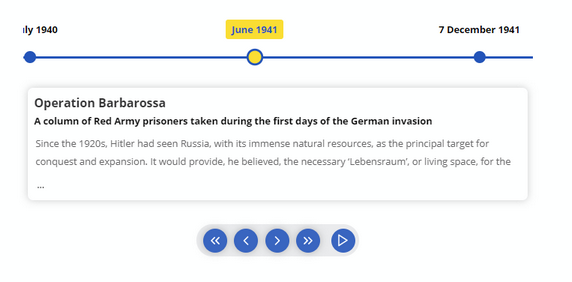
When no mode is specified, the component defaults to HORIZONTAL mode. Please check props for all the available options.
  import React from "react"
  import { Chrono } from "react-chrono";

  const Home = () => {
    const items = [{
      title: "May 1940",
      contentTitle: "Dunkirk",
      contentText:"Men of the British Expeditionary Force (BEF) wade out to..",
      media: {
        type: "IMAGE",
        source: {
          url: "http://someurl/image.jpg"
        }
      }
    }, ...];

    return (
      <div style={{ width: "500px", height: "400px" }}>
        <Chrono items={items} cardHeight={300} />
      </div>
    )
  }
Vertical Mode
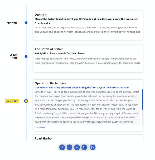
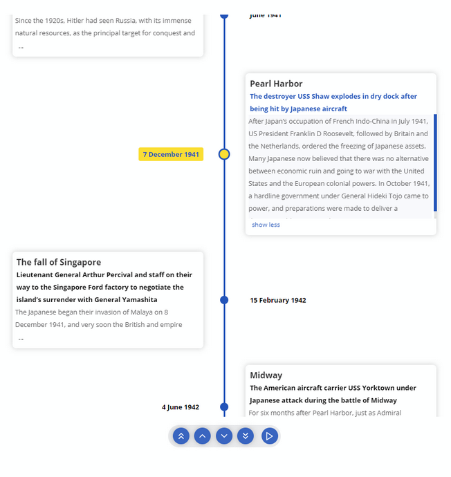
To render the timeline vertically use the VERTICAL mode
  <div style={{ width: "500px", height: "950px" }}>
    <chrono
      items={items}
      mode="VERTICAL"
    />
  </div>
Tree
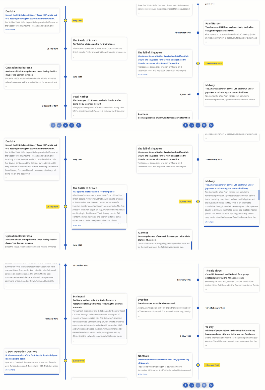
In Tree mode the timeline is rendered vertically with cards alternating between left and right side.
  <div style={{ width: "500px", height: "950px" }}>
    <chrono
      items={items}
      mode="TREE"
    />
  </div>
Slideshow
Play the timeline automatically with the slideShow mode.
  <div style={{ width: "500px", height: "950px" }}>
    <chrono
      items={items}
      slideShow
      mode="TREE"
    />
  </div>
Props
| name | description | default |
|---|---|---|
| mode | sets the mode of the component. can be HORIZONTAL, VERTICAL or TREE |
HORIZONTAL |
| items | collection of Timeline Item Model. | [] |
| disableNavOnKey | Disables keyboard navigation. | false |
| slideShow | Enables slideshow control. | false |
| slideItemDuration | The amount of delay in ms for the timeline points in slideshow mode. |
5000 |
| itemWidth | width of the timeline section in HORIZONTAL mode. |
300 |
| hideControls | hides the navigation controls. | 300 |
| cardHeight | sets the minimum height of the timeline card. | 250 |
| theme | prop to customize the colors. |
Mode
react-chrono supports three modes HORIZONTAL, VERTICAL and TREE. No additional setting is required.
<chrono items={items} mode="HORIZONTAL" /> <chrono items={items} mode="VERTICAL" /> <chrono items={items} mode="TREE" />Timeline item Model
| name | description | type |
|---|---|---|
| title | title of the timeline item | String |
| contentTitle | title that is displayed on the timeline card | String |
| contentText | text displayed in the timeline card | String |
| contentDetailedText | detailed text displayed in the timeline card | String |
| media | media object to set image or video. | Object |
{
  title: "May 1940",
  contentTitle: "Dunkirk",
  media: {
    name: "dunkirk beach",
    source: {
      url: "http://someurl/image.jpg"
    },
    type: "IMAGE"
  },
  contentText:
    "Men of the British Expeditionary Force (BEF) wade out to a destroyer during the evacuation from Dunkirk."
}
Keyboard Navigation
The timeline can be navigated via keyboard.
- For
HORIZONTALmode use your LEFT RIGHT arrow keys for navigation. - For
VERTICALorTREEmode, the timeline can be navigated via the UP DOWN arrow keys. - To easily jump to the first item or the last item in the timeline, use HOME or END keys.
To disable keyboard navigation set disableNavOnKey to true.
<chrono items={items} disableNavOnKey />Media
Both images and videos can be embedded in the timeline. Just add the media attribute to the Timeline Item model and the component will take care of the rest.
To embed a image
{
  title: "May 1940",
  contentTitle: "Dunkirk",
  media: {
    name: "dunkirk beach",
    source: {
      url: "http://someurl/image.jpg"
    },
    type: "IMAGE"
  }
}
To embed a video
Videos start playing automatically when active and will be automatically paused when not active. Like images, videos are also automatically hidden when not in the visible viewport of the container.
{
  title: "7 December 1941",
  contentTitle: "Pearl Harbor",
  media: {
    source: {
      url: "/pearl-harbor.mp4",
      type: "mp4"
    },
    type: "VIDEO",
    name: "Pearl Harbor"
  }
}
Slideshow mode
Slideshow can be enabled by setting the slideShow prop to true. You can also set an optional slideItemDuration that sets the time delay between cards.
setting this prop enables the play button in the timeline control panel.
<chrono items={items} slideShow slideItemDuration={4500} />Item Width
The itemWidth prop can be used to set the width of each individual timeline sections. This setting is applicable only for the HORIZONTAL mode.
Theme
Customize colors with theme prop.
<chrono items={items} titlePosition="BOTTOM" theme={{primary: "red", secondary: "blue" }} />📦 CodeSandbox Examples
📦 Build Setup
# install dependencies
yarn install

# start dev setup
yarn run start

# run css linting
yarn run lint:css

# eslint
yarn run eslint

# prettier
yarn run lint

# package lib
yarn run rollup
🔨 Contributing
- Fork it
- Create your feature branch (
git checkout -b new-feature) - Commit your changes (
git commit -am 'Add feature') - Push to the branch (
git push origin new-feature) - Create a new Pull Request
🧱 Built with
- Typescript.
- Styled with emotion.
- Powered by snowpack
🎯 What's coming next
- Support for Mobile devices & Tablets (responsive).
Meta
Prabhu Murthy – @prabhumurthy2 – prabhu.m.murthy@gmail.com
Distributed under the MIT license. See LICENSE for more information.
