Visualize instant power consumption and generation divided by categories at a glance.
Tested on Sigenergy in all modes, including Ai.
The included gauges are:
- Consumption
- Solar production
- Grid import
- Grid export
- Battery charge
- Battery discharge

This has not been tested on HA earlier than 2024.9 and requires the following HACS addons:
- Apex-Charts card - For the gauges.
- lovelace-card-mod - For adding the icons instead of regular text.
- Install the required HACS addons above, if not already installed.
- Copy the HA automation and fields file
power_flow_gauges_sigen.yamlfor Sigenergy systems to yourpackagesdirectory. (Other EnergyStorageSystems may become available later.). If you don't have such a directory, look at the Sigenergy installation instructions on how to make one. - Restart Home Assistant for the above file to be loaded.
- Refference the icons font for the frontend:
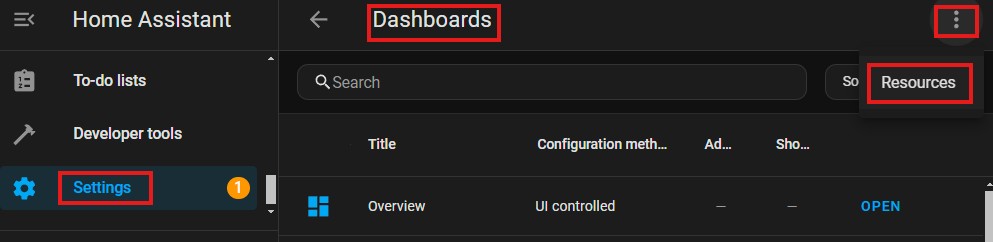
- Go to Settings -> Dashboards -> Three dots menu -> Resources.
- Add
https://fonts.googleapis.com/icon?family=Material+Iconsas a Stylesheet resource.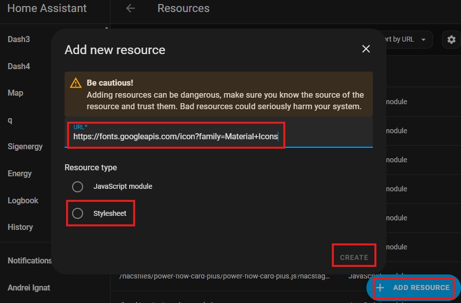
- Go to Settings -> Dashboards -> Three dots menu -> Resources.
- Create the a new Dashboard and copy the contents of
dashboard_icons.yamlto it.- Go to Settings -> Dashboards -> ADD DASHBOARD -> New Dashboard from scratch
- Give it a name and click CREATE
- Go to the new dashboard and Edit -> Click on Three Dots menu -> Raw configuration editor.
- Remove all existing text and paste the contents from the
dashboards_?.yamlfile.


If using Sigenergy system your all set.
If using another inverter then inside the power_flow_gauges_sigen.yaml, change all entities starting with sigen_ to match the equivalent ones of your ESS.
- iOS doesn't like the Google icons font and I haven't been able to debug it yet. The text dashboard works fine.
- Because this solution uses already existing cards, it can't be installed trough HACS.
If you any kind of assistance, you have two options:
a) Use the github discussion
b) Only if code-related (bugs / contributions): Open an github issue or issue a pullrequest
--
Happy measuring!