The aim of this exercise is to create a responsive webpage showcasing your cake business.
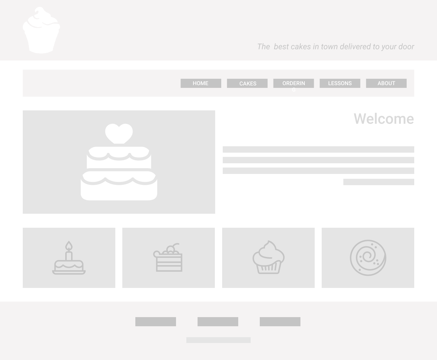
Two wireframes are provided down below (scroll to the bottom).
-
Fork and clone this repo.
- To fork, hit the 'fork' button in the top right corner of this page on Github. Now you should be on your own Github repository - you'll know this because your name should now be in the repo name at the top of the Github page.
- To clone, click the green button that says 'Code' on that page. Now the code is on your own machine (this happened when you cloned), AND it's linked to your own Cakes repository on Github (which was created when you forked).
-
Before you start coding, create a new branch following this format
your-class-name/your-name, for example:london-class-7/adam-smith. Your branch name should be all lowercase, with no spaces.
When you're ready to start coding:
- Write the HTML following the mobile design
- Then write your CSS for everything to look great on mobile
- Remember to link your CSS file to your HTML file inside the
<head>inindex.html - You don't need to use any media queries yet, because we're following a Mobile First approach!
-
Now add media queries to your CSS, and change the layout and sizing of elements so they make better use of a wider screen (see the desktop wireframe design below).
-
To follow Mobile First principles, we will only be using
min-widthin our media queries (no max-width!) -
You should use 2 different breakpoints, meaning you should have 3 different variants of your layout. Here's an example.
If we have the following 2 breakpoints:
- breakpoint 1 --> 540px
- breakpoint 2 --> 900px
Then our CSS code will be split into 3:
- "default": default styles, should implement the mobile design (no media query used for these). These styles will apply to all screen sizes by default.
- "medium": Our first media query
@media (min-width: 540px) {...}will overwrite our default styles for screens at least 540px wide. Screens below 540px will apply the styles from the "default". - "large": Our second media query
@media (min-width: 900px) {...}will overwrite our default AND medium styles for screens at least 900px wide (no upper limit).
- Choose 1-2 fonts to use (lots of free fonts here)
- Choose 2-3 colours that you think go together well, and try to limit yourself to those in your CSS (look here for inspiration)
- Select some nice cake pictures to replace the placeholders in the wireframes (good photo source here).
- Get creative! Can you add some cool hover effects to buttons and images?
- It's up to you to find a solution for any elements that are visible in desktop and not on mobile - and vice versa.
- Commit and push your code often so you get into the habit and you avoid losing any code that you write if your machine crashes for example.
- Once you're ready to submit your homework for review, do a final push and create a Pull Request. If you're unsure how to do this, have a look here.
Your PR should be named following this format:Class name - Your name, for example:London class 7 - Adam Smith.
Deploy your work to Netlify!
Remember to follow this naming convention when creating your custom URL in Netlify: https://cyf-[your-Github-username]-cakes.netlify.app/
Build the mobile wireframe first, then adapt it for larger screens.

