Welcome all to my first website MOTORCYCLE FESTIVAL!
The motorcycle festival is about to invite people to the MOTORCYCLE FESTIVAL. This website is for motorcycle enthusiasts and festival! It's designed to be a friendly place. The attention of the advanced public is also attracted by festivals that combine music and various spiritual practices: the so-called "spaces" for self-development and communication with like-minded people. Of course, the main attraction for the audience is the content. Connoisseurs are eager to find out what the organizer has to offer them. And in the case of music festivals - who can he offer. And here the priority of goals and objectives again comes into force. The situation is twofold: on the one hand, the desire for commercial success of the project, to reach a wider audience dictates the need to invite sonorous names, on the other hand, the audience may be interested and often interested in everything new, including new performers. The real attraction of this fiesta is the “bike show and music”, goodwill and a convivial atmosphere for all. From bikers to non-bikers or even aspiring bikers, visitors, tourists, families and locals, BikeFest has something for all. The festival allure can best be described by broad smiles and good humour as everyone soaks up the atmosphere in the Bike Camp located hear the town centre, on the Nikolaev Road, in the grounds of the Dom Pavlovyh Hotel. Add in an action-packed, fun-fueled programme of events and activities, lots of live music stages day and night, coupled with the opportunity to ride the twisting tracks around the town.
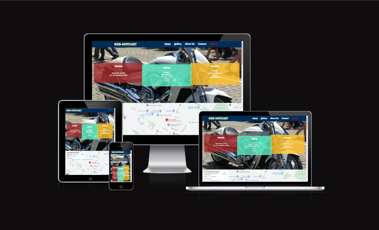
Amiresponsive
Features
Featured at the top of the page id the logo (MENU) and the nav bar which in the nav bar you can navigate between the HOME, GALLERY, ABOUT US, CONTACTS and SIGN UP, sections which are currently active and adaptive menu. The colour chosen for this page and the font were designed for readable and logical think it suits the page and its aspects and its easy to read and visually pleasing, the fonts are copperplate gothic light as I felt it suits the feel of the page and the type of people who will view this page it’s nice and sharp and stands out. The navigation is clearly labelled for users to easily find their way through the page and the social media links are clickable.
About:
The about section explains what the webpage is for and why its been created and what the main goal of the page is.
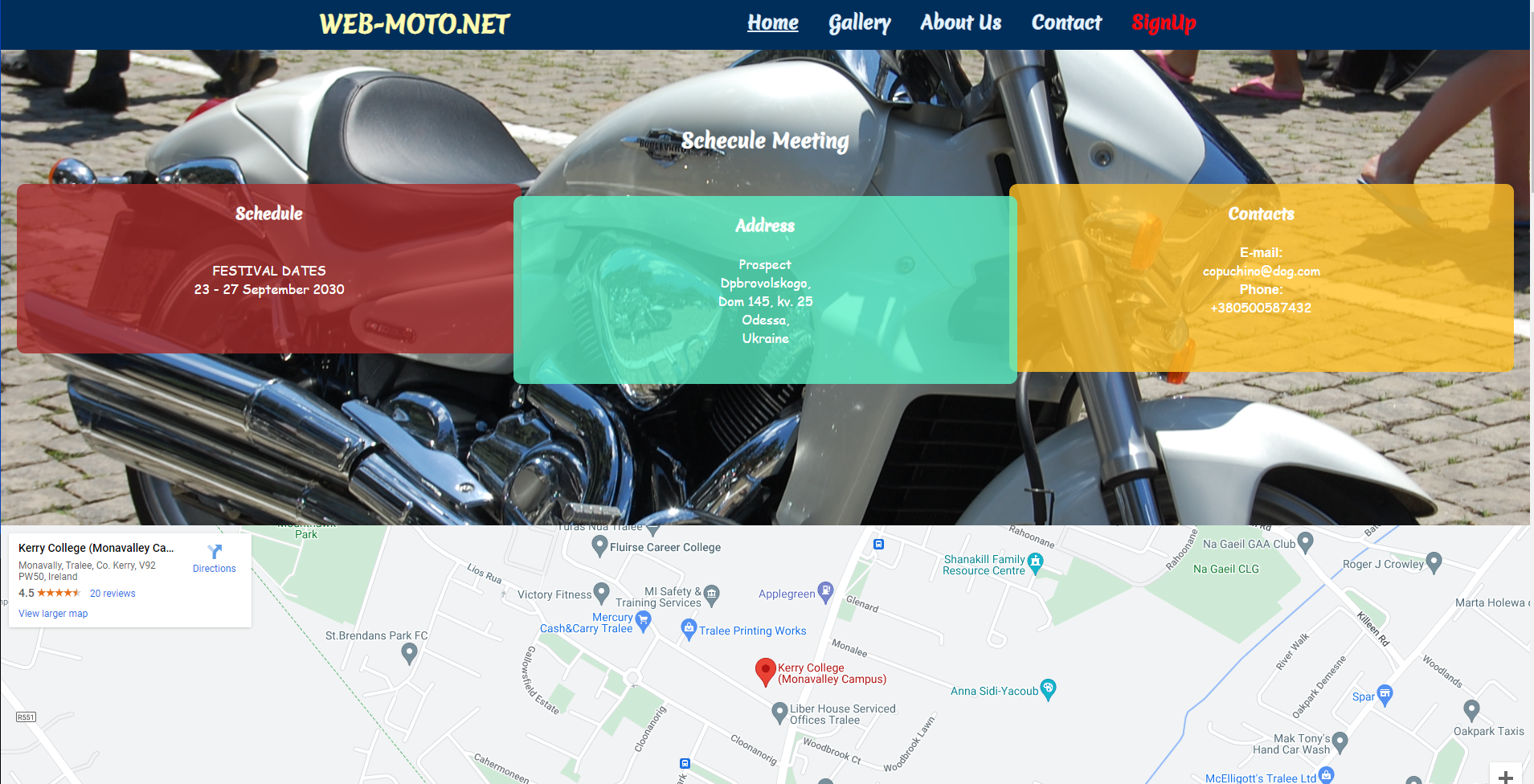
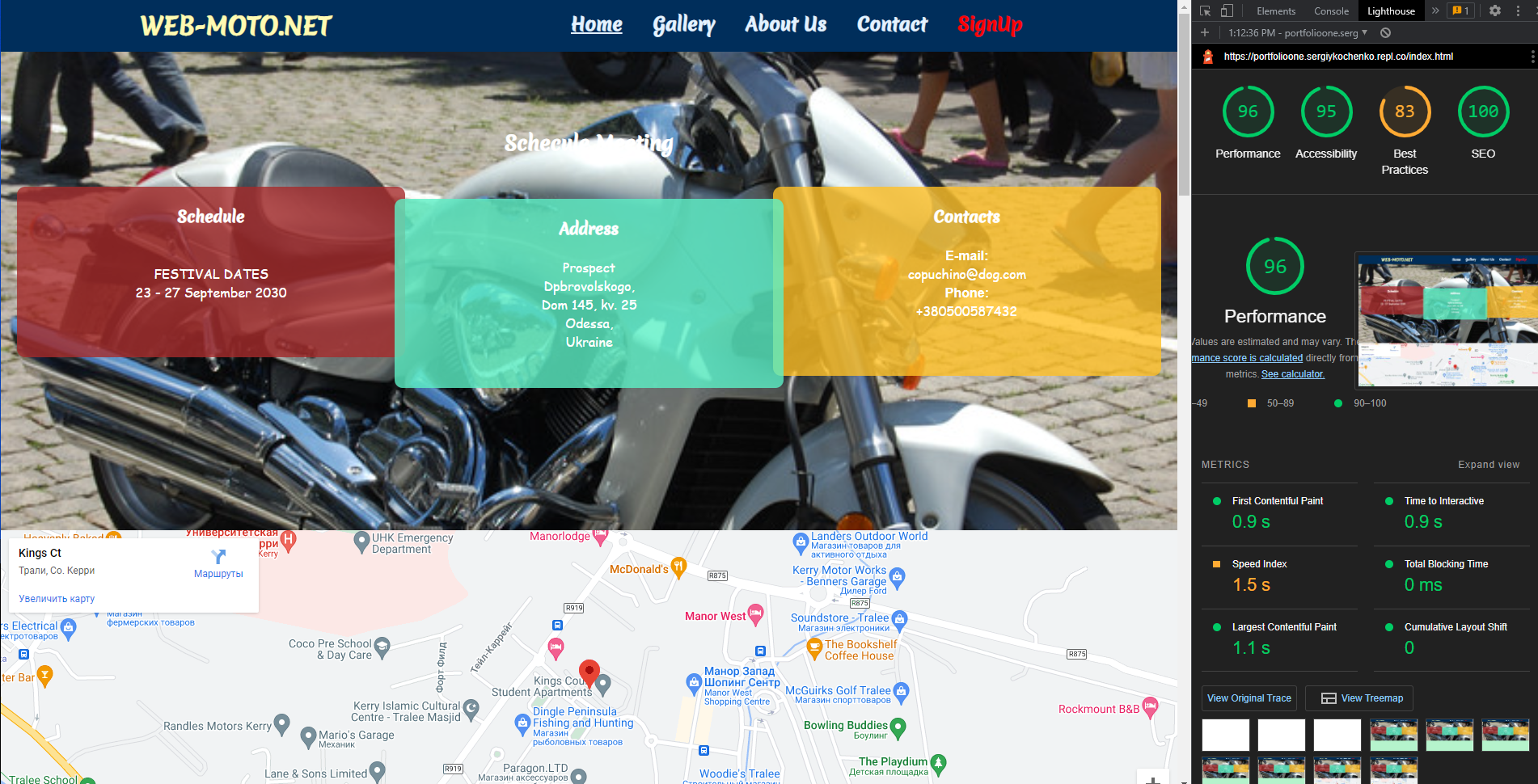
The home page describes the schedule, the address and contact information.
Heading
The Heading clearly states the meaning and purpose of the page it’s in the same font and Colour as the rest of the page as I feel its suits it. The header is adaptive to smartphones and computer desktops with “Hamburger” auto folding and unfolding depending on the resolution screen of the device in use. There is a logo on the left side of the header with an active link to the social-net bikers' common website.
About Us
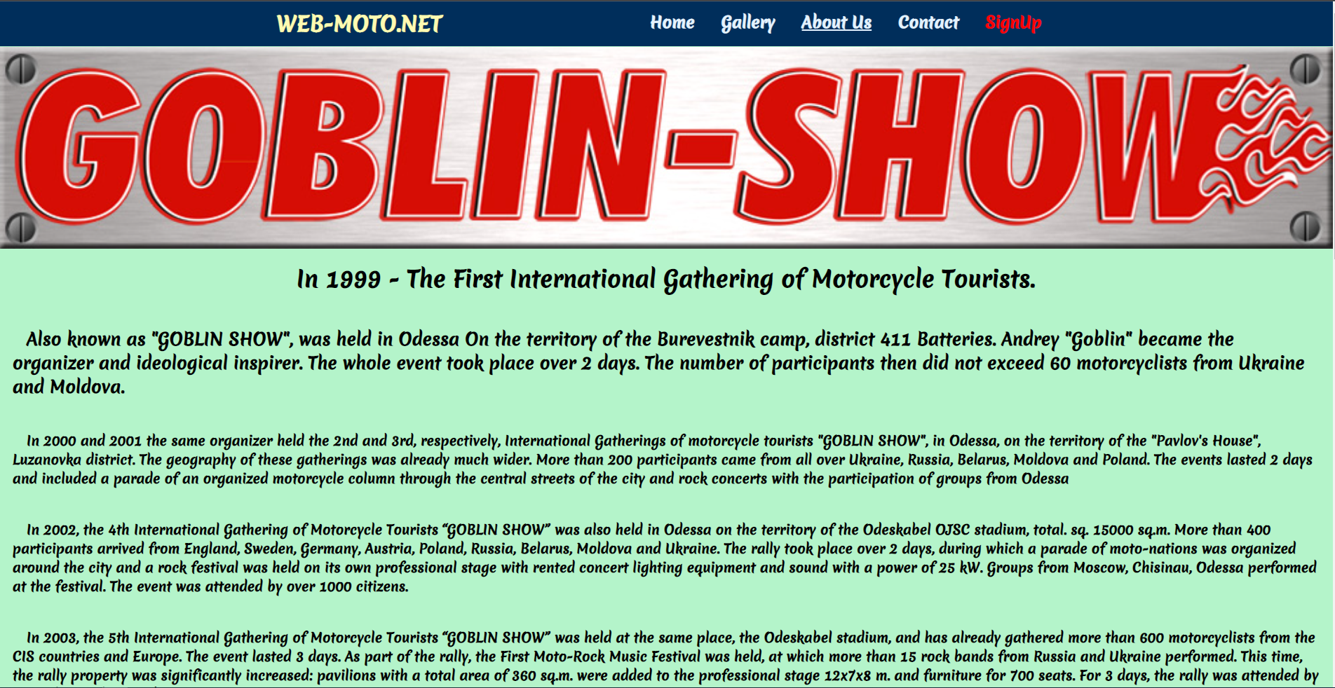
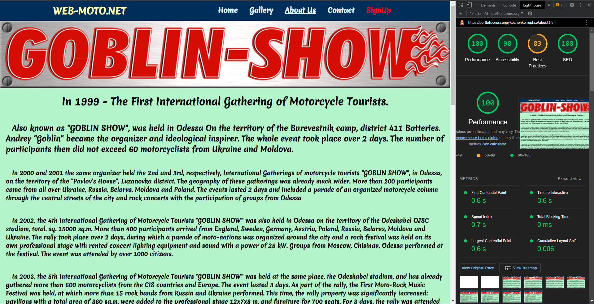
The page describes the history of the organisation and gives information from years of foundation till now.
Gallery
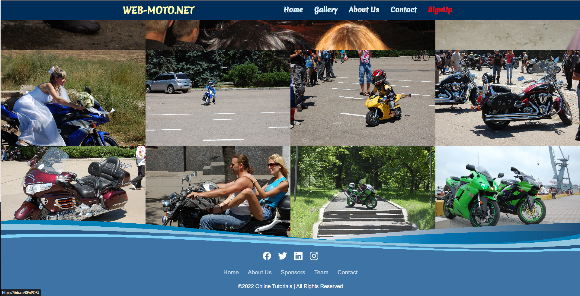
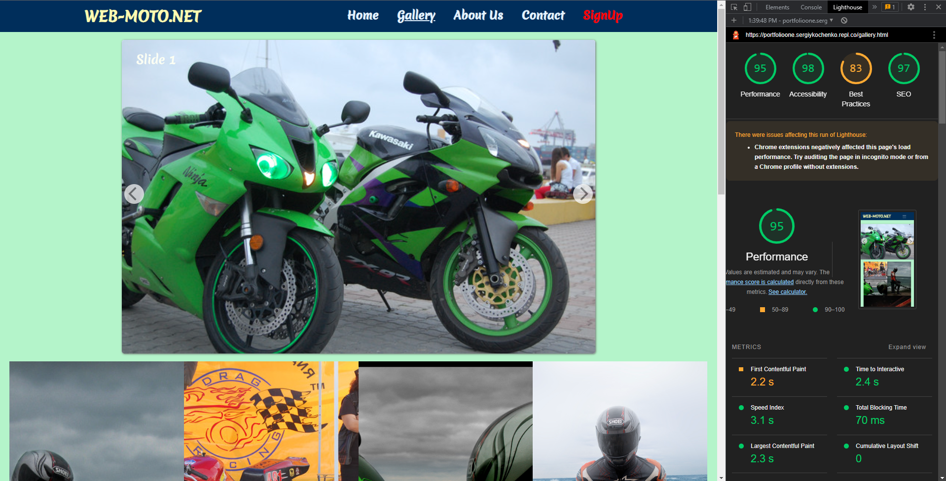
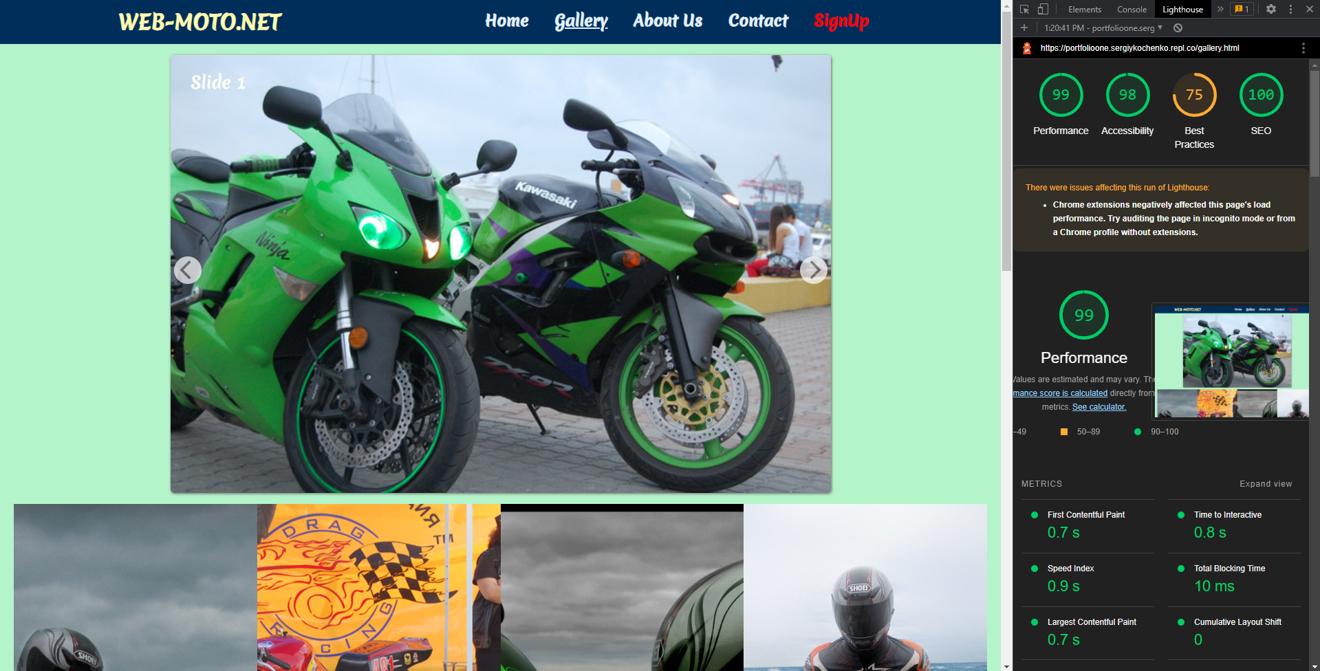
The Gallery section shows some of the trips taken by people who joined on the days advertised and other shows of the event.
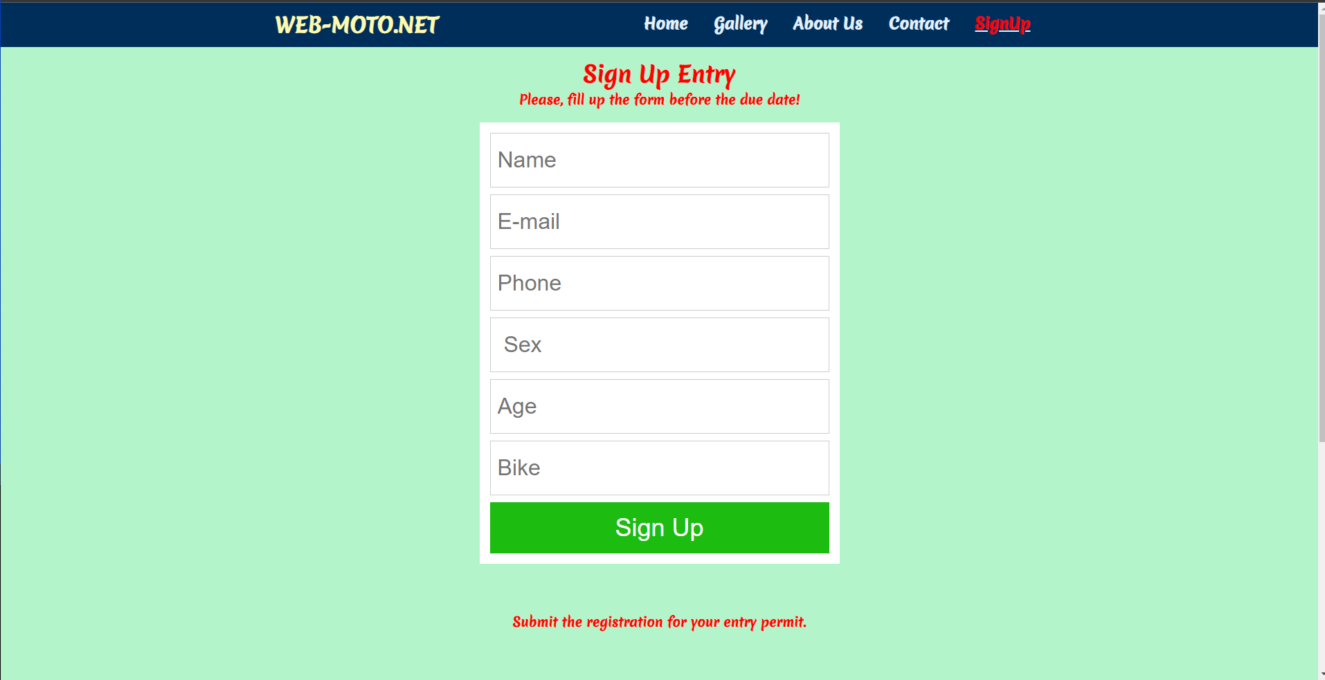
The Sign Up Page
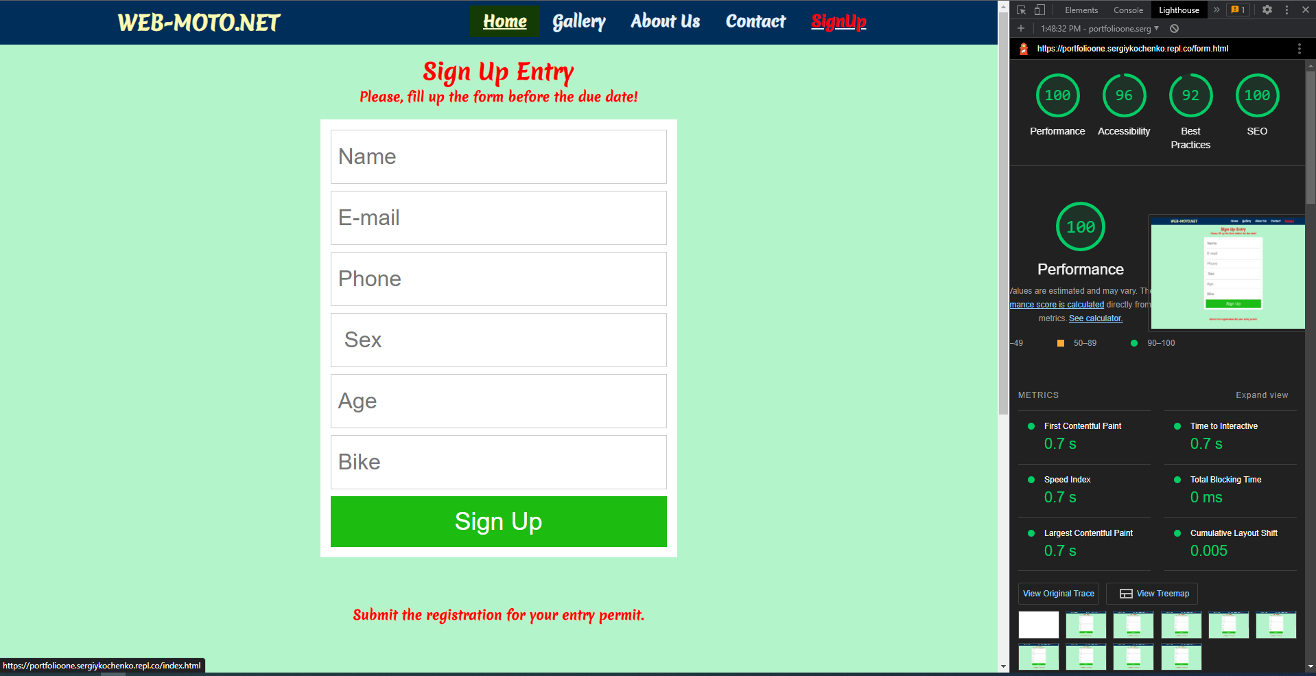
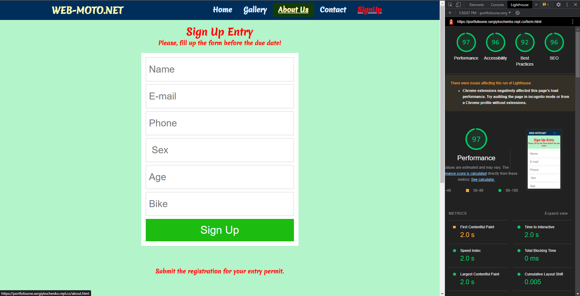
This page will allow the user to get signed up to festival. The user will be able specify if they would like to take part in or not. The user will be asked to submit their full name, email address and some information more.
Footer
The footer features a myriad of ways for the viewer to contact, social media and home...
Testing
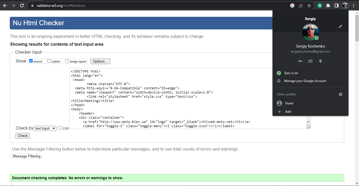
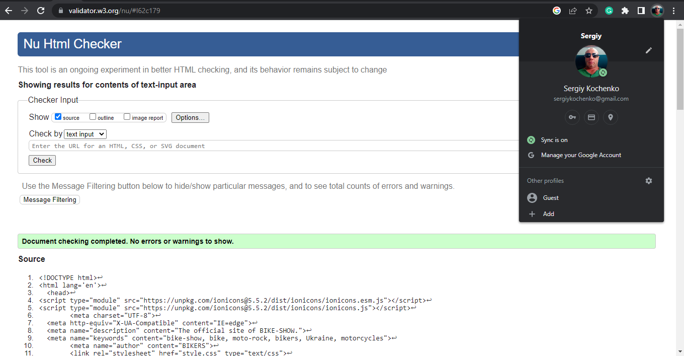
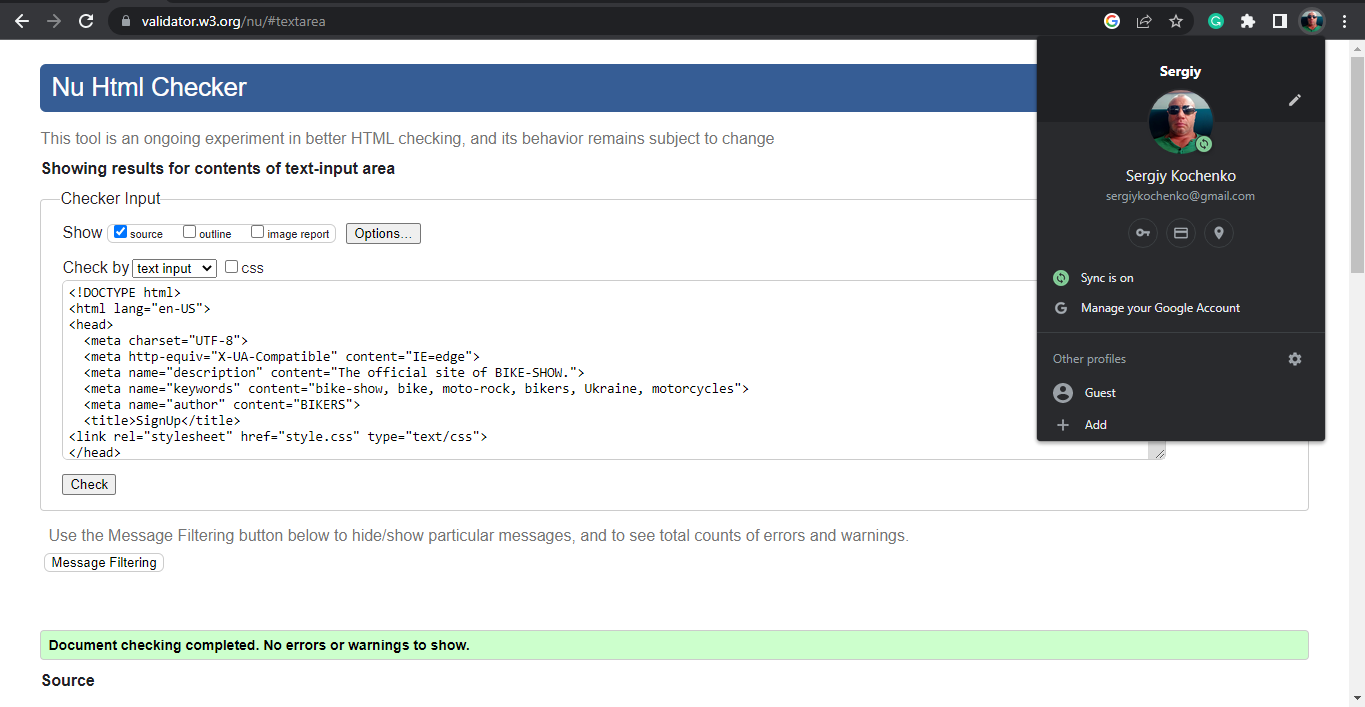
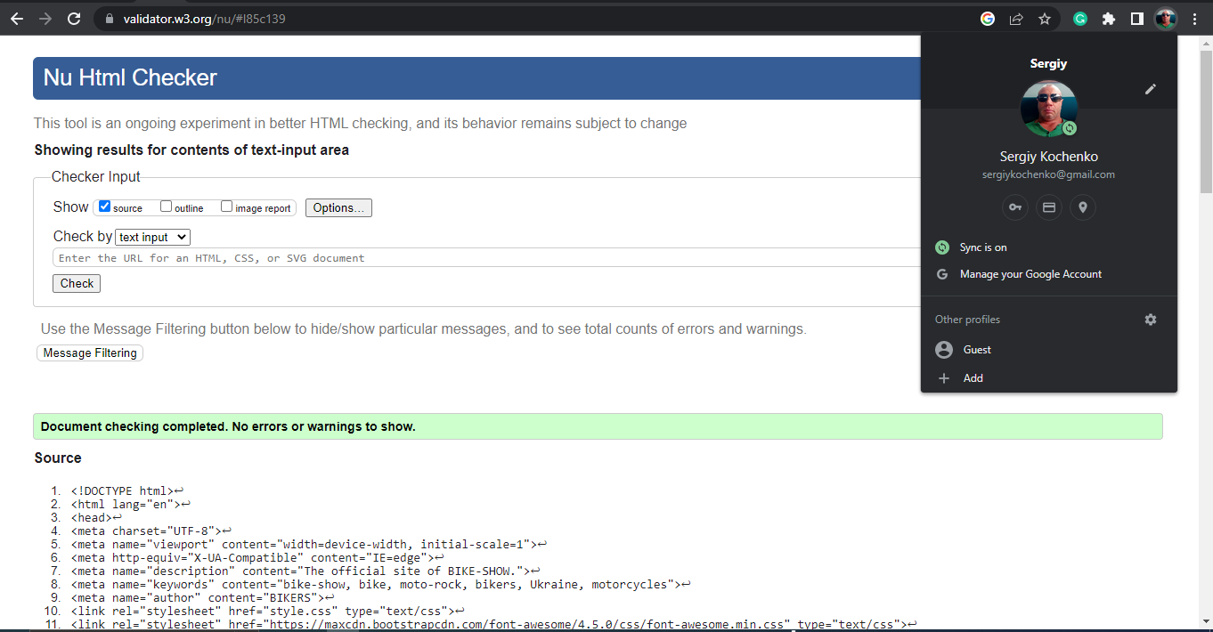
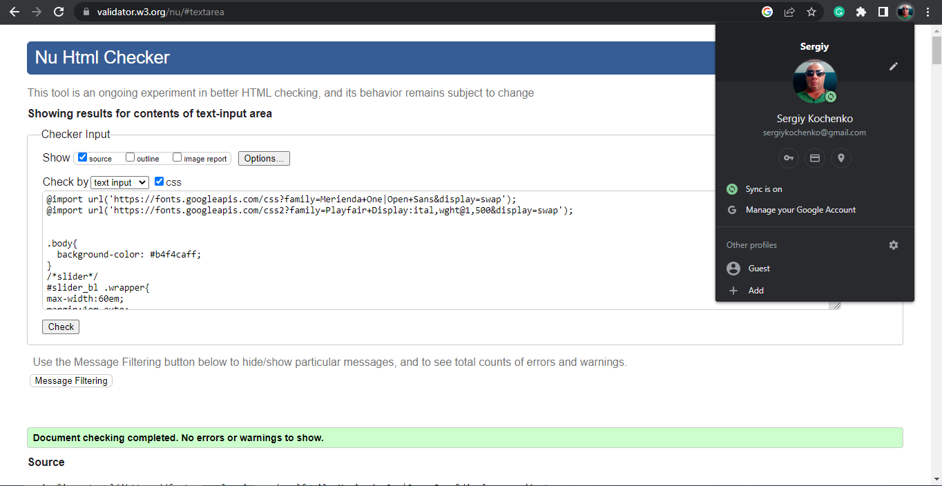
Validator screenshots:
index.html
about.html
form.html
gallery.html
style.html
Lighthouse screenshots:
"Home" page desktop test
"Home" page mobile test
"Gallery" page desktop test
"Gallery" page mobile test
"SighUp" page desktop test
"SignUP" page mobile test
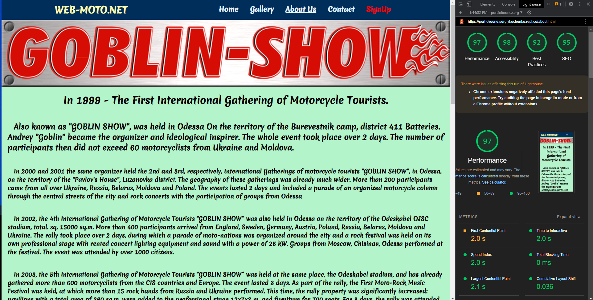
"About Us" page desktop test
"About Us" page mobile test
Browser Compatibility
Testing has been carried out on the following browsers:
- Google Chrome Version 108.0.5359.125 (Official Build) (64-bit)
- Google Chrome 106 Windows 10
- Google Chrome 105 Windows 10
- Safari on macOS (Safari Version 16.1.1)
OS Compatibility
Testing has been carried out on the following device:
- Apple iPhone 12 Pro Max iOS 16 (16.0.2)
- Samsung (SM-T285) Android 5.1.1 (22)
- LENOVO (Lenovo Lenovo TB-X606X) Android 10 (29)
- Samsung (SM-T505) Android 11 (30)
- Samsung (SM-A107F) Android 11 (30)
User Stories
First Time Visitor Goals
- As a First Time Visitor, I want to easily understand the main purpose of the site and learn more about the organisation.
- As a First Time Visitor, I want to be able to easily navigate throughout the site to find content.
- As a potential user I would like to be able to book in online in advance to save time.
Scope
The focus of the project, given the time frame and my current skills, was to develop a one page scrolling website with 5 main sections that users could easily navigate, provide a means of online communication through the use of a contact form, and a clear description of the services provided. It was important to include a brief background on the ivent and team as it is a local business.
Skeleton
It is a one-page scrolling website with 5 different sections:
- "Home" Page
- "Gallery" page
- "About Us" page
- "Contacts" Section
- "Sign Up" page
Bug report
"Step to reproduce:"
- Keep device in vertical position.
- Open the website on mobile device: https://sergiykochenko.github.io/SergiyKochenko/
- Click on any of the header page
- Check if all the contents are in good order position and adapted to the davice by scroll down the page.
**Expected result:**
Website pages must be adapted to screen resolution of mobile device .
**Actual result:**
Menu page found not adapted to mobile screen resilution.
**Additional note:**
Test carried out with Wi-fi and Mobile date mode.
**Additional information:**Device and OS: iPhone 12 Pro Max, IOS 16.1.1 (20A380).
Un Bug
Changed the CSS and HTML codes in an adaptive way for mobile versions, depending on the screen resolution. And also changed and reduced the resolution of photos.
Deployment
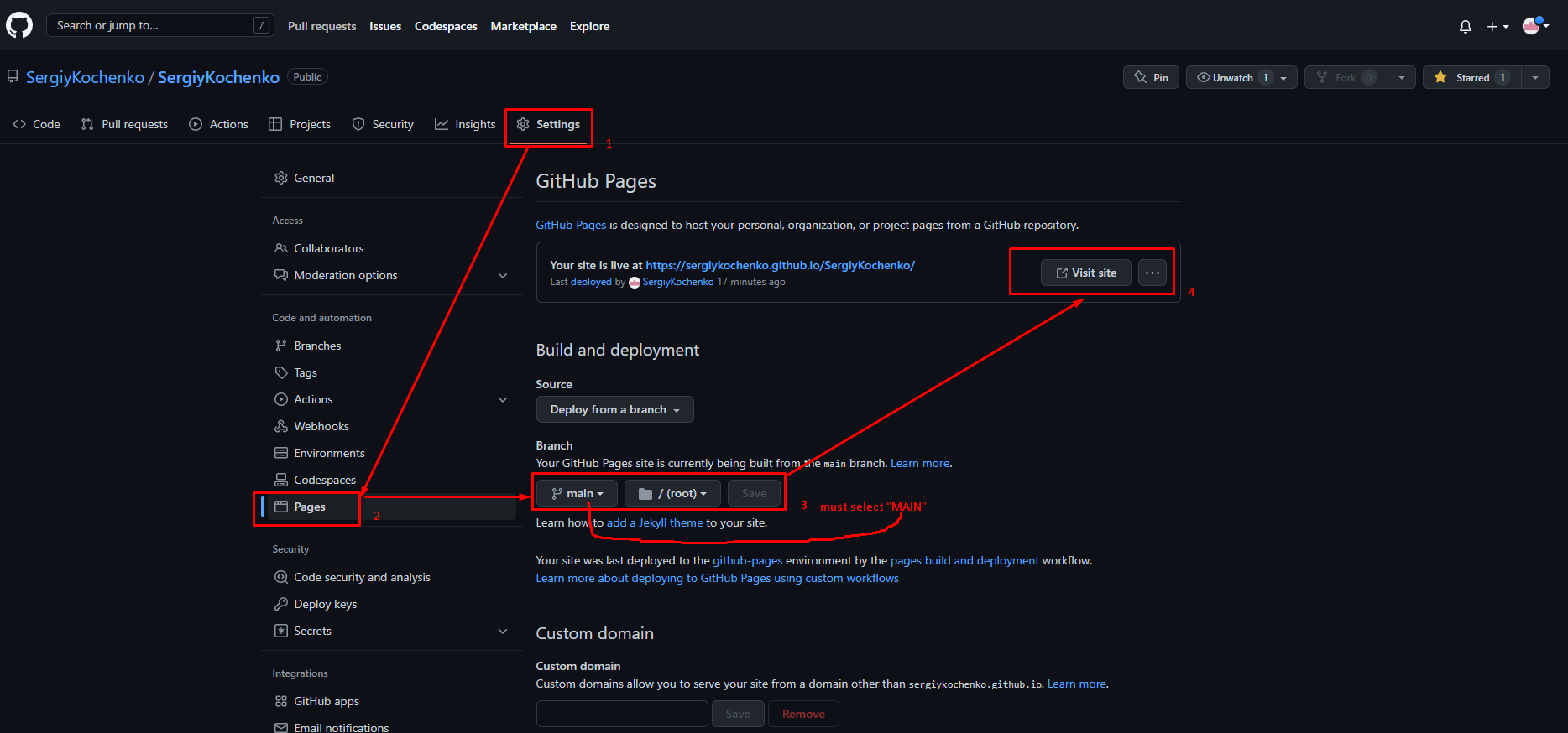
- Go to github.com/respositories
- Select settings
- On the left hand side of the menu you will see "Pages" select that option.
- Once in github pages section, select the branch section that says none chnage this to main and click save and it will deploy
Credits
Content:
- The code for the initial CSS and HTML formatting and the social media links are learned from the Code Institute
- The icons for the social media links are from [https://unpkg.com/]
Media:
The photos are from [https://ibb.co/]
Technologies used
- HTML5 www.w3schools.com
- Font-awesome
- CSS
- Git for version control.
- GitHub for the repository to store the files.
- GitHub Pages to deploy the site.
- Replit
- Youtube
- Replit
