Define and display data model diagrams:
-
Data model definition
- Define data model manually with YAML
- Extract data model from R data frames
- Reverse-engineer SQL Server Database
- Reverse-engineer PostgreSQL Database
-
Rendering
- Define model segments
- Display focused sub-diagram or
- Hide columns to improve model diagram readability
- Use colors to emphasize specific tables
- Define graph direction or other graphviz attributes
- Display additional column attributes
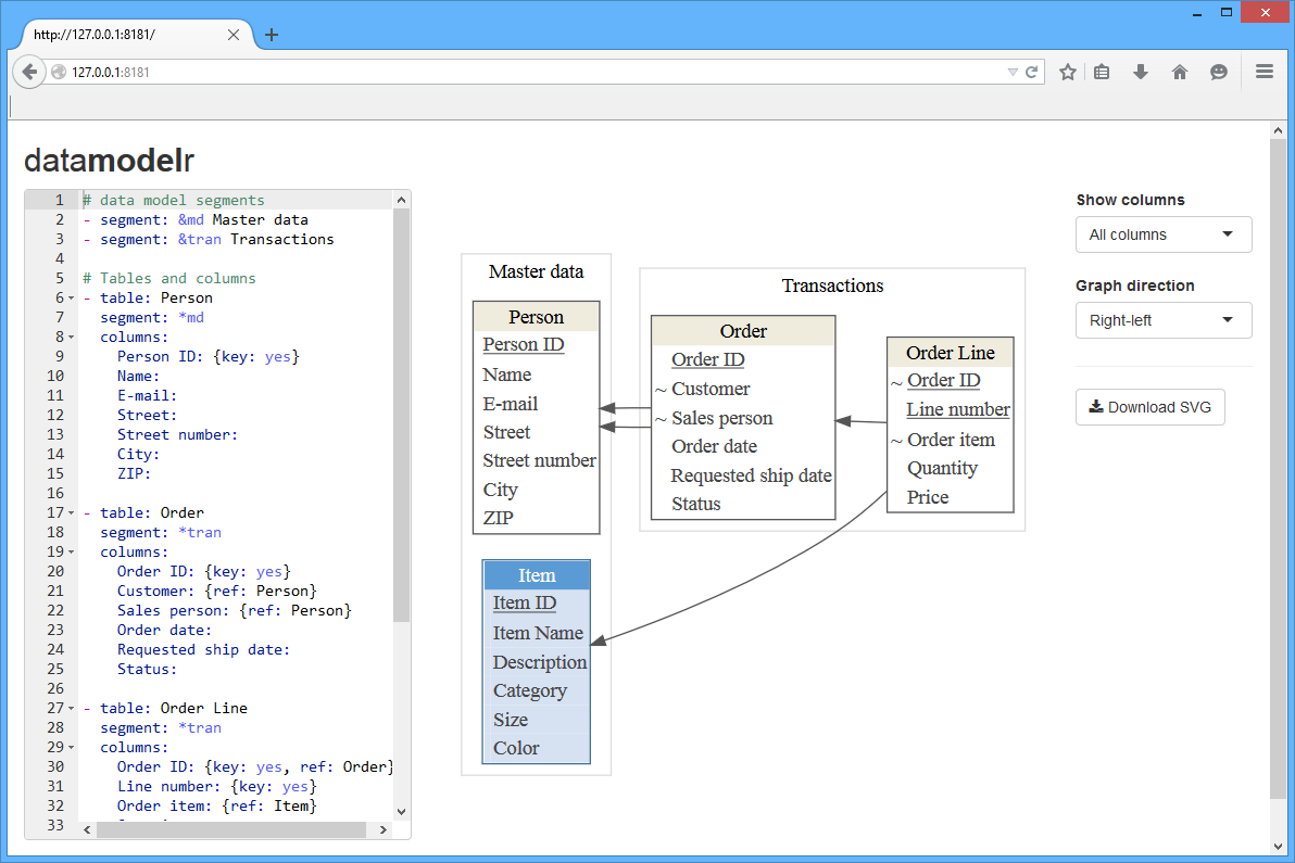
Use shiny to implement interactive model definition and rendering.
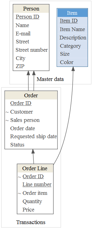
devtools::install_github("bergant/datamodelr")Define a data model in YAML:
# data model segments

- segment: &md Master data
- segment: &tran Transactions

# Tables and columns

- table: Person
  segment: *md
  columns:
    Person ID: {key: yes}
    Name:
    E-mail:
    Street:
    Street number:
    City:
    ZIP:

- table: Order
  segment: *tran
  columns:
    Order ID: {key: yes}
    Customer: {ref: Person}
    Sales person: {ref: Person}
    Order date:
    Requested ship date:
    Status:

- table: Order Line
  segment: *tran
  columns:
    Order ID: {key: yes, ref: Order}
    Line number: {key: yes}
    Order item: {ref: Item}
    Quantity:
    Price:

- table: Item
  segment: *md
  display: accent1
  columns:
    Item ID: {key: yes}
    Item Name:
    Description:
    Category:
    Size:
    Color:
Create a data model object with dm_read_yaml:
library(datamodelr)
file_path <- system.file("samples/example.yml", package = "datamodelr")
dm <- dm_read_yaml(file_path)
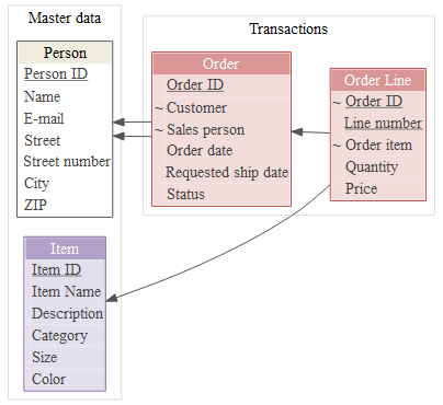
Create a graph object to plot the model:
graph <- dm_create_graph(dm, rankdir = "BT")
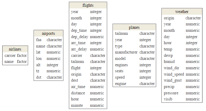
dm_render_graph(graph)Attach flights database (nycflights13 package) and create a data model from data frames:
library("nycflights13")
dm_f <- dm_from_data_frames(flights, airlines, weather, airports, planes)
Create plot:
graph <- dm_create_graph(dm_f, rankdir = "BT", col_attr = c("column", "type"))
dm_render_graph(graph)
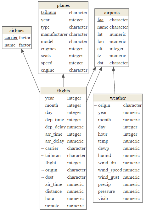
Add references and primary keys:
dm_f <- dm_add_references(
  dm_f,

  flights$carrier == airlines$carrier,
  flights$origin == airports$faa,
  flights$dest == airports$faa,
  flights$tailnum == planes$tailnum,
  weather$origin == airports$faa
)
graph <- dm_create_graph(dm_f, rankdir = "BT", col_attr = c("column", "type"))
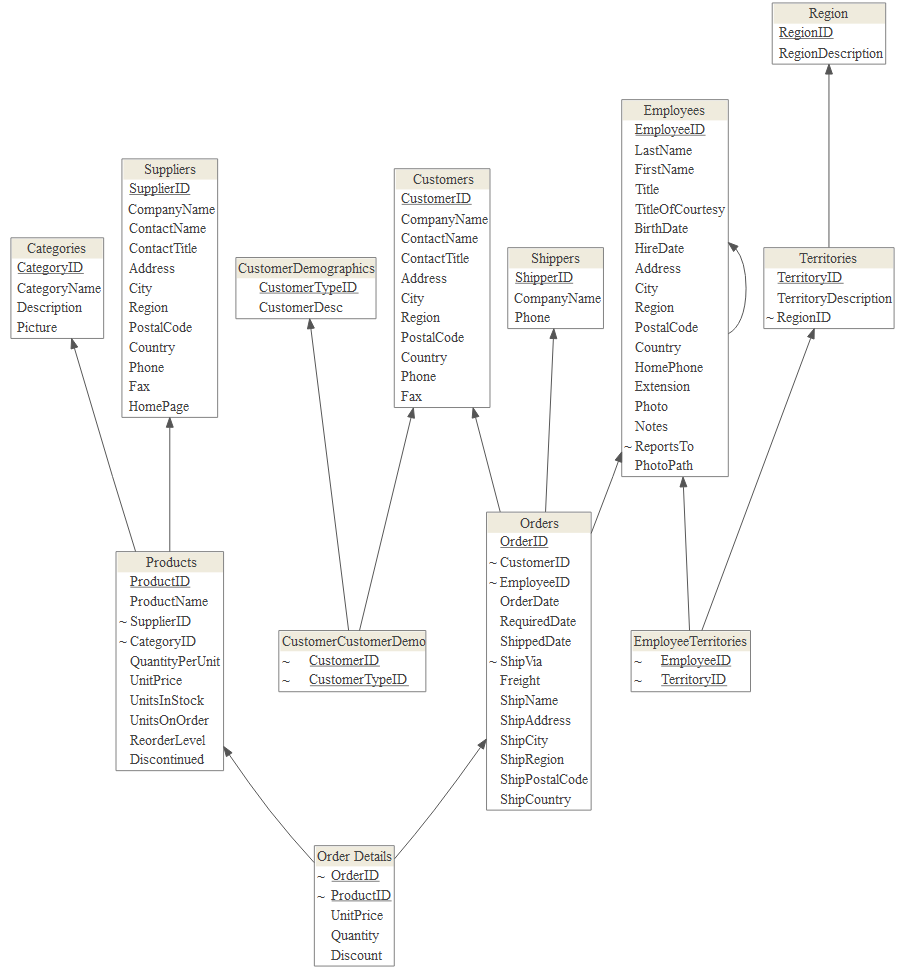
dm_render_graph(graph)This example uses Northwind sample database and RODBC package as an interface to SQL Server.
library(RODBC)
con <- odbcConnect(dsn = "NW")
sQuery <- dm_re_query("sqlserver")
dm_northwind <- sqlQuery(con, sQuery, stringsAsFactors = FALSE, errors=TRUE)
odbcClose(con)

# convert to a data model
dm_northwind <- as.data_model(dm_northwind)
Plot the result:
graph <- dm_create_graph(dm_northwind, rankdir = "BT")
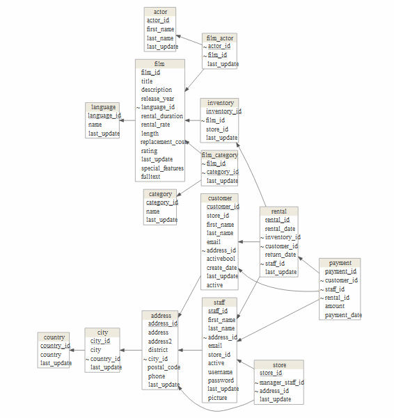
dm_render_graph(graph)This example uses DVD Rental sample database and RPostgreSQL package as an interface to PostgreSQL database.
library(RPostgreSQL)
#> Loading required package: DBI
con <- dbConnect(dbDriver("PostgreSQL"), dbname="dvdrental", user ="postgres")
sQuery <- dm_re_query("postgres")
dm_dvdrental <- dbGetQuery(con, sQuery)
dbDisconnect(con)
#> [1] TRUE

dm_dvdrental <- as.data_model(dm_dvdrental)
Show model:
graph <- dm_create_graph(dm_dvdrental, rankdir = "RL")
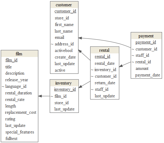
dm_render_graph(graph)To focus in on a few tables from your model use focus attribute in dm_create_graph function:
focus <- list(tables = c(
    "customer",
    "payment",
    "rental",
    "inventory",
    "film"
))

graph <- dm_create_graph( dm_dvdrental, rankdir = "RL", focus = focus)
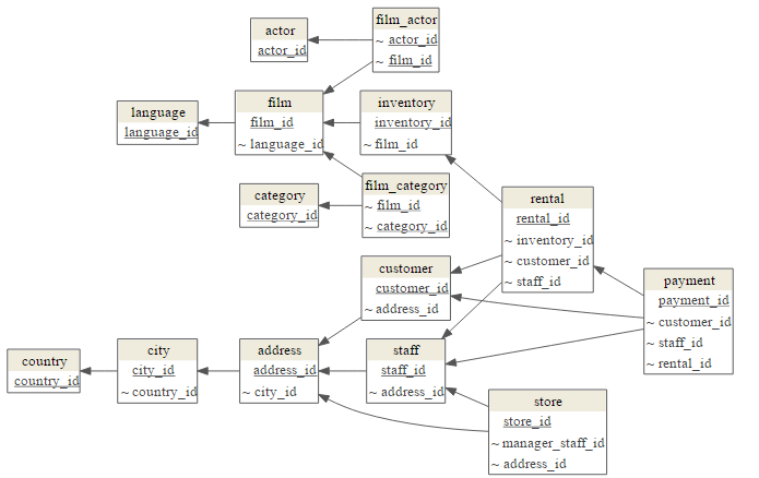
dm_render_graph(graph)To emphasize table relations and hide the "non-key""
columns use view_type = "keys_only":
graph <- dm_create_graph(dm_dvdrental, view_type = "keys_only", rankdir = "RL")
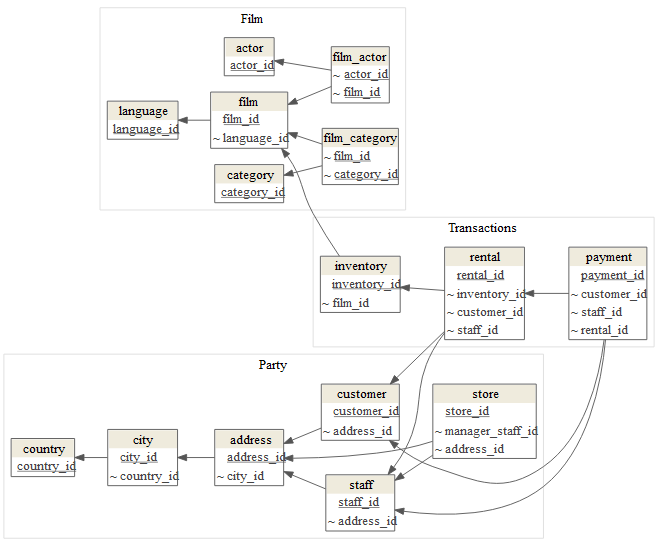
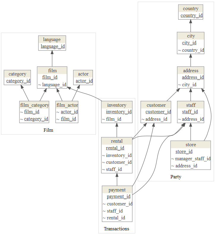
dm_render_graph(graph)Arrange tables in clusters with dm_set_segment function:
table_segments <- list(
  Transactions = c("rental", "inventory", "payment"),
  Party = c("customer", "staff", "address", "city", "country", "store"),
  Film = c("film", "film_actor", "actor", "language", "film_category", "category") )

dm_dvdrental_seg <- dm_set_segment(dm_dvdrental, table_segments)
Render diagram with segments:
graph <- dm_create_graph(dm_dvdrental_seg, rankdir = "RL", view_type = "keys_only")
dm_render_graph(graph)Use rankdir to change the direction of graph:
graph <- dm_create_graph(dm_dvdrental_seg, rankdir = "BT", view_type = "keys_only")
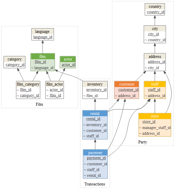
dm_render_graph(graph)To emphasise tables with colors use dm_set_display function:
display <- list(
  accent1 = c("rental", "payment"),
  accent2 = c("customer"),
  accent3 = c("staff", "store"),
  accent4 = c("film", "actor") )

dm_dvdrental_col <- dm_set_display(dm_dvdrental_seg, display)
graph <- dm_create_graph(dm_dvdrental_col, rankdir = "BT", view_type = "keys_only")
dm_render_graph(graph)
Default color scheme includes:
Add your colors with dm_add_colors function:
my_colors <-
  dm_color_scheme(
    purple = dm_palette(
      line_color = "#8064A2",
      header_bgcolor = "#B1A0C7",
      header_font = "#FFFFFF",
      bgcolor = "#E4DFEC"
    ),
    red = dm_palette(
      line_color = "#C0504D",
      header_bgcolor = "#DA9694",
      header_font = "#FFFFFF",
      bgcolor = "#F2DCDB"
    )
)

dm_add_colors(my_colors)

dm <- dm_set_display(dm, display = list(
  red = c("Order", "Order Line"),
  purple = "Item"
))

graph <- dm_create_graph(dm, rankdir = "RL")
dm_render_graph(graph)
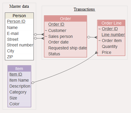
To change general graph, node or edge
graphviz
attributes use graph_attrs, edge_attrs and node_attrs arguments
when creating graph. This example changes
graph background,
arrow style (edge attribute) and
font (node attribute):
graph <- dm_create_graph(
  dm,
  graph_attrs = "rankdir = RL, bgcolor = '#F4F0EF' ",
  edge_attrs = "dir = both, arrowtail = crow, arrowhead = odiamond",
  node_attrs = "fontname = 'Arial'")

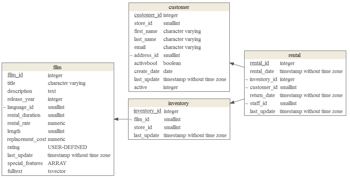
dm_render_graph(graph)To include additional column attributes set col_attr when creating graph:
focus <- list(tables = c(
    "customer",
    "rental",
    "inventory",
    "film"
))

graph <- dm_create_graph( dm_dvdrental, rankdir = "RL", focus = focus,
                          col_attr = c("column", "type"))
dm_render_graph(graph)Try datamodelr Shiny application:
shiny::runApp(system.file("shiny", package = "datamodelr"))datamodelr depends on:
- DiagrammeR for graph rendering
- yaml for parsing YAML files in R
- RStudio shiny and shinyAce for shiny application demo.
