A utility library for Android with various tools to help fix the elevation shadow artifacts visible on Views and Composables with transparent or translucent backgrounds.
Those artifacts are a result of the hardware-accelerated shadows that came with the introduction of Material Design in Lollipop. The shadow gradient is left un-clipped everywhere, presumably as a performance consideration.
These tools use the same classes and methods that the platform uses to render shadows, simply replacing the originals with clipped copies.
[Download]
The Modifier extension function is called clippedShadow(). It works similarly to the regular shadow() except that there is no content clip parameter – since that can be handled with a separate clip() – and it does not generate a new surface/graphics layer. It is purely decorative.
Box(
    Modifier
        .size(100.dp)
        .clippedShadow(
            elevation = 10.dp,
            shape = RoundedCornerShape(10),
            ambientColor = Color.Blue,
            spotColor = Color.Blue
        )
)
Unlike the View solution, you will need to disable the Composable's inherent shadow yourself, if it has one. Box doesn't, but ones like Card and Button do, so you'll need to pass zeroes for their elevations. The demo app has a few examples on the Compose page with the necessary settings, a couple of which also show how to replace the shadows on existing Composables that animate their elevations without having to rewrite them or fiddle with their internals.
Since these shadows are drawn inline pretty much exactly like the regular ones, that should be about as complicated as the Compose version gets. It may take a few other adjustments to line things up correctly to begin with, but no more than it would for the regular shadow(), too.
Consequently, most of the rest of this document is geared toward the View version, though there might occasionally be some items relevant to the compose package in the Notes near the end.
Nobody wants to mess with a whole library for such a small thing that should've already been handled in the native UI framework, so this was designed to be as simple and familiar as possible:
view.clipOutlineShadow = trueThat's it. Unless your setup requires that a sibling View overlap a target of the fix, or it involves a target with an irregular shape on Android R or above, that's possibly all you need.
The Boolean-value clipOutlineShadow extension property is basically a switch to toggle the fix on Views individually, and it's designed to mimic an intrinsic property as much as possible. Though the shadow is actually being handled and drawn in the parent ViewGroup, the property can be set on the target View at any time, even while it's unattached, so there's no need to worry about timing. Additionally, the clipped shadow automatically animates and transforms along with its target, and it will handle moving itself to any new parents, should the target be moved.
It is hoped that that simple usage should cover most cases, but for the situations mentioned above, the library offers a couple of configuration options as possible recourses. Those and a few other features and tools are discussed in the following content.
-
Android's continuing lockdown on reflection makes irregular shapes a bit of a problem on R+, but the only real Achilles' heel to the overall technique is overlapping sibling
Views. -
The library offers a few customized Recycling
ViewGroups that are optimized for handling these clipped shadows on all of their children, and several Regular ones that are mainly meant to allow the shadow properties to be set on their children from corresponding attributes in layout XML. -
A relatively simple
Drawableclass is provided to create "independent" shadows fromViews orPaths. This may be useful as another fix option, or even as a design element on its own. -
General notes, caveats, etc.
-
Available through JitPack, currently.
-
Complete listing of the public API. (Currently out of date, but mostly correct.)
The main limitation is inherent to the technique used here, which was chosen because it allows the fix to be externally applied to any View without having to modify it or its existing setup. That method is basically to disable the target's built-in shadow and draw a clipped copy either in front of or behind it. Since the shadow is essentially pulled out of the normal draw routine, it's possible to end up with different kinds of artifacts than those which we're trying to fix.
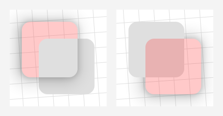
On the left, the red target has a lower elevation than its plain, gray sibling, but the default Foreground plane draws in front of everything. On the right, the red target is higher than the gray sibling, but its Background shadow draws behind all of the child Views.
It is important to note that this is an issue only for siblings of the target. Views in separate parent ViewGroups have separate draws and won't interfere with each other. Indeed, in some cases the most straightforward solution is to simply wrap a target or sibling in another ViewGroup, like a plain old FrameLayout. There are certainly cases where siblings must overlap, however, hence the next core property and its corresponding enum class:
enum class ClippedShadowPlane { Foreground, Background, Inline }The View.clippedShadowPlane extension property sets the "plane" on which the clipped shadow will be drawn:
-
Foregrounddraws in the overlay of the target's parentViewGroup, after all of the children. It is the default. -
The
Backgroundplane draws behind the parent's content, immediately after its background drawable. -
The new
Inlinetype is drawn right along with the target itself, and is most similar in behavior and appearance to the regular shadows, but it has some additional requirements and caveats, which is why it's not the default option.
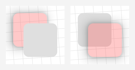
For example, the setups from the images above fixed:
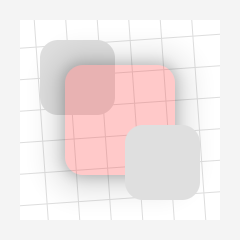
On the left, we've set redView.clippedShadowPlane = Background, moving the shadow draw to the back. The setup on the right was fixed by letting it draw to the Foreground plane, which is the default. The new Inline plane would fix both situations:
Though Inline shadows seem to be the most appropriate solution, they behave a bit differently than the others, and have additional external requirements in order to function correctly.
-
Non-library parents: Since it's drawn along with the target
Viewitself, anInlineshadow will work inside non-library parentViewGroups only if the targetViewis not being otherwise clipped by anything else. Specifically:-
The parent
ViewGroupmust haveclipChildrenset tofalse. The default value istrue, so this has to be set manually in pretty much anyViewGroup. -
The target
Viewitself must haveclipToOutlineset tofalse, which is the default value for theViewclass, but certain subclasses enable it internally; e.g.,CardViewand its variants.
If either of those is
true, the shadow draw is disabled since it would be mostly or completely invisible, which is one of the main reasons thatInlineis not the default. There is a rather explicit warning log, though, if one of these shadows is used in such a setup.*** Please note that there is currently a possibly-unfixable bug with
Inlineshadows in non-library parents on API levels 24-28 (Nougat, Oreo, and Pie). This was missed in testing due to a faulty setup, and I would not have released this feature had I spotted it. However, I consider theInlineplane a rather corner-case option anyway, in that there can't be that many setups that would absolutely require three overlapped siblings with elevations, so the feature will remain as-is for now, while I work to find a remedy. The above-mentioned disabling and log will be modified in the next release to include this situation on those versions. *** -
-
Library parents: If an
Inlineshadow is on a target that is a child of one of the library'sClippedShadowsViewGroups, theclipChildrenandclipToOutlinesettings are not necessary, as the draw is handed off to the parent where it's inserted before those child clip operations happen.However, to be able to insert these draws between children,
ClippedShadowsViewGroups have to manually reorder the child draws, which adds a tiny bit of overhead and prevents some of the low-level optimizations that hardware-acceleration brought in the first place.
If you're able to specify the above-mentioned clip settings, Inline shadows in non-library parents actually have the least overhead of any type. The special behavior in library parents simply offers another possible fix option for particular setups and requirements.
The other notable limitation comes on Android R and above, when creating the copy for Views with irregular shapes; i.e., Views that aren't rectangles, regular round rectangles, or circles. Reflection is required to get at the Path that describes those irregular shapes, and the increasing restrictions on non-SDK interfaces have finally made that field inaccessible. For these cases, the library has a ViewPathProvider interface that works very similarly to the framework's ViewOutlineProvider class, allowing the user to set the necessary Path. For example:
@RequiresApi(30)  // Just to keep the example short
class PuzzlePieceView constructor(
    context: Context,
    attrs: AttributeSet? = null
) : View(context, attrs) {

    private val viewPath = Path()

    private val paint = Paint(Paint.ANTI_ALIAS_FLAG)

    init {
        outlineProvider = object : ViewOutlineProvider() {
            override fun getOutline(view: View, outline: Outline) {
                val sideLength = minOf(view.width, view.height).toFloat()
                viewPath.setToPuzzlePiece(sideLength)
                outline.setPath(viewPath)
            }
        }
        pathProvider = ViewPathProvider { _, path ->
            path.set(viewPath)
        }
        clipOutlineShadow = true

        paint.color = Color.argb(64, 0, 0, 255)
        outlineAmbientShadowColor = Color.BLUE
        outlineSpotShadowColor = Color.BLUE
        elevation = 15F
    }

    override fun onDraw(canvas: Canvas) {
        canvas.drawPath(viewPath, paint)
    }
}
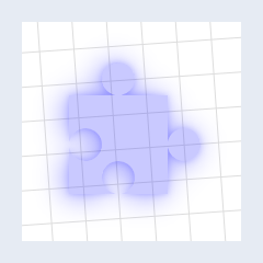
The setToPuzzlePiece() function is available in the demo module, if you'd like a full working example to play around with (link). Give it a non-zero width and height, and it'll produce something like:
Do note that the ViewPathProvider is a fallback, not an override. It will only be checked if the library is unable to determine the Path on its own. If a non-empty Path cannot be resolved – with or without a ViewPathProvider set – then a shadow simply won't be drawn.
Also included in the library is the MaterialComponentsViewPathProvider object, a concrete implementation of this interface that will automatically handle figuring the Path on Views with a MaterialShapeDrawable background, which is how many modern library components get their overall shape and appearance.
shapedButton.pathProvider = MaterialComponentsViewPathProviderThis is a separate object that needs to be manually set so that MaterialShapeDrawable and related classes can be stripped at compile time, if they're not being used otherwise.
There are two general categories of ViewGroups: Recycling and Regular.
By default, the library's shadow objects clean up after themselves whenever the target View is detached from the hierarchy. Since certain ViewGroups like ListView and RecyclerView continually detach and reattach their children during scroll events, this would cause some rather inefficient handling with the default behavior. To that end, the library offers a handful of customized Recycling ViewGroup subclasses that are optimized for clipped shadows on all of their children.
The list of available Recycling ViewGroups can be found on their page in the API reference. Each implements a common library interface but otherwise behaves exactly like its superclass, and is a drop-in replacement in both code and XML. For example:
<com.zedalpha.shadowgadgets.view.viewgroup.ClippedShadowsRecyclerView
    android:id="@+id/recycler_view"
    android:layout_width="match_parent"
    android:layout_height="match_parent"
    … />
There is no special setup necessary, other than providing the Adapter that creates elevated, translucent items.
The Regular ones are meant merely to aid in setting the library's clipped shadow properties on children from corresponding attributes in layout XML. To that end, they each recognize the following attributes on child tags:
app:clipOutlineShadowapp:clippedShadowPlane
The XML values for each correspond to the code values as you would expect. For example:
<com.zedalpha.shadowgadgets.view.viewgroup.ClippedShadowsRelativeLayout
    xmlns:android="http://schemas.android.com/apk/res/android"
    xmlns:app="http://schemas.android.com/apk/res-auto">

    <Button
        android:id="@+id/translucent_button"
        …
        app:clipOutlineShadow="true"
        app:clippedShadowPlane="background" />

</com.zedalpha.shadowgadgets.view.viewgroup.ClippedShadowsRelativeLayout>
For the purposes of consistent behavior across all of the different ViewGroup types, these attributes will work properly only on Views with IDs that are unique within the ViewGroup. They are ignored on children that do not have an android:id.
Each ViewGroup also has a few properties from the common interface, ClippedShadowsViewGroup, most of them simply conveniences for setting shadow properties on all of their children. The details for those can be found on the relevant reference pages on the wiki.
The previous class – ShadowDrawable – has been removed, technically, but the replacement is mostly similar, as far as available properties. The main upshot to the new class is that it no longer depends on RenderNode access, so we can use it freely without having to check availability first. Like everything else here, though, it still requires a hardware-accelerated Canvas to work.
ClippedShadowDrawable is essentially a very thin wrapper around the core class used to draw these shadows in the other tools. It's provided mainly as a convenience for those who would like to be able to draw these manually without having to mess with the core module directly (which can get very confusing). However, there are several ways in which it does not act like a regular Drawable:
-
The most important caveat here is that you are responsible for keeping the clip updated anytime a relevant property in the drawable changes. That is, if you change its rotation, for example, you need to invalidate the current draw. If the drawable's callback is set appropriately - e.g., like it would be when acting as a
View's background – then you likely need only to callinvalidateSelf()on it. Otherwise, you'll need toinvalidate()theViewyou're drawing in, or perform the analogous action in whatever context you're in.The reason this happens is that one of the features of
RenderNodes is their ability to be transformed and rearranged without necessarily having to redraw their content, so it's possible to modify properties on them without the draw around them changing. If that happens with our shadows, the clip area won't be updated, and you could end up with possibly even worse artifacts than what we're trying to fix in the first place. The demo app has a Drawable page that demonstrates this pretty clearly. -
The bounds have no effect whatsoever on the final draw. Though they should still be set appropriately where needed to ensure that things like the invalidation mechanism still work correctly, they will not translate or stretch or clip or do anything else to the actual shadow, whose shape and initial position come solely from the
Outlineset. After that, transformations can be applied either throughCanvasfunctions before the draw – e.g.,canvas.translate(dx, dy)– or by setting the relevant properties on the drawable itself – e.g.,drawable.translationX = dx; drawable.translationY = dy. The demo app has a simple subclass example that automatically centers the shadow within the bounds, to show how you could customize the class to your needs. -
It is rather important to
dispose()of these drawables when appropriate – e.g., in aFragment'sonDestroyView()– at least until yourminSdkis 29, at which point you can use the constructor that doesn't require an ownerViewto hook into the hardware-accelerated draw routine. Use after disposal is not an automaticException, but it's not advised, and there is no guaranteed behavior. -
Drawable's requiredsetColorFilter()override is currently a no-op.
-
The docs in the wiki are currently out of date, and this README isn't as detailed as it should be yet. They will be updated in the near future, hopefully.
-
If you only need the fix for
Views in a simple static setup or two – e.g., a basicCardView– you might prefer to put something together from the core techniques demonstrated in this Stack Overflow answer. The main benefits of this library are its additional features on top of those methods, like its automatic handling of target state and animations. If that core solution is sufficient, you probably don't want the overhead here. -
Starting with 2.0.0,
ShadowFallbackStrategyand its corresponding extension property are removed as obsolete. The fallback draw implementation now works just like the primary one, obviating the need for that particular option. -
Colored shadows are supported on Pie and above, technically. They absolutely do work for Q+, but I cannot get colored shadows to work at all on Pie itself, with or without this library involved. All of the relevant methods and attributes were introduced with that version, and the documentation indicates that they should work like normal, but none of the emulators I've tested on show anything but black shadows. The code is in place here for Pie, though, if it's somehow functional for other installations. The demo app's Intro page has a setup that lets you fiddle with the shadow color, so that could be used as a quick test, if you're curious.
-
To disable the target's inherent shadow, its
ViewOutlineProvideris wrapped in a custom implementation. This has the possibility of breaking something if some function or component is expecting theViewto have one of the static platform implementations; i.e.,ViewOutlineProvider.BACKGROUND,BOUNDS, orPADDED_BOUNDS. This shouldn't cause a fatal error, or anything – it's no different than anything else that uses a customViewOutlineProvider– but you might need to rework some background drawables or the like.This also means that if you are using a custom
ViewOutlineProviderof your own on a target, it should be set before enabling the clipped shadow, or at least before the targetViewattaches to itsWindow. -
To be able to draw the clipped shadows in the
Backgroundplane, the parentViewGroupitself must have a non-null background. If it does not have one at the time that such a shadow is added, a special libraryobjectis set automatically. For efficiency, this is the only time it is checked, so you should not set the parent's background to specificallynullany time it hasBackgroundshadows active. Any other non-null value is perfectly fine, but otherwise, the clipped shadows in that plane may end up drawing on the wrong background, possibly disappearing completely. -
The layout inflation helpers' description and demonstration have been wholly removed to the wiki. They are a rather niche tool, unlikely of much use to others, and probably won't be updated any further, apart from possible minor maintenance.
-
The demo app was designed and tested on 1080x1920 xxhdpi devices and not much else, so things might not look that great on other configurations. Just a heads up.
The initial releases are available through JitPack. In the appropriate repositories, simply add their Maven URL:
repositories {
    google()
    mavenCentral()
    maven { url "https://jitpack.io" }
}
then add a dependency for the latest release of whichever module you need, view or compose:
dependencies {
    …
    implementation 'com.github.zed-alpha.shadow-gadgets:view:[latest-release]'
    implementation 'com.github.zed-alpha.shadow-gadgets:compose:[latest-release]'
}
You can also get the core module directly, if you'd like, but I've not had time to put together any documentation or examples for it.
MIT License
Copyright (c) 2023 ZedAlpha
Permission is hereby granted, free of charge, to any person obtaining a copy of this software and associated documentation files (the "Software"), to deal in the Software without restriction, including without limitation the rights to use, copy, modify, merge, publish, distribute, sublicense, and/or sell copies of the Software, and to permit persons to whom the Software is furnished to do so, subject to the following conditions:
The above copyright notice and this permission notice shall be included in all copies or substantial portions of the Software.
THE SOFTWARE IS PROVIDED "AS IS", WITHOUT WARRANTY OF ANY KIND, EXPRESS OR IMPLIED, INCLUDING BUT NOT LIMITED TO THE WARRANTIES OF MERCHANTABILITY, FITNESS FOR A PARTICULAR PURPOSE AND NONINFRINGEMENT. IN NO EVENT SHALL THE AUTHORS OR COPYRIGHT HOLDERS BE LIABLE FOR ANY CLAIM, DAMAGES OR OTHER LIABILITY, WHETHER IN AN ACTION OF CONTRACT, TORT OR OTHERWISE, ARISING FROM, OUT OF OR IN CONNECTION WITH THE SOFTWARE OR THE USE OR OTHER DEALINGS IN THE SOFTWARE.


