I've got the question if there was an Angular library that does a similar thing to json2react - maybe there is - nonetheless we are here now with my somewhat whacky approach to it :P
If you have any suggestions for potential improvments I'd be grateful to hear them! 🍪
https://stackblitz.com/edit/json2component-example
This project is on npm now! To install it just run the following command inside your angular project:
> npm i json2componentTo use this library import it into the module it's going to be used in. This can either be the AppModule or some sub module.
@NgModule({
  declarations: [AppComponent, CustomComponent],
  imports: [
    BrowserModule,
    AppRoutingModule,
    JSON2ComponentModule.forRoot([
      { component: CustomComponent, name: 'custom-component' },
    ]),
  ],
  providers: [],
  bootstrap: [AppComponent],
})
export class AppModule {}
If you want to specify Angular components in the JSON schema you need to specify these components in the forRoot method of the module. It takes an array of objects represented by the IFactoryConfiguration interface. If you are not going to use Angular components provide an empty array.
After that you can start using the json-component component in the configured module. To render a view from JSON you need to specify a template that is compliant with the IJSONComponentSchema interface. An example schema is provided with the module.
The template schema consists of five properties:
This property is required
The type of element being generated. For now this projects supports:
- p
- h1
- h2
- div
- img
Supported elements are also declared and listed in interfaces/HTMLElement.type.ts/NativeElement
{
    "type": "div"
}
You can also specify the name of an angular component registered in the forRoot method.
This property is optional
An object containing key value pairs that represent css classes:
"styles" : {
  "background-color": "#121212",
  "font-family": "sans-serif"
}This property is optional
Content that is being displayed inside an element like <h1>I like cookies</h1>
{
    "content": "I like cookies"
}This property is optional
An object containing key value pairs that represent properties of an HTML element or Angular component.
{
    "type": "img",
    "props": {
        "src": "https://web.com/content/super-cute-dog.jpg"
    }
}This property is optional
An array of Objects complient with the IJSONComponentSchema interface.
Specifing this property will insert new elements inside the parent.
{
    "type": "div",
    "children": [
        {
            "type": "h1",
            "props": {
                "innerHTML": "My favourite food"
            }
        },
        {
            "type": "p",
            "content": "Is cookies :3"
        }
    ]
}As mentioned earlier you are also able to specify Angular components inside templates. To use them they first have to be imported in the modules forRoot method. After that they can be used as following:
{
  "type": "custom-component",
  "props": {
    "title": "Things I like",
    "customProps": {
      "someProp": ":3",
    },
  },
  "styles": {
    "_h1": {
      "display": "flex",
      "justify-content": "center",
    },
    "_div": {
      "display": "flex",
    },
  },
  "children": [ ... ]
}
Any property specified for a component will be set inside the component instance as a property of the class and can be accessed as such.
import { Component, OnInit } from '@angular/core';
import { ComponentProps, ICustomComponent, JSONComponentBase, StyleClasses } from '../shared/json2component';

@Component({
  selector: 'custom-component',
  template: `
    <h1 [ngStyle]="headerStyle">{{ title }}</h1>
    <div [ngStyle]="divStyle">
      <span *ngFor="let child of _children">
        <base-element [componentBase]="child"></base-element>
      </span>
    </div>
  `,
})
export class CustomComponent implements OnInit, ICustomComponent {
  // Default properties that are being set form the template
  public readonly _styles: StyleClasses;
  public readonly _props: ComponentProps;
  public readonly _children: JSONComponentBase[];
  public readonly _content: string;

  // The template definition of the current element
  public readonly _definition: JSONComponentBase;

  // Properties being set as props
  public title: string;
  public customProps: { someProp: string };

  public divStyle: StyleClasses;
  public headerStyle: StyleClasses;

  constructor() {}

  ngOnInit(): void {
    this.divStyle = this._styles._div;
    this.headerStyle = this._styles._h1;
  }
}
Due to limitations by the implementation of this feature you'll have to manually apply things like styling to the component. To do so you get access to all data specified for the component. To keep track of what properties are available by default make the component implement the ICustomComponent interface.
You are able to acces the component definition of the component instance with the _definition property. It is of type JSONComponentBase and contains all data for the current node in the template and its children.
You can use the ngStyle directive to apply styling to elements inside the component by using the _style property. To keep apart the styling of different elements of a component you can keep them as seperate definitions inside the styles property in the template.
"styles": {
  "_h1": {
    // Styling for h1
  },
  "some-segment": {
    // Styling for some-segment
  }
}
In the component you can then store these styles in two different properties as shown in the example component above.
Everything specified in props is available in the _props property of the component class. Additionally every prop is also directly set as a property of the class with the key of the prop as its name.
If you want to specify children for your component you'll need to implement the process of displaying them by yourself. A very simple way of doing so is shown in the example component above. By importing the module you get access to the base-element component that is responsible for rendering a JSONComponentBase. You can use it by specifying such a component base that you get in the _children property for example.
<span *ngFor="let child of _children">
  <base-element [componentBase]="child"></base-element>
</span>There is a sample schema provided with the module that can be imported from from the module directory to see how the schema can be used
import { schema } from './shared/json2component';

@Component({
  selector: 'app-root',
  templateUrl: './app.component.html',
  styleUrls: ['./app.component.scss'],
})
export class AppComponent {
  _schema = schema;
}
That schema can then be used in a template to dynamically create components from that schema.
<json-component [template]="_schema"></json-component>Using this schema will result in the following preview
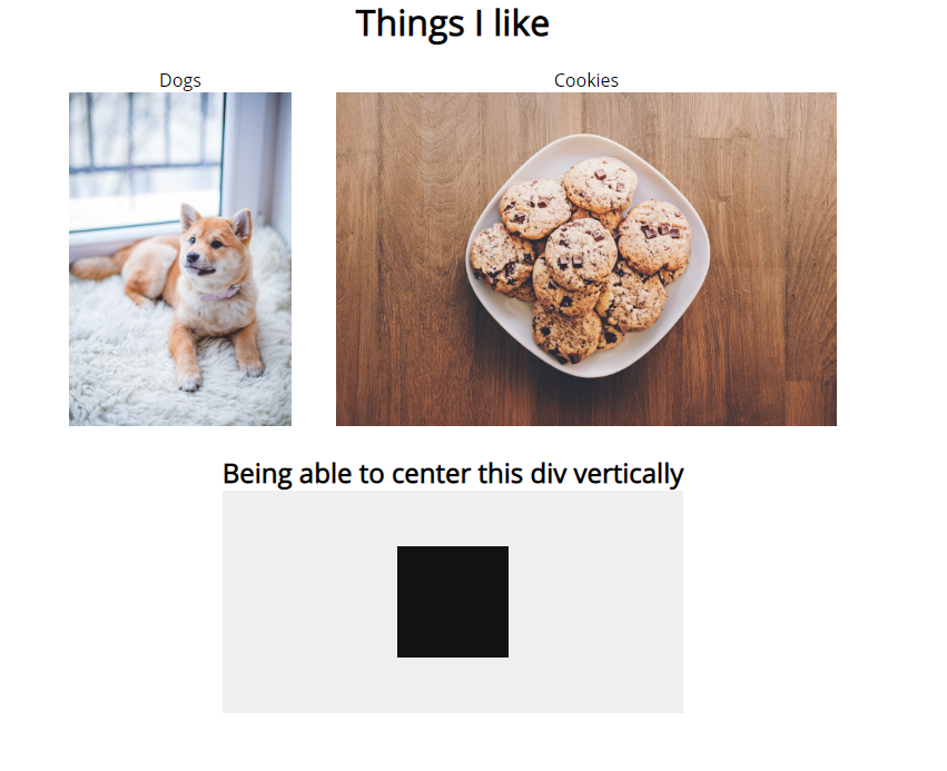
{
  "type": "div",
  "styles": {
    "width": "100vw",
    "display": "flex",
    "align-items": "center",
    "flex-direction": "column"
  },
  "children": [
    {
      "type": "custom-component",
      "props": {
        "title": "Things I like",
        "customProps": { "someProp": ":3" }
      },
      "styles": {
        "_h1": { "display": "flex", "justify-content": "center" },
        "_div": { "display": "flex" }
      },
      "children": [
        {
          "type": "p",
          "content": "Dogs",
          "styles": {
            "display": "flex",
            "align-items": "center",
            "flex-direction": "column",
            "padding": "20px"
          },
          "children": [
            {
              "type": "img",
              "props": {
                "src": "https://images.pexels.com/photos/1805164/pexels-photo-1805164.jpeg"
              },
              "styles": { "margin-top": "10px", "max-width": "200px" }
            }
          ]
        },
        {
          "type": "p",
          "content": "Cookies",
          "styles": {
            "display": "flex",
            "align-items": "center",
            "flex-direction": "column",
            "padding": "20px"
          },
          "children": [
            {
              "type": "img",
              "props": {
                "src": "https://images.pexels.com/photos/890577/pexels-photo-890577.jpeg"
              },
              "styles": { "margin-top": "10px", "max-height": "300px" }
            }
          ]
        }
      ]
    },
    {
      "type": "p",
      "content": "Being able to center this div vertically",
      "styles": {
        "display": "flex",
        "align-items": "center",
        "flex-direction": "column"
      },
      "children": [
        {
          "type": "div",
          "styles": {
            "height": "250px",
            "width": "500px",
            "display": "flex",
            "flex-direction": "column",
            "justify-content": "center",
            "align-items": "center",
            "background-color": "#EFEFEF",
            "margin-top": "10px"
          },
          "children": [
            {
              "type": "div",
              "styles": {
                "width": "100px",
                "height": "100px",
                "background-color": "#121212"
              }
            }
          ]
        }
      ]
    }
  ]
}
export const schema = ((): string =>
JSON.stringify({
type: 'div',
styles: {
width: '100vw',
display: 'flex',
'align-items': 'center',
'flex-direction': 'column',
},
children: [
{
type: 'custom-component',
props: {
title: 'Things I like',
customProps: {
someProp: ':3',
},
},
styles: {
_h1: {
display: 'flex',
'justify-content': 'center',
},
_div: {
display: 'flex',
},
},
children: [
{
type: 'p',
content: 'Dogs',
styles: {
display: 'flex',
'align-items': 'center',
'flex-direction': 'column',
padding: '20px',
},
children: [
{
type: 'img',
props: {
src:
'https://images.pexels.com/photos/1805164/pexels-photo-1805164.jpeg',
},
styles: {
'margin-top': '10px',
'max-width': '200px',
},
},
],
},
{
type: 'p',
content: 'Cookies',
styles: {
display: 'flex',
'align-items': 'center',
'flex-direction': 'column',
padding: '20px',
},
children: [
{
type: 'img',
props: {
src:
'https://images.pexels.com/photos/890577/pexels-photo-890577.jpeg',
},
styles: {
'margin-top': '10px',
'max-height': '300px',
},
},
],
},
],
},
{
type: 'p',
content: 'Being able to center this div vertically',
styles: {
display: 'flex',
'align-items': 'center',
'flex-direction': 'column',
},
children: [
{
type: 'div',
styles: {
height: '250px',
width: '500px',
display: 'flex',
'flex-direction': 'column',
'justify-content': 'center',
'align-items': 'center',
'background-color': '#EFEFEF',
'margin-top': '10px',
},
children: [
{
type: 'div',
styles: {
width: '100px',
height: '100px',
'background-color': '#121212',
},
},
],
},
],
},
],
} as IJSONComponentSchema))();