Slider button card by @mattieha
A button card with integrated slider for light, switch, fan, cover, input_boolean entities.
- Go to the HACS store > Settings (dots in right upper corner) > Custom repositories > Fill in the repo url
https://github.com/mattieha/slider-button-cardand chooseLovelaceas category. - Click install on the added card in HACS
- Download
slider-button-card.jsfile from the latest-release. - Put
slider-button-card.jsfile into yourconfig/wwwfolder. - Add reference to
slider-button-card.jsin Lovelace. There's two way to do that:- Using UI: Configuration → Lovelace Dashboards → Resources → Click Plus button → Set Url as
/local/slider-button-card.js→ Set Resource type asJavaScript Module. - Using YAML: Add following code to
lovelacesection.resources: - url: /local/slider-button-card.js type: module
- Using UI: Configuration → Lovelace Dashboards → Resources → Click Plus button → Set Url as
- Add
custom:slider-button-cardto Lovelace UI as any other card (using either editor or YAML configuration).
In most cases the card is best used in combination with the default grid card.
The width and height of the slider button card is determined by the columns option of the grid card and the Render cards as squares option.
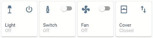
Example columns: 2 and Render cards as squares: false
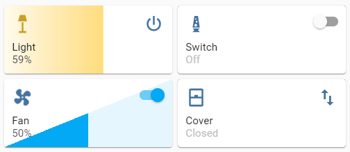
Example columns: 1 and Render cards as squares: false
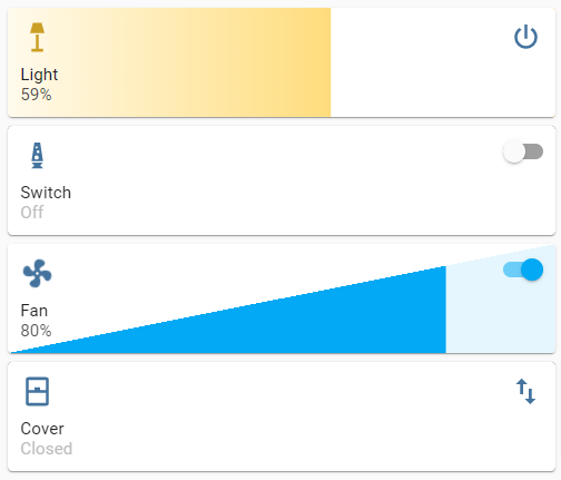
Used as standalone card the width will be 100% of the column, and the height will be as needed.
With the option slider.force_square it's possible to force the height to be the same as the width.
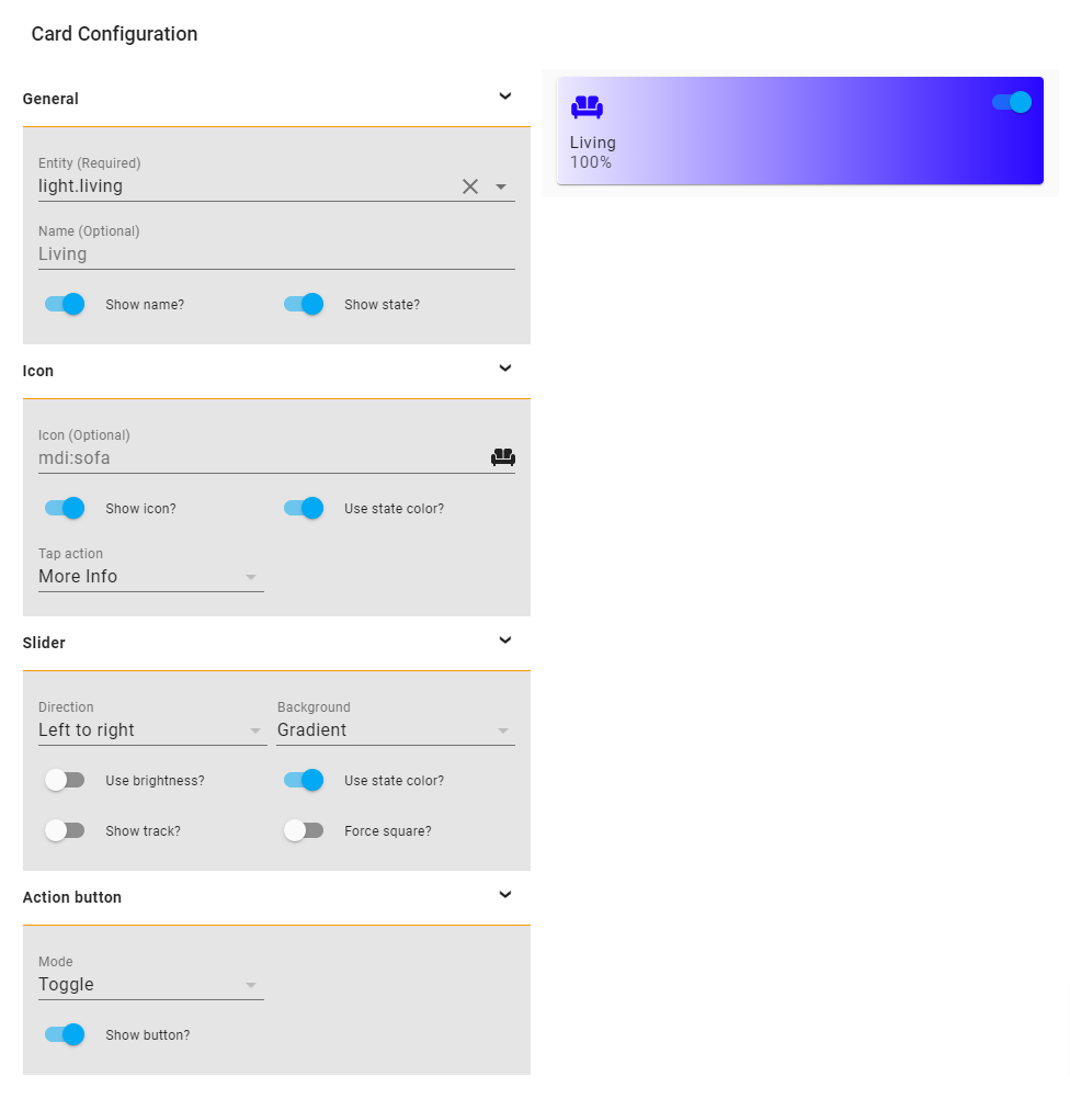
Slider Button Card supports Lovelace's Visual Editor.
Show screenshot
| Name | Type | Requirement | Description | Default |
|---|---|---|---|---|
| type | string | Required | custom:slider-button-card |
|
| entity | string | Required | HA entity ID from domain light, switch, fan, cover, input_boolean |
|
| name | string | Optional | Name | entity.friendly_name |
| show_name | boolean | Optional | Show name | true |
| show_state | boolean | Optional | Show state | true |
| icon | object | Optional | Icon options | |
| slider | object | Optional | Slider options | |
| action_button | object | Optional | Action button options |
| Name | Type | Requirement | Description | Default |
|---|---|---|---|---|
| icon | string | Optional | Icon | default entity icon |
| show | boolean | Optional | Show icon | true |
| use_state_color | boolean | Optional | Use state color | true |
| tap_action | object | Optional | Action to take on tap | action: more-info |
| Name | Type | Requirement | Description | Default |
|---|---|---|---|---|
| direction | string | Optional | Direction left-right, top-bottom, bottom-top |
left-right |
| background | string | Optional | Background solid, gradient, triangle, striped, custom |
gradient |
| use_state_color | boolean | Optional | Use state color | true |
| use_percentage_bg_opacity | boolean | Optional | Apply opacity to background based on percentage | true |
| show_track | boolean | Optional | Show track when state is on | false |
| force_square | boolean | Optional | Force the button as a square | false |
| toggle_on_click | boolean | Optional | Force the slider to act as a toggle, if true sliding is disabled |
false |
| Name | Type | Requirement | Description | Default |
|---|---|---|---|---|
| mode | string | Optional | Mode toggle, custom |
toggle |
| show | boolean | Optional | Show the action button | true |
| icon | string | Optional | Icon when mode is custom |
mdi:power |
| show_spinner | boolean | Optional | Show spinner when mode is custom |
true |
| tap_action | object | Optional | Action to take on tap | action: toggle |
| Name | Type | Requirement | Description | Default |
|---|---|---|---|---|
| action | string | Required | Action to perform (more-info, toggle, call-service, navigate url, none) | more-info |
| navigation_path | string | Optional | Path to navigate to (e.g. /lovelace/0/) when action defined as navigate | none |
| url | string | Optional | URL to open on click when action is url. The URL will open in a new tab | none |
| service | string | Optional | Service to call (e.g. media_player.media_play_pause) when action defined as call-service | none |
| service_data | object | Optional | Service data to include (e.g. entity_id: media_player.bedroom) when action defined as call-service | none |
| haptic | string | Optional | Haptic feedback for the Beta IOS App success, warning, failure, light, medium, heavy, selection | none |
| repeat | number | Optional | How often to repeat the hold_action in milliseconds. |
non |
Custom styles can be set by using Card mod
    style: |
      :host {
        --VARIABLE: VALUE;
}| Variable | Description | Default |
|---|---|---|
--icon-color |
Color of the icon when icon.use_state_color === false |
var(--paper-item-icon-color) |
--label-color-on |
Color of the label when state is on | var(--primary-text-color, white) |
--label-color-off |
Color of the label when state is off | var(--primary-text-color, white) |
--state-color-on |
Color of the state value when state is on | var(--label-badge-text-color, white) |
--state-color-off |
Color of the state value when state is off | var(--disabled-text-color) |
--action-icon-color-on |
Color of the action button icon when state is on | var(--paper-item-icon-color, black) |
--action-icon-color-off |
Color of the action button icon when state is off | var(--paper-item-icon-color, black) |
--action-spinner-color |
Color of the spinner action button | var(--label-badge-text-color, white) |
- No support for firefox
- Mobile
- With
slider.directionset totop-bottomorbottom-topscrolling is triggered
- With
When you discover any bugs please open an issue.
This card supports translations. Please, help to add more translations and improve existing ones. Here's a list of supported languages:
- English
- Nederlands (Dutch)
- Your language?
- Inspired by Slider entity row